The IoT Journey -- Visualizing IoT Streaming Data with Power BI
In my previous posts in this series(see posts one, two, three, four, five and six) I discussed the construction of a system to collect sensor data from a device and send that data to the Microsoft Azure IoT Suite. The final step in this journey is to build an application that will use the data that we’re sending to the cloud. There are many approaches to building the visualization layer (for a complete discussion on this topic, see the IoT Suite Remote Monitoring solution here: https://www.microsoft.com/en-us/server-cloud/remotemonitoring/Index.html ), but I wanted to incorporate the use of Microsoft Power BI to demonstrate a Software as a Service (SaaS) solution to visualize the output of the sensor platform.
Obviously this is overkill for temperature and humidity data for a single sensor, but imagine having a worldwide network of these sensors reporting data. The beauty of the cloud and the SaaS platform for visualization, is that there is virtually an unlimited amount of capacity available to you with very little work on the front end to build the solution.
The first step in this process is to obtain and provision a Microsoft Power BI subscription if you don’t already have one. Power BI is available in a free tier that will work for this example, so you do not need to purchase a subscription in order to build the solution.
Step One – Obtain a Power BI Subscription
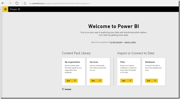
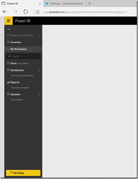
Sign up for Microsoft Power BI at www.powerbi.com and select the Get Started now button. Follow the instructions on the screen to sign up. Note that you must use a corporate email address (not an @gmail, @outlook or @hotmail address). If you want, you can sign up for a 30-day trial of Office 365, or sign up for a $5 per month plan and then use that address as your Power BI login. The good news there is that after the 30-day trial, Power BI will continue to function normally. Once you’ve signed up for Power BI and logged in, you’ll see the following screen:
Once Power BI is successfully provisioned, the next step is to configure the Azure IoT Hub to send data to Power BI so that we can add it to a dataset.
Step Two – Send IoT Data to Power BI
One of the services available in the Azure IoT Suite is Azure Stream Analytics (ASA). ASA is a fully-managed cloud service that enables real-time processing of streaming data. It is a very powerful service, and when coupled with Azure Event Hubs, can scale to millions of devices.
For the purpose of this post, we will use ASA to receive data from the IoT Hub that we created in the previous post, and then output the data to a data set that is read by Power BI to build a report and dashboard to represent the data being sent by our sensors. As mentioned earlier, this is overkill for a single sensor, but it will give you an idea of how simple building this solution is, and of course it can be easily scaled to a virtually unlimited amount of sensors.
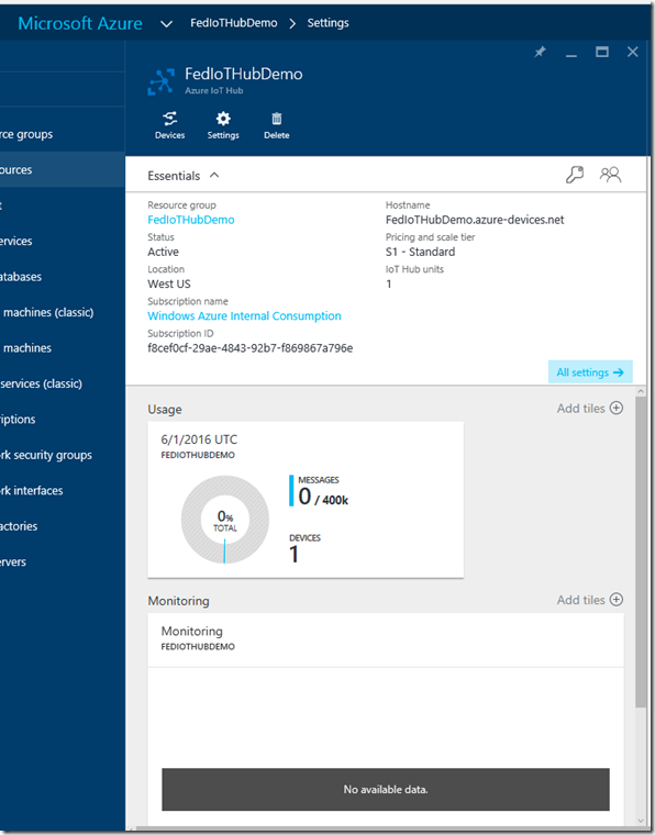
As you recall, in the last post we created an Event Hub (in my case it was named FedIoTHubDemo) and we configured it to receive data from our Raspberry Pi device. Now we will use that hub to send data to ASA so that it can be viewed in Power BI. You will need to open the Azure Management Portal and navigate to the Event Hub that you created in the previous post.
Make sure that you make note of the name and region where the resources are located.
To connect ASA to the Event Hub, we will perform the following steps:
- Create a new Stream Analytics Job
- Configure an Input to ASA
- Write a Query using the Azure Stream Analytics Query Language
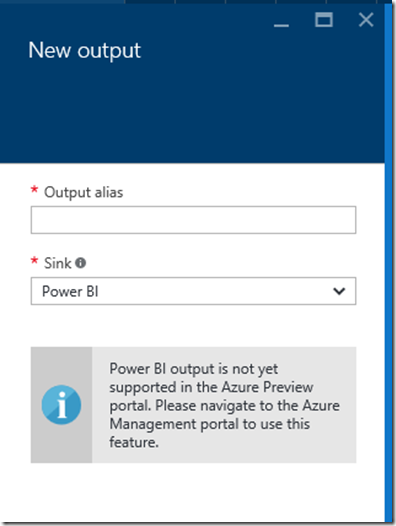
- Configure an Output to Power BI (as of the time of this post, this is not supported in the management portal, we will need to use the legacy portal to perform this step)
- Start the Job
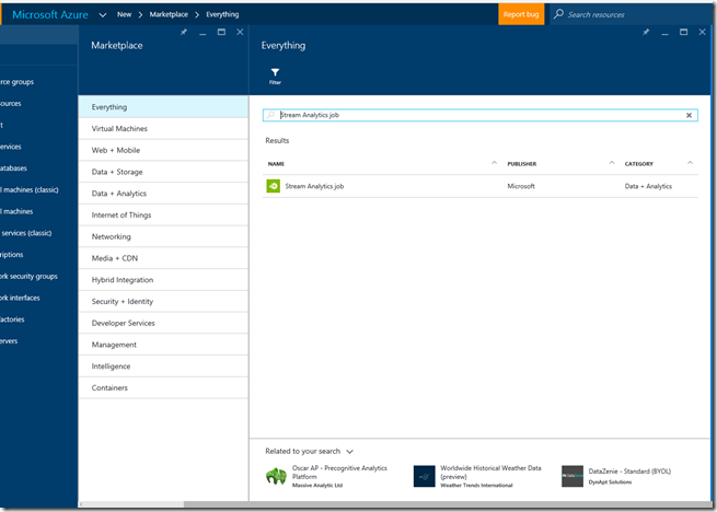
In the Azure Management Portal, select New in the upper left, and then select everything in the Marketplace pane, and then type Stream Analytics Job in the search box:
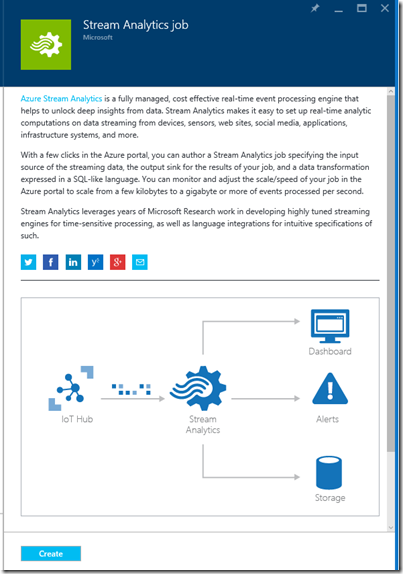
Then select Stream Analytics Job from the search results:
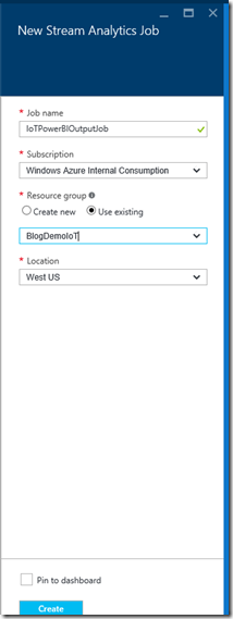
Then select Create to open the ASA blade:
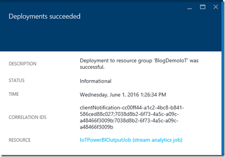
Give the job a name, select the resource group that you used for the Hub and then select a location for the resources. Then select Create to create the Job. This will start the deployment process and you will receive a message in the portal when the deployment is completed:
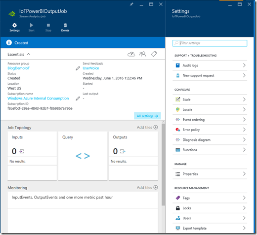
Once the deployment is complete, click on the job to open the dashboard and settings blade:
Note that there are no inputs or outputs configured. For our example, we will configure an Input that uses the IoT Hub that we previously created.
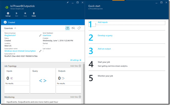
Click on the cloud icon in the essentials section of the pane to open the Quick Start Wizard:
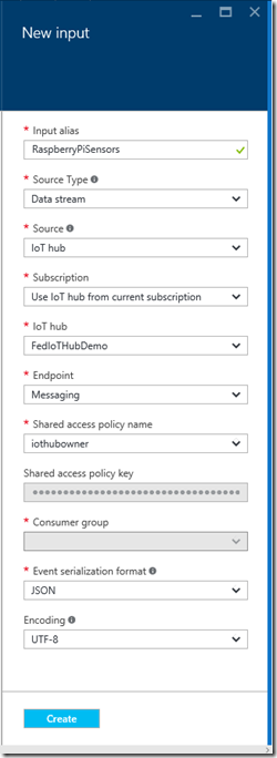
Then click Add inputs. Give the input a name, and then select IoT Hub as the source. Make sure the drop-downs are filled with the appropriate names from the IoT Hub that you created earlier. Use the Shared Access Key for the iothubowner policy that you copied to the text file in the last post (or copy it again from the IoT Hub that you created).
Once all of the fields are filled out (don’t worry about the Consumer Group dialog unless you chose a name for it previously. It is named $default unless you chose a name) click Create to create the Input. The system will create the input and then test it to ensure that it is properly configured.
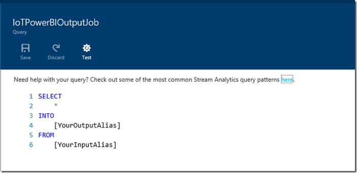
Once the input is created, click on Step 2 of the quick start wizard, Develop a Query. This will open the query pane with a sample query:
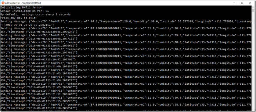
The ASA Query Language is very similar to T-SQL with some extensions specifically for streaming data. In our scenario, the message that is sent from the Raspberry Pi to the Azure IoT Hub is very basic, consisting of 7 fields(deviceID, temperatureF, temperatureC, humidity, latitude, longitude and timestamp):

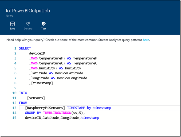
This message is sent to Azure approximately every 3 seconds. In our case, we will want to create a query that collects the data in the stream, groups it appropriately and then assigns a time window to the collection times so that we know what the groupings refer to. The most appropriate groupings are deviceID, latitude & longitude, and the time window is controlled by the timestamp value. In theory this will be every 3 seconds, but there is no guarantee that the Pi will send the data on that schedule, so we will create a Tumbling Window to represent a 5 second interval. (in production we would likely change this to have a wider window, as we have no driving need to see the temperature every 5 seconds). The resulting query will look like this:
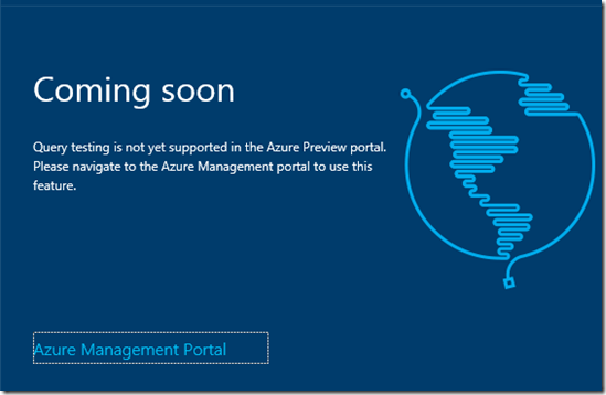
Click Save to save the query. Make sure that the FROM table you reference in the query is the same name that you gave the Input earlier. Typically you would test the query at this time, but currently testing is not supported in the Azure Management Portal. (It should be available soon, and I’ll update this post when it is)
Once the query is saved, you will need to launch the legacy Azure Management Portal (https://manage.windowsazure.com ) as the current portal does not support creating a Power BI output sink for ASA.
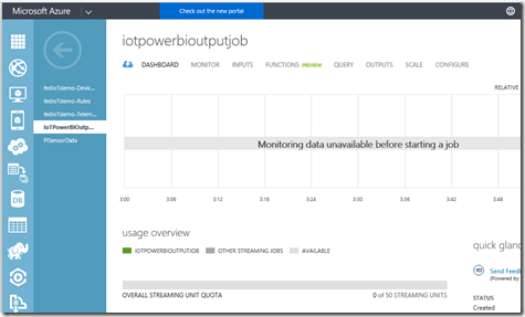
Launch the legacy portal and navigate to the Stream Analytics Job that you created.
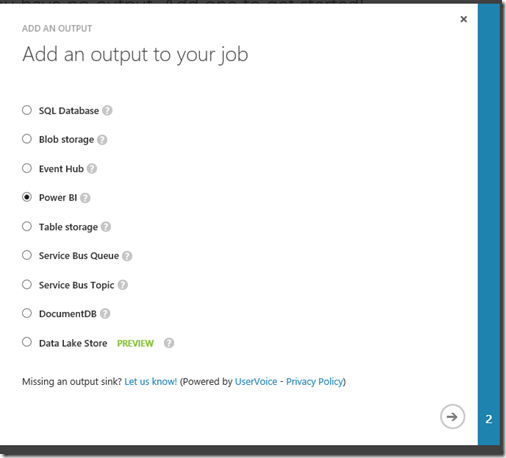
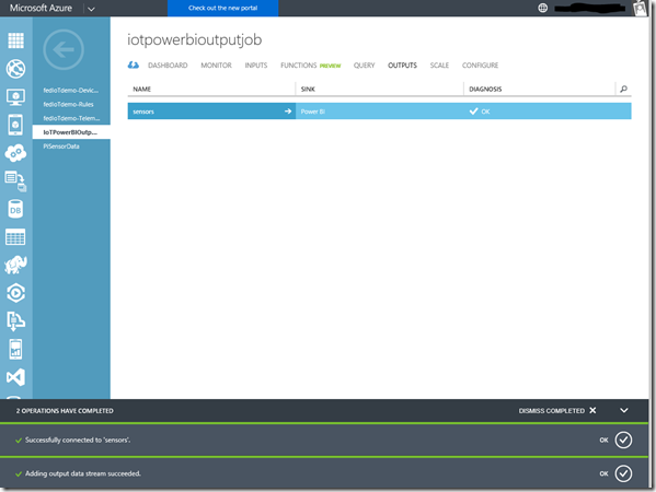
Select the OUTPUTS tab, and add a new output. Select Power BI and then click the next arrow:
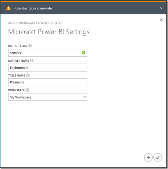
Then click the Authorize Now button and sign in using the credentials that you used to provision your Power BI environment. This will bring you to the configuration dialog for the output:
Note that the values you use for the DataSet and Table will appear in Power BI, so choose a name that is meaningful. Click the OK CheckMark to create and test the output.
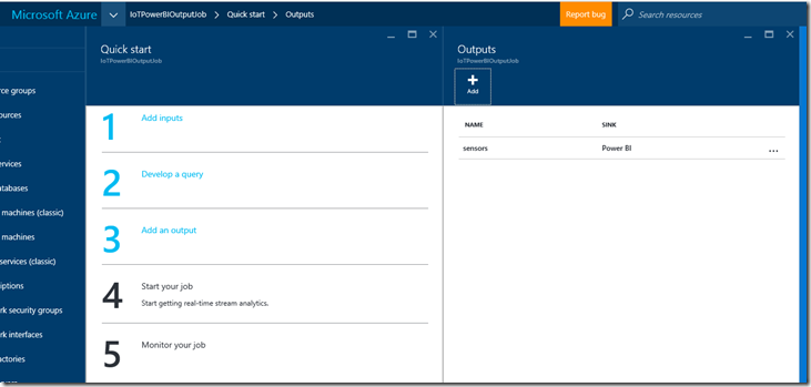
Now that the output has been configured, you can exit the legacy portal and return to the new portal where you will see the output you just created listed in the outputs section of the job:
Next, in the ASA Job blade, click the Start button, select Now, and click the Start command. This will start the ASA Job, but will take several minutes to complete.
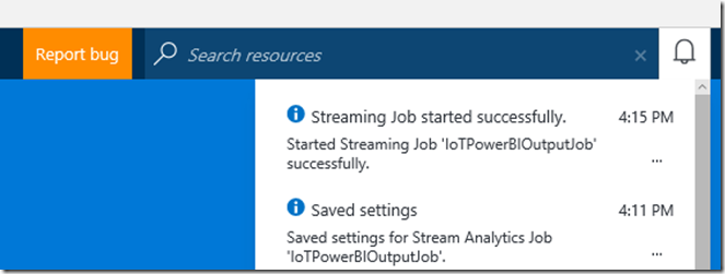
Once the job is started, you will see a message in the portal.:
Now that the job has been started, we will need to start the sensor application on the Raspberry Pi and start sending data to Azure.
Step Three – Send the Data to Azure
This is the easiest step, since we’ve already built and tested the application. Follow the steps from the previous post to use an SSH client to connect to your Raspberry Pi and start the DHT11Test application to start sending data to Azure:
Let the application run for a few minutes before proceeding to the next step.
Step Four – Build the Power BI Dashboard
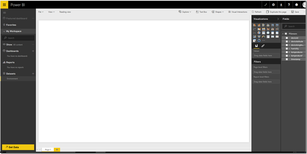
After the application has been running for awhile, launch Power BI and expand the workspace on the left side of the screen (note the arrow icon at the bottom left)
You will see the DataSet name that you provided above in the Datasets section. Click the dataset to open the designer. Note the table name that you specified earlier, and the fields from the Raspberry Pi application:
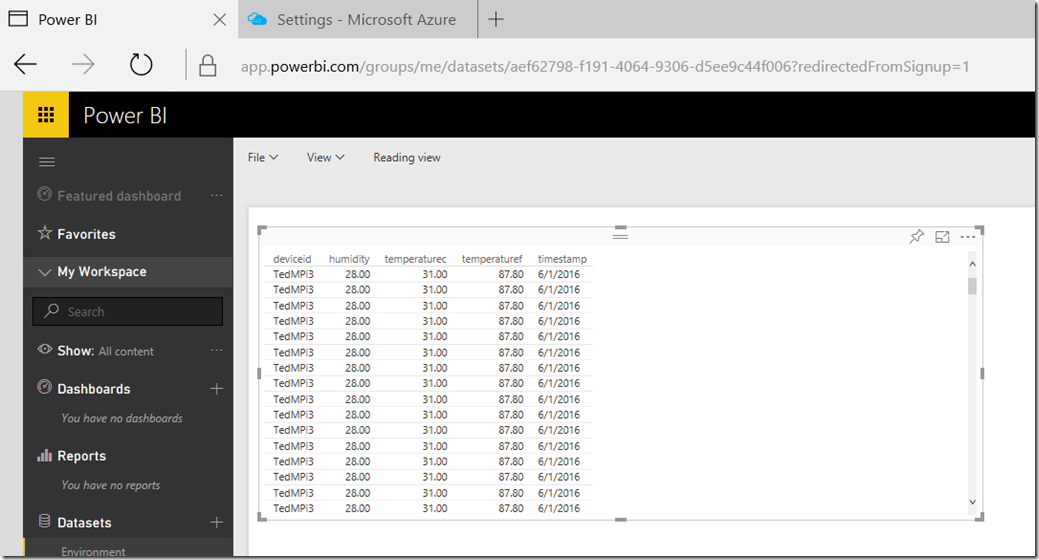
For the purposes of this post, we will build a simple report and dashboard to visualize our environmental data. Click on the deviceid, temperaturef, temperaturec and timestamp fields. Note that you will have a table displayed with each of these values:
Note that the numeric values are summarized at the bottom of the table. Since we do not want this, choose each of the numeric fields in the Values section and select Don’t Summarize in the drop down list. Your table should look like this:
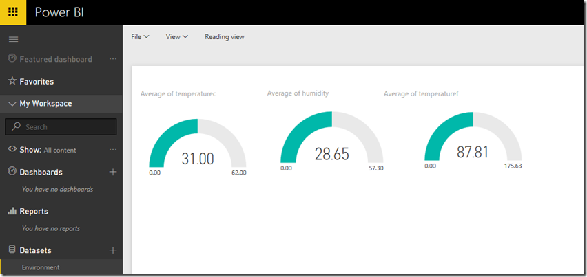
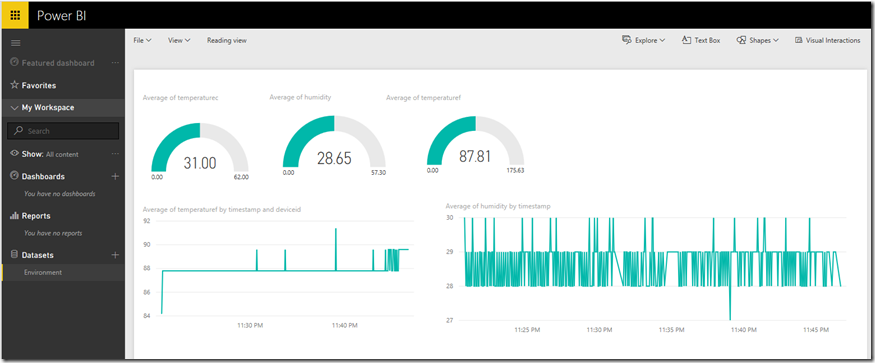
Since we want to build a nice dashboard instead of a table of values, lets switch to a gauge to display each of the values. In the Visualizations pane, select the Gauge icon. Drag the temperaturec field to the Values box, and in the drop down, select Average. Leave the other textboxes blank. Resize the Gauge to make it look nice. Your canvas should now look like this:
Now click on a blank area in the report canvas, and then select the humidity field. Click on the Gauge icon in visualizations, and repeat the above step to visualize the average humidity. Repeat for the temperaturef field as well.
Now click on a blank area under the gauges, and select the timestamp field. In the visualizations select a line chart, and drag the temperaturef field to the values and the timestamp field to the axis. Resize the graph and then click on an open area in the canvas. Repeat these steps choosing the humidity field, and then resize the graph. It should look like this:
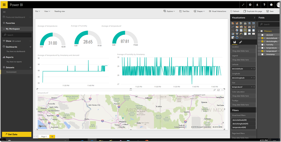
Now, click a blank area under the line graphs and select the Map visualization. Drag the devicelatitude field to the latitude box, the devicelongitude field to the longitide box, and the temperaturef field to the size box. Resize the graph to fit the canvas. It should look like this:
You have now built a report, using data from the sensors on the Raspberry Pi and streamed to Power BI via Azure Streaming Analytics!
On the report canvas, choose File and then Save and then give the report a name. Once the report is saved, click the Pin icon on each graph to pin to the dashboard (the first pin will require you to name the dashboard). Once everything is pinned, select the dashboard in the left side and resize the elements as desired.
Now you have a dashboard connected to the report. Notice that when you click on a dashboard element, it drills down to the report page that contains the visualization.
Spend some time experimenting with various visualizations, and explore the power of Power BI.
Conclusion
In this post we completed the journey by connecting the data collected from sensors on our Raspberry Pi to Power BI by using the Azure IoT Suite.
This showcases how powerful the Azure IoT Suite can be, while remaining relatively easy to develop solutions that utilize the suite.
If you purchased the sensor kit from Sunfounder that I mentioned in earlier posts, you’ll find that you have several additional sensors to play with that can be added to your Raspberry Pi environment and connected to Power BI.
