Death to the Start Menu – Part I
So I have been playing around with Vista SP1 RC and so far it has been a much more enjoyable experience from a usability perspective. The number UAC prompts are down, network performance regarding file sharing is now what it should have been at release time and stability is much better. I always thought the UI in Vista was better than its predecessor though it did take a few weeks getting used to especially with the initially annoying Network and Sharing Center. Since switching to my Mac for personal use a few years ago prior to joining Microsoft, I’ve had to go through the pain of using the Start Menu again *learned a lot about usability in the process*.
“Start Menu, pain? Surely you jest,” you might be thinking. Actually, it is my opinion that the Start Menu is one of the most outmoded concepts that makes Windows, well um…Windows. Back when Microsoft was young and applications were still 16-bit, Microsoft had a teenage love affair with IBM, a much older partner. Somewhere between DOS and OS/2, Microsoft gave birth to Windows 95. For all its critiques, it really was a revolution in the UI field of computing. At the time, applications were disjointed and not aware like they are today. Background services connecting applications together didn’t exist pervasively. As a result, until Windows 95, the PC had not seen application-level multi-tasking in the consumer space. The Start Menu provided an elegant way to open and manage different applications.
By Windows 98, the Start Menu was a resounding success and it wasn’t uncommon to see someone’s bar look something like this:
Now this is a shot of Vista’s Start bar so it has notable enhancements such as the title of the document/webpage as well as the icon of the application. In earlier versions, you didn’t have these convenient elements. The end result though, regardless of product, was a mess of buttons that didn’t really give you a sense of what each window contained. Actually the picture above was inaccurate as the default setting of Windows only kept the Start Menu height at one “window unit,” so what you really ended up with is something similar to the following:
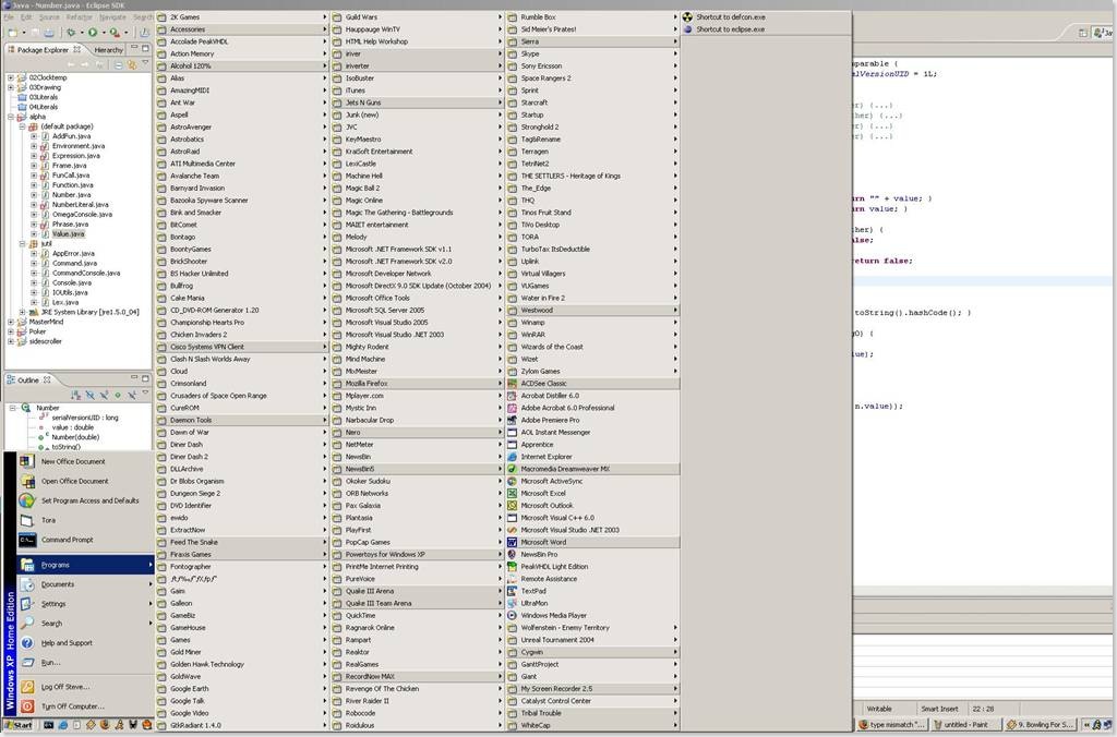
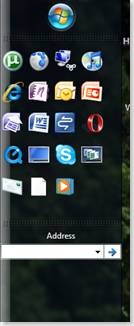
This is where things started to stagnate--don’t get me started on “grouped tabs.” As processing power increased over the years, the number of windows people kept open at a given time climbed. With no competitors offering an alternative to the Start Menu, the pace of innovation grinded to a halt through XP. Amazingly innovative features like “Quick Launch” and add-on toolbars were turned off by default leaving a growing ignorant user base to suffer needlessly. Furthermore, as applications installed on a Windows machine increased dramatically, the “programs” part of the Start Menu became an untidy beast of tiny text and columns upon columns of folders. Years of observation of others and personal frustration with the usability led me to the following conclusions.
1. The Start Menu could no longer scale in conveying actionable context as the number of windows increased
2. The Start Menu could no longer scale in its ability to launch all applications from the program menu without user frustration resulting from clutter.
Let’s pause and take all this in.
Start Menu good -> Start Menu Successful -> Positive Windows Perception -> More Windows OS sales -> More Applications -> More Windows -> More Clutter -> Add Grouped Tabs and Quick Launch -> Turn off Grouped Tabs and Quick Launch -> Start Menu bad.
…to be continued. *you all have no idea how this is gonna end do you :) * Here are a few clues…
Comments
Anonymous
January 01, 2003
While I continue to write part 2 of " Death to the Start Menu ," I wanted to give a few moreAnonymous
January 01, 2003
The comment has been removedAnonymous
January 01, 2003
Actually you are way wrong and also right on a few things. Scrolling feels like a step back. I feel it is a step back especially if you are not using a wheel mouse i.e. laptop. I don't think they took that use-case into account. With a mouse wheel, usability tends to be much better. You are wrong when it comes to "people just need to understand organization" IT administrators as well as Microsoft should take the responsibility of implementing best practices into the UI. IT admins can go beyond simple maintainence and try to engineer desktops that have controlled UI via group policy so the user doesn't do stupid stuff. IT admins also need to understand that not everyone is a power-user thus be critically thinking of ways that will improve end-user productivity with the support of operations management. Often times, all this means is pushing/enabling features via group policy as the default is disabled. Microsoft has a responsibility to evolve UI to take into account new paradigms in computing and information flow. I would say that Microsoft is doing that pretty well, simply failing to get the message across effectively. blame marketing Stay tuned to part 2. This will probably be a 3-part article.Anonymous
January 01, 2003
i was refering to the 4 pic. I have heard of launchy, it'll never EVER be deployed in a business or enterprise enviroment. This article isn't about power users, its about over end-user experience in MANAGED environments. Finally, I have a life. A great one as seen by may fun picture :)Anonymous
January 01, 2003
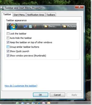
I'll disregard your jab about me leaving out your response, it required approval due to SPAM threshold. I don't delete responses. Firstly, regardless of your feelings about scrolling, which I agree with. You are severely misinformed, and makes me to believe you haven't tried Vista beyond a few mintues at the store. Choice is important, that is why the Start Menu/Taskbar have "classic mode" which replicates XP's startmenu...period. right-click the taskbar, properties,goto start menu tab, select classic. BTW this is an option that is available for configuration via group policy. To sum up exactly how much Microsoft has left in Vista in terms of "classic" options, here's the list: Explorer Menu Bar option, IE menu bar option, control panel classic view, start menu classic mode...the only thing they didn't have a classic mode for is for Networking and Sharing Center. Frankly you get used to it learn something new in terms of features that existed in XP but no one knew about.Anonymous
January 01, 2003
PingBack from http://geeklectures.info/2007/12/26/death-to-the-start-menu-%e2%80%93-part-i/Anonymous
January 01, 2003
actually every app i have installed is used extensively for work as this is my enterprise laptop. Also every window and background service running are things that allow me to multi-task when doing work. Plus this mentality that you shouldn't install applications because it will reduce performance nonsense. It comes down to which applications you install and how many low quality services you are running.Anonymous
December 26, 2007
The comment has been removedAnonymous
December 27, 2007
I Like the startbar just the way it is.Anonymous
December 27, 2007
What are you talking about?Your 2nd and 3rd pic shows Windows Taskbar and not START menu .. and Have you ever heard of Launchy? Go get a lifeAnonymous
December 27, 2007
Vista's present start menu is a ste back. There is nothing wrong with XP's start menu. Scrolling, like in Vista, is ignorant. People just need to understand organization so it doesn't turn into your example. The quick launch is good and should be for what a user sees as important. Having a menu to easily find ANY software a person has installed should stay. MS should make it easier for a person to organize the start menu into something the user can follow. The Vista scrolling thing is the wrong way as far as I'm concerned. I agree that what is exampled above is insane and I would never allow that.Anonymous
December 27, 2007
The comment has been removedAnonymous
December 27, 2007
Nice to see you left out my response to you after telling me I was way wrong. That must be why Vista is doing soooo well....blowing people off and all. Vista is only going to catch on when there is nothing else that people can get and they are stuck having to take Vista.Anonymous
December 29, 2007
The comment has been removedAnonymous
April 03, 2011
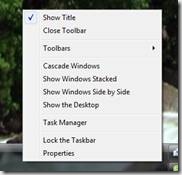
How did you do the uncheck "show title" part? When I look in the right-click menu in my toolbar, I can't see the option. I am using Windows Vista Home Premium (upgraded).


