Time Intelligence Differences between Grids and Scorecards
Time intelligence (TI) is one of the great features of PerformancePoint, but it has always taken users time to understand and implement. And we have received more than a few discussion list posts and customer inquiries when things don't add up -- literally. Today, I wanted to draw your attention to a small case in point. One of our testers brought this to my attention, and I thought that it would be nice to share with the community.
The issue is, in short, that grids and charts don't aggregate data the same way that scorecards do when TI filters have been applied to them. Many of you may have already encountered this, been frustrated by it, and have learned to account for it. In order to show you the discrepancy between the two visualizations, you really just need four things: you need a data source that has TI mapping set up, a KPI (and a scorecard), a grid, and a filter. Like usual, I'll use the AdventureWorks cube to illustrate my point.
The Data Source
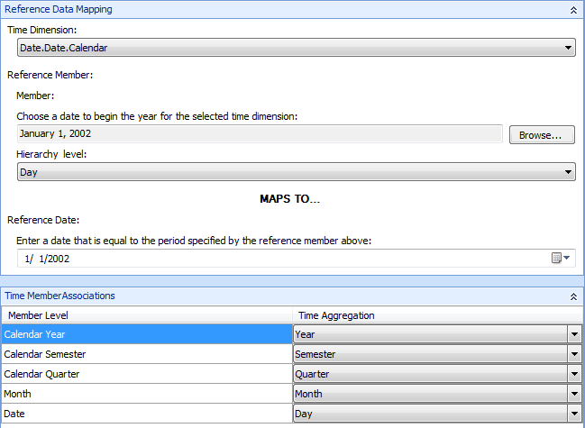
For the purposes of this, I'm just going to use the standard AdventureWorks OLAP cube. Our data source will be based on the Date.Date.Calendar dimension, and, in this case, we will need to select a member for which there's actually data -- 1/1/2002. Our hierarchy level will be based on day. We are going to map to the same date that our member is set to. Here is a screen shot that will clear things up.
The TI Filter
Simply create a regular TI connection formula filter. This will create a day-based calendar control that we can use to make our filtering granular to the day.
The Analytic Grid
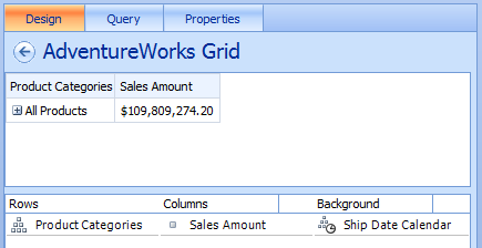
The grid that we are using isn't special in itself. I created a grid with product categories on rows, sales amount on columns, and ship date calendar on the background. The ship date calendar is what we will use to filter against our TI calendar control.
Now, while the grid itself isn't all that special, the connection to the TI filter is. And that's because it uses a connection formula.
You can see that we connect to the Ship Date Calendar in the "Connect to:" field. And by specifying quarter,day in the connection formula, I'm telling the formula to aggregate by quarter and to include the selected day in that aggregation. That's what's giving me the value of $109,809,274.20. Let's move to the KPI now.
The KPI
Our KPI is set like the following: Create a blank KPI. For the purposes of this blog, we will just create an "actual" (as opposed to an actual and a target). We don't need to change the number format (I, however, did change mine to currency). Under Data Mappings, change the data source to use our AdventureWorks source, and use the Sales Amount measure, since that's what we're also using in our grid. Incidentally, go ahead and change the Calculation type to "Data value" so that you can decomp the value later if you want.
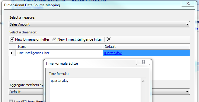
As part of the Dimensional Data Source Mapping, add a new Time Intelligence Filter, and specify quarter,day as part of the Time Formula Editor.
Now, both our grid and our scorecard KPI are both configured with the same time dimension formula: quarter,day.
The Dashboard
On the dashboard, I connected my TI filter to my scorecard using Current date-time for both the source and for the destination. After that connection has been made, I will have one calendar control that filters both my scorecard and my analytic grid. And both of those objects will aggregate to quarter + day against the exact same data source. Here is the resulting dashboard:
You'll notice that I highlighted the values. I did that because they are, in fact, different. And, even then, by only a few dollars. Theoretically, they should be the same. Like I mentioned above, they are running against the same data source and are aggregated using the same TI formulas. This is the point that I wanted to highlight. This is not a case of bad data, but rather a case where scorecards and grids roll up data differently. In this example, Grids do not include the day hierarchy, but scorecards do. The lesson here is to be careful with your TI formulas because the different reports do not necessarily treat them equally.
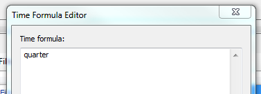
Let's see what happens when we alter the formulas a bit. Actually, we're only going to alter one formula: the scorecard's. When I remove the child hierarchy, day, our values fall back in line with one another. So altering the time formula on the KPI from quarter,day to just quarter, like this
yields a dashboard that looks like this:
Now the grid and the scorecard values match, as you would expect. Again, many of you may have already encountered this issue. And if you have, you like already account for it. But if you have not, it's good to be aware of it and to work around it using whatever methods make sense for you.
That's it for now. Thanks for reading.
Kevin Donovan
Program Manager
Office BI
Comments
Anonymous
March 06, 2012
Hi, If I want to have present KPI of the same measure for different time periods, for instance, one for MonthtoDay, one for YearToday on one scorecard, I should create two KPIs, am I right? thank you every much.Anonymous
March 06, 2012
Hi Kevin, Does the connection formula "Quarter, day" mean QTD, QuarterToDay? And since you are the program manager, I'd like ask a question not directly related to this topic and hope you do not mind: is PerformancePoint Designer going to support more Analytical Chart types? ThanksAnonymous
March 06, 2012
Hua, to your first question, yes, that should work. To your second question about visualizations in PPS . . . I can't say what's coming in the next release of PPS. Sorry. But, are there visualizations that are missing today that you would like to see?Anonymous
March 06, 2012
The comment has been removedAnonymous
April 10, 2014
Hi, I have a cube and in cube I have 1900, 2012, 2013 and 2014. I have created one Time Intelligence Post Formulas. I have to hide 1900 from all Charts and Grids. Would anyone can help me to do this? Thanks, Arya


