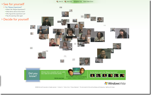
New Look and Feel for Mojave Experiment
Gone is the dark and mysterious backdrop to the Mojave Experiment, now there is a fresh and light look and feel to www.mojaveexperiment.com.
The “deep zoom” navigation is also really cool and I love the way everything falls into a 3D world with depth of field – very nice.
We’ve also now released the demos that we showed to the customers which is good (they can be found on the green band at the bottom right).
Comments
Anonymous
January 01, 2003
The comment has been removedAnonymous
January 01, 2003
Always try new things! :-) Dark theme would be ace! Cheers JamesAnonymous
August 28, 2008
Meh. The deep zoom is a nice touch, and it's great to see them finally add some more videos that makes sense, but I liked the old look better. There's just always something about a glossy black background, with bright white text that makes something look so cool. I'm not much a fan of this more bland white that's appearing on Windows pages, with some small splashes of color, and edgy font. Just my opinion.Anonymous
September 16, 2008
Thanks for the praise on the site! Not many blogs are focusing on the implementation, more on the subject matter. I suppose that is the point, though. As for a 'dark' theme, we'll have to add that to the backlog... :)
