Banks in the eye of the beholder
or should the title to this off topic post read “beware of the graphics trap”.
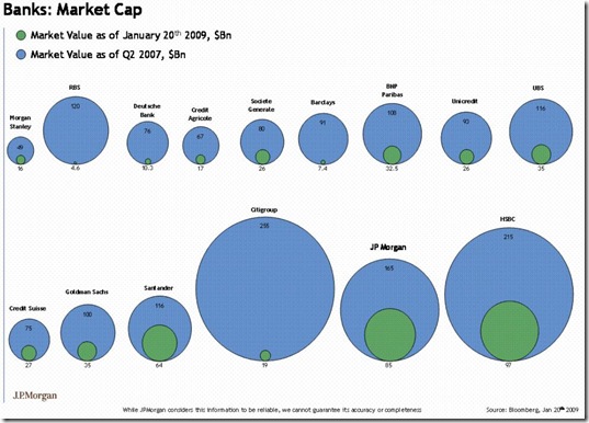
Earlier in the week a post over at ftalphaville.ft.com go my attention with it graphical comparison of the market capitalization of a broad range of banks in the US market between Q2 2007 and now (well the 21st January).
The interesting thing about this post is that it actually represents the compared values as relationships in diameter which in turn translates into an area difference far exceeding the numbers.
If you compare the values (the diameter relationship shown in the graphic) of Citi Group’s $255Bn versus $19Bn, it shrunk to 17% of its former self and compare this with the area comparison of 51070 versus 283.5, visually representing that it shrunk to 0.55% of its former self.
I draw two things from this:
- Firstly it just goes to show what a bit of subtle statistical misrepresentation of the facts can do to our perceptions. So watch out for this easy to make mistake when creating reports of any kind.
- and secondly it highlighted the truly democratic nature of internet media which found this “error” out in a matter of minutes. The blog now carries a disclaimer and is well punished in the comments.
That’s not to say the actual decline in market capitalization of these banks is not in itself “impressive”.
<Gary>
