Dynamic Layout and Transitions in Expression Blend 4
Click here to watch Kenny’s MIX 2010 session that covers a lot of the topics that you see in this post. - Kirupa |
In Expression Blend, we’ve been thinking for a loooong time about how to make it ever easier to create great animated visual effects quickly on top of the Silverlight and WPF runtimes. We’ve been looking at large-scale animation needs since Blend 2 SP1 and steadily building features to address those needs, and we think we’ve reached critical mass. With Blend 4, we have a compelling set of technologies that work very well together.
This blog post is a companion to the “Dynamic Layout and Transitions” demo app that we’ve placed in the Expression Gallery at https://gallery.expression.microsoft.com/en-us/DynamicLayoutTrans. That app shows off the features whose motivations are described here.
Prehistory (2007)
Since its inception, Blend has offered keyframed editing of Silverlight and WPF properties via Storyboards. While I won’t go into specific details on that here, it forms the basis for all the features described below. Some of these features work directly from Storyboards you create and others create Storyboards behind the scenes on your behalf – and sometimes both.
Ancient History (2008)
Let’s start by turning the clock back two years. In Expression Blend 2 SP1, we introduced the States Panel, which edits VisualStates and VisualStateGroups for Silverlight 2 (and WPF 3.5 with the WPF Toolkit). This introduced the notion of a “state” as a means of communication between visuals and code, and made it dramatically easier to describe a set of visual changes. Based on input, the control code could decide when to enter what state, and the visuals would decide what changes were present in that state plus how long it took to transition between any pair of states (e.g. you might want most state changes to take 0.25s, but want Pressed state changes to be instantaneous).
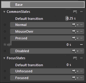
This proved to be a very effective tool, but it had limitations. The core VisualStateManager runtime (which we’ll call “VSM” from now on) could only do linear interpolations of the values being set. This works great for opacity and transform offsets, but doesn’t work well for discrete properties or data that isn’t known until runtime. Also, not all animation scenarios are driven by state changes. So we put our thinking caps on about how we could get more scenarios to work in a way that designers could rapidly tool the effects.
Recent History (2009)
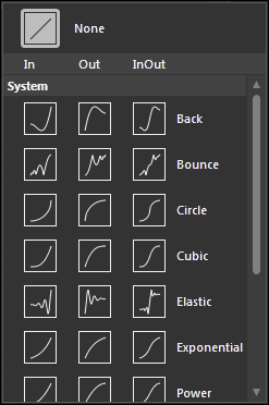
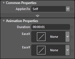
In V3, we added four primary enhancements in this area. The first was EasingFunctions, which are critical to making property animations have the right feel. We’ve got all the classics – quadratics, cubics, bounce, elastic, etc. Plus, you can write your own EasingFunction in C# or VB and apply it to any animation you wish. This is all supported in Silverlight 3 and WPF 4. EasingFunctions can be applied to an individual animation or keyframe, and you can apply a default EasingFunction to your entire state transition.
The second was a GoToStateBehavior on top of Blend’s Behaviors engine, which made it easy to program all your state change logic directly in the markup without code. Like all of Blend’s Behaviors, you can simply drag it from our Asset Panel onto any elements you choose.
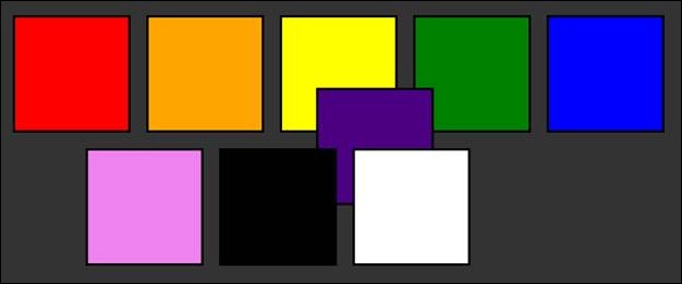
Those two enhancements just made the existing scenarios run better. We also wanted to address new classes of scenario. The first one we tackled was the issue of elements moving in a StackPanel or WrapPanel. Traditionally, these elements have snapped into place as an application changes elements or changes size, and we wanted a smooth transition that users could control. So we introduced the FluidMoveBehavior to make it easy for an element to watch the layout manager for when it moved to a new spot, and smooth out its progress with an animation controlled by one of those EasingFunctions we described earlier. So now it’s easy to have your elements animate into place at a speed you choose!
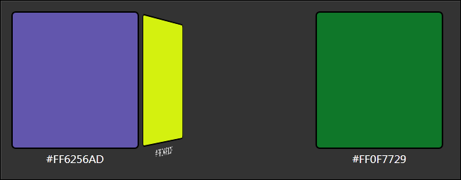
Here’s a picture of the feature in action. There’s no more room on the first line for the purple rectangle, so it’s moving to the beginning of the second row and the other elements are moving to make space. Technically, from a layout perspective, the elements in motion are actually at their destinations already – but by adding the appropriate transforms on top, we make the change look smooth from the visual perspective that users care about.
The fourth enhancement we made was the most challenging for us. We noticed that many times, customers wanted different states in their control to have different layouts entirely, but still respond to active layout changes in the application. For example, one layout might have a set of task panes visible outside the working area, and another might have one or more of these panes hidden. Customers wanted to describe these different layouts with states to get a good separation between their visuals and their business logic, but the properties that needed to change between these states weren’t properties that could be smoothly interpolated. For example, how do you interpolate between Visibility.Visible and Visibility.Collapsed?
What we learned was that in cases like these, users weren’t satisfied with the direct property animations that our system provided – they just wanted it to “look right”, and making it “look right” required that we animate a morph of the change rather than the change itself. So we wrote an engine that would take a layout snapshot before the state change, take another layout snapshot after the state change, and create a smooth morph between the start and end positions, employing the duration and EasingFunction of the user’s choosing. We dubbed this “FluidLayout”, and you can turn it on here:

Just click that little button, and all your layout changes in that VisualStateGroup will be animated between states even when it seems impossible. We’ll even simulate a Visibility change by means of an opacity simulation. Note that you’ll have more success if you click this before you start making layout changes – otherwise, when you move an object, it’ll create translate/scale animations that don’t respect layout, because that’s the best that the standard VSM can do.
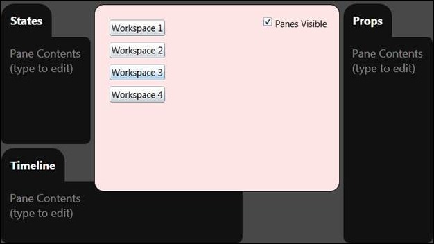
It’s hard to do justice to this feature in a picture, but here’s my best attempt. In this example, the Timeline Pane is in the process of shrinking to the leftmost column, which I configured by changing the Pane’s Grid.ColumnSpan property in a state. Similarly, I changed the RowSpan of the pink rectangle, and it is in the process of growing taller as a result.
The Present (2010)
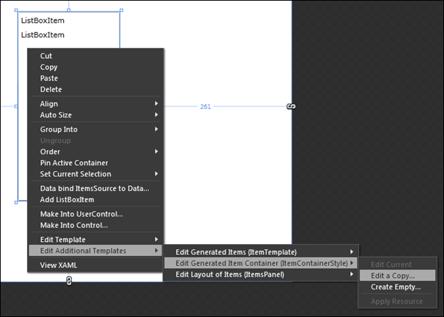
In Blend 4, we’ve managed to take these themes even farther, and have three more toys for designers to play with. Let’s start with animating things in and out of lists. In V3, you could apply a FluidMoveBehavior to your ListBox, and the other items would dutifully make room for your new item or close up the space. But there wasn’t any easy way to effectively control the item that was itself being added or removed; if you were clever, you could rig up some events to make an element animate on entry, and you had to be really really clever (and pollute your data model in unfortunate ways) to make an element animate on exit. We worked closely with the Silverlight team to produce a solution here that you can tool effectively, and it’s called LayoutStates. To find them, first edit the ItemContainerStyle:
And then, note these three new VisualStates in the States Panel:
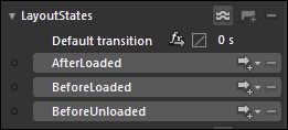
You can use these states to model what an element looks like just before it’s loaded, what it looks like after it’s been loaded, and what it looks like just before it’s unloaded. Silverlight will then animate the state changes for you at the appropriate times, as your items are added to or removed from the list. Remember to add a FluidMoveBehavior to the ItemsPanel template (note its presence in the Edit Additional Templates submenu, a couple of pictures above), and set AppliesTo = Children, to get the other elements to move out of the way. Note that if your ItemsPanel is a VirtualizingStackPanel, your ListBox should have VirtualizingStackPanel.VirtualizationMode set to Standard, or you should learn one of the other new tricks below.
Here’s an example of this in action – the middle item is just entering the list.
The next feature we added is another in the vein of simulation. In V3, we added FluidLayout to VSM in order to get a smooth and realistic morph between two states, but it got us to thinking about the other sorts of morphs we could perform. Enter TransitionEffects. Whereas transition effects in video editing provide a pixel-based transition from one video clip to another, Blend’s TransitionEffects provide a pixel-based transition from one state to another. In Blend, a TransitionEffect is a PixelShader that has an animatable Progress property. We are shipping several of these in our SDK, and if you know HLSL you can write your own. Here’s how you set one up:
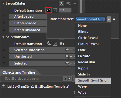
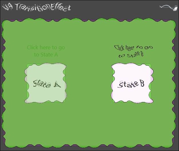
As configured here, all state changes in the LayoutStates group will perform a “Smooth Swirl Grid” pixel-based TransitionEffect, taking one second and with a cubic ease. You can of course set a different transition for any individual state change if desired. Some of the TransitionEffects have properties to further customize them; for example, Smooth Swirl Grid lets you control the level of subdivision and the intensity of the twisting effect, but those properties are under the combo dropdown in the picture. Here’s a screenshot of that TransitionEffect in action:
The final feature we added is something that we’ve been trying to wrap our minds around for five years. We’ve noticed that in a lot of applications, visuals will move from one part of the application to another even though the visuals are often generated from data. In a true MVVM design where the data model should know nothing about the visuals, it’s extremely challenging to get these kinds of effects.
What we’ve done is train the visuals to learn more about the data model – specifically, to train FluidMoveBehavior to associate positions with data instead of with visuals. This needs a little bit of explanation, but is remarkably easy to use – you can create an animated list-detail example from scratch in about two minutes.
Here’s a picture of such an app:
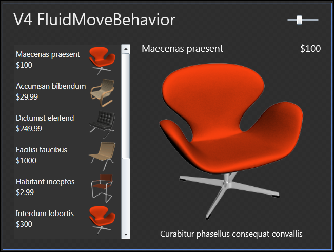
What we want is for the large chair in the details view to appear to grow out of the small chair in the master list. All we have to do is locate the Image element in the ItemTemplate for the ListBox, and give it a FluidMoveTagSetBehavior that will register it with the FluidMove system. That looks like this:
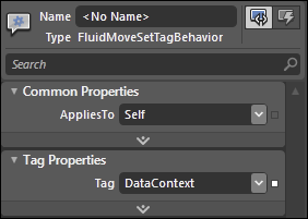
Note that the Tag property indicates that element will be tagged according to its DataContext, which is the model item behind the visuals. Next, there’s a FluidMoveBehavior on the detail Image, which looks like this:
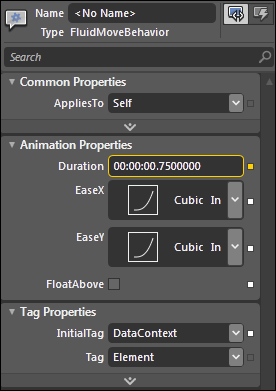
The other half of the connection is made with the InitialTag field that is set to DataContext. This means that when the detail element appears, it will consider the registered position of its DataContext to be the place it will appear to come from. And that’s the whole thing! Here’s a screenshot of that app in action; note that in this case I set the FluidMoveBehavior on the entire Grid, so that the details would animate along with the image.
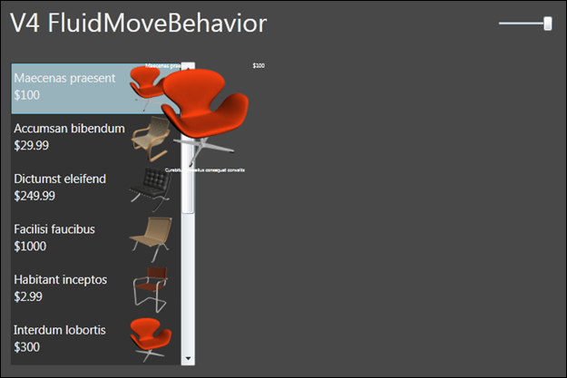
There’s an awful lot happening behind the scenes, but we’ve managed to boil this complex scenario to these two simple properties. This system can even be used to animate objects from one list to another list.
The Future (201X)
If I had included all of our future investigations in this area, this blog post would be twice as long as it is already. We’re working hard to address more and more scenarios in the simplest ways possible. Rest assured that you’ll be hearing about even more improvements someday in the not too distant future!
If you have any opinions or feedback, please feel free to comment below.
Thanks,
Kenny Young
Architect, Expression Blend
Comments
Anonymous
March 16, 2010
Kenny- Fantastic post. In fac -t I am presently working on an SL4 MvvM app that needs a visual very similar to the last example with the expanding chair. I think you just saved me a ton of time. Kudos to you and the team for another excellent SL release. BrettAnonymous
March 17, 2010
Er, why not include a link to a functional page instead of forcing everyone to download and build the sample?Anonymous
March 17, 2010
Jay - the sample is based on Silverlight 4 RC and Blend 4 Beta. The current licensing on both specifies that we can't generally display samples outside of source code form. Once we RTM Silverlight and Blend 4, we'll try to get a working example of all this so that you can view them in your browser. Thanks, KirupaAnonymous
March 17, 2010
This is sooo good! I have dreamed of having such things since day 1 (and actually I have built a few of those abstractions myself, e.g. the automatic layout animations, or animated items insertion). One thing gets me worried, though. Is the "Present 2010" available in WPF 4? I'm especially concerned with LayoutStates, which I haven't seen outside SL discussions. As you wrote, animating items insertion and removal is a huge visual improvement, but it's very hard and annoying to implement with today's API. I would be extremely disappointed if this is a SL-only feature at the release of WPF 4. Congrats on those, we're going to see awesome WPF/SL UI in the future!Anonymous
March 17, 2010
We're extremely gratified to hear of your excitement and interest :-) Unfortunately the LayoutStates feature is indeed unsupported on WPF 4. Happily, however, that's the only feature in the demo that is not available for WPF 4. We expect that this will be addressed in a future WPF release. KennyAnonymous
March 19, 2010
Just a nitpick. You probably meant the GoToStateAction instead of the GoToStateBehavior in the Recent History (2009) section. The difference being an Action instead of a Behavior. Cheers, PavanAnonymous
March 19, 2010
I have to congratulate you on another excellent release! This stuff is just amazing and enables new levels of capability that would otherwise not be feasible. However, I do have to nitpick and express my sadness that LayoutStates are not supported in WPF. In the past, Silverlight has always had the cool new features well before WPF. With this release I see that the two are becoming closer in terms of feature parity. This excites me as it is annoying to find that WPF has been lacking in the past while Silverlight enjoys rich new feature sets. The Visual States system is the first thing that comes to mind. Is it Microsoft's intention to ensure that, as time goes on, WPF will get all of the features that Silverlight has? Do you have any plans for ensuring feature parity with each new release as opposed to releasing new features for Silverlight and then WPF later? Thanks and keep up the excellent work!Anonymous
March 20, 2010
That expanding Chair feature is fantastic !! Thanks microsoft for making the MIX10 sessions available on the web. Loved your Dynamic layout session - short - sweet and hitting all the right spots Now I've no excuse in sticking with VB6Anonymous
March 22, 2010
I've just run the example and the Fluid Move Behaviour has blown my mind.Anonymous
March 23, 2010
Hey, i was at your mix presentation and my face was blown off. I love fluid movements so much! I do however have a small issue. Ive been building up a demo, and in the demo i am using WPF4. I have set up all listbox item as the FluidMovmentTarget, and I have a large area where I want the resulting information to expand from, much like your demo with the chair scaling out of the listbox. Everything works great as it stands, however I have additional functionality where the listbox containing all the images, is nested in a grid which has 2 rows, the listbox is in row 1 of the 2, with no row span. Using a standard button, I then animate the listbox to span both rows, and using the FLuidLayout option in the VSM, it animates very nicely. Now my problem is, as soon as I animate the spanning of the rows, the FluidMovmentTarget seems to break, and then all the images for the rest of the application session originate from 0,0. What can i do, to not make that happen? =D Thanks!Anonymous
March 23, 2010
Good catch - this will be fixed before we release. It's now working on my machine... :-) Thanks to you too! KennyAnonymous
March 24, 2010
I'm seeing an issue where I cannot set any transforms in blend in a ListBoxItemTemplate. I can see the value change as I move my mouse but then Blend is resetting the value to 0. If I look in the xaml nothing is changed in the states? Any ideas?Anonymous
March 25, 2010
JS, I'm not sure what you mean here - as best as I can interpret your issue, this is working for me. If you want to discuss your scenario further, you can send me mail at kennyy@<that company that I work for>.com, and I'd be happy to help.Anonymous
March 25, 2010
I'm not sure if you know about the ScatterView control from the Surface SDK. I'm wondering how can I animate the items into certain arrangement with a click of a button. Is it something I could do now with the current release of WPF/Silverlight?Anonymous
March 26, 2010
Sorry, I don't have enough experience with ScatterView specifically to be sure. It looks like ScatterView does more of its work via RenderTransforms than with layout properties, which would not match up with this approach...yet :-)Anonymous
March 27, 2010
I just watch the MIX presentation, and the following questions came to my mind:
- When applying the FluidMoveBehavior to all children of a panel, is there a way to add a delay between the animation of individual elements? It's often nicer if all elements don't move as "one big block of elements" (that's how the usually look like if they all make the same movement at the same time with the same animation), but rather move one after the other (with a very small delay) so that they look like individual elements. 1.bis same question with the new layout states. If ten elements are inserted at the same time in a list, is there a way to make them appear in a "cascading" way, rather than all at the same time?
- For real-life scenarios: how does the FluidMoveBehavior handle virtualization (e.g. applied to a VirtualizedStackPanel)?
- Again, for more complex scenarios: is there a way to make the FluidMoveTagSetBehavior work even if the two DataContext instances aren't the same? It could be the case that the list item is bound to a lightweight representation of my data, and the details is bound to another more complete class, which would be fetched from a web service when the item is selected. In that case DataContexts aren't the same instance, but they could be linked in other ways (through an Id property, for example).
- Regarding FluidMoveTagSetBehavior, is there a way to put boundaries on the UI it affects? E.g. if I put the same Master-Detail view you use in your demo twice side-by-side (e.g. in a Grid). Is there a way to make it work so that the left master always animate from the left list and never from the right one, although they share the same data?
- Is there a way to apply some effects during the animation of a FluidMoveBehavior? E.g. add a directional blur?
- Smooth animated scrolling feels great. Can you make that built-in the platform, or provide a behavior, or at least make it easier by letting us directly animate the scroll position property? (More regarding this: http://www.designerwpf.com/2009/05/06/how-to-create-an-animated-scrollviewer-or-listbox-in-wpf/ http://blogs.msdn.com/delay/archive/2009/08/04/scrolling-so-smooth-like-the-butter-on-a-muffin-how-to-animate-the-horizontal-verticaloffset-properties-of-a-scrollviewer.aspx )
- Anonymous
March 28, 2010
Hey jdu, some answers for you:
- Not yet - this is definitely on our radar, but we don't have a specific timetable to report. 1.bis. Same answer, though you can work around this in the short term by adding elements to your data model one at a time.
- There are two ways to get FluidMove working with virtualization: a) Set the VirtualizingStackPanel.VirtualizationMode property on your ListBox to be VirtualizationMode.Standard; this keeps VirtualizingStackPanel from sharing the same visuals between different items. b) In your FluidMoveBehavior, use Tag=DataContext. This will ensure that a recycled element is treated as different. If you use one of these two techniques, then things will work pretty well, though items may at times be devirtualized before their animations are complete.
- Yes! There's an advanced property called TagPath (and a matching InitialTagPath) that can be used to drill into the DataContext. It is used the same way as the Path property of a Binding. So if your complete class has a property that points to your lightweight representation, then you can set the name of that property in your InitialTagPath and everything will work. Or you could have an ultralightweight moniker in both models that you point to in both behaviors.
- Right now, the data models have to be separate. If you have a case where this is too complex or unwieldy, we'd like to learn more.
- Currently, no, but it's a good idea! :-)
- We know this is desirable, but so far we haven't made a behavior for this. I know that some kind of scrolling improvements are in store for the Phone release of Silverlight, but I can't quote the specifics accurately. Hope these answers help! Kenny
- Anonymous
March 28, 2010
Thanks for those answers! I'm happy to learn that the most important ones are OK (virtualization, or using a property to identify a tag). Speaking about virtualization, it would be nice to have a way to let an animation complete before the item gets devirtualized... Also, I hope the layout states work as well (with virtualization)? I was wondering: how much of this is shipped built-in the .net platform (WPF / Silverlight) and how much is provided inside Blend libraries? And if it's provided in libraries:
- are you going to make the behaviors better (e.g. regarding 1) out of band (i.e. not in sync with a new SL/WPF release)?
- are any of those new behaviors usable in previous versions (SL 3, WPF 3.5)? BTW, those are really nice extensions. SL/WPF UI will feel so much better with them.
Anonymous
March 30, 2010
Yes, LayoutStates should work with virtualization, though you should not see a state change when an item is virtualized due to scrolling. This is intentional, as in a user's eyes, all those items are already in the list and the state animations should be reserved for items that are new to the collection. The parts of this example that are provided by the platform are: the basic concept of states, EasingFunctions, and LayoutStates specifically. Everything else uses the libraries in the Blend SDK. We do have the ability to make these better out-of-band, but don't have a specific timetable for doing so. WRT your previous-version question, the first two demos in the sample were created in Blend 3, which offered FluidLayout and a simpler version of the FluidMoveBehavior that wasn't yet capable of the data-aware scenarios. Thanks for the comments, they help us a lot! KennyAnonymous
March 30, 2010
Thanks for your answers! I have one more remark / question. When animating a removed item (using the LayoutState) one important pain point is to be able to exclude that item from the control. It's very important that the user shouldn't be able to select, interact or perform a command on an item during its "removal" animation. As this would easily lead to bugs, since the manipulated item isn't in the collection anymore. This is difficult to do today without platform support. I hope the new LayoutState take care of that aspect in addition to the "visual" animation?Anonymous
April 01, 2010
The comment has been removedAnonymous
April 01, 2010
Thanks Ricardo! jdu, on your last point: Sounds like Silverlight should turn off IsHitTestVisible while the item is animating away. I'm actually not sure whether they are doing this or not. If not, you could get most of the benefit by doing this yourself in your BeforeUnloaded state.Anonymous
April 01, 2010
Yeah, one can work around it if they don't. But it's harder than it looks... E.g. IsHitTestVisible doesn't prevent keyboard interaction.Anonymous
July 09, 2010
is there a workaround for layoutstates in wpf at the moment?Anonymous
July 09, 2010
There are two levels of workaround available for WPF at the moment. Workaround #1 requires zero code but only handles BeforeLoaded and not BeforeUnloaded. For this workaround, you can define your own state group using the States Pane, and add BeforeLoaded and AfterLoaded states to that group. Then, add two GoToStateActions that are triggered by the Loaded event; the first action should go to the BeforeLoaded state without animating, and the second should animate to the AfterLoaded state. It's important to make sure that these two actions are in the proper order in the markup, and you might have to inspect that manually. Alternatively, if you construct your design such that the BeforeLoaded state is empty, you'll only need the one GoToStateAction that animates to AfterLoaded. Workaround #2 would handle BeforeUnloaded as well, but requires code that is deeply integrated with your data model. You could add a flag to your data model that indicates your intent to delete the element, and then add a DataStateBehavior to listen to your flag and set the BeforeUnloaded state when the flag is set. Then, you can add a delay timer to your data model to give the animation time to run, and when the timer expires, remove the element from the collection. It's not pretty but it works. KennyAnonymous
July 18, 2010
Hi kenny, i tried your workaround #1 which doesn't seems to work... workaround #2 works fine though... for workaround #1.. is this the xaml syntax you are referring to? <i:EventTrigger> <ei:GoToStateAction StateName="BeforeLoaded" UseTransitions="False"/> <ei:GoToStateAction StateName="AfterLoaded" UseTransitions="True"/> </i:EventTrigger> i tried the method which you suggest just using AfterLoaded and Base state set to empty.. it works fine... but i'm a little picky :P... i want to be able to see the Base state when i'm working inside blend.. therefore i would prefer to have the BeforeLoaded state....Anonymous
August 04, 2010
The comment has been removedAnonymous
August 09, 2010
The comment has been removedAnonymous
September 08, 2010
Hi Kenny, I've just seen your video on Dynamic Layout and Transitions -Awesome!!! Just a couple a questions....
- Based on your 'FluidMoveBehavior' -the ListBox & Image demo, is it possible to have a transition on the current image to fade out and then fade back in again with the new selected item/image -rather than moving from the listbox?
- Can I apply LayoutStates on any non-list based control (ie Image, TextBox) -or do I need to code this in some way ? Cheers
- Anonymous
September 08, 2010
Hi Norsten, glad you like this. It was fun to make :-) Regarding your questions:
- There is no official way to do this, but if you look at the project linked at the top of the article, you'll see that it contains an unofficial answer. It's a TransitionContentControl, where you supply it a Style that includes LayoutStates. In the project, I've further wrapped the TransitionContentControl in another unofficial control called a Slideshow that adds a collection and next/previous buttons, but it sounds like for your case you'd want to just use the TransitionContentControl directly. In MainPage.xaml, you can see an example of the template, called SlideTemplate - you just want yours to animate opacity instead of offset. If you want to see how it is used and modified, you could check out the MIX video also linked at the top of the article, starting from about 11:20. I've never used TransitionContentControl directly, but it should work OK.
- I don't know that I understand exactly what you want here. I'll describe two approaches that could perhaps be used, and if neither seems applicable, please clarify. One approach would be to create a new VisualStateGroup with two states - one where the element is visible and one where it is not. You can customize the transition between states to perform any animation you wish, and you can make the state change either from code or by using a GoToStateBehavior. Another approach would be to use a TransitionContentControl as described above. Kenny
Anonymous
September 08, 2010
Hi Kenny, Thanks for your response. Sorry for not being clear, I'll try again... My test example has the following... a listbox showing a databound list of images and an image control that is bound to the listbox that shows the selected image. I want to know if it is possible to add a fade transition to the image control that would fade out the current image -and then fade in the new. I've had a look at the sample code you mentioned and the slide control looks like a item container -I'm not sure how I would the TransitionContentControl to work with an image control (would you be able to show/email a small example?) Regarding the 'LayoutState' - I see what you mean there. I just thought that it would be possible to add this group to other controls -but your suggestion on using a TransiionContentControl is probably the way to go. Cheers PeteAnonymous
September 10, 2010
The fade on data change is something that is admittedly hard to do right now, but definitely cool. We've been thinking about it, and I have a prototype that is in too rough a shape to distribute; if I get time to polish it, I'll blog a followup. KennyAnonymous
September 10, 2010
Fantastic -I'll keep my eyes out for it. Thanks PeteAnonymous
September 15, 2010
I made a very simple WPF test in Blend 4. When I run the app, anywhere I click on the listbox crashes the app. If I remove the FluidMoveSetTagBehavior behavior from the itemtemplate, it doesn't crash, but, of course, there is no motion. Any advice is appreciated. You may download the solution here: bradfichter.com/.../FluidMove.zipAnonymous
September 16, 2010
Congratulations Brad, you've found a bug! :-) We'll look into fixing this, but thankfully the workaround is very simple. Your sample has this markup: <DataTemplate x:Key="ItemTemplate"> <Image Source="{Binding Image}" HorizontalAlignment="Left" Height="64" Width="64"> <i:Interaction.Behaviors> <ei:FluidMoveSetTagBehavior Tag="DataContext"/> </i:Interaction.Behaviors> </Image> </DataTemplate> The issue is that the element with the FluidMoveSetTagBehavior has to have a more traditional parent. Just make this change and things will start to work: <DataTemplate x:Key="ItemTemplate"> <Grid> <Image Source="{Binding Image}" HorizontalAlignment="Left" Height="64" Width="64"> <i:Interaction.Behaviors> <ei:FluidMoveSetTagBehavior Tag="DataContext"/> </i:Interaction.Behaviors> </Image> </Grid> </DataTemplate> Thanks for the feedback! KennyAnonymous
December 14, 2010
Is the LayoutStates group available for Windows Phone 7 applications? I tried it in my WP7 application and it didn't work. Maybe I did something wrong.Anonymous
December 14, 2010
Good question MH. You didn't do anything wrong, it's an oversight on our part and LayoutStates shouldn't be advertised in this scenario. We're aware of the issue and things will improve. KennyAnonymous
March 30, 2011
If the slideshow has only 2 pages, clicking fast twice on the top arrow (i.e. the second click happens before the first sliding animation ended) leads to a crash in TransitionContentControl.SetContent: contentPresenter.Content = content; --> Value does not fall within the expected range.Anonymous
April 08, 2012
The correct URL for the MIX10 presentation mentioned at the header note in the article is: channel9.msdn.com/.../CL55Anonymous
May 20, 2012
Hi Kenny, Nicely done! Unfortunately it doesn't work for me. I tried it with your project and I experimented the same. What I did: I downloaded the file. Unzipped. Opened with VS2010 Changed to .Net 4.0 and Silverlight 5 Complied - no problem. When I run, I get no animation. After that I opened it in Blend (for Silverlight 5) and I can't see any settings for LayoutStates...maybe I lost it during the -> SL5 conversion??? I don't know... Ok, I tried to reproduce what you did but if I set default transition to 1s and I set any fx, I don't get any animation. I tried to set fx transitions to AfterLoad as well...but I got the same. Do you have any idea?Anonymous
December 12, 2012
So no examples then.. just bragging about features nobody knows how to use. Typical of an MSDN blog.Anonymous
July 18, 2013
Please could you change Blog post to point or provide a link to the source sample. Thank you in advance.