Twitter data visualisation for Windows Phone
I admit it, I'm starting to really want to put my hands on a Windows Phone 7 series. But I wondered, if I was alone. There have been many positive reviews and few question marks, but given the pool of searchable twitter comments out there it can be a poll for what people (well largely tech enabled and savvy people) are talking about.
Caveat: Only 27% twitter users are actually active
There are some excellent ways of reading, managing and viewing tweets (I personally like this simple search and display -visible tweets) but after reading "Four Ways of Looking at Twitter" I thought i would give some twitter analysis a go.
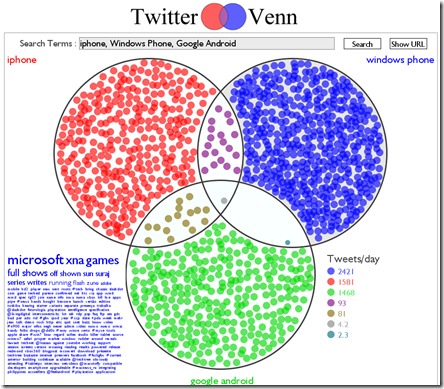
Of course there are many sites out there - See "17 Ways to Visualize the Twitter Universe" - but the following I found the most useful:
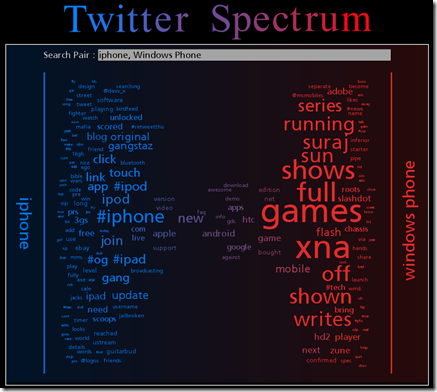
Like Scott I then looked at Twitter Spectrum, a similar tool that compares two search terms and shows which words are most commonly associated with each term
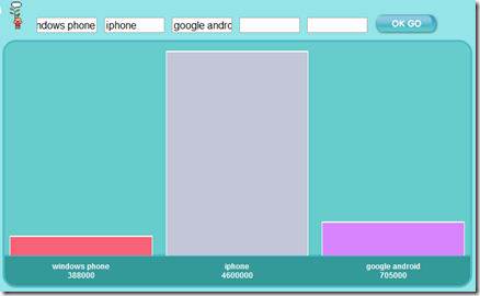
A more basic tool, TweetVolume, presents a more telling picture.
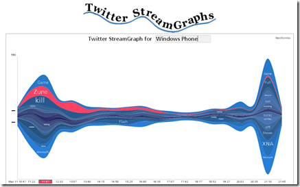
Finally a StreamGraph can show for the latest 1000 tweets of a given search term. I found this misleading as much of the information is re-tweets.
How relevant this information is is questionable, but one things for certain, real time data visualisation is going to be important for businesses to gauge response, impact, feeling and momentum.
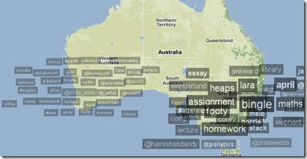
If the trends map is anything to go by the twitter verse in Australia is filled with students and TV/Radio.
