Showing Excel ranges in the Excel Services Gadget
The last post I wrote, I showed the Excel Services gadget and how it can be a great tool for bringing your Excel data right to the desktop. In this short post, I will show some of the other capabilities it has – namely, the ability to show ranges on top of charts.
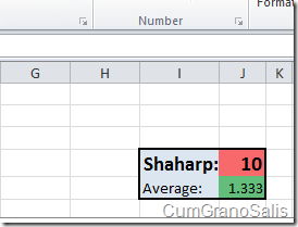
In the settings page of the gadget, you have the ability to choose not only charts, but also ranges, tables and PivotTables. The workbook I have contains a simple color coded “score card” which contains the number of bugs I have and the average number – I can choose that score-card to show when the gadget is minimized – in some cases, it can be a better indication than the chart shown in the last post. The actual workbook that contains the range is relatively simple – here’s what that specific range looks like:
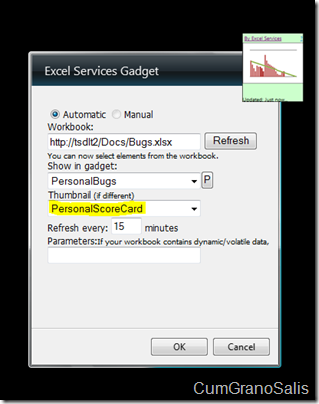
Here’s what the settings page looks like – notice that I still want to see the chart showing my stats when the gadget is maximized:
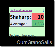
Once you hit OK and the gadget refreshes, you will see the score card showing in the gadget itself:
And just like in the previous post – clicking on the “Maximize” button will show the chart.
Here’s a short video that shows exactly how this works and what it looks like:
Enjoy!!
Comments
- Anonymous
April 17, 2014
The comment has been removed - Anonymous
April 17, 2014
The comment has been removed - Anonymous
April 17, 2014
The comment has been removed


