If I can build a phone app anyone can: Controls, and more controls…
In this blog I create my project and have to learn the different controls I can choose from to build my app
As I continue my series on building my first phone app, I have chosen the Windows Phone application template and I am ready to start adding controls to my first page. If you missed any of the earlier posts in the series, you can access them here.
As I look at the Toolbox, I realize there are a lot of different controls to choose from, so in this post I’ll try to figure out what they do. There are so many controls I broke them into three groups for my quick description of each control just scroll down, I’ve also tried to hyperlink to documentation on the controls as I researched what each control is for.
Controls for entering and displaying data
- Checkbox
- ListBox
- Map
- PasswordBox
- RadioButton
- Slider
- TextBlock
- TextBox
Controls that do stuff
- AdControl
- Button
- HyperlinkButton
- MediaElement
- WebBrowser
Controls to make things look pretty
- Border
- Canvas
- Ellipse
- Grid
- Image
- Rectangle
- StackPanel
Controls for entering and displaying data
A Checkbox is a great way to let a user enter a Yes or No | True or False value. You’ll need to set the Content property to change the text that appears beside the textbox. The IsChecked property tells you whether the checkbox is checked or unchecked. There is also a IsThreeState property which allows you to have a checkbox represent something 3 different values like Yes/No/Unknown. IsChecked will be true if the checkbox is checked, false if the value is unchecked. If you enable the IsThreeState the unknown/undetermined state of the checkbox will return a value of Nothing for IsChecked.
Allows you to give the user a list of items to choose from. Specify the values to show in the list using the Items property, or I am sure you can set up data binding as well to read the data to display from some form of data source. This is the sort of list that takes up a lot of space on the screen, it’s not a drop down list. When you select one of the values it will be highlighted. I don’t see an option for allowing multiple selections, and it’s really hard to select the listbox after you create it, whenever I click on the listbox, it keeps selecting the Listbox items instead which is kind of annoying.
I guess you use maps to display data, data such as where you are, or where something is located! Looks like using this control is a bit more involved! There is all sorts of extra stuff they talk about like if you want to use a Bing Maps Silverlight Control you need a Bing Maps key which you get from the Bing Maps Account Center. I get the feeling the map control would be a blog unto itself! So for now I’ll just say, yes you can display a map and highlight locations on a map or directions on a map. I know the Where’s Timmy app from Tim Hortons has a map!
This is like a text box where you can enter data, but no-one can see what you are typing, perfect for entering passwords! Instead a character appears on the screen. You can control what character appears with the PasswordChar property.
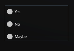
Great to give a user selection between 2-5 choices on the screen and only one can be selected at a time. Use the Content property to change the text displayed beside the radio button. The IsChecked Property will tell you if a particular radio button is selected. When you add multiple radio buttons to a screen by default they all become part of one group, so as soon as you choose one radio button, all the others are deselected.
A slider is great for getting a user to choose a value in a range. You specify the highest and lowest values for the slider control with the Minimum and Maximum properties and then the Value property will tell you the value selected by the user.
This is your label control for displaying text. You specify the text to display with the Text property.
This is your control for letting users type in data with the on screen keyboard, the Text property will tell you the value entered by the user or can be used to set a default value.
Controls that do stuff
This is the new control that came out which allows you to include advertising in your applications. Adding the control is pretty straightforward, drag and drop. You can set the height and width properties to resize it. But it takes more than just dropping the control on your form to get advertising working according to this site. You have to register your mobile app using Microsoft pubCenter and then you have to set the Application Id and Ad Unit ID properties in the ad control then you will have an ad enabled app in the marketplace to make money.
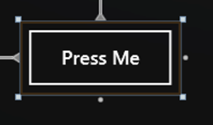
Buttons are what you expect, buttons a user can tap to do something. You’ll want to set the Content property because that controls the text that appears on the button. At some point you will create Click event handlers for the button as well where you can write the code that makes stuff happen when a button is pressed. One thing I noticed about the button control on the phone is the buffer around it. It turns out this is deliberate so you don’t accidentally put buttons really close together and make it hard for someone with fat fingers to tap the right button.
Is exactly what it sounds like: it’s a button that looks and acts as a hyperlink. You will want to set the NavigateUri property to specify where to go when someone clicks it, and the Content property to change the text that appears for the button.
This control lets you add audio or video. You specify the audio or video to play in the Source property. I found a little article here that describes how to use this control.
This control could display HTML content you generate in your code if you want to get fancy, or you can use it to display content from a website specified by the Source property.
Controls to make things look pretty
Allows you to draw a pretty border around other controls on your form. You can set the properties you would expect like BorderThickness and BorderBrush to control the color and thickness of the line around the border, Background to change the background color within the border. CornerRadius is kind of cool so I can make rounded corners. Wow, I could make some really ugly apps with this. Check out my green and red border with rounded corners! Did I mention, I am not known for making elegant looking pages.
According to MSDN: “A canvas defines an area within which you can explicitly position child objects by using coordinates relative to that area.” Okay then I guess I would use a canvas if I want to be able to move something around on the screen with my code. I guess I could make one of those annoying pages with a button that says “Click here to win one million dollars” and whenever you tap on it it moves. You can set the Background property to set the background color.
This just draws an ellipse on the screen. The Stroke property controls the color of the outline of your ellipse. StrokeThickness controls the width of the line. Fill controls the background colour of the ellipse. Weird how all the property names are different for Ellipse than they are for Border and Canvas eh? I made an ugly red and green ellipse to go with my ugly border.
A grid is an area made up of columns and rows, so this would be great for displaying a table of data. You’ll need to go to the ColumnDefinitions property and add ColumnDefinitions for each column you want in the table. For each column you can specify a MinWidth and MaxWidth property. Then you need to go to the RowDefinitions Property to add a RowDefinition for each row. There is also a ShowGridLines property that controls whether you see the lines on the grid between columns and rows. You can then add controls in the different squares of the grid. Here’s my 3 row, 2 column grid with the grid lines displayed.
Okay I know Images can be used to display data or to make things look pretty, I had to pick somewhere to put it! The image control allows you to display images. Use the Source property to specify the image to display. If your images aren’t the same size as your image control, play around with the Stretch property to control whether it clips, or resizes the image for you. It looks like JPEG and PNG formats are supported
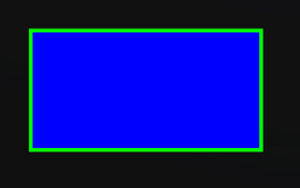
This just draws a rectangle on the screen. The Stroke property controls the color of the outline of your rectangle. StrokeThickness controls the width of the line. Fill controls the background colour of the ellipse. Weird how all the property names are different for Ellipse than they are for Border and Canvas eh? I decided to go with blue and green for my rectangle ![]()
The ScrollViewer lets you create a scrollable area, great for letting users read large amounts of text that might not fit on the scree, the user can then scroll to see all the content. It can have a horizontal or vertical scroll bar which you control with the HorizontalScrollBarVisibility and the VerticalScrollBarVisibility properties. Now what’s interesting is when I did a little searching I found a few articles that said you need to use Blend to create a ScrollViewer, those were pre 7.5, but when I tried to dig into 7.5/Mango I found comments about performance improvements so maybe you still need to use Blend to create this, still not sure. I could see this control being very useful though!
A StackPanel lets you nicely line up child controls horizontally or vertically, for example you could make sure all your radio buttons are nicely lined up. I like this one, easy to use and helps me make my form look much cleaner!
Comments
Anonymous
January 16, 2012
I find the StackPanel and the ScrollViewer to be very odd controls. I THOUGHT I would love to use the StackPanel, but in practise, it proves to be more a PITA than anything. Nesting a ScrollViewer (with is a GREAT control by the way!) in a StackPanel causes some STRANGE XAML behaviour, like you wont' be able to scroll down very far before it "bounces" back. I've seen this with our study group a few times and in my own apps. Simple fix, change the StackPanel to a Grid (a bit of coding, but it works!).Anonymous
January 17, 2012
Thanks for the heads up! Duly noted


