What are controls? (WPF .NET)
Windows Presentation Foundation (WPF) ships with many of the common UI components that are used in almost every Windows app, such as Button, Label, TextBox, Menu, and ListBox. Historically, these objects are referred to as controls. The term "control" is used loosely to mean any class that represents a visible object in an app. It's important to note that a class doesn't need to inherit from the Control class to have a visible presence. Classes that inherit from the Control class contain a ControlTemplate, which allows the consumer of a control to radically change the control's appearance without having to create a new subclass. This article discusses how controls (both those that do inherit from the Control class and those that don't) are commonly used in WPF.
Create an instance of a control
You can add a control to an app by using either Extensible Application Markup Language (XAML) or code. For example, consider the following image of a WPF window that asks a user for their name and address:
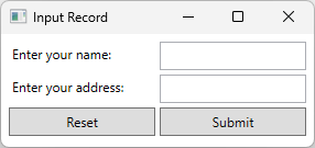
This window has six controls: two labels, two text boxes, and two buttons. XAML is used to create these controls, as demonstrated in the following snippet:
<Window x:Class="Examples.ExampleApp"
        xmlns="http://schemas.microsoft.com/winfx/2006/xaml/presentation"
        xmlns:x="http://schemas.microsoft.com/winfx/2006/xaml"
        Title="Input Record" Height="Auto" Width="300" SizeToContent="Height">
    <Grid Margin="5">
        <Grid.RowDefinitions>
            <RowDefinition Height="30"/>
            <RowDefinition Height="30"/>
            <RowDefinition Height="30"/>
        </Grid.RowDefinitions>
        <Grid.ColumnDefinitions>
            <ColumnDefinition/>
            <ColumnDefinition/>
        </Grid.ColumnDefinitions>

        <Label>Enter your name:</Label>
        <TextBox Grid.Row="0" Grid.Column="1" Name="FirstName" Margin="2" />

        <Label Grid.Row="1">Enter your address:</Label>
        <TextBox Grid.Row="1" Grid.Column="1" Name="LastName" Margin="2" />

        <Button Grid.Row="2" Grid.Column="0" Name="Reset" Margin="2">Reset</Button>
        <Button Grid.Row="2" Grid.Column="1" Name="Submit" Margin="2">Submit</Button>
    </Grid>
</Window>
All controls can be created similarly in XAML. The same window can be created in code:
// Grid container which is the content of the Window
Grid container = new() { Margin = new Thickness(5) };
container.RowDefinitions.Add(new RowDefinition());
container.RowDefinitions.Add(new RowDefinition());
container.RowDefinitions.Add(new RowDefinition());
container.ColumnDefinitions.Add(new ColumnDefinition());
container.ColumnDefinitions.Add(new ColumnDefinition());

// Create the two labels, assign the second label to the second row
Label labelName = new() { Content = "Enter your name:" };
container.Children.Add(labelName);

Label labelAddress = new() { Content = "Enter your address:" };
Grid.SetRow(labelAddress, 1);
container.Children.Add(labelAddress);

// Create the two textboxes, assign both to the second column and
// assign the second textbox to the second row.
TextBox textboxName = new() { Margin = new Thickness(2) };
Grid.SetColumn(textboxName, 1);
container.Children.Add(textboxName);

TextBox textboxAddress = new() { Margin = new Thickness(2) };
Grid.SetRow(textboxAddress, 1);
Grid.SetColumn(textboxAddress, 1);
container.Children.Add(textboxAddress);

// Create the two buttons, assign both to the third row and
// assign the second button to the second column.
Button buttonReset = new() { Margin = new Thickness(2), Content = "Reset" };
Grid.SetRow(buttonReset, 2);
container.Children.Add(buttonReset);

Button buttonSubmit = new() { Margin = new Thickness(2), Content = "Submit" };
Grid.SetColumn(buttonSubmit, 1);
Grid.SetRow(buttonSubmit, 2);
container.Children.Add(buttonSubmit);

// Create the popup window and assign the container (Grid) as its content
Window inputWindow = new()
{
    Title = "Input Record",
    Height = double.NaN,
    Width = 300,
    SizeToContent = SizeToContent.Height,
    Content = container
};

inputWindow.Show();
' Grid container which is the content of the Window
Dim container As New Grid() With {.Margin = New Thickness(5)}
container.RowDefinitions.Add(New RowDefinition())
container.RowDefinitions.Add(New RowDefinition())
container.RowDefinitions.Add(New RowDefinition())
container.ColumnDefinitions.Add(New ColumnDefinition())
container.ColumnDefinitions.Add(New ColumnDefinition())

' Create the two labels, assign the second label to the second row
Dim labelName As New Label() With {.Content = "Enter your name:"}
container.Children.Add(labelName)

Dim labelAddress As New Label() With {.Content = "Enter your address:"}
Grid.SetRow(labelAddress, 1)
container.Children.Add(labelAddress)

' Create the two textboxes, assign both to the second column and
' assign the second textbox to the second row.
Dim textboxName As New TextBox() With {.Margin = New Thickness(2)}
Grid.SetColumn(textboxName, 1)
container.Children.Add(textboxName)

Dim textboxAddress As New TextBox() With {.Margin = New Thickness(2)}
Grid.SetRow(textboxAddress, 1)
Grid.SetColumn(textboxAddress, 1)
container.Children.Add(textboxAddress)

' Create the two buttons, assign both to the third row and
' assign the second button to the second column.
Dim buttonReset As New Button() With {.Margin = New Thickness(2), .Content = "Reset"}
Grid.SetRow(buttonReset, 2)
container.Children.Add(buttonReset)

Dim buttonSubmit As New Button() With {.Margin = New Thickness(2), .Content = "Submit"}
Grid.SetColumn(buttonSubmit, 1)
Grid.SetRow(buttonSubmit, 2)
container.Children.Add(buttonSubmit)

' Create the window and assign the container (Grid) as its content
Dim inputWindow As New Window() With
{
    .Title = "Input Record",
    .Height = Double.NaN,
    .Width = 300,
    .SizeToContent = SizeToContent.Height,
    .Content = container
}

inputWindow.Show()
Subscribe to events
You can subscribe to a control's event by using either XAML or code, but you can only handle an event in code.
In XAML, the event is set as an attribute on the element. You can't use the <Element.Event>handler<Element.Event> notation for events. The following snippet shows how to subscribe to the Click event of a Button:
<Button Click="Submit_Click" Grid.Row="2" Grid.Column="1" Name="Submit" Margin="2">Submit</Button>
And here's how to do the same in code:
Button buttonSubmit = new() { Margin = new Thickness(2), Content = "Submit" };
buttonSubmit.Click += Submit_Click;
Dim buttonSubmit As New Button() With {.Margin = New Thickness(2), .Content = "Submit"}
AddHandler buttonSubmit.Click, AddressOf Submit_Click
The following snippet handles the Click event of a Button:
private void Submit_Click(object sender, RoutedEventArgs e)
{
    MessageBox.Show("Someone clicked the submit button.");
}
Private Sub Submit_Click(sender As Object, e As Windows.RoutedEventArgs)
    MessageBox.Show("Someone clicked the submit button.")
End Sub
Change the appearance of a control
It's common to change the appearance of a control to fit the look and feel of your app. You can change the appearance of a control by doing one of the following, depending on what you want to accomplish:
- Change the value of a property of the control.
- Create a Style for the control.
- Create a new ControlTemplate for the control.
Change a control's property
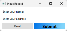
Many controls have properties that allow you to change how the control appears, such as a button's background. You can set the value properties in both XAML and code. The following example sets the Background, FontSize, and FontWeight properties on a Button in XAML:
<Button Grid.Row="2" Grid.Column="1" Name="Submit" Margin="2" Content="Submit">
    <Button.FontSize>18</Button.FontSize>
    <Button.FontWeight>Bold</Button.FontWeight>
    <Button.Background>
        <LinearGradientBrush>
            <GradientStop Color="#0073E6" Offset="0.0" />
            <GradientStop Color="#81D4FA" Offset="0.9" />
        </LinearGradientBrush>
    </Button.Background>
</Button>
And here's how to do the same in code:
Button buttonSubmit = new() { Margin = new Thickness(2), Content = "Submit" };
buttonSubmit.FontSize = 18f;
buttonSubmit.FontWeight = FontWeights.Bold;
buttonSubmit.Background =
    new LinearGradientBrush(
        (Color)ColorConverter.ConvertFromString("#0073E6"),
        (Color)ColorConverter.ConvertFromString("#81D4FA"),
        new Point(0d, 0d),
        new Point(0.9d, 0d));
Dim buttonSubmit As New Button() With {.Margin = New Thickness(2), .Content = "Submit"}
buttonSubmit.FontSize = 18.0F
buttonSubmit.FontWeight = FontWeights.Bold
buttonSubmit.Background =
        New LinearGradientBrush(
            ColorConverter.ConvertFromString("#0073E6"),
            ColorConverter.ConvertFromString("#81D4FA"),
            New Point(0D, 0D),
            New Point(0.9D, 0D))
The example window now looks like the following image:
Create a style for a control
WPF gives you extensive ability to specify the appearance of controls by creating a Style, instead of setting properties on each control. Style definitions are typically defined in XAML in a ResourceDictionary, such as the Resources property of a control or Window. Resources are applied to the scope in which they're declared. For more information, see Overview of XAML resources.
The following example applies a Style to every Button contained in the same Grid that defines the style:
<Grid.Resources>
    <Style TargetType="{x:Type Button}">
        <Style.Setters>
            <Setter Property="FontSize" Value="18" />
            <Setter Property="FontWeight" Value="Bold" />
            <Setter Property="Background">
                <Setter.Value>
                    <LinearGradientBrush>
                        <GradientStop Color="#0073E6" Offset="0.0" />
                        <GradientStop Color="#81D4FA" Offset="0.9" />
                    </LinearGradientBrush>
                </Setter.Value>
            </Setter>
        </Style.Setters>
    </Style>
</Grid.Resources>
And here's how to do the same in code:
Grid container = new() { Margin = new Thickness(5) };
container.RowDefinitions.Add(new RowDefinition());
container.RowDefinitions.Add(new RowDefinition());
container.RowDefinitions.Add(new RowDefinition());
container.ColumnDefinitions.Add(new ColumnDefinition());
container.ColumnDefinitions.Add(new ColumnDefinition());

Style buttonStyle = new(typeof(Button));
buttonStyle.Setters.Add(new Setter(Button.FontSizeProperty, 18d));
buttonStyle.Setters.Add(new Setter(Button.FontWeightProperty, FontWeights.Bold));
buttonStyle.Setters.Add(new Setter(Button.BackgroundProperty,
    new LinearGradientBrush(
        (Color)ColorConverter.ConvertFromString("#0073E6"),
        (Color)ColorConverter.ConvertFromString("#81D4FA"),
        new Point(0d, 0d),
        new Point(0.9d, 0d))));

container.Resources.Add(typeof(Button), buttonStyle);
Dim container As New Grid() With {.Margin = New Thickness(5)}
container.RowDefinitions.Add(New RowDefinition())
container.RowDefinitions.Add(New RowDefinition())
container.RowDefinitions.Add(New RowDefinition())
container.ColumnDefinitions.Add(New ColumnDefinition())
container.ColumnDefinitions.Add(New ColumnDefinition())

Dim buttonStyle As New Style(GetType(Button))
buttonStyle.Setters.Add(New Setter(Button.FontSizeProperty, 18.0R))
buttonStyle.Setters.Add(New Setter(Button.FontWeightProperty, FontWeights.Bold))
buttonStyle.Setters.Add(New Setter(Button.BackgroundProperty,
        New LinearGradientBrush(
            ColorConverter.ConvertFromString("#0073E6"),
            ColorConverter.ConvertFromString("#81D4FA"),
            New Point(0D, 0D),
            New Point(0.9D, 0D))))

container.Resources.Add(GetType(Button), buttonStyle)
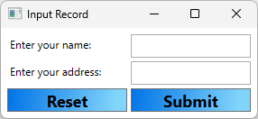
The following image shows the style applied to the grid of the window, which changes the appearance of the two buttons:
Instead of applying the style to all controls of a specific type, they can also be assigned to specific controls by adding a key to the style in the resource dictionary, and referencing that key in the Style property of the control. For more information about styles, see Styling and Templating.
Create a ControlTemplate
A Style allows you to set properties on multiple controls at a time, but sometimes you might want to customize the appearance of a control beyond what you can do with a Style. Classes that inherit from the Control class have a ControlTemplate, which defines the structure and appearance of a control.
Consider the Button control, a common control used by almost every app. The primary behavior of a button is to enable an app to take some action when the user selects the button. By default, the button in WPF appears as a raised rectangle. While developing an app, you might want to take advantage of the behavior of a button—that is, how the user interacts with the button, which raises a Click event—but you might change the button's appearance beyond what you can do by changing the button's properties. In this case, you can create a new ControlTemplate.
The following example creates a ControlTemplate for a Button. The ControlTemplate creates a visual for the Button that presents a border with rounded corners and a gradient background.
<Button Grid.Row="2" Grid.Column="1" Name="Submit" Margin="2" Content="Submit">
    <Button.Template>
        <ControlTemplate TargetType="Button">
            <Border Name="Border" CornerRadius="10" BorderThickness="1" BorderBrush="Black">
                <Border.Background>
                    <LinearGradientBrush StartPoint="0,0.5"
                         EndPoint="1,0.5">
                        <GradientStop Color="{Binding Background.Color, RelativeSource={RelativeSource TemplatedParent}}" Offset="0.0" />
                        <GradientStop Color="PeachPuff" Offset="0.9" />
                    </LinearGradientBrush>
                </Border.Background>
                <ContentPresenter Margin="2" HorizontalAlignment="Center" VerticalAlignment="Center" RecognizesAccessKey="True"/>
            </Border>
            <ControlTemplate.Triggers>
                <!--Change the appearance of the button when the user clicks it.-->
                <Trigger Property="IsPressed" Value="true">
                    <Setter TargetName="Border" Property="Background">
                        <Setter.Value>
                            <LinearGradientBrush StartPoint="0,0.5" EndPoint="1,0.5">
                                <GradientStop Color="{Binding Background.Color, RelativeSource={RelativeSource TemplatedParent}}" Offset="0.0" />
                                <GradientStop Color="LightBlue" Offset="0.9" />
                            </LinearGradientBrush>
                        </Setter.Value>
                    </Setter>
                </Trigger>
            </ControlTemplate.Triggers>
        </ControlTemplate>
    </Button.Template>
</Button>
Note
The Background property of the Button must be set to a SolidColorBrush for the example to work properly.
And here's how to do the same in code. The following code creates a XAML string and parses it to generate a template that can be applied, which is the supported way to generate a template at run-time.
Button buttonSubmit = new() { Margin = new Thickness(2), Content = "Submit" };

// Create the XAML used to define the button template
const string xaml = """
    <ControlTemplate TargetType="Button">
        <Border Name="Border" CornerRadius="10" BorderThickness="1" BorderBrush="Black">
            <Border.Background>
                <LinearGradientBrush StartPoint="0,0.5"
                     EndPoint="1,0.5">
                    <GradientStop Color="{Binding Background.Color, RelativeSource={RelativeSource TemplatedParent}}" Offset="0.0" />
                    <GradientStop Color="PeachPuff" Offset="0.9" />
                </LinearGradientBrush>
            </Border.Background>
            <ContentPresenter Margin="2" HorizontalAlignment="Center" VerticalAlignment="Center" RecognizesAccessKey="True"/>
        </Border>
        <ControlTemplate.Triggers>
            <!--Change the appearance of the button when the user clicks it.-->
            <Trigger Property="IsPressed" Value="true">
                <Setter TargetName="Border" Property="Background">
                    <Setter.Value>
                        <LinearGradientBrush StartPoint="0,0.5" EndPoint="1,0.5">
                            <GradientStop Color="{Binding Background.Color, RelativeSource={RelativeSource TemplatedParent}}" Offset="0.0" />
                            <GradientStop Color="LightBlue" Offset="0.9" />
                        </LinearGradientBrush>
                    </Setter.Value>
                </Setter>
            </Trigger>
        </ControlTemplate.Triggers>
    </ControlTemplate>
    """;

// Load the XAML into a stream that can be parsed
using MemoryStream stream = new(System.Text.Encoding.UTF8.GetBytes(xaml));

// Create a parser context and add the default namespace and
// the x namespace, which is common to WPF XAML
System.Windows.Markup.ParserContext context = new();
context.XmlnsDictionary.Add("", "http://schemas.microsoft.com/winfx/2006/xaml/presentation");
context.XmlnsDictionary.Add("x", "http://schemas.microsoft.com/winfx/2006/xaml");

// Parse the XAML and assign it to the button's template
buttonSubmit.Template = (ControlTemplate)System.Windows.Markup.XamlReader.Load(stream, context);

// Set the other properties of the button
Grid.SetColumn(buttonSubmit, 1);
Grid.SetRow(buttonSubmit, 2);

// Assign the button to the grid container
container.Children.Add(buttonSubmit);
Dim buttonSubmit As New Button() With {.Margin = New Thickness(2), .Content = "Submit"}

' Create the XAML used to define the button template
Const xaml As String = "
    <ControlTemplate TargetType=""Button"">
        <Border Name=""Border"" CornerRadius=""10"" BorderThickness=""1"" BorderBrush=""Black"">
            <Border.Background>
                <LinearGradientBrush StartPoint=""0,0.5""
                     EndPoint=""1,0.5"">
                    <GradientStop Color=""{Binding Background.Color, RelativeSource={RelativeSource TemplatedParent}}"" Offset=""0.0"" />
                    <GradientStop Color=""PeachPuff"" Offset=""0.9"" />
                </LinearGradientBrush>
            </Border.Background>
            <ContentPresenter Margin=""2"" HorizontalAlignment=""Center"" VerticalAlignment=""Center"" RecognizesAccessKey=""True""/>
        </Border>
        <ControlTemplate.Triggers>
            <!--Change the appearance of the button when the user clicks it.-->
            <Trigger Property=""IsPressed"" Value=""true"">
                <Setter TargetName=""Border"" Property=""Background"">
                    <Setter.Value>
                        <LinearGradientBrush StartPoint=""0,0.5"" EndPoint=""1,0.5"">
                            <GradientStop Color=""{Binding Background.Color, RelativeSource={RelativeSource TemplatedParent}}"" Offset=""0.0"" />
                            <GradientStop Color=""LightBlue"" Offset=""0.9"" />
                        </LinearGradientBrush>
                    </Setter.Value>
                </Setter>
            </Trigger>
        </ControlTemplate.Triggers>
    </ControlTemplate>"

' Load the XAML into a stream that can be parsed
Using stream As New MemoryStream(System.Text.Encoding.UTF8.GetBytes(xaml))

    ' Create a parser context and add the default namespace and
    ' the x namespace, which is common to WPF XAML
    Dim context = New System.Windows.Markup.ParserContext()
    context.XmlnsDictionary.Add("", "http://schemas.microsoft.com/winfx/2006/xaml/presentation")
    context.XmlnsDictionary.Add("x", "http://schemas.microsoft.com/winfx/2006/xaml")

    ' Parse the XAML and assign it to the button's template
    buttonSubmit.Template = System.Windows.Markup.XamlReader.Load(stream, context)
End Using

' Set the other properties of the button
Grid.SetColumn(buttonSubmit, 1)
Grid.SetRow(buttonSubmit, 2)

' Assign the button to the grid container
container.Children.Add(buttonSubmit)
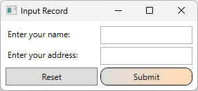
The following image shows what the template looks like when applied:
In the previous example, the ControlTemplate is applied to a single button. However, a ControlTemplate can be assigned to a Style and applied to all buttons, like what was demonstrated in the Create a style for a control section.
For more information about how to take advantage of the unique features a template provides, see Styling and Templating.
Rich content in controls
Most classes that inherit from the Control class have the capacity to contain rich content. For example, a Label can contain any object, such as a string, an Image, or a Panel. The following classes provide support for rich content and act as base classes for most of the controls in WPF:
ContentControl—Some examples of classes that inherit from this class are Label, Button, and ToolTip.
ItemsControl—Some examples of classes that inherit from this class are ListBox, Menu, and StatusBar.
HeaderedContentControl—Some examples of classes that inherit from this class are TabItem, GroupBox, and Expander.
HeaderedItemsControl—Some examples of classes that inherit from this class are MenuItem, TreeViewItem, and ToolBar.