HowTo: Waterfall Diagrams with SSRS
I realize a new trend for the usage of Waterfall Diagrams at customers. But how would you implement this by using only Reporting Services standard features? Well, a question which reduced my sleep for several nights because – as usual – this was an urgent customer requirement.
Before I begin to explain, what detailed steps are necessary, let me shortly mention where you should know one’s way about Reporting topics:
- Expressions…
..can be used in many ways. You can’t know everything about but some basics should be familiar to you. - Calculated fields…
…can be added to Datasets in order to use some additional columns with formulas or as they are already titled: with calculations.
Let’s assume that you want to report data out of a SSAS cube. But you don’t like to spend hours on writing the right MDX query. Here is a solution to reduce the need of complex MDX with 1 additional action you have to take on your dimension. Just add another attribute indicating the direction of your KPI. Will it increase the start value or decrease? I will explain the reason for this later on.
1. For my example I use a simple T-SQL query to simulate the cubes’ output to SSRS:
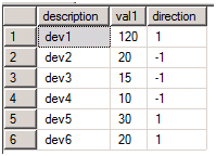
select ’dev1’ as description, 120 as val1, 1 as direction
union
select ’dev2’ as description, 20 as val1, -1 as direction
union
select ’dev3’ as description, 15 as val1, -1 as direction
union
select ’dev4’ as description, 10 as val1, -1 as direction
union
select ’dev5’ as description, 30 as val1, 1 as direction
union
select ’dev6’ as description, 20 as val1, 1 as direction
The result looks like this:

2. Define a Dataset with the query above (including a Data Source which you need to create first).
3. Now add a Calculated Field with the name “Val2” and the expression:
=Fields!val1.Value*Fields!Direction.Value
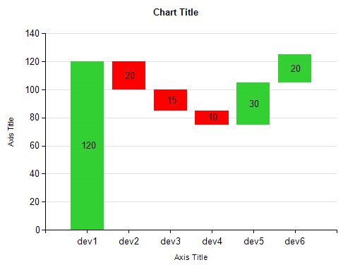
4. Drag a Chart from the toolbox and drop it to the Report body and select "Range" as Type
5. Drag the column val1 from the Report Data Area and drop it to the data fields area
6. Edit the Series Properties and replace the Top Value field by the following expression:
=Fields!val1.Value +
IIF(Fields!Direction.Value=1,
Previous(RunningValue(Fields!val2.Value,Sum,Nothing)),
RunningValue(Fields!val2.Value,Sum,Nothing)))
replace the Buttom Value field by the following expression:
=IIF(RowNumber("DataSet1")=1 and Fields!Direction.Value=1,
0,
IIF(Fields!Direction.Value=1,
Previous(RunningValue(Fields!val2.Value,Sum,Nothing)),
RunningValue(Fields!val2.Value,Sum,Nothing)))
Notice:
The RunningValue is always summerized on postive and negative values of the Calculated Field.
The beam needs to be positive without Plus or Minus sign. This little trick guarantees the right position.
7. Drag the column description from the Report Data Area and drop it to the category fields area
8. Let’s improve the column colors by setting the Fill Color of your <Expr> Series to the expression:
=IIF(Fields!Direction.Value=1,"LimeGreen","Red")
9. Finish – you’re done except improving Titles, Legends, etc…

Comments
Anonymous
January 06, 2011
I have a typical Waterfall model requirement , for which I need more examples to study about the WaterFall model . Please provide some more WaterFall model examplesAnonymous
October 16, 2012
Hi, Thanks for the arrticle . It is very useful. I have small query in this report . You put the expression in the series property by comparing previous bar but my requirement is if the value is negative it is should be down(red) bar else it should be up (green) How can we write this expression. Please let us know. Thanks in advanceAnonymous
October 16, 2012
Hi Raghuram, You look for the right Expression in Step no.6 only checking for positive and negative values, right? Well, I don't know excactly your Data context, but I would assume, you have to extend the Expression with a "IIF". So the whole Expression would look like =IIF(Fields!val1.Value>=0,<here positive Expression part>, <here negative Expression part>) For the Expression part you can can also use the Sum of RunningValue. For step no.8 you could change the Expression to =IIF(Fields!val1.Value >=0,"Green","Red") Hope, that helps! Regards, VolkerAnonymous
September 27, 2013
The comment has been removedAnonymous
September 27, 2013
Here is my Query Decription value Total Downtime 51.3 Other Dept 0 Other Area 35.5 Downtime After 15.8 DriverCheck 3.6 ChangeOver 7.3 AfterTotal 4.8 Chart Should look like 51.3 35.5 15.8 3.6 7.6 4.8
Total Downtime Other Dept Other Area Downtime After DriverCheck ChangeOver AfterTotal
Anonymous
September 27, 2013
Desc Value Total Downtime 51.3 Other Dept 0 Other Area 35.5 Downtime After 15.8 Driver Check 3.6 ChangeOver 7.3 AfterTotal 4.8Anonymous
September 27, 2013
The comment has been removedAnonymous
March 05, 2015
Hello there, thank you so much for posting this. I am struggling to show data labels as differential. It always sums up and shows as total. In you last image, you are showing it as a differential.Anonymous
August 03, 2015
Hi, I have created the waterfall chart through SSRS, I am now facing the problem to show the data label on the chart, below are the 2 probs:
- Data label are actually showing the running value and not the actual value (taken from the table)
- Inspite of setting the Position to Top and increasing the height of the waterfall chart the legends are not showing on top of the bar and showing within the bar itself. Please suggest.