Using the NavigationView in your UWP applications
The navigation view control provides top-level application navigation. For a more detailed description see the Windows Dev Center document “Navigation view”. In this blog post I want to provide you with quick guidance on how to leverage this control in your UWP application.
First, a few “need to know” items.
1. This control requires the Windows creators addition build 16299 or better.
2. This element is not a container control. Thus, you can have more than one on a page. However, this control is meant for top level app navigation. Thus, you will only ever have 1 in an application.
OK, let’s get started by building a quick sample application.
The following step by step instructions will walk you through building an application that leverages this control.
1. Create a new “Universal Windows Application” in Visual Studio.
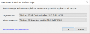
2. When prompted for target platform (see below) ensure to set the minimum to “Windows 10 Fall Creators Update (10.0; Build 16299)”.

3. Open the “MainPage.Xaml” file and add the “<NavigationView></NavigationView>” element to the Grid container control as shown below.
 <NavigationView x:Name="nvTopLevelNav"
                Loaded="nvTopLevelNav_Loaded"
                Margin="0,12,0,0"
                SelectionChanged="nvTopLevelNav_SelectionChanged"
                ItemInvoked="nvTopLevelNav_ItemInvoked"
                IsTabStop="False"
                Header="Let's go shopping!">
</NavigationView>
At this point let’s pause and take a look at each of the control attributes listed above.
- x:Name – compile time reference (name) of the control.
- Loaded – Event fired when the control is added to the control element tree of this page.
- Margin – Positioning margin
- SelectionChanged – Event fired when the user selects a different menu item or the menu selections is changed in code.
- ItemInvoked – Event fired when an item is selected.
- IsTabStop – An inherited property used to indicate rather this control element is in the tab chain or not. The default for this property is true. However, it is not good idea to have your menu on the tab chain. Thus, setting to false here. For more detail see IsTabStop Property.
- Header – Property value displayed above the content frame.
4. Now we need to add a few empty event handlers to the code behind. We will discuss these events later in this post. For now please just add the code block below to the MainPage class.
 #region NavigationView event handlers
private void nvTopLevelNav_Loaded(object sender, RoutedEventArgs e)
{
}

private void nvTopLevelNav_SelectionChanged(NavigationView sender, NavigationViewSelectionChangedEventArgs args)
{
}

private void nvTopLevelNav_ItemInvoked(NavigationView sender, NavigationViewItemInvokedEventArgs args)
{
}
#endregion
5. Next, we need to add a few menu items. To do this add the XAML listed below inside the “NavigationView” element.
 <NavigationView.MenuItems>
<NavigationViewItem Icon="Home" Content="Home" Tag="Home_Page" />
          <NavigationViewItem Icon="Shop" Content="Shop" Tag="Shop_Page" />
          <NavigationViewItem Content="Shopping Cart" Tag="Cart_Page">
                    <NavigationViewItem.Icon>
                              <FontIcon Glyph="  [Insert Hex Decimal Value Here. See Segoe MDL2 below for details.]  "/>
                    </NavigationViewItem.Icon>
          </NavigationViewItem>
          <NavigationViewItem Icon="Message" Content="Message" Tag="Message_Page" />
          <NavigationViewItem Icon="Print" Content="Print" Tag="Print_Page" />
</NavigationView.MenuItems>
The XAML above will add 5 items to our top-level application navigation by populating the MenuItems property of the NavigationView object with 5 instances of NavigationViewItem class. Each of the attributes set in the “NavigationViewItem” element above is detailed below.
- Icon – This is the icon displayed to the left of the item content (see below). It can be set using one of the defined constants (Shown above in: Home, Shop, Message, Or Print) that specify a glyph from the Segoe MDL2 Assets font . Or, it can be set as any of the available glyphs in the Segoe MDL2 Assets font (Shown above in: Shopping Cart). A complete list of the Segoe MDL2 Assets font can be found here .
- Content – The content to be displayed within the “NavigationViewItem” element. This can be any XAML content.
- Tag – This is the element tag used in the code to identify an item.
6. The next task is to provide a frame where your application views can be displayed. Here we want to start with the simplest possible XAML which is just a “Frame” element nested within the “NavigationView” element as shown below.
 <NavigationView x:Name="nvTopLevelNav"
                Loaded="nvTopLevelNav_Loaded"
                Margin="0,12,0,0"
                SelectionChanged="nvTopLevelNav_SelectionChanged"
                ItemInvoked="nvTopLevelNav_ItemInvoked"
                IsTabStop="False"
                Header="Let's go shopping!">
     <NavigationView.MenuItems>
          <NavigationViewItem Icon="Home" Content="Home" Tag="Home_Page" />
                            <NavigationViewItem Icon="Shop" Content="Shop" Tag="Shop_Page" />
                      <NavigationViewItem Content="Shopping Cart" Tag="Cart_Page">
                      <NavigationViewItem.Icon>
                              <FontIcon Glyph="  [Insert Hex Decimal Value Here]  "/>
                      </NavigationViewItem.Icon>
                       </NavigationViewItem>
          <NavigationViewItem Icon="Message" Content="Message" Tag="Message_Page" />
          <NavigationViewItem Icon="Print" Content="Print" Tag="Print_Page" />
          </NavigationView.MenuItems>
     <Frame x:Name="contentFrame"></Frame>
</NavigationView>
7. Before we can test this XAML, we need to add the views for each menu item. Follow the steps below to add a view for each of the menu item.
-
- Create a new folder in your project called “Views”.
- Place a new page item in the “Views” folder for each menu item.
- Add a single “TextBlock” element to the “Grid” element in each page. Be sure to indicate the name of the view in the “TextBlock” content as shown below.
1.
 <Page x:Class="NavigationView_Sample.Views.HomePage"
      xmlns="https://schemas.microsoft.com/winfx/2006/xaml/presentation"
      xmlns:x="https://schemas.microsoft.com/winfx/2006/xaml"
      xmlns:local="using:NavigationView_Sample.Views"
      xmlns:d="https://schemas.microsoft.com/expression/blend/2008"
      xmlns:mc="https://schemas.openxmlformats.org/markup-compatibility/2006"
      mc:Ignorable="d">

    <Grid Background="{ThemeResource ApplicationPageBackgroundThemeBrush}">
         <TextBlock>Home</TextBlock>
    </Grid>

</Page>
8. Now let us go back and deal with the empty event handlers we created in step #4. We will start with nvTopLevelNav_Loaded handler. This handler is called when the page first loads. We will use it to set the selected item – to Home – and navigate the frame to the HomePage. The code listed below should accomplish this.
 private void nvTopLevelNav_Loaded(object sender, RoutedEventArgs e)
{
      // set the initial SelectedItem
      foreach (NavigationViewItemBase item in nvTopLevelNav.MenuItems)
      {
          if (item is NavigationViewItem && item.Tag.ToString() == "Home_Page")
          {
                nvTopLevelNav.SelectedItem = item;
                break;
          }
      }
      contentFrame.Navigate(typeof(HomePage));
}
9. Once the nvTopLevelNav_Loaded handler is completed we will move on to the nvTopLevelNav_ItemInvoked handler.
Here we will need to do a bit of digging to see what is in the parameters passed. The figure above shows the “Watch Window” (click to enlarge) from a debug session in Visual Studio 2017. We can see that the NavigationViewItemInvokedEventArgs returns two useful pieces of information.
- The content of the invoked menu item.
- A Boolean indicating if the “Settings” item was invoked.
As is - this leaves us with few good chooses. Most of the sample code available will use the InvokedItem property as a string and simply use a string comparison to determine the navigation. This method – although effective – prevents you from using the Tag attribute set in the XAML.
Here is another way. Change the XAML for the “Shop” item element as shown below.
 <NavigationViewItem Icon="Shop" Tag="Shop_Page">
     <TextBlock Tag="Nav_Shop">Shop</TextBlock>
</NavigationViewItem>
With this method we will ensure that the content Tag is readable (see below - Click to enlarge).
The code (CS and XAML) to leverage this method is listed below.
<NavigationView.MenuItems>
<NavigationViewItem Icon="Home" Tag="Home_Page">
<TextBlock Tag="Nav_Home">Home</TextBlock>
</NavigationViewItem>
<NavigationViewItem Icon="Shop" Tag="Shop_Page">
<TextBlock Tag="Nav_Shop">Shop</TextBlock>
</NavigationViewItem>
<NavigationViewItem Tag="Cart_Page">
<NavigationViewItem.Icon>
<FontIcon Glyph=""/>
</NavigationViewItem.Icon>
<TextBlock Tag="Nav_ShopCart">Shopping Cart</TextBlock>
</NavigationViewItem>
<NavigationViewItem Icon="Message" Tag="Message_Page">
<TextBlock Tag="Nav_Message">Message</TextBlock>
</NavigationViewItem>
<NavigationViewItem Icon="Print" Tag="Print_Page">
<TextBlock Tag="Nav_Print">Print</TextBlock>
</NavigationViewItem>
</NavigationView.MenuItems>
 private void nvTopLevelNav_ItemInvoked(NavigationView sender, NavigationViewItemInvokedEventArgs args)
{
     TextBlock ItemContent = args.InvokedItem as TextBlock;
     if (ItemContent != null)
     {
           switch (ItemContent.Tag)
           {
               case "Nav_Home":
               contentFrame.Navigate(typeof(HomePage));
               break;

               case "Nav_Shop":
               contentFrame.Navigate(typeof(ShopPage));
               break;

               case "Nav_ShopCart":
               contentFrame.Navigate(typeof(CartPage));
               break;

               case "Nav_Message":
               contentFrame.Navigate(typeof(MessagePage));
               break;

               case "Nav_Print":
               contentFrame.Navigate(typeof(PrintPage));
               break;
          }
     }
}
I will leave it to you to workout how to change the code in step #8 such that you only have one set of Tags to track.
The “SelectionChanged” event indicates when the selected menu item has changed and the event arguments NavigationViewSelectionChangedEventArgs will provide you with menu item – not just the content – of the newly selected menu item. This is unlike the “ItemInvoked” event which provides the content of the invoked menu item. The reason for using the “ItemInvoked” event over the “SelectionChanged” event is the fact that the “ItemInvoked” occurs every time a menu item receives user action where as the “SelectionChanged” only occurs when the selection has changed. For this reason, I will leave the “SelectionChanged” event handler empty.
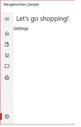
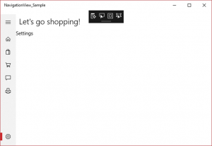
10. The last topic we need to cover in this post is the “Settings” menu item. This is a built-in menu item which by default is visible and placed at the bottom of the menu as shown a below.
The NavigationView Class contains a property IsSettingsVisible which gets or sets a value that indicates whether the settings button is shown or not. Like all properties this can be set in the XAML or code. However, the default value of this dependency property is true. Thus the XAML listed below is not needed.
 <NavigationView x:Name="nvTopLevelNav"
                Loaded="nvTopLevelNav_Loaded"
                Margin="0,12,0,0"
                SelectionChanged="nvTopLevelNav_SelectionChanged"
                ItemInvoked="nvTopLevelNav_ItemInvoked"
                IsTabStop="False"
                IsSettingsVisible="True"
                Header="Let's go shopping!">
Both the “SelectionChanged” and the “ItemInvoked” event handler arguments contain another property IsSettingsSelected and IsSettingsInvoked respectively. All you need to add to the event handler is a check for this property value to know if the user has invoked or selected the "Settings" menu item. The code below illustrates this for the "ItemInvoked" event handler.
 private void nvTopLevelNav_ItemInvoked(NavigationView sender, NavigationViewItemInvokedEventArgs args)
{
     if (args.IsSettingsInvoked)<br>     {<br>        contentFrame.Navigate(typeof(SettingsPage));<br>     }
     else<br>     {
        TextBlock ItemContent = args.InvokedItem as TextBlock;
        if (ItemContent != null)
        {
            switch (ItemContent.Tag)
            {
                case "Nav_Home":
                contentFrame.Navigate(typeof(HomePage));
                break;

                case "Nav_Shop":
                contentFrame.Navigate(typeof(ShopPage));
                break;

                case "Nav_ShopCart":
                contentFrame.Navigate(typeof(CartPage));
                break;

                case "Nav_Message":
                contentFrame.Navigate(typeof(MessagePage));
                break;

                case "Nav_Print":
                contentFrame.Navigate(typeof(PrintPage));
                break;
           }
       }
     }
}
OK, we have worked through a simple implantation of a very complex and robust user control. I hope that you continue to explore this controls many powerful capacities and find ways to leverage it in your current and future projects.
Happy coding.


