Tutorial: Add a pie chart to your report (Report Builder)
In this tutorial, you create pie chart in a Reporting Services paginated report. You add percentages and combine small slices into a single slice.
Pie and doughnut charts display data as a proportion of the whole. They have no axes. When you add a numeric field to a pie chart, the chart calculates the percentage of each value to the total.
This illustration shows the pie chart you create in this tutorial.
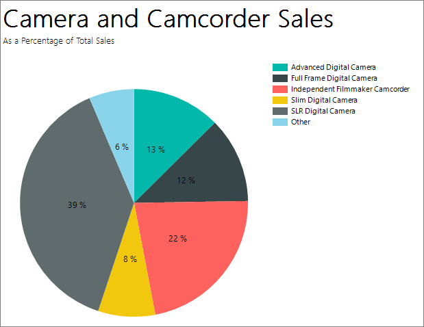
If there are too many data points on a pie chart, your data point labels might be too crowded to read. In that case, consider combining many small slices into one larger slice. Pie charts are more readable when you have aggregated your data into a few data points.
Note
In this tutorial, the steps for the wizard are consolidated into two procedures. For step-by-step instructions about how to browse to a report server, add a data source, and add a dataset, see the first tutorial in this series: Tutorial: Create a basic table report (Report Builder).
Estimated time to complete this tutorial: 10 minutes
Requirements
For information about requirements, see Prerequisites for tutorials (Report Builder).
1. Create a pie chart from the Chart Wizard
In this section, you use the Chart Wizard to create an embedded dataset, choose a shared data source, and create a pie chart.
Start Report Builder either from your computer, the Reporting Services web portal, or SharePoint integrated mode.
The New Report or Dataset dialog box opens.
If you don't see the New Report or Dataset dialog box, on the File menu > New.
In the left pane, verify that New Report is selected.
In the right pane, choose Chart Wizard.
On the Choose a dataset page, select Create a dataset, and then choose Next.
On the Choose a connection to a data source page, select an existing data source or browse to the report server and choose a data source, and then select Next. You might need to enter a user name and password.
Note
The data source you choose is unimportant, as long as you have adequate permissions. You will not be getting data from the data source. For more information, see Alternative ways to get a data connection (Report Builder).
On the Design a Query page, select Edit as Text.
Paste the following query into the query pane:
Note
In this tutorial, the query contains the data values, so it does not need an external data source. This makes the query long. In a business environment, a query would not contain the data. This is for learning purposes only.
SELECT 'Advanced Digital Camera' AS Product, CAST(254995.21 AS money) AS Sales
UNION SELECT 'Slim Digital Camera' AS Product, CAST(164499.04 AS money) AS Sales
UNION SELECT 'SLR Digital Camera' AS Product, CAST(782176.79 AS money) AS Sales
UNION SELECT 'Lens Adapter' AS Product, CAST(36333.08 AS money) AS Sales
UNION SELECT 'Macro Zoom Lens' AS Product, CAST(40199.3 AS money) AS Sales
UNION SELECT 'USB Cable' AS Product, CAST(53245.5 AS money) AS Sales
UNION SELECT 'Independent Filmmaker Camcorder' AS Product, CAST(452288.0 AS money) AS Sales
UNION SELECT 'Full Frame Digital Camera' AS Product, CAST(247250.85 AS money) AS Sales
(Optional) Select the Run button (!) to see the data your chart is based on.
Select Next.
2. Choose the chart type
You can choose from various predefined chart types.
On the Choose a chart type page, select Pie, then choose Next. The Arrange chart fields page opens.
On the Arrange chart fields page, drag the Product field to the Categories pane. Categories define the number of slices in the pie chart. In this example, there are eight slices, one for each product.
Drag the Sales field to the Values pane. Sales represents the sales amount for the subcategory. The Values pane displays
[Sum(Sales)]because the chart displays the aggregate for each product.Select Next to see a preview.
Select Finish.
The chart is added to the design surface. You don't see the actual values of the pie chart. You see Product 1, Product 2, etc., to give an idea of how the chart should look.
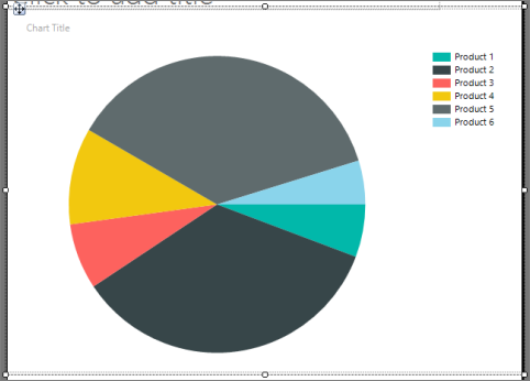
Select the chart to display the chart handles. Drag the bottom-right corner of the chart to make it bigger. The report design surface also gets bigger, to accommodate the chart size.
Select Run to preview the report.
The report displays the pie chart with eight slices, one for each product. Now you see the actual products and the size of each slice represents the sales for that product. Three of the slices are thin.
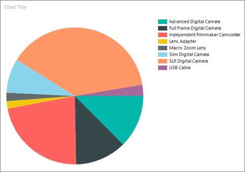
3. Display percentages in each slice
On each slice of the pie, you can display a percentage for this slice compared to the whole pie.
Switch to report design view.
Right-click the pie chart and select Show Data Labels. The data labels appear on the chart.
Right-click a label, then select Series Label Properties.
In the Label data box, select #PERCENT.
(Optional) To specify how many decimal places the label shows, in the Label data box after #PERCENT, enter {Pn} where n is the number of decimal places to display. For example, to display no decimal places, enter #PERCENT{P0}.
To display values as percentages, the UseValueAsLabel property must be false. If you're prompted to set this value in the Confirm Action dialog, select Yes.
Note
Number Format in the Series Label Properties dialog box has no effect when you format percentages. This formats the labels as percentages, but does not calculate the percentage of the pie that each slice represents.
Select OK.
Select Run to preview the report.
The report displays the percentage of the whole for each pie slice.
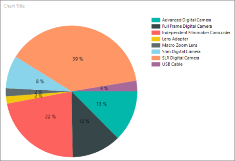
4. Combine small slices into one slice
Three of the slices in the pie are small. You can combine multiple small slices into one larger "Other" slice that represents all three.
Switch to report design view.
If the Properties pane isn't showing, on the View tab > Show/Hide group > select Properties.
On the design surface, select on any slice of the pie chart. The properties for the series are displayed in the Properties pane.
In the General section, expand the CustomAttributes node.
Set the CollectedStyle property to SingleSlice.
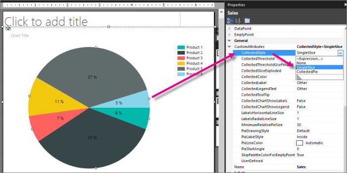
Verify that the CollectedThreshold property is set to 5.
Verify that the CollectedThresholdUsePercent property is set to True.
On the Home tab, select Run to preview the report.
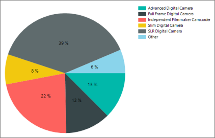
In the legend, you now see the category "Other". The new pie slice combines all the slices that were under 5% into one slice that is 6% of the whole pie.
5. Start pie chart values at the top
By default in pie charts, the first value in the dataset starts at 90 degrees from the top of the pie. You see that in the pie chart in the previous sections.
In this section, you make the first value start at the top.
Switch to report design view.
Select the pie itself.
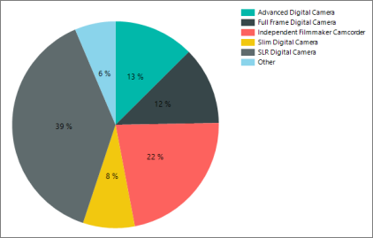
In the Properties pane, under Custom Attributes, change PieStartAngle from 0 to 270.
Select Run to preview your report.
Now the pie chart slices are in alphabetical order, starting at the top, and ending with the "Other" slice.
6. Add a report title
Because the pie chart is the only visualization in the report, the chart doesn't need its own title. The report title is fine.
In the chart, select the Chart Title box and press DELETE.
In the design surface, select Click to add title.
Enter Camera and Camcorder Sales, press ENTER, and then enter As a Percentage of Total Sales, so it looks like this:
Camera and Camcorder Sales
As a Percentage of Total Sales
Select Camera and Camcorder Sales, and on the Home tab > Font section > choose Bold.
Select As a Percentage of Total Sales, and on the Home tab > Font section > set the font size to 10.
(Optional) You might need to make the Title text box taller to accommodate the two lines of text.
This title appears at the top of the report. When there's no page header defined, items at the top of the report body are the equivalent of a report header.
Select Run to preview the report.
7. Save the report
Save the report
Switch to report design view.
On the File menu, select Save.
In Name, enter Sales Pie Chart.
Select Save.
Your report is saved on the report server.