Area charts in a paginated report (Report Builder)
Applies to:
Microsoft Report Builder (SSRS)
Power BI Report Builder
Report Designer in SQL Server Data Tools
An area chart in a paginated report displays a series as a set of points connected by a line, with all the area filled in below the line. For more information on how to add data to an area chart, see Charts (Report Builder).
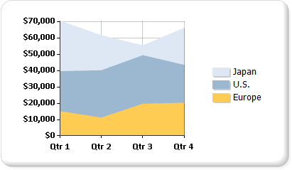
The following illustration shows an example of a stacked area chart. The data is well suited for display on a stacked area chart because the chart can display totals for all series and the proportion that each series contributes to the total.

Note
You can create and modify paginated report definition (.rdl) files in Microsoft Report Builder, Power BI Report Builder, and in Report Designer in SQL Server Data Tools.
Variations
Stacked area: An area chart where multiple series are stacked vertically. If there's only one series in your chart, the stacked area chart displays the same as an area chart.
Percent stacked area: An area chart where multiple series are stacked vertically to fit the entire chart area. If there's only one series in your chart, the stacked area chart displays the same as an area chart.
Smooth area: An area chart where the data points are connected by a smooth line instead of a regular line. Use a smooth area chart instead of an area chart when you're more concerned with displaying trends than with displaying the values of individual data points.
Data considerations for area charts
Along with the line chart, the area chart is the only chart type that displays data contiguously. For this reason, an area chart is commonly used to represent data that occurs over a continuous period of time.
A percent stacked area chart is useful for showing proportional data that occurs over time.
If there's only one series, a stacked area chart is drawn as an area chart.
In a plain area chart, if the values in multiple series are similar, the areas might overlap, obscuring important data point values. You can resolve this issue by changing the chart type to a stacked area chart, which is designed to show multiple series on an area chart.
If your stacked area chart contains gaps, it's possible that your dataset includes empty values, which is shown as a vacant section on a stacked area chart. If your dataset includes empty values, consider inserting empty points on the chart. Adding empty points fills in the empty areas on the chart with a different color to indicate null or zero values. For more information, see Add empty points to a chart (Report Builder).
Area chart types are similar to column and line charts in behavior. If you're making a comparison between multiple series, consider using a column chart instead. If you're analyzing trends over a period of time, consider using a line chart.