Part 1. Getting Started with XAML
In a Xamarin.Forms application, XAML is mostly used to define the visual contents of a page and works together with a C# code-behind file.
The code-behind file provides code support for the markup. Together, these two files contribute to a new class definition that includes child views and property initialization. Within the XAML file, classes and properties are referenced with XML elements and attributes, and links between the markup and code are established.
Creating the Solution
To begin editing your first XAML file, use Visual Studio or Visual Studio for Mac to create a new Xamarin.Forms solution. (Select the tab below corresponding to your environment.)
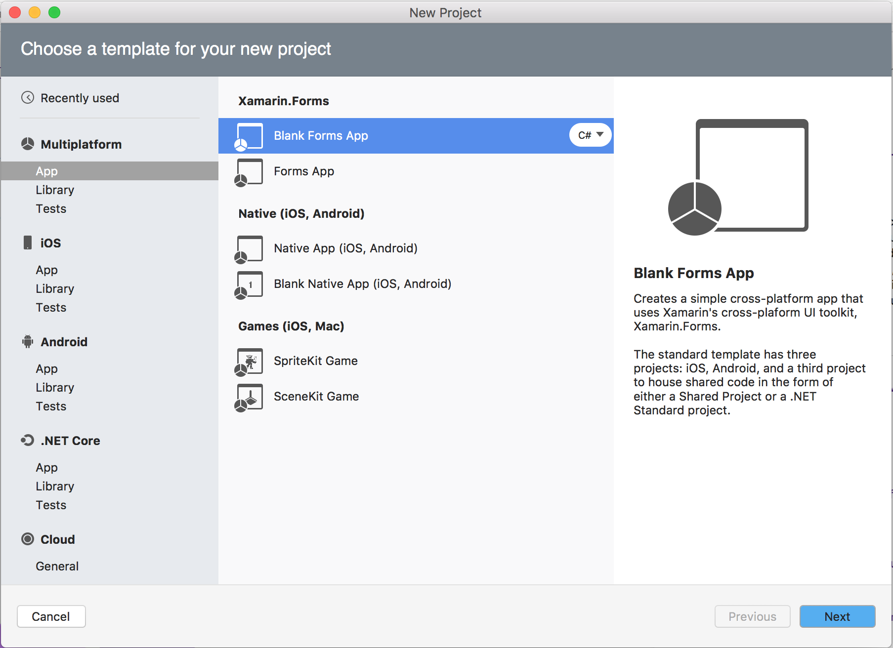
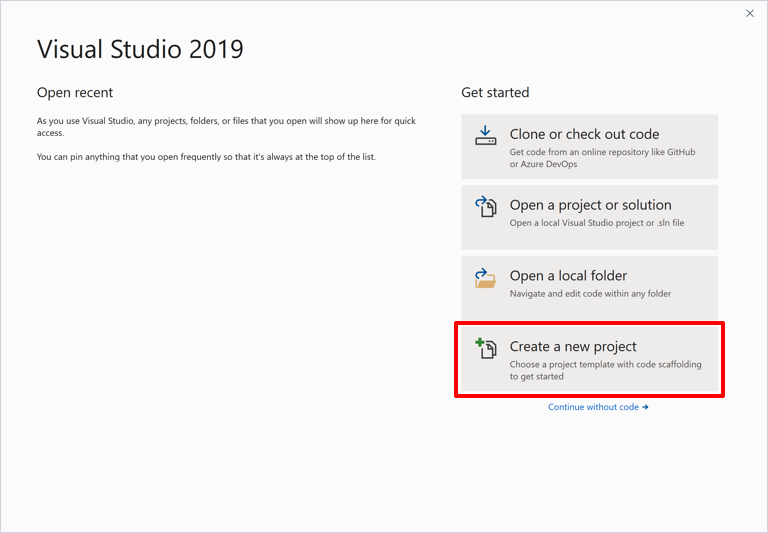
In Windows, launch Visual Studio 2019, and in the start window click Create a new project to create a new project:
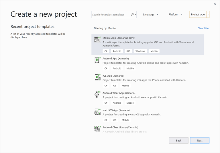
In the Create a new project window, select Mobile in the Project type drop down, select the Mobile App (Xamarin.Forms) template, and click the Next button:
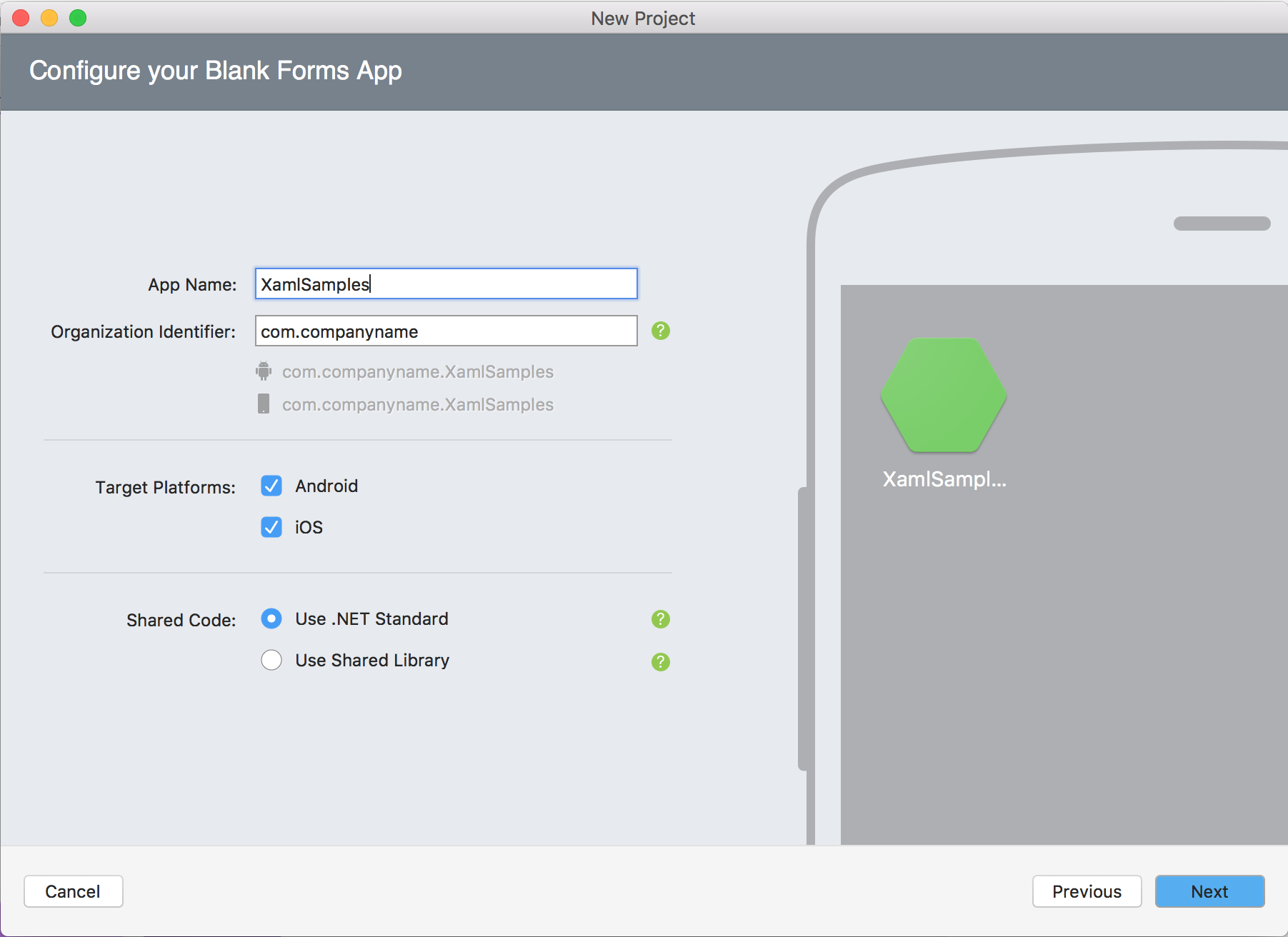
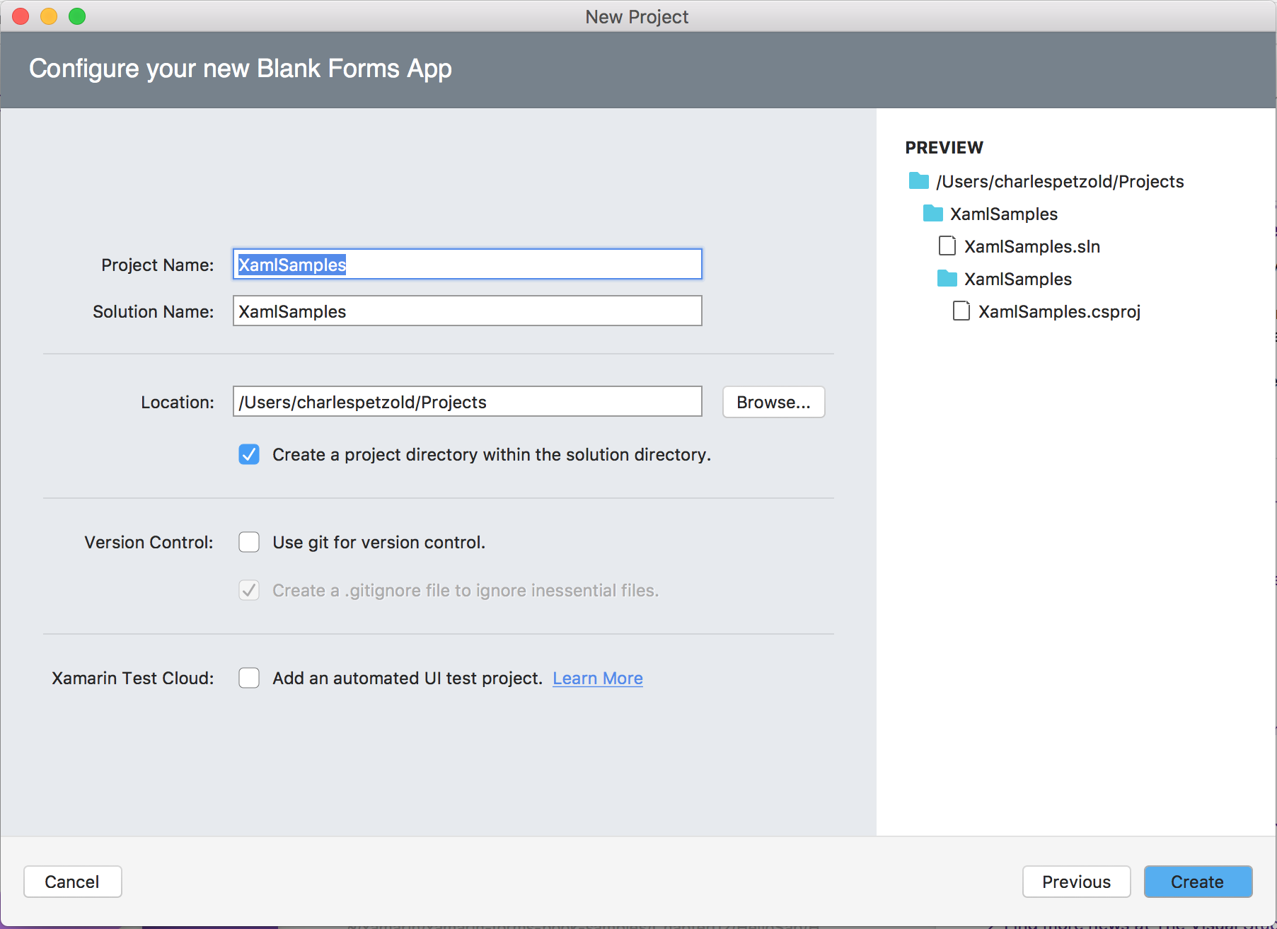
In the Configure your new project window, set the Project name to XamlSamples (or whatever your prefer), and click the Create button.
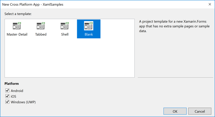
In the New Cross Platform App dialog, click Blank, and click the OK button:
Four projects are created in the solution: the XamlSamples .NET Standard library, XamlSamples.Android, XamlSamples.iOS, and the Universal Windows Platform solution, XamlSamples.UWP.
After creating the XamlSamples solution, you might want to test your development environment by selecting the various platform projects as the solution startup project, and building and deploying the simple application created by the project template on either phone emulators or real devices.
Unless you need to write platform-specific code, the shared XamlSamples .NET Standard library project is where you’ll be spending virtually all of your programming time. These articles will not venture outside of that project.
Anatomy of a XAML File
Within the XamlSamples .NET Standard library are a pair of files with the following names:
- App.xaml, the XAML file; and
- App.xaml.cs, a C# code-behind file associated with the XAML file.
You'll need to click the arrow next to App.xaml to see the code-behind file.
Both App.xaml and App.xaml.cs contribute to a class named App that derives from Application. Most other classes with XAML files contribute to a class that derives from ContentPage; those files use XAML to define the visual contents of an entire page. This is true of the other two files in the XamlSamples project:
- MainPage.xaml, the XAML file; and
- MainPage.xaml.cs, the C# code-behind file.
The MainPage.xaml file looks like this (although the formatting might be a little different):
<ContentPage xmlns="http://xamarin.com/schemas/2014/forms"
             xmlns:x="http://schemas.microsoft.com/winfx/2009/xaml"
             xmlns:local="clr-namespace:XamlSamples"
             x:Class="XamlSamples.MainPage">

    <StackLayout>
        <!-- Place new controls here -->
        <Label Text="Welcome to Xamarin Forms!"
               VerticalOptions="Center"
               HorizontalOptions="Center" />
    </StackLayout>

</ContentPage>
The two XML namespace (xmlns) declarations refer to URIs, the first seemingly on Xamarin’s web site and the second on Microsoft’s. Don’t bother checking what those URIs point to. There’s nothing there. They are simply URIs owned by Xamarin and Microsoft, and they basically function as version identifiers.
The first XML namespace declaration means that tags defined within the XAML file with no prefix refer to classes in Xamarin.Forms, for example ContentPage. The second namespace declaration defines a prefix of x. This is used for several elements and attributes that are intrinsic to XAML itself and which are supported by other implementations of XAML. However, these elements and attributes are slightly different depending on the year embedded in the URI. Xamarin.Forms supports the 2009 XAML specification, but not all of it.
The local namespace declaration allows you to access other classes from the .NET Standard library project.
At the end of that first tag, the x prefix is used for an attribute named Class. Because the use of this x prefix is virtually universal for the XAML namespace, XAML attributes such as Class are almost always referred to as x:Class.
The x:Class attribute specifies a fully qualified .NET class name: the MainPage class in the XamlSamples namespace. This means that this XAML file defines a new class named MainPage in the XamlSamples namespace that derives from ContentPage—the tag in which the x:Class attribute appears.
The x:Class attribute can only appear in the root element of a XAML file to define a derived C# class. This is the only new class defined in the XAML file. Everything else that appears in the XAML file is instead simply instantiated from existing classes and initialized.
The MainPage.xaml.cs file looks like this (aside from unused using directives):
using Xamarin.Forms;

namespace XamlSamples
{
    public partial class MainPage : ContentPage
    {
        public MainPage()
        {
            InitializeComponent();
        }
    }
}
The MainPage class derives from ContentPage, but notice the partial class definition. This suggests that there should be another partial class definition for MainPage, but where is it? And what is that InitializeComponent method?
When Visual Studio builds the project, it parses the XAML file to generate a C# code file. If you look in the XamlSamples\XamlSamples\obj\Debug directory, you’ll find a file named XamlSamples.MainPage.xaml.g.cs. The ‘g’ stands for generated. This is the other partial class definition of MainPage that contains the definition of the InitializeComponent method called from the MainPage constructor. These two partial MainPage class definitions can then be compiled together. Depending on whether the XAML is compiled or not, either the XAML file or a binary form of the XAML file is embedded in the executable.
At runtime, code in the particular platform project calls a LoadApplication method, passing to it a new instance of the App class in the .NET Standard library. The App class constructor instantiates MainPage. The constructor of that class calls InitializeComponent, which then calls the LoadFromXaml method that extracts the XAML file (or its compiled binary) from the .NET Standard library. LoadFromXaml initializes all the objects defined in the XAML file, connects them all together in parent-child relationships, attaches event handlers defined in code to events set in the XAML file, and sets the resultant tree of objects as the content of the page.
Although you normally don’t need to spend much time with generated code files, sometimes runtime exceptions are raised on code in the generated files, so you should be familiar with them.
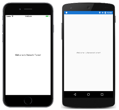
When you compile and run this program, the Label element appears in the center of the page as the XAML suggests:
For more interesting visuals, all you need is more interesting XAML.
Adding New XAML Pages
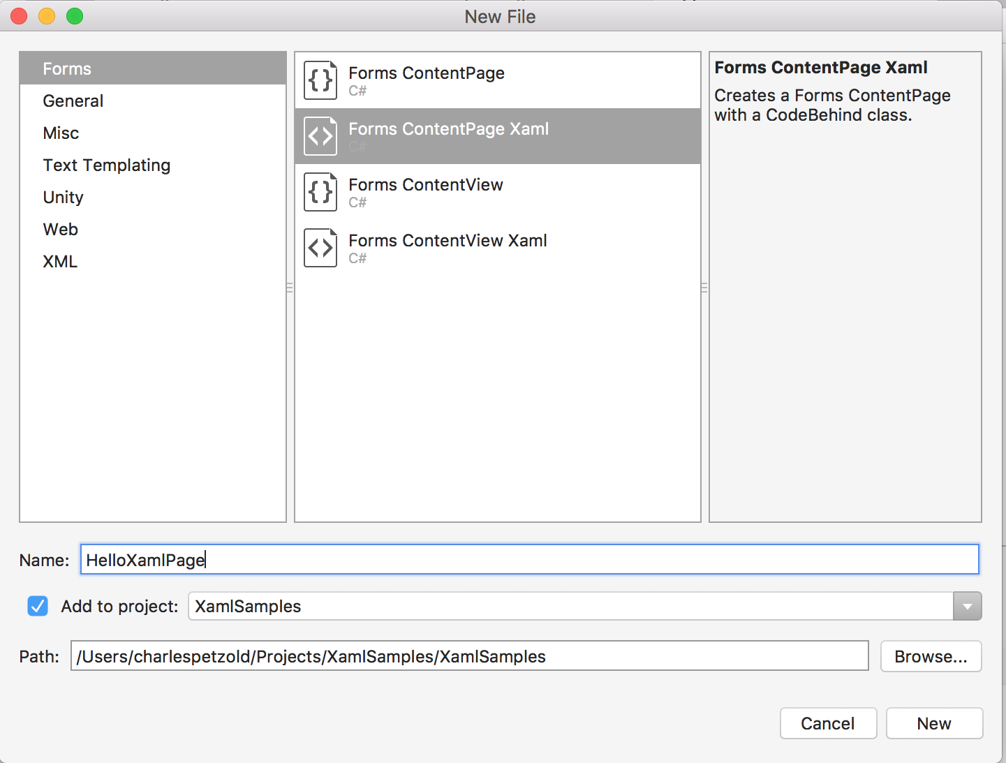
To add other XAML-based ContentPage classes to your project, select the XamlSamples .NET Standard library project, right-click, and select Add > New Item.... In the Add New Item dialog, select Visual C# Items > Xamarin.Forms > Content Page (not Content Page (C#), which creates a code-only page, or Content View, which is not a page). Give the page a name, for example, HelloXamlPage:
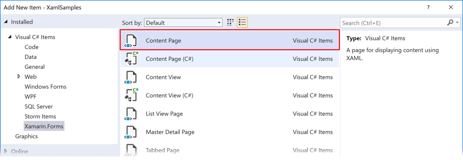
Two files are added to the project, HelloXamlPage.xaml and the code-behind file HelloXamlPage.xaml.cs.
Setting Page Content
Edit the HelloXamlPage.xaml file so that the only tags are those for ContentPage and ContentPage.Content:
<ContentPage xmlns="http://xamarin.com/schemas/2014/forms"
             xmlns:x="http://schemas.microsoft.com/winfx/2009/xaml"
             x:Class="XamlSamples.HelloXamlPage">
    <ContentPage.Content>

    </ContentPage.Content>
</ContentPage>
The ContentPage.Content tags are part of the unique syntax of XAML. At first, they might appear to be invalid XML, but they are legal. The period is not a special character in XML.
The ContentPage.Content tags are called property element tags. Content is a property of ContentPage, and is generally set to a single view or a layout with child views. Normally properties become attributes in XAML, but it would be hard to set a Content attribute to a complex object. For that reason, the property is expressed as an XML element consisting of the class name and the property name separated by a period. Now the Content property can be set between the ContentPage.Content tags, like this:
<ContentPage xmlns="http://xamarin.com/schemas/2014/forms"
             xmlns:x="http://schemas.microsoft.com/winfx/2009/xaml"
             x:Class="XamlSamples.HelloXamlPage"
             Title="Hello XAML Page">
    <ContentPage.Content>

        <Label Text="Hello, XAML!"
               VerticalOptions="Center"
               HorizontalTextAlignment="Center"
               Rotation="-15"
               IsVisible="true"
               FontSize="Large"
               FontAttributes="Bold"
               TextColor="Blue" />

    </ContentPage.Content>
</ContentPage>
Also notice that a Title attribute has been set on the root tag.
At this time, the relationship between classes, properties, and XML should be evident: A Xamarin.Forms class (such as ContentPage or Label) appears in the XAML file as an XML element. Properties of that class—including Title on ContentPage and seven properties of Label—usually appear as XML attributes.
Many shortcuts exist to set the values of these properties. Some properties are basic data types: For example, the Title and Text properties are of type String, Rotation is of type Double, and IsVisible (which is true by default and is set here only for illustration) is of type Boolean.
The HorizontalTextAlignment property is of type TextAlignment, which is an enumeration. For a property of any enumeration type, all you need to supply is a member name.
For properties of more complex types, however, converters are used for parsing the XAML. These are classes in Xamarin.Forms that derive from TypeConverter. Many are public classes but some are not. For this particular XAML file, several of these classes play a role behind the scenes:
LayoutOptionsConverterfor theVerticalOptionspropertyFontSizeConverterfor theFontSizepropertyColorTypeConverterfor theTextColorproperty
These converters govern the allowable syntax of the property settings.
The ThicknessTypeConverter can handle one, two, or four numbers separated by commas. If one number is supplied, it applies to all four sides. With two numbers, the first is left and right padding, and the second is top and bottom. Four numbers are in the order left, top, right, and bottom.
The LayoutOptionsConverter can convert the names of public static fields of the LayoutOptions structure to values of type LayoutOptions.
The FontSizeConverter can handle a NamedSize member or a numeric font size.
The ColorTypeConverter accepts the names of public static fields of the Color structure or hexadecimal RGB values, with or without an alpha channel, preceded by a number sign (#). Here’s the syntax without an alpha channel:
TextColor="#rrggbb"
Each of the little letters is a hexadecimal digit. Here is how an alpha channel is included:
TextColor="#aarrggbb">
For the alpha channel, keep in mind that FF is fully opaque and 00 is fully transparent.
Two other formats allow you to specify only a single hexadecimal digit for each channel:
TextColor="#rgb"
TextColor="#argb"
In these cases, the digit is repeated to form the value. For example, #CF3 is the RGB color CC-FF-33.
Page Navigation
When you run the XamlSamples program, the MainPage is displayed. To see the new HelloXamlPage you can either set that as the new startup page in the App.xaml.cs file, or navigate to the new page from MainPage.
To implement navigation, first change code in the App.xaml.cs constructor so that a NavigationPage object is created:
public App()
{
    InitializeComponent();
    MainPage = new NavigationPage(new MainPage());
}
In the MainPage.xaml.cs constructor, you can create a simple Button and use the event handler to navigate to HelloXamlPage:
public MainPage()
{
    InitializeComponent();

    Button button = new Button
    {
        Text = "Navigate!",
        HorizontalOptions = LayoutOptions.Center,
        VerticalOptions = LayoutOptions.Center
    };

    button.Clicked += async (sender, args) =>
    {
        await Navigation.PushAsync(new HelloXamlPage());
    };

    Content = button;
}
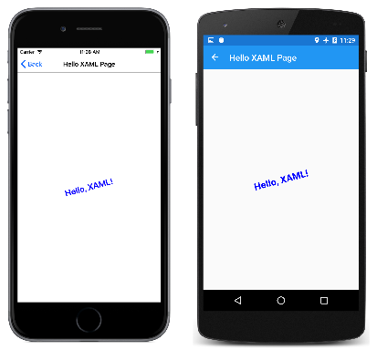
Setting the Content property of the page replaces the setting of the Content property in the XAML file. When you compile and deploy the new version of this program, a button appears on the screen. Pressing it navigates to HelloXamlPage. Here’s the resultant page on iPhone, Android, and UWP:
You can navigate back to MainPage using the < Back button on iOS, using the left arrow at the top of the page or at the bottom of the phone on Android, or using the left arrow at the top of the page on Windows 10.
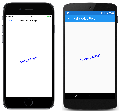
Feel free to experiment with the XAML for different ways to render the Label. If you need to embed any Unicode characters into the text, you can use the standard XML syntax. For example, to put the greeting in smart quotes, use:
<Label Text="“Hello, XAML!”" … />
Here’s what it looks like:
XAML and Code Interactions
The HelloXamlPage sample contains only a single Label on the page, but this is very unusual. Most ContentPage derivatives set the Content property to a layout of some sort, such as a StackLayout. The Children property of the StackLayout is defined to be of type IList<View> but it’s actually an object of type ElementCollection<View>, and that collection can be populated with multiple views or other layouts. In XAML, these parent-child relationships are established with normal XML hierarchy. Here’s a XAML file for a new page named XamlPlusCodePage:
<ContentPage xmlns="http://xamarin.com/schemas/2014/forms"
             xmlns:x="http://schemas.microsoft.com/winfx/2009/xaml"
             x:Class="XamlSamples.XamlPlusCodePage"
             Title="XAML + Code Page">
    <StackLayout>
        <Slider VerticalOptions="CenterAndExpand" />

        <Label Text="A simple Label"
               Font="Large"
               HorizontalOptions="Center"
               VerticalOptions="CenterAndExpand" />

        <Button Text="Click Me!"
                HorizontalOptions="Center"
                VerticalOptions="CenterAndExpand" />
    </StackLayout>
</ContentPage>
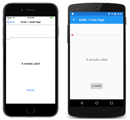
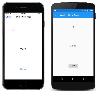
This XAML file is syntactically complete, and here’s what it looks like:
However, you are likely to consider this program to be functionally deficient. Perhaps the Slider is supposed to cause the Label to display the current value, and the Button is probably intended to do something within the program.
As you’ll see in Part 4. Data Binding Basics, the job of displaying a Slider value using a Label can be handled entirely in XAML with a data binding. But it is useful to see the code solution first. Even so, handling the Button click definitely requires code. This means that the code-behind file for XamlPlusCodePage must contain handlers for the ValueChanged event of the Slider and the Clicked event of the Button. Let’s add them:
namespace XamlSamples
{
    public partial class XamlPlusCodePage
    {
        public XamlPlusCodePage()
        {
            InitializeComponent();
        }

        void OnSliderValueChanged(object sender, ValueChangedEventArgs args)
        {

        }

        void OnButtonClicked(object sender, EventArgs args)
        {

        }
    }
}
These event handlers do not need to be public.
Back in the XAML file, the Slider and Button tags need to include attributes for the ValueChanged and Clicked events that reference these handlers:
<ContentPage xmlns="http://xamarin.com/schemas/2014/forms"
             xmlns:x="http://schemas.microsoft.com/winfx/2009/xaml"
             x:Class="XamlSamples.XamlPlusCodePage"
             Title="XAML + Code Page">
    <StackLayout>
        <Slider VerticalOptions="CenterAndExpand"
                ValueChanged="OnSliderValueChanged" />

        <Label Text="A simple Label"
               Font="Large"
               HorizontalOptions="Center"
               VerticalOptions="CenterAndExpand" />

        <Button Text="Click Me!"
                HorizontalOptions="Center"
                VerticalOptions="CenterAndExpand"
                Clicked="OnButtonClicked" />
    </StackLayout>
</ContentPage>
Notice that assigning a handler to an event has the same syntax as assigning a value to a property.
If the handler for the ValueChanged event of the Slider will be using the Label to display the current value, the handler needs to reference that object from code. The Label needs a name, which is specified with the x:Name attribute.
<Label x:Name="valueLabel"
       Text="A simple Label"
       Font="Large"
       HorizontalOptions="Center"
       VerticalOptions="CenterAndExpand" />
The x prefix of the x:Name attribute indicates that this attribute is intrinsic to XAML.
The name you assign to the x:Name attribute has the same rules as C# variable names. For example, it must begin with a letter or underscore and contain no embedded spaces.
Now the ValueChanged event handler can set the Label to display the new Slider value. The new value is available from the event arguments:
void OnSliderValueChanged(object sender, ValueChangedEventArgs args)
{
    valueLabel.Text = args.NewValue.ToString("F3");
}
Or, the handler could obtain the Slider object that is generating this event from the sender argument and obtain the Value property from that:
void OnSliderValueChanged(object sender, ValueChangedEventArgs args)
{
    valueLabel.Text = ((Slider)sender).Value.ToString("F3");
}
When you first run the program, the Label doesn’t display the Slider value because the ValueChanged event hasn’t yet fired. But any manipulation of the Slider causes the value to be displayed:
Now for the Button. Let’s simulate a response to a Clicked event by displaying an alert with the Text of the button. The event handler can safely cast the sender argument to a Button and then access its properties:
async void OnButtonClicked(object sender, EventArgs args)
{
    Button button = (Button)sender;
    await DisplayAlert("Clicked!",
        "The button labeled '" + button.Text + "' has been clicked",
        "OK");
}
The method is defined as async because the DisplayAlert method is asynchronous and should be prefaced with the await operator, which returns when the method completes. Because this method obtains the Button firing the event from the sender argument, the same handler could be used for multiple buttons.
You’ve seen that an object defined in XAML can fire an event that is handled in the code-behind file, and that the code-behind file can access an object defined in XAML using the name assigned to it with the x:Name attribute. These are the two fundamental ways that code and XAML interact.
Some additional insights into how XAML works can be gleaned by examining the newly generated XamlPlusCode.xaml.g.cs file, which now includes any name assigned to any x:Name attribute as a private field. Here's a simplified version of that file:
public partial class XamlPlusCodePage : ContentPage {

    private Label valueLabel;

    private void InitializeComponent() {
        this.LoadFromXaml(typeof(XamlPlusCodePage));
        valueLabel = this.FindByName<Label>("valueLabel");
    }
}
The declaration of this field allows the variable to be freely used anywhere within the XamlPlusCodePage partial class file under your jurisdiction. At runtime, the field is assigned after the XAML has been parsed. This means that the valueLabel field is null when the XamlPlusCodePage constructor begins but valid after InitializeComponent is called.
After InitializeComponent returns control back to the constructor, the visuals of the page have been constructed just as if they had been instantiated and initialized in code. The XAML file no longer plays any role in the class. You can manipulate these objects on the page in any way that you want, for example, by adding views to the StackLayout, or setting the Content property of the page to something else entirely. You can “walk the tree” by examining the Content property of the page and the items in the Children collections of layouts. You can set properties on views accessed in this way, or assign event handlers to them dynamically.
Feel free. It’s your page, and XAML is only a tool to build its content.
Summary
With this introduction, you’ve seen how a XAML file and code file contribute to a class definition, and how the XAML and code files interact. But XAML also has its own unique syntactical features that allow it to be used in a very flexible manner. You can begin exploring these in Part 2. Essential XAML Syntax.
