Xamarin.Forms Entry
The Xamarin.Forms Entry is used for single-line text input. The Entry, like the Editor view, supports multiple keyboard types. Additionally, the Entry can be used as a password field.
Set and read text
The Entry, like other text-presenting views, exposes the Text property. This property can be used to set and read the text presented by the Entry. The following example demonstrates setting the Text property in XAML:
<Entry x:Name="entry" Text="I am an Entry" />
In C#:
var entry = new Entry { Text = "I am an Entry" };
To read text, access the Text property in C#:
var text = entry.Text;
Set placeholder text
The Entry can be set to show placeholder text when it is not storing user input. This is accomplished by setting the Placeholder property to a string, and is often used to indicate the type of content that is appropriate for the Entry. In addition, the placeholder text color can be controlled by setting the PlaceholderColor property to a Color:
<Entry Placeholder="Username" PlaceholderColor="Olive" />
var entry = new Entry { Placeholder = "Username", PlaceholderColor = Color.Olive };
Note
The width of an Entry can be defined by setting its WidthRequest property. Do not depend on the width of an Entry being defined based on the value of its Text property.
Prevent text entry
Users can be prevented from modifying the text in an Entry by setting the IsReadOnly property, which has a default value of false, to true:
<Entry Text="This is a read-only Entry"
       IsReadOnly="true" />
var entry = new Entry { Text = "This is a read-only Entry", IsReadOnly = true });
Note
The IsReadonly property does not alter the visual appearance of an Entry, unlike the IsEnabled property that also changes the visual appearance of the Entry to gray.
Transform text
An Entry can transform the casing of its text, stored in the Text property, by setting the TextTransform property to a value of the TextTransform enumeration. This enumeration has four values:
Noneindicates that the text won't be transformed.Defaultindicates that the default behavior for the platform will be used. This is the default value of theTextTransformproperty.Lowercaseindicates that the text will be transformed to lowercase.Uppercaseindicates that the text will be transformed to uppercase.
The following example shows transforming text to uppercase:
<Entry Text="This text will be displayed in uppercase."
       TextTransform="Uppercase" />
The equivalent C# code is:
Entry entry = new Entry
{
    Text = "This text will be displayed in uppercase.",
    TextTransform = TextTransform.Uppercase
};
Limit input length
The MaxLength property can be used to limit the input length that's permitted for the Entry. This property should be set to a positive integer:
<Entry ... MaxLength="10" />
var entry = new Entry { ... MaxLength = 10 };
A MaxLength property value of 0 indicates that no input will be allowed, and a value of int.MaxValue, which is the default value for an Entry, indicates that there is no effective limit on the number of characters that may be entered.
Character spacing
Character spacing can be applied to an Entry by setting the Entry.CharacterSpacing property to a double value:
<Entry ...
       CharacterSpacing="10" />
The equivalent C# code is:
Entry entry = new Entry { CharacterSpacing = 10 };
The result is that characters in the text displayed by the Entry are spaced CharacterSpacing device-independent units apart.
Note
The CharacterSpacing property value is applied to the text displayed by the Text and Placeholder properties.
Password fields
Entry provides the IsPassword property. When IsPassword is true, the contents of the field will be presented as black circles:
In XAML:
<Entry IsPassword="true" />
In C#:
var MyEntry = new Entry { IsPassword = true };

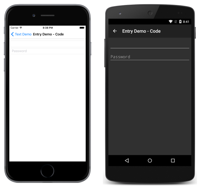
Placeholders may be used with instances of Entry that are configured as password fields:
In XAML:
<Entry IsPassword="true" Placeholder="Password" />
In C#:
var MyEntry = new Entry { IsPassword = true, Placeholder = "Password" };

Set the cursor position and text selection length
The CursorPosition property can be used to return or set the position at which the next character will be inserted into the string stored in the Text property:
<Entry Text="Cursor position set" CursorPosition="5" />
var entry = new Entry { Text = "Cursor position set", CursorPosition = 5 };
The default value of the CursorPosition property is 0, which indicates that text will be inserted at the start of the Entry.
In addition, the SelectionLength property can be used to return or set the length of text selection within the Entry:
<Entry Text="Cursor position and selection length set" CursorPosition="2" SelectionLength="10" />
var entry = new Entry { Text = "Cursor position and selection length set", CursorPosition = 2, SelectionLength = 10 };
The default value of the SelectionLength property is 0, which indicates that no text is selected.
Display a clear button
The ClearButtonVisibility property can be used to control whether an Entry displays a clear button, which enables the user to clear the text. This property should be set to a ClearButtonVisibility enumeration member:
Neverindicates that a clear button will never be displayed. This is the default value for theEntry.ClearButtonVisibilityproperty.WhileEditingindicates that a clear button will be displayed in theEntry, while it has focus and text.
The following example shows setting the property in XAML:
<Entry Text="Xamarin.Forms"
       ClearButtonVisibility="WhileEditing" />
The equivalent C# code is:
var entry = new Entry { Text = "Xamarin.Forms", ClearButtonVisibility = ClearButtonVisibility.WhileEditing };
The following screenshots show an Entry with the clear button enabled:

Customize the keyboard
The keyboard that's presented when users interact with an Entry can be set programmatically via the Keyboard property, to one of the following properties from the Keyboard class:
Chat– used for texting and places where emoji are useful.Default– the default keyboard.Email– used when entering email addresses.Numeric– used when entering numbers.Plain– used when entering text, without anyKeyboardFlagsspecified.Telephone– used when entering telephone numbers.Text– used when entering text.Url– used for entering file paths & web addresses.
This can be accomplished in XAML as follows:
<Entry Keyboard="Chat" />
The equivalent C# code is:
var entry = new Entry { Keyboard = Keyboard.Chat };
Examples of each keyboard can be found in our Recipes repository.
The Keyboard class also has a Create factory method that can be used to customize a keyboard by specifying capitalization, spellcheck, and suggestion behavior. KeyboardFlags enumeration values are specified as arguments to the method, with a customized Keyboard being returned. The KeyboardFlags enumeration contains the following values:
None– no features are added to the keyboard.CapitalizeSentence– indicates that the first letter of the first word of each entered sentence will be automatically capitalized.Spellcheck– indicates that spellcheck will be performed on entered text.Suggestions– indicates that word completions will be offered on entered text.CapitalizeWord– indicates that the first letter of each word will be automatically capitalized.CapitalizeCharacter– indicates that every character will be automatically capitalized.CapitalizeNone– indicates that no automatic capitalization will occur.All– indicates that spellcheck, word completions, and sentence capitalization will occur on entered text.
The following XAML code example shows how to customize the default Keyboard to offer word completions and capitalize every entered character:
<Entry Placeholder="Enter text here">
    <Entry.Keyboard>
        <Keyboard x:FactoryMethod="Create">
            <x:Arguments>
                <KeyboardFlags>Suggestions,CapitalizeCharacter</KeyboardFlags>
            </x:Arguments>
        </Keyboard>
    </Entry.Keyboard>
</Entry>
The equivalent C# code is:
var entry = new Entry { Placeholder = "Enter text here" };
entry.Keyboard = Keyboard.Create(KeyboardFlags.Suggestions | KeyboardFlags.CapitalizeCharacter);
Customize the return key
The appearance of the return key on the soft keyboard, which is displayed when an Entry has focus, can be customized by setting the ReturnType property to a value of the ReturnType enumeration:
Default– indicates that no specific return key is required and that the platform default will be used.Done– indicates a "Done" return key.Go– indicates a "Go" return key.Next– indicates a "Next" return key.Search– indicates a "Search" return key.Send– indicates a "Send" return key.
The following XAML example shows how to set the return key:
<Entry ReturnType="Send" />
The equivalent C# code is:
var entry = new Entry { ReturnType = ReturnType.Send };
Note
The exact appearance of the return key is dependent upon the platform. On iOS, the return key is a text-based button. However, on the Android and Universal Windows Platforms, the return key is a icon-based button.
When the return key is pressed, the Completed event fires and any ICommand specified by the ReturnCommand property is executed. In addition, any object specified by the ReturnCommandParameter property will be passed to the ICommand as a parameter. For more information about commands, see The Command Interface.
Enable and disable spell checking
The IsSpellCheckEnabled property controls whether spell checking is enabled. By default, the property is set to true. As the user enters text, misspellings are indicated.
However, for some text entry scenarios, such as entering a username, spell checking provides a negative experience and should be disabled by setting the IsSpellCheckEnabled property to false:
<Entry ... IsSpellCheckEnabled="false" />
var entry = new Entry { ... IsSpellCheckEnabled = false };
Note
When the IsSpellCheckEnabled property is set to false, and a custom keyboard isn't being used, the native spell checker will be disabled. However, if a Keyboard has been set that disables spell checking, such as Keyboard.Chat, the IsSpellCheckEnabled property is ignored. Therefore, the property cannot be used to enable spell checking for a Keyboard that explicitly disables it.
Enable and disable text prediction
The IsTextPredictionEnabled property controls whether text prediction and automatic text correction is enabled. By default, the property is set to true. As the user enters text, word predictions are presented.
However, for some text entry scenarios, such as entering a username, text prediction and automatic text correction provides a negative experience and should be disabled by setting the IsTextPredictionEnabled property to false:
<Entry ... IsTextPredictionEnabled="false" />
var entry = new Entry { ... IsTextPredictionEnabled = false };
Note
When the IsTextPredictionEnabled property is set to false, and a custom keyboard isn't being used, text prediction and automatic text correction is disabled. However, if a Keyboard has been set that disables text prediction, the IsTextPredictionEnabled property is ignored. Therefore, the property cannot be used to enable text prediction for a Keyboard that explicitly disables it.
Colors
Entry can be set to use a custom background and text colors via the following bindable properties:
- TextColor – sets the color of the text.
- BackgroundColor – sets the color shown behind the text.
Special care is necessary to ensure that colors will be usable on each platform. Because each platform has different defaults for text and background colors, you'll often need to set both if you set one.
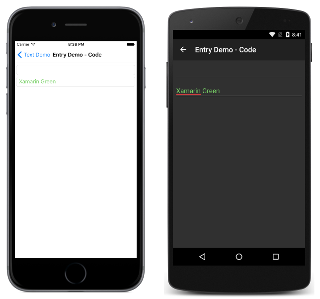
Use the following code to set the text color of an entry:
In XAML:
<Entry TextColor="Green" />
In C#:
var entry = new Entry();
entry.TextColor = Color.Green;

Note that the placeholder is not affected by the specified TextColor.
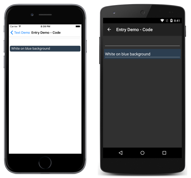
To set the background color in XAML:
<Entry BackgroundColor="#2c3e50" />
In C#:
var entry = new Entry();
entry.BackgroundColor = Color.FromHex("#2c3e50");

Be careful to make sure that the background and text colors you choose are usable on each platform and don't obscure any placeholder text.
Events and interactivity
Entry exposes two events:
TextChanged– raised when the text changes in the entry. Provides the text before and after the change.Completed– raised when the user has ended input by pressing the return key on the keyboard.
Note
The VisualElement class, from which Entry inherits, also has Focused and Unfocused events.
Completed
The Completed event is used to react to the completion of an interaction with an Entry. Completed is raised when the user ends input with a field by pressing the return key on the keyboard (or by pressing the Tab key on UWP). The handler for the event is a generic event handler, taking the sender and EventArgs:
void Entry_Completed (object sender, EventArgs e)
{
    var text = ((Entry)sender).Text; //cast sender to access the properties of the Entry
}
The completed event can be subscribed to in XAML:
<Entry Completed="Entry_Completed" />
and C#:
var entry = new Entry ();
entry.Completed += Entry_Completed;
After the Completed event fires, any ICommand specified by the ReturnCommand property is executed, with the object specified by the ReturnCommandParameter property being passed to the ICommand.
TextChanged
The TextChanged event is used to react to a change in the content of a field.
TextChanged is raised whenever the Text of the Entry changes. The handler for the event takes an instance of TextChangedEventArgs. TextChangedEventArgs provides access to the old and new values of the Entry Text via the OldTextValue and NewTextValue properties:
void Entry_TextChanged (object sender, TextChangedEventArgs e)
{
    var oldText = e.OldTextValue;
    var newText = e.NewTextValue;
}
The TextChanged event can be subscribed to in XAML:
<Entry TextChanged="Entry_TextChanged" />
and C#:
var entry = new Entry ();
entry.TextChanged += Entry_TextChanged;