Introduction to Xamarin.Forms Styles
Styles allow the appearance of visual elements to be customized. Styles are defined for a specific type and contain values for the properties available on that type.
Xamarin.Forms applications often contain multiple controls that have an identical appearance. For example, an application may have multiple Label instances that have the same font options and layout options, as shown in the following XAML code example:
<ContentPage xmlns="http://xamarin.com/schemas/2014/forms"
    xmlns:x="http://schemas.microsoft.com/winfx/2009/xaml"
    x:Class="Styles.NoStylesPage"
    Title="No Styles"
    IconImageSource="xaml.png">
    <ContentPage.Content>
        <StackLayout Padding="0,20,0,0">
            <Label Text="These labels"
                   HorizontalOptions="Center"
                   VerticalOptions="CenterAndExpand"
                   FontSize="Large" />
            <Label Text="are not"
                   HorizontalOptions="Center"
                   VerticalOptions="CenterAndExpand"
                   FontSize="Large" />
            <Label Text="using styles"
                   HorizontalOptions="Center"
                   VerticalOptions="CenterAndExpand"
                   FontSize="Large" />
        </StackLayout>
    </ContentPage.Content>
</ContentPage>
The following code example shows the equivalent page created in C#:
public class NoStylesPageCS : ContentPage
{
    public NoStylesPageCS ()
    {
        Title = "No Styles";
        IconImageSource = "csharp.png";
        Padding = new Thickness (0, 20, 0, 0);

        Content = new StackLayout {
            Children = {
                new Label {
                    Text = "These labels",
                    HorizontalOptions = LayoutOptions.Center,
                    VerticalOptions = LayoutOptions.CenterAndExpand,
                    FontSize = Device.GetNamedSize (NamedSize.Large, typeof(Label))
                },
                new Label {
                    Text = "are not",
                    HorizontalOptions = LayoutOptions.Center,
                    VerticalOptions = LayoutOptions.CenterAndExpand,
                    FontSize = Device.GetNamedSize (NamedSize.Large, typeof(Label))
                },
                new Label {
                    Text = "using styles",
                    HorizontalOptions = LayoutOptions.Center,
                    VerticalOptions = LayoutOptions.CenterAndExpand,
                    FontSize = Device.GetNamedSize (NamedSize.Large, typeof(Label))
                }
            }
        };
    }
}
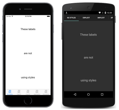
Each Label instance has identical property values for controlling the appearance of the text displayed by the Label. This results in the appearance shown in the following screenshots:
Setting the appearance of each individual control can be repetitive and error prone. Instead, a style can be created that defines the appearance, and then applied to the required controls.
Create a style
The Style class groups a collection of property values into one object that can then be applied to multiple visual element instances. This helps to reduce repetitive markup, and allows an applications appearance to be more easily changed.
Although styles were designed primarily for XAML-based applications, they can also be created in C#:
Styleinstances created in XAML are typically defined in aResourceDictionarythat's assigned to theResourcescollection of a control, page, or to theResourcescollection of the application.Styleinstances created in C# are typically defined in the page's class, or in a class that can be globally accessed.
Choosing where to define a Style impacts where it can be used:
Styleinstances defined at the control level can only be applied to the control and to its children.Styleinstances defined at the page level can only be applied to the page and to its children.Styleinstances defined at the application level can be applied throughout the application.
Each Style instance contains a collection of one or more Setter objects, with each Setter having a Property and a Value. The Property is the name of the bindable property of the element the style is applied to, and the Value is the value that is applied to the property.
Each Style instance can be explicit, or implicit:
- An explicit
Styleinstance is defined by specifying aTargetTypeand anx:Keyvalue, and by setting the target element'sStyleproperty to thex:Keyreference. For more information about explicit styles, see Explicit Styles. - An implicit
Styleinstance is defined by specifying only aTargetType. TheStyleinstance will then automatically be applied to all elements of that type. Note that subclasses of theTargetTypedo not automatically have theStyleapplied. For more information about implicit styles, see Implicit Styles.
When creating a Style, the TargetType property is always required. The following code example shows an explicit style (note the x:Key) created in XAML:
<Style x:Key="labelStyle" TargetType="Label">
    <Setter Property="HorizontalOptions" Value="Center" />
    <Setter Property="VerticalOptions" Value="CenterAndExpand" />
    <Setter Property="FontSize" Value="Large" />
</Style>
To apply a Style, the target object must be a VisualElement that matches the TargetType property value of the Style, as shown in the following XAML code example:
<Label Text="Demonstrating an explicit style" Style="{StaticResource labelStyle}" />
Styles lower in the view hierarchy take precedence over those defined higher up. For example, setting a Style that sets Label.TextColor to Red at the application level will be overridden by a page level style that sets Label.TextColor to Green. Similarly, a page level style will be overridden by a control level style. In addition, if Label.TextColor is set directly on a control property, this takes precedence over any styles.
The articles in this section demonstrate and explain how to create and apply explicit and implicit styles, how to create global styles, style inheritance, how to respond to style changes at runtime, and how to use the in-built styles included in Xamarin.Forms.
Note
What is StyleId?
Prior to Xamarin.Forms 2.2, the StyleId property was used to identify individual elements in an application for identification in UI testing, and in theme engines such as Pixate. However, Xamarin.Forms 2.2 introduced the AutomationId property, which has superseded the StyleId property.
