Xamarin.Forms CollectionView Data
CollectionView includes the following properties that define the data to be displayed, and its appearance:
ItemsSource, of typeIEnumerable, specifies the collection of items to be displayed, and has a default value ofnull.ItemTemplate, of typeDataTemplate, specifies the template to apply to each item in the collection of items to be displayed.
These properties are backed by BindableProperty objects, which means that the properties can be targets of data bindings.
Note
CollectionView defines a ItemsUpdatingScrollMode property that represents the scrolling behavior of the CollectionView when new items are added to it. For more information about this property, see Control scroll position when new items are added.
CollectionView supports incremental data virtualization as the user scrolls. For more information, see Load data incrementally.
Populate a CollectionView with data
A CollectionView is populated with data by setting its ItemsSource property to any collection that implements IEnumerable. By default, CollectionView displays items in a vertical list.
Important
If the CollectionView is required to refresh as items are added, removed, or changed in the underlying collection, the underlying collection should be an IEnumerable collection that sends property change notifications, such as ObservableCollection.
CollectionView can be populated with data by using data binding to bind its ItemsSource property to an IEnumerable collection. In XAML, this is achieved with the Binding markup extension:
<CollectionView ItemsSource="{Binding Monkeys}" />
The equivalent C# code is:
CollectionView collectionView = new CollectionView();
collectionView.SetBinding(ItemsView.ItemsSourceProperty, "Monkeys");
In this example, the ItemsSource property data binds to the Monkeys property of the connected viewmodel.
Note
Compiled bindings can be enabled to improve data binding performance in Xamarin.Forms applications. For more information, see Compiled Bindings.
For information on how to change the CollectionView layout, see Xamarin.Forms CollectionView Layout. For information on how to define the appearance of each item in the CollectionView, see Define item appearance. For more information about data binding, see Xamarin.Forms Data Binding.
Warning
CollectionView will throw an exception if its ItemsSource is updated off the UI thread.
Define item appearance
The appearance of each item in the CollectionView can be defined by setting the CollectionView.ItemTemplate property to a DataTemplate:
<CollectionView ItemsSource="{Binding Monkeys}">
    <CollectionView.ItemTemplate>
        <DataTemplate>
            <Grid Padding="10">
                <Grid.RowDefinitions>
                    <RowDefinition Height="Auto" />
                    <RowDefinition Height="Auto" />
                </Grid.RowDefinitions>
                <Grid.ColumnDefinitions>
                    <ColumnDefinition Width="Auto" />
                    <ColumnDefinition Width="Auto" />
                </Grid.ColumnDefinitions>
                <Image Grid.RowSpan="2"
                       Source="{Binding ImageUrl}"
                       Aspect="AspectFill"
                       HeightRequest="60"
                       WidthRequest="60" />
                <Label Grid.Column="1"
                       Text="{Binding Name}"
                       FontAttributes="Bold" />
                <Label Grid.Row="1"
                       Grid.Column="1"
                       Text="{Binding Location}"
                       FontAttributes="Italic"
                       VerticalOptions="End" />
            </Grid>
        </DataTemplate>
    </CollectionView.ItemTemplate>
    ...
</CollectionView>
The equivalent C# code is:
CollectionView collectionView = new CollectionView();
collectionView.SetBinding(ItemsView.ItemsSourceProperty, "Monkeys");

collectionView.ItemTemplate = new DataTemplate(() =>
{
    Grid grid = new Grid { Padding = 10 };
    grid.RowDefinitions.Add(new RowDefinition { Height = GridLength.Auto });
    grid.RowDefinitions.Add(new RowDefinition { Height = GridLength.Auto });
    grid.ColumnDefinitions.Add(new ColumnDefinition { Width = GridLength.Auto });
    grid.ColumnDefinitions.Add(new ColumnDefinition { Width = GridLength.Auto });

    Image image = new Image { Aspect = Aspect.AspectFill, HeightRequest = 60, WidthRequest = 60 };
    image.SetBinding(Image.SourceProperty, "ImageUrl");

    Label nameLabel = new Label { FontAttributes = FontAttributes.Bold };
    nameLabel.SetBinding(Label.TextProperty, "Name");

    Label locationLabel = new Label { FontAttributes = FontAttributes.Italic, VerticalOptions = LayoutOptions.End };
    locationLabel.SetBinding(Label.TextProperty, "Location");

    Grid.SetRowSpan(image, 2);

    grid.Children.Add(image);
    grid.Children.Add(nameLabel, 1, 0);
    grid.Children.Add(locationLabel, 1, 1);

    return grid;
});
The elements specified in the DataTemplate define the appearance of each item in the list. In the example, layout within the DataTemplate is managed by a Grid. The Grid contains an Image object, and two Label objects, that all bind to properties of the Monkey class:
public class Monkey
{
    public string Name { get; set; }
    public string Location { get; set; }
    public string Details { get; set; }
    public string ImageUrl { get; set; }
}
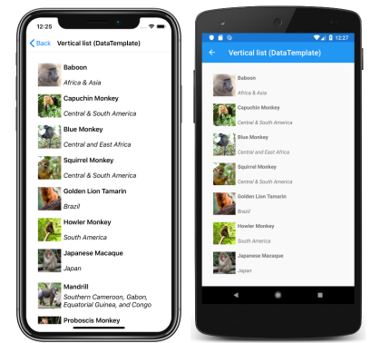
The following screenshots show the result of templating each item in the list:
For more information about data templates, see Xamarin.Forms Data Templates.
Choose item appearance at runtime
The appearance of each item in the CollectionView can be chosen at runtime, based on the item value, by setting the CollectionView.ItemTemplate property to a DataTemplateSelector object:
<ContentPage ...
             xmlns:controls="clr-namespace:CollectionViewDemos.Controls">
    <ContentPage.Resources>
        <DataTemplate x:Key="AmericanMonkeyTemplate">
            ...
        </DataTemplate>

        <DataTemplate x:Key="OtherMonkeyTemplate">
            ...
        </DataTemplate>

        <controls:MonkeyDataTemplateSelector x:Key="MonkeySelector"
                                             AmericanMonkey="{StaticResource AmericanMonkeyTemplate}"
                                             OtherMonkey="{StaticResource OtherMonkeyTemplate}" />
    </ContentPage.Resources>

    <CollectionView ItemsSource="{Binding Monkeys}"
                    ItemTemplate="{StaticResource MonkeySelector}" />
</ContentPage>
The equivalent C# code is:
CollectionView collectionView = new CollectionView
{
    ItemTemplate = new MonkeyDataTemplateSelector { ... }
};
collectionView.SetBinding(ItemsView.ItemsSourceProperty, "Monkeys");
The ItemTemplate property is set to a MonkeyDataTemplateSelector object. The following example shows the MonkeyDataTemplateSelector class:
public class MonkeyDataTemplateSelector : DataTemplateSelector
{
    public DataTemplate AmericanMonkey { get; set; }
    public DataTemplate OtherMonkey { get; set; }

    protected override DataTemplate OnSelectTemplate(object item, BindableObject container)
    {
        return ((Monkey)item).Location.Contains("America") ? AmericanMonkey : OtherMonkey;
    }
}
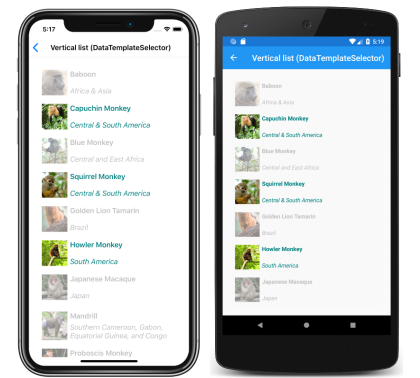
The MonkeyDataTemplateSelector class defines AmericanMonkey and OtherMonkey DataTemplate properties that are set to different data templates. The OnSelectTemplate override returns the AmericanMonkey template, which displays the monkey name and location in teal, when the monkey name contains "America". When the monkey name doesn't contain "America", the OnSelectTemplate override returns the OtherMonkey template, which displays the monkey name and location in silver:
For more information about data template selectors, see Create a Xamarin.Forms DataTemplateSelector.
Important
When using CollectionView, never set the root element of your DataTemplate objects to a ViewCell. This will result in an exception being thrown because CollectionView has no concept of cells.
Context menus
CollectionView supports context menus for items of data through the SwipeView, which reveals the context menu with a swipe gesture. The SwipeView is a container control that wraps around an item of content, and provides context menu items for that item of content. Therefore, context menus are implemented for a CollectionView by creating a SwipeView that defines the content that the SwipeView wraps around, and the context menu items that are revealed by the swipe gesture. This is achieved by setting the SwipeView as the root view in the DataTemplate that defines the appearance of each item of data in the CollectionView:
<CollectionView x:Name="collectionView"
                ItemsSource="{Binding Monkeys}">
    <CollectionView.ItemTemplate>
        <DataTemplate>
            <SwipeView>
                <SwipeView.LeftItems>
                    <SwipeItems>
                        <SwipeItem Text="Favorite"
                                   IconImageSource="favorite.png"
                                   BackgroundColor="LightGreen"
                                   Command="{Binding Source={x:Reference collectionView}, Path=BindingContext.FavoriteCommand}"
                                   CommandParameter="{Binding}" />
                        <SwipeItem Text="Delete"
                                   IconImageSource="delete.png"
                                   BackgroundColor="LightPink"
                                   Command="{Binding Source={x:Reference collectionView}, Path=BindingContext.DeleteCommand}"
                                   CommandParameter="{Binding}" />
                    </SwipeItems>
                </SwipeView.LeftItems>
                <Grid BackgroundColor="White"
                      Padding="10">
                    <!-- Define item appearance -->
                </Grid>
            </SwipeView>
        </DataTemplate>
    </CollectionView.ItemTemplate>
</CollectionView>
The equivalent C# code is:
CollectionView collectionView = new CollectionView();
collectionView.SetBinding(ItemsView.ItemsSourceProperty, "Monkeys");

collectionView.ItemTemplate = new DataTemplate(() =>
{
    // Define item appearance
    Grid grid = new Grid { Padding = 10, BackgroundColor = Color.White };
    // ...

    SwipeView swipeView = new SwipeView();
    SwipeItem favoriteSwipeItem = new SwipeItem
    {
        Text = "Favorite",
        IconImageSource = "favorite.png",
        BackgroundColor = Color.LightGreen
    };
    favoriteSwipeItem.SetBinding(MenuItem.CommandProperty, new Binding("BindingContext.FavoriteCommand", source: collectionView));
    favoriteSwipeItem.SetBinding(MenuItem.CommandParameterProperty, ".");

    SwipeItem deleteSwipeItem = new SwipeItem
    {
        Text = "Delete",
        IconImageSource = "delete.png",
        BackgroundColor = Color.LightPink
    };
    deleteSwipeItem.SetBinding(MenuItem.CommandProperty, new Binding("BindingContext.DeleteCommand", source: collectionView));
    deleteSwipeItem.SetBinding(MenuItem.CommandParameterProperty, ".");

    swipeView.LeftItems = new SwipeItems { favoriteSwipeItem, deleteSwipeItem };
    swipeView.Content = grid;
    return swipeView;
});
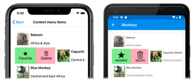
In this example, the SwipeView content is a Grid that defines the appearance of each item in the CollectionView. The swipe items are used to perform actions on the SwipeView content, and are revealed when the control is swiped from the left side:
SwipeView supports four different swipe directions, with the swipe direction being defined by the directional SwipeItems collection the SwipeItems objects are added to. By default, a swipe item is executed when it's tapped by the user. In addition, once a swipe item has been executed the swipe items are hidden and the SwipeView content is re-displayed. However, these behaviors can be changed.
For more information about the SwipeView control, see Xamarin.Forms SwipeView.
Pull to refresh
CollectionView supports pull to refresh functionality through the RefreshView, which enables the data being displayed to be refreshed by pulling down on the list of items. The RefreshView is a container control that provides pull to refresh functionality to its child, provided that the child supports scrollable content. Therefore, pull to refresh is implemented for a CollectionView by setting it as the child of a RefreshView:
<RefreshView IsRefreshing="{Binding IsRefreshing}"
             Command="{Binding RefreshCommand}">
    <CollectionView ItemsSource="{Binding Animals}">
        ...
    </CollectionView>
</RefreshView>
The equivalent C# code is:
RefreshView refreshView = new RefreshView();
ICommand refreshCommand = new Command(() =>
{
    // IsRefreshing is true
    // Refresh data here
    refreshView.IsRefreshing = false;
});
refreshView.Command = refreshCommand;

CollectionView collectionView = new CollectionView();
collectionView.SetBinding(ItemsView.ItemsSourceProperty, "Animals");
refreshView.Content = collectionView;
// ...
When the user initiates a refresh, the ICommand defined by the Command property is executed, which should refresh the items being displayed. A refresh visualization is shown while the refresh occurs, which consists of an animated progress circle:
The value of the RefreshView.IsRefreshing property indicates the current state of the RefreshView. When a refresh is triggered by the user, this property will automatically transition to true. Once the refresh completes, you should reset the property to false.
For more information about RefreshView, see Xamarin.Forms RefreshView.
Load data incrementally
CollectionView supports incremental data virtualization as the user scrolls. This enables scenarios such as asynchronously loading a page of data from a web service, as the user scrolls. In addition, the point at which more data is loaded is configurable so that users don't see blank space, or are stopped from scrolling.
CollectionView defines the following properties to control incremental loading of data:
RemainingItemsThreshold, of typeint, the threshold of items not yet visible in the list at which theRemainingItemsThresholdReachedevent will be fired.RemainingItemsThresholdReachedCommand, of typeICommand, which is executed when theRemainingItemsThresholdis reached.RemainingItemsThresholdReachedCommandParameter, of typeobject, which is the parameter that's passed to theRemainingItemsThresholdReachedCommand.
CollectionView also defines a RemainingItemsThresholdReached event that is fired when the CollectionView is scrolled far enough that RemainingItemsThreshold items have not been displayed. This event can be handled to load more items. In addition, when the RemainingItemsThresholdReached event is fired, the RemainingItemsThresholdReachedCommand is executed, enabling incremental data loading to take place in a viewmodel.
The default value of the RemainingItemsThreshold property is -1, which indicates that the RemainingItemsThresholdReached event will never be fired. When the property value is 0, the RemainingItemsThresholdReached event will be fired when the final item in the ItemsSource is displayed. For values greater than 0, the RemainingItemsThresholdReached event will be fired when the ItemsSource contains that number of items not yet scrolled to.
Note
CollectionView validates the RemainingItemsThreshold property so that its value is always greater than or equal to -1.
The following XAML example shows a CollectionView that loads data incrementally:
<CollectionView ItemsSource="{Binding Animals}"
                RemainingItemsThreshold="5"
                RemainingItemsThresholdReached="OnCollectionViewRemainingItemsThresholdReached">
    ...
</CollectionView>
The equivalent C# code is:
CollectionView collectionView = new CollectionView
{
    RemainingItemsThreshold = 5
};
collectionView.RemainingItemsThresholdReached += OnCollectionViewRemainingItemsThresholdReached;
collectionView.SetBinding(ItemsView.ItemsSourceProperty, "Animals");
In this code example, the RemainingItemsThresholdReached event fires when there are 5 items not yet scrolled to, and in response executes the OnCollectionViewRemainingItemsThresholdReached event handler:
void OnCollectionViewRemainingItemsThresholdReached(object sender, EventArgs e)
{
    // Retrieve more data here and add it to the CollectionView's ItemsSource collection.
}
Note
Data can also be loaded incrementally by binding the RemainingItemsThresholdReachedCommand to an ICommand implementation in the viewmodel.


