Xamarin.Forms BoxView
BoxView renders a simple rectangle of a specified width, height, and color. You can use BoxView for decoration, rudimentary graphics, and for interaction with the user through touch.
Because Xamarin.Forms does not have a built-in vector graphics system, the BoxView helps to compensate. Some of the sample programs described in this article use BoxView for rendering graphics. The BoxView can be sized to resemble a line of a specific width and thickness, and then rotated by any angle using the Rotation property.
Although BoxView can mimic simple graphics, you might want to investigate Using SkiaSharp in Xamarin.Forms for more sophisticated graphics requirements.
Setting BoxView Color and Size
Typically you'll set the following properties of BoxView:
Colorto set its color.CornerRadiusto set its corner radius.WidthRequestto set the width of theBoxViewin device-independent units.HeightRequestto set the height of theBoxView.
The Color property is of type Color; the property can be set to any Color value, including the 141 static read-only fields of named colors ranging alphabetically from AliceBlue to YellowGreen.
The CornerRadius property is of type CornerRadius; the property can be set to a single double uniform corner radius value, or a CornerRadius structure defined by four double values that are applied to the top left, top right, bottom left, and bottom right of the BoxView.
The WidthRequest and HeightRequest properties only play a role if the BoxView is unconstrained in layout. This is the case when the layout container needs to know the child's size, for example, when the BoxView is a child of an auto-sized cell in the Grid layout. A BoxView is also unconstrained when its HorizontalOptions and VerticalOptions properties are set to values other than LayoutOptions.Fill. If the BoxView is unconstrained, but the WidthRequest and HeightRequest properties are not set, then the width or height are set to default values of 40 units, or about 1/4 inch on mobile devices.
The WidthRequest and HeightRequest properties are ignored if the BoxView is constrained in layout, in which case the layout container imposes its own size on the BoxView.
A BoxView can be constrained in one dimension and unconstrained in the other. For example, if the BoxView is a child of a vertical StackLayout, the vertical dimension of the BoxView is unconstrained and its horizontal dimension is generally constrained. But there are exceptions for that horizontal dimension: If the BoxView has its HorizontalOptions property set to something other than LayoutOptions.Fill, then the horizontal dimension is also unconstrained. It's also possible for the StackLayout itself to have an unconstrained horizontal dimension, in which case the BoxView will also be horizontally unconstrained.
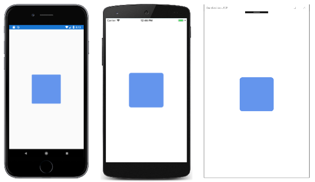
The sample displays a one-inch-square unconstrained BoxView in the center of its page:
<ContentPage xmlns="http://xamarin.com/schemas/2014/forms"
             xmlns:x="http://schemas.microsoft.com/winfx/2009/xaml"
             xmlns:local="clr-namespace:BasicBoxView"
             x:Class="BasicBoxView.MainPage">

    <BoxView Color="CornflowerBlue"
             CornerRadius="10"
             WidthRequest="160"
             HeightRequest="160"
             VerticalOptions="Center"
             HorizontalOptions="Center" />

</ContentPage>
Here's the result:
If the VerticalOptions and HorizontalOptions properties are removed from the BoxView tag or are set to Fill, then the BoxView becomes constrained by the size of the page, and expands to fill the page.
A BoxView can also be a child of an AbsoluteLayout. In that case, both the location and size of the BoxView are set using the LayoutBounds attached bindable property. The AbsoluteLayout is discussed in the article AbsoluteLayout.
You'll see examples of all these cases in the sample programs that follow.
Rendering Text Decorations
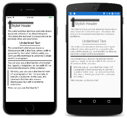
You can use the BoxView to add some simple decorations on your pages in the form of horizontal and vertical lines. The sample demonstrates this. All of the program's visuals are defined in the MainPage.xaml file, which contains several Label and BoxView elements in the StackLayout shown here:
<ContentPage xmlns="http://xamarin.com/schemas/2014/forms"
             xmlns:x="http://schemas.microsoft.com/winfx/2009/xaml"
             xmlns:local="clr-namespace:TextDecoration"
             x:Class="TextDecoration.MainPage">
    <ContentPage.Padding>
        <OnPlatform x:TypeArguments="Thickness">
            <On Platform="iOS" Value="0, 20, 0, 0" />
        </OnPlatform>
    </ContentPage.Padding>

    <ContentPage.Resources>
        <ResourceDictionary>
            <Style TargetType="BoxView">
                <Setter Property="Color" Value="Black" />
            </Style>
        </ResourceDictionary>
    </ContentPage.Resources>

    <ScrollView Margin="15">
        <StackLayout>

            ···

        </StackLayout>
    </ScrollView>
</ContentPage>
All of the markup that follows are children of the StackLayout. This markup consists of several types of decorative BoxView elements used with the Label element:
The stylish header at the top of the page is achieved with an AbsoluteLayout whose children are four BoxView elements and a Label, all of which are assigned specific locations and sizes:
<AbsoluteLayout>
    <BoxView AbsoluteLayout.LayoutBounds="0, 10, 200, 5" />
    <BoxView AbsoluteLayout.LayoutBounds="0, 20, 200, 5" />
    <BoxView AbsoluteLayout.LayoutBounds="10, 0, 5, 65" />
    <BoxView AbsoluteLayout.LayoutBounds="20, 0, 5, 65" />
    <Label Text="Stylish Header"
           FontSize="24"
           AbsoluteLayout.LayoutBounds="30, 25, AutoSize, AutoSize"/>
</AbsoluteLayout>
In the XAML file, the AbsoluteLayout is followed by a Label with formatted text that describes the AbsoluteLayout.
You can underline a text string by enclosing both the Label and BoxView in a StackLayout that has its HorizontalOptions value set to something other than Fill. The width of the StackLayout is then governed by the width of the Label, which then imposes that width on the BoxView. The BoxView is assigned only an explicit height:
<StackLayout HorizontalOptions="Center">
    <Label Text="Underlined Text"
           FontSize="24" />
    <BoxView HeightRequest="2" />
</StackLayout>
You can't use this technique to underline individual words within longer text strings or a paragraph.
It's also possible to use a BoxView to resemble an HTML hr (horizontal rule) element. Simply let the width of the BoxView be determined by its parent container, which in this case is the StackLayout:
<BoxView HeightRequest="3" />
Finally, you can draw a vertical line on one side of a paragraph of text by enclosing both the BoxView and the Label in a horizontal StackLayout. In this case, the height of the BoxView is the same as the height of StackLayout, which is governed by the height of the Label:
<StackLayout Orientation="Horizontal">
    <BoxView WidthRequest="4"
             Margin="0, 0, 10, 0" />
    <Label>

        ···

    </Label>
</StackLayout>
Listing Colors with BoxView
The BoxView is convenient for displaying colors. This program uses a ListView to list all the public static read-only fields of the Xamarin.Forms Color structure:
The sample program includes a class named NamedColor. The static constructor uses reflection to access all the fields of the Color structure and create a NamedColor object for each one. These are stored in the static All property:
public class NamedColor
{
    // Instance members.
    private NamedColor()
    {
    }

    public string Name { private set; get; }

    public string FriendlyName { private set; get; }

    public Color Color { private set; get; }

    public string RgbDisplay { private set; get; }

    // Static members.
    static NamedColor()
    {
        List<NamedColor> all = new List<NamedColor>();
        StringBuilder stringBuilder = new StringBuilder();

        // Loop through the public static fields of the Color structure.
        foreach (FieldInfo fieldInfo in typeof(Color).GetRuntimeFields ())
        {
            if (fieldInfo.IsPublic &&
                fieldInfo.IsStatic &&
                fieldInfo.FieldType == typeof (Color))
            {
                // Convert the name to a friendly name.
                string name = fieldInfo.Name;
                stringBuilder.Clear();
                int index = 0;

                foreach (char ch in name)
                {
                    if (index != 0 && Char.IsUpper(ch))
                    {
                        stringBuilder.Append(' ');
                    }
                    stringBuilder.Append(ch);
                    index++;
                }

                // Instantiate a NamedColor object.
                Color color = (Color)fieldInfo.GetValue(null);

                NamedColor namedColor = new NamedColor
                {
                    Name = name,
                    FriendlyName = stringBuilder.ToString(),
                    Color = color,
                    RgbDisplay = String.Format("{0:X2}-{1:X2}-{2:X2}",
                                               (int)(255 * color.R),
                                               (int)(255 * color.G),
                                               (int)(255 * color.B))
                };

                // Add it to the collection.
                all.Add(namedColor);
            }
        }
        all.TrimExcess();
        All = all;
    }

    public static IList<NamedColor> All { private set; get; }
}
The program visuals are described in the XAML file. The ItemsSource property of the ListView is set to the static NamedColor.All property, which means that the ListView displays all the individual NamedColor objects:
<ContentPage xmlns="http://xamarin.com/schemas/2014/forms"
             xmlns:x="http://schemas.microsoft.com/winfx/2009/xaml"
             xmlns:local="clr-namespace:ListViewColors"
             x:Class="ListViewColors.MainPage">
    <ContentPage.Padding>
        <OnPlatform x:TypeArguments="Thickness">
            <On Platform="iOS" Value="10, 20, 10, 0" />
            <On Platform="Android, UWP" Value="10, 0" />
        </OnPlatform>
    </ContentPage.Padding>

    <ListView SeparatorVisibility="None"
              ItemsSource="{x:Static local:NamedColor.All}">
        <ListView.RowHeight>
            <OnPlatform x:TypeArguments="x:Int32">
                <On Platform="iOS, Android" Value="80" />
                <On Platform="UWP" Value="90" />
            </OnPlatform>
        </ListView.RowHeight>

        <ListView.ItemTemplate>
            <DataTemplate>
                <ViewCell>
                    <ContentView Padding="5">
                        <Frame OutlineColor="Accent"
                               Padding="10">
                            <StackLayout Orientation="Horizontal">
                                <BoxView Color="{Binding Color}"
                                         WidthRequest="50"
                                         HeightRequest="50" />
                                <StackLayout>
                                    <Label Text="{Binding FriendlyName}"
                                           FontSize="22"
                                           VerticalOptions="StartAndExpand" />
                                    <Label Text="{Binding RgbDisplay, StringFormat='RGB = {0}'}"
                                           FontSize="16"
                                           VerticalOptions="CenterAndExpand" />
                                </StackLayout>
                            </StackLayout>
                        </Frame>
                    </ContentView>
                </ViewCell>
            </DataTemplate>
        </ListView.ItemTemplate>
    </ListView>
</ContentPage>
The NamedColor objects are formatted by the ViewCell object that is set as the data template of the ListView. This template includes a BoxView whose Color property is bound to the Color property of the NamedColor object.
Playing the Game of Life by Subclassing BoxView
The Game of Life is a cellular automaton invented by mathematician John Conway and popularized in the pages of Scientific American in the 1970s. A good introduction is provided by the Wikipedia article Conway's Game of Life.
The Xamarin.Forms sample program defines a class named LifeCell that derives from BoxView. This class encapsulates the logic of an individual cell in the Game of Life:
class LifeCell : BoxView
{
    bool isAlive;

    public event EventHandler Tapped;

    public LifeCell()
    {
        BackgroundColor = Color.White;

        TapGestureRecognizer tapGesture = new TapGestureRecognizer();
        tapGesture.Tapped += (sender, args) =>
        {
            Tapped?.Invoke(this, EventArgs.Empty);
        };
        GestureRecognizers.Add(tapGesture);
    }

    public int Col { set; get; }

    public int Row { set; get; }

    public bool IsAlive
    {
        set
        {
            if (isAlive != value)
            {
                isAlive = value;
                BackgroundColor = isAlive ? Color.Black : Color.White;
            }
        }
        get
        {
            return isAlive;
        }
    }
}
LifeCell adds three more properties to BoxView: the Col and Row properties store the position of the cell within the grid, and the IsAlive property indicates its state. The IsAlive property also sets the Color property of the BoxView to black if the cell is alive, and white if the cell is not alive.
LifeCell also installs a TapGestureRecognizer to allow the user to toggle the state of cells by tapping them. The class translates the Tapped event from the gesture recognizer into its own Tapped event.
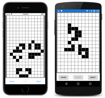
The GameOfLife program also includes a LifeGrid class that encapsulates much of the logic of the game, and a MainPage class that handles the program's visuals. These include an overlay that describes the rules of the game. Here is the program in action showing a couple hundred LifeCell objects on the page:
Creating a Digital Clock
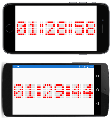
The sample program creates 210 BoxView elements to simulate the dots of an old-fashioned 5-by-7 dot-matrix display. You can read the time in either portrait or landscape mode, but it's larger in landscape:
The XAML file does little more than instantiate the AbsoluteLayout used for the clock:
<ContentPage xmlns="http://xamarin.com/schemas/2014/forms"
             xmlns:x="http://schemas.microsoft.com/winfx/2009/xaml"
             xmlns:local="clr-namespace:DotMatrixClock"
             x:Class="DotMatrixClock.MainPage"
             Padding="10"
             SizeChanged="OnPageSizeChanged">

    <AbsoluteLayout x:Name="absoluteLayout"
                    VerticalOptions="Center" />
</ContentPage>
Everything else occurs in the code-behind file. The dot-matrix display logic is greatly simplified by the definition of several arrays that describe the dots corresponding to each of the 10 digits and a colon:
public partial class MainPage : ContentPage
{
    // Total dots horizontally and vertically.
    const int horzDots = 41;
    const int vertDots = 7;

    // 5 x 7 dot matrix patterns for 0 through 9.
    static readonly int[, ,] numberPatterns = new int[10, 7, 5]
    {
        {
            { 0, 1, 1, 1, 0}, { 1, 0, 0, 0, 1}, { 1, 0, 0, 1, 1}, { 1, 0, 1, 0, 1},
            { 1, 1, 0, 0, 1}, { 1, 0, 0, 0, 1}, { 0, 1, 1, 1, 0}
        },
        {
            { 0, 0, 1, 0, 0}, { 0, 1, 1, 0, 0}, { 0, 0, 1, 0, 0}, { 0, 0, 1, 0, 0},
            { 0, 0, 1, 0, 0}, { 0, 0, 1, 0, 0}, { 0, 1, 1, 1, 0}
        },
        {
            { 0, 1, 1, 1, 0}, { 1, 0, 0, 0, 1}, { 0, 0, 0, 0, 1}, { 0, 0, 0, 1, 0},
            { 0, 0, 1, 0, 0}, { 0, 1, 0, 0, 0}, { 1, 1, 1, 1, 1}
        },
        {
            { 1, 1, 1, 1, 1}, { 0, 0, 0, 1, 0}, { 0, 0, 1, 0, 0}, { 0, 0, 0, 1, 0},
            { 0, 0, 0, 0, 1}, { 1, 0, 0, 0, 1}, { 0, 1, 1, 1, 0}
        },
        {
            { 0, 0, 0, 1, 0}, { 0, 0, 1, 1, 0}, { 0, 1, 0, 1, 0}, { 1, 0, 0, 1, 0},
            { 1, 1, 1, 1, 1}, { 0, 0, 0, 1, 0}, { 0, 0, 0, 1, 0}
        },
        {
            { 1, 1, 1, 1, 1}, { 1, 0, 0, 0, 0}, { 1, 1, 1, 1, 0}, { 0, 0, 0, 0, 1},
            { 0, 0, 0, 0, 1}, { 1, 0, 0, 0, 1}, { 0, 1, 1, 1, 0}
        },
        {
            { 0, 0, 1, 1, 0}, { 0, 1, 0, 0, 0}, { 1, 0, 0, 0, 0}, { 1, 1, 1, 1, 0},
            { 1, 0, 0, 0, 1}, { 1, 0, 0, 0, 1}, { 0, 1, 1, 1, 0}
        },
        {
            { 1, 1, 1, 1, 1}, { 0, 0, 0, 0, 1}, { 0, 0, 0, 1, 0}, { 0, 0, 1, 0, 0},
            { 0, 1, 0, 0, 0}, { 0, 1, 0, 0, 0}, { 0, 1, 0, 0, 0}
        },
        {
            { 0, 1, 1, 1, 0}, { 1, 0, 0, 0, 1}, { 1, 0, 0, 0, 1}, { 0, 1, 1, 1, 0},
            { 1, 0, 0, 0, 1}, { 1, 0, 0, 0, 1}, { 0, 1, 1, 1, 0}
        },
        {
            { 0, 1, 1, 1, 0}, { 1, 0, 0, 0, 1}, { 1, 0, 0, 0, 1}, { 0, 1, 1, 1, 1},
            { 0, 0, 0, 0, 1}, { 0, 0, 0, 1, 0}, { 0, 1, 1, 0, 0}
        },
    };

    // Dot matrix pattern for a colon.
    static readonly int[,] colonPattern = new int[7, 2]
    {
        { 0, 0 }, { 1, 1 }, { 1, 1 }, { 0, 0 }, { 1, 1 }, { 1, 1 }, { 0, 0 }
    };

    // BoxView colors for on and off.
    static readonly Color colorOn = Color.Red;
    static readonly Color colorOff = new Color(0.5, 0.5, 0.5, 0.25);

    // Box views for 6 digits, 7 rows, 5 columns.
    BoxView[, ,] digitBoxViews = new BoxView[6, 7, 5];

    ···

}
These fields conclude with a three-dimensional array of BoxView elements for storing the dot patterns for the six digits.
The constructor creates all the BoxView elements for the digits and colon, and also initializes the Color property of the BoxView elements for the colon:
public partial class MainPage : ContentPage
{

    ···

    public MainPage()
    {
        InitializeComponent();

        // BoxView dot dimensions.
        double height = 0.85 / vertDots;
        double width = 0.85 / horzDots;

        // Create and assemble the BoxViews.
        double xIncrement = 1.0 / (horzDots - 1);
        double yIncrement = 1.0 / (vertDots - 1);
        double x = 0;

        for (int digit = 0; digit < 6; digit++)
        {
            for (int col = 0; col < 5; col++)
            {
                double y = 0;

                for (int row = 0; row < 7; row++)
                {
                    // Create the digit BoxView and add to layout.
                    BoxView boxView = new BoxView();
                    digitBoxViews[digit, row, col] = boxView;
                    absoluteLayout.Children.Add(boxView,
                                                new Rectangle(x, y, width, height),
                                                AbsoluteLayoutFlags.All);
                    y += yIncrement;
                }
                x += xIncrement;
            }
            x += xIncrement;

            // Colons between the hours, minutes, and seconds.
            if (digit == 1 || digit == 3)
            {
                int colon = digit / 2;

                for (int col = 0; col < 2; col++)
                {
                    double y = 0;

                    for (int row = 0; row < 7; row++)
                    {
                        // Create the BoxView and set the color.
                        BoxView boxView = new BoxView
                            {
                                Color = colonPattern[row, col] == 1 ?
                                            colorOn : colorOff
                            };
                        absoluteLayout.Children.Add(boxView,
                                                    new Rectangle(x, y, width, height),
                                                    AbsoluteLayoutFlags.All);
                        y += yIncrement;
                    }
                    x += xIncrement;
                }
                x += xIncrement;
            }
        }

        // Set the timer and initialize with a manual call.
        Device.StartTimer(TimeSpan.FromSeconds(1), OnTimer);
        OnTimer();
    }

    ···

}
This program uses the relative positioning and sizing feature of AbsoluteLayout. The width and height of each BoxView are set to fractional values, specifically 85% of 1 divided by the number of horizontal and vertical dots. The positions are also set to fractional values.
Because all the positions and sizes are relative to the total size of the AbsoluteLayout, the SizeChanged handler for the page need only set a HeightRequest of the AbsoluteLayout:
public partial class MainPage : ContentPage
{

    ···

    void OnPageSizeChanged(object sender, EventArgs args)
    {
        // No chance a display will have an aspect ratio > 41:7
        absoluteLayout.HeightRequest = vertDots * Width / horzDots;
    }

    ···

}
The width of the AbsoluteLayout is automatically set because it stretches to the full width of the page.
The final code in the MainPage class processes the timer callback and colors the dots of each digit. The definition of the multi-dimensional arrays at the beginning of the code-behind file helps make this logic the simplest part of the program:
public partial class MainPage : ContentPage
{

    ···

    bool OnTimer()
    {
        DateTime dateTime = DateTime.Now;

        // Convert 24-hour clock to 12-hour clock.
        int hour = (dateTime.Hour + 11) % 12 + 1;

        // Set the dot colors for each digit separately.
        SetDotMatrix(0, hour / 10);
        SetDotMatrix(1, hour % 10);
        SetDotMatrix(2, dateTime.Minute / 10);
        SetDotMatrix(3, dateTime.Minute % 10);
        SetDotMatrix(4, dateTime.Second / 10);
        SetDotMatrix(5, dateTime.Second % 10);
        return true;
    }

    void SetDotMatrix(int index, int digit)
    {
        for (int row = 0; row < 7; row++)
            for (int col = 0; col < 5; col++)
            {
                bool isOn = numberPatterns[digit, row, col] == 1;
                Color color = isOn ? colorOn : colorOff;
                digitBoxViews[index, row, col].Color = color;
            }
    }
}
Creating an Analog Clock
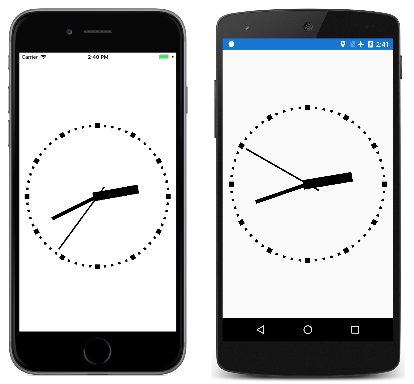
A dot-matrix clock might seem to be an obvious application of BoxView, but BoxView elements are also capable of realizing an analog clock:
All the visuals in the sample program are children of an AbsoluteLayout. These elements are sized using the LayoutBounds attached property, and rotated using the Rotation property.
The three BoxView elements for the hands of the clock are instantiated in the XAML file, but not positioned or sized:
<ContentPage xmlns="http://xamarin.com/schemas/2014/forms"
             xmlns:x="http://schemas.microsoft.com/winfx/2009/xaml"
             xmlns:local="clr-namespace:BoxViewClock"
             x:Class="BoxViewClock.MainPage">
    <ContentPage.Padding>
        <OnPlatform x:TypeArguments="Thickness">
            <On Platform="iOS" Value="0, 20, 0, 0" />
        </OnPlatform>
    </ContentPage.Padding>

    <AbsoluteLayout x:Name="absoluteLayout"
                    SizeChanged="OnAbsoluteLayoutSizeChanged">

        <BoxView x:Name="hourHand"
                 Color="Black" />

        <BoxView x:Name="minuteHand"
                 Color="Black" />

        <BoxView x:Name="secondHand"
                 Color="Black" />
    </AbsoluteLayout>
</ContentPage>
The constructor of the code-behind file instantiates the 60 BoxView elements for the tick marks around the circumference of the clock:
public partial class MainPage : ContentPage
{

    ···

    BoxView[] tickMarks = new BoxView[60];

    public MainPage()
    {
        InitializeComponent();

        // Create the tick marks (to be sized and positioned later).
        for (int i = 0; i < tickMarks.Length; i++)
        {
            tickMarks[i] = new BoxView { Color = Color.Black };
            absoluteLayout.Children.Add(tickMarks[i]);
        }

        Device.StartTimer(TimeSpan.FromSeconds(1.0 / 60), OnTimerTick);
    }

    ···

}
The sizing and positioning of all the BoxView elements occurs in the SizeChanged handler for the AbsoluteLayout. A little structure internal to the class called HandParams describes the size of each of the three hands relative to the total size of the clock:
public partial class MainPage : ContentPage
{
    // Structure for storing information about the three hands.
    struct HandParams
    {
        public HandParams(double width, double height, double offset) : this()
        {
            Width = width;
            Height = height;
            Offset = offset;
        }

        public double Width { private set; get; }   // fraction of radius
        public double Height { private set; get; }  // ditto
        public double Offset { private set; get; }  // relative to center pivot
    }

    static readonly HandParams secondParams = new HandParams(0.02, 1.1, 0.85);
    static readonly HandParams minuteParams = new HandParams(0.05, 0.8, 0.9);
    static readonly HandParams hourParams = new HandParams(0.125, 0.65, 0.9);

    ···

 }
The SizeChanged handler determines the center and radius of the AbsoluteLayout, and then sizes and positions the 60 BoxView elements used as tick marks. The for loop concludes by setting the Rotation property of each of these BoxView elements. At the end of the SizeChanged handler, the LayoutHand method is called to size and position the three hands of the clock:
public partial class MainPage : ContentPage
{

    ···

    void OnAbsoluteLayoutSizeChanged(object sender, EventArgs args)
    {
        // Get the center and radius of the AbsoluteLayout.
        Point center = new Point(absoluteLayout.Width / 2, absoluteLayout.Height / 2);
        double radius = 0.45 * Math.Min(absoluteLayout.Width, absoluteLayout.Height);

        // Position, size, and rotate the 60 tick marks.
        for (int index = 0; index < tickMarks.Length; index++)
        {
            double size = radius / (index % 5 == 0 ? 15 : 30);
            double radians = index * 2 * Math.PI / tickMarks.Length;
            double x = center.X + radius * Math.Sin(radians) - size / 2;
            double y = center.Y - radius * Math.Cos(radians) - size / 2;
            AbsoluteLayout.SetLayoutBounds(tickMarks[index], new Rectangle(x, y, size, size));
            tickMarks[index].Rotation = 180 * radians / Math.PI;
        }

        // Position and size the three hands.
        LayoutHand(secondHand, secondParams, center, radius);
        LayoutHand(minuteHand, minuteParams, center, radius);
        LayoutHand(hourHand, hourParams, center, radius);
    }

    void LayoutHand(BoxView boxView, HandParams handParams, Point center, double radius)
    {
        double width = handParams.Width * radius;
        double height = handParams.Height * radius;
        double offset = handParams.Offset;

        AbsoluteLayout.SetLayoutBounds(boxView,
            new Rectangle(center.X - 0.5 * width,
                          center.Y - offset * height,
                          width, height));

        // Set the AnchorY property for rotations.
        boxView.AnchorY = handParams.Offset;
    }

    ···

}
The LayoutHand method sizes and positions each hand to point straight up to the 12:00 position. At the end of the method, the AnchorY property is set to a position corresponding to the center of the clock. This indicates the center of rotation.
The hands are rotated in the timer callback function:
public partial class MainPage : ContentPage
{

    ···

    bool OnTimerTick()
    {
        // Set rotation angles for hour and minute hands.
        DateTime dateTime = DateTime.Now;
        hourHand.Rotation = 30 * (dateTime.Hour % 12) + 0.5 * dateTime.Minute;
        minuteHand.Rotation = 6 * dateTime.Minute + 0.1 * dateTime.Second;

        // Do an animation for the second hand.
        double t = dateTime.Millisecond / 1000.0;

        if (t < 0.5)
        {
            t = 0.5 * Easing.SpringIn.Ease(t / 0.5);
        }
        else
        {
            t = 0.5 * (1 + Easing.SpringOut.Ease((t - 0.5) / 0.5));
        }

        secondHand.Rotation = 6 * (dateTime.Second + t);
        return true;
    }
}
The second hand is treated a little differently: An animation easing function is applied to make the movement seem mechanical rather than smooth. On each tick, the second hand pulls back a little and then overshoots its destination. This little bit of code adds a lot to the realism of the movement.
