หมายเหตุ
การเข้าถึงหน้านี้ต้องได้รับการอนุญาต คุณสามารถลอง ลงชื่อเข้าใช้หรือเปลี่ยนไดเรกทอรีได้
การเข้าถึงหน้านี้ต้องได้รับการอนุญาต คุณสามารถลองเปลี่ยนไดเรกทอรีได้
Note
This book was published in the spring of 2016, and has not been updated since then. There is much in the book that remains valuable, but some of the material is outdated, and some topics are no longer entirely correct or complete.
A Xamarin.Forms view appears on the screen in a location and size determined by its parent, which is generally a Layout or Layout<View> derivative. The transform is a Xamarin.Forms feature that can modify that location, size, or even orientation.
Xamarin.Forms supports three basic types of transforms:
- Translation — shift an element horizontally or vertically
- Scale — change the size of an element
- Rotation — turn an element around a point or axis
In Xamarin.Forms, the scaling is isotropic; it affects the width and height uniformly. Rotation is supported both on the two-dimensional surface of the screen and in 3D space. There is no skew (or sheer) transform, and no generalized matrix transform.
Transforms are supported with eight properties of type double defined by the VisualElement class:
All these properties are backed by bindable properties. They can be targets of data binding and styled. Chapter 22. Animation demonstrates how these properties can be animated, but some samples in this chapter show how you can animate them using the Xamarin.Forms timer.
Transform properties affect only how the element is rendered, and do not affect how the element is perceived in layout.
The translation transform
Nonzero values of the TranslationX
and TranslationY properties shift an element horizontally or vertically.
The TranslationDemo program allows you to experiment with these properties with two Slider elements that control the TranslationX and TranslationY properties of a Frame. The transform also affects all children of that Frame.
Text effects
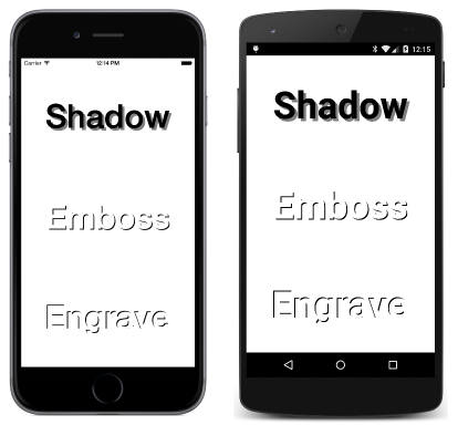
One common use of the translation properties is to offset slightly the rendering of text. This is demonstrated in the TextOffsets sample:
Another effect is to render multiple copies of a Label to resemble a 3D block, such as demonstrated in the BlockText sample.
Jumps and animations
The
ButtonJump sample uses translation to move a Button whenever it's tapped, but the primary intent is to demonstrate that the Button receives user input at the location where the button is rendered.
The ButtonGlide sample is similar but uses a timer to animate the Button from one point to another.
The scale transform
The Scale transform can increase or decrease the rendered size of the element. The default value is 1. A value of 0 causes the element to be invisible. Negative values cause the element to appear to be rotated 180 degrees. The Scale property does not affect the Width or Height properties of the element. Those values remain the same.
You can experiment with the Scale property using the SimpleScaleDemo sample.
The ButtonScaler sample demonstrates the difference between animating the Scale property of a Button and animating the FontSize property. The FontSize property affects how the Button is perceived in layout; the Scale property does not.
The ScaleToSize sample calculates a Scale property that is applied to a Label element to make it as large as possible while still fitting within the page.
Anchoring the scale
The elements scaled in the previous three samples have all increased or decreased in size relative to the center of the element. In other words, the element increases or decreases in size the same in all directions. Only the point at the center of the element remains in the same location during the scaling.
You can change the center of the scaling by setting the AnchorX and
AnchorY properties. These properties are relative to the element itself. For AnchorX, a value of 0 refers to the left side of the element and 1 refers to the right side. Similarly for AnchorY, 0 is the top and 1 is the bottom. Both properties have default values of 0.5, which is the center.
The
AnchoredScaleDemo sample allows you to experiment with the AnchorX and AnchorY properties as well as the Scale property.
On iOS, using non-default values of AnchorX and AnchorY properties is generally incompatible with phone orientation changes.
The rotation transform
The Rotation property is specified in degrees and indicates clockwise rotation around a point of the element defined by AnchorX and AnchorY. The PlaneRotationDemo allows you to experiment with these three properties.
Rotated text effects
The BoxViewCircle sample demonstrates the mathematics necessary to draw a circle using 64 tiny rotated BoxView elements.
The RotatedText sample displays multiple Label elements with the same text string rotated to appear like spokes.
The CircularText sample displays a text string that appears to wrap in a circle.
An analog clock
The Xamarin.FormsBook.Toolkit library contains an AnalogClockViewModel class that calculates angles for the hands of a clock. To avoid platform dependencies in the ViewModel, the class uses Task.Delay rather than a timer for finding a new DateTime value.
Also included in Xamarin.FormsBook.Toolkit is a SecondTickConverter class that implements IValueConverter and serves to round a second angle to the nearest second.
The MinimalBoxViewClock uses three rotating BoxView elements to draw an analog clock.
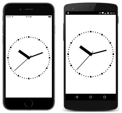
The BoxViewClock uses BoxView for more extensive graphics, including tick marks around the face of the clock, and hands that rotate a little distance from their ends:
In addition a SecondBackEaseConverter class in Xamarin.FormsBook.Toolkit causes the second hand to appear to pull back a little before jumping ahead, and then to move back into its correct position.
Vertical sliders?
The VerticalSliders sample demonstrates that Slider elements can be rotated 90 degrees and still function. However, it's difficult to position these rotated Slider elements because in layout they still appear to be horizontal.
3D-ish rotations
The RotationX property appears to rotate an element around a 3D X-axis so that the top and bottom of the element seem to move towards or away from the viewer. Similarly, the RotationY seems to rotate an element around the Y-axis to make the left and right sides of the element seem to move towards or away from the viewer.
The AnchorX property affects RotationY but not RotationX. The AnchorY property affects RotationX but not RotationY. You can experiment with the ThreeDeeRotationDemo sample to explore the interactions of these properties.
The 3D coordinate system implied by Xamarin.Forms is left-handed. If you point the forefinger of your left hand in the direction of increasing X coordinates (to the right) and your middle finger in the direction of increasing Y coordinates (down), then your thumb points in the direction of increasing Z coordinates (out of the screen).
Also, for any of the three axis, if you point your left-hand thumb in the direction of increasing values, then the curve of your fingers indicates the direction of rotation for positive rotating angles.

