Using the Xamarin.Android Designer
This article is a walkthrough of the Xamarin.Android Designer. It demonstrates how to create a user interface for a small color browser app; this user interface is created entirely in the Designer.
Overview
Android user interfaces can be created declaratively by using XML files or programmatically by writing code. The Xamarin.Android Designer allows developers to create and modify declarative layouts visually, without requiring hand-editing of XML files. The Designer also provides real-time feedback that lets the developer evaluate UI changes without having to redeploy the application to a device or to an emulator. These Designer features can speed up Android UI development tremendously. This article demonstrates how to use the Xamarin.Android Designer to visually create a user interface.
Tip
Newer releases of Visual Studio support opening .xml files inside the Android Designer.
Both .axml and .xml files are supported in the Android Designer.
Walkthrough
The objective of this walkthrough is to use the Android Designer to create a user interface for an example color browser app. The color browser app presents a list of colors, their names, and their RGB values. You'll learn how to add widgets to the Design Surface as well as how to lay out these widgets visually. After that, you'll learn how to modify widgets interactively on the Design Surface or by using the Designer's Properties pane. Finally, you'll see how the design looks when the app runs on a device or emulator.
Creating a new project
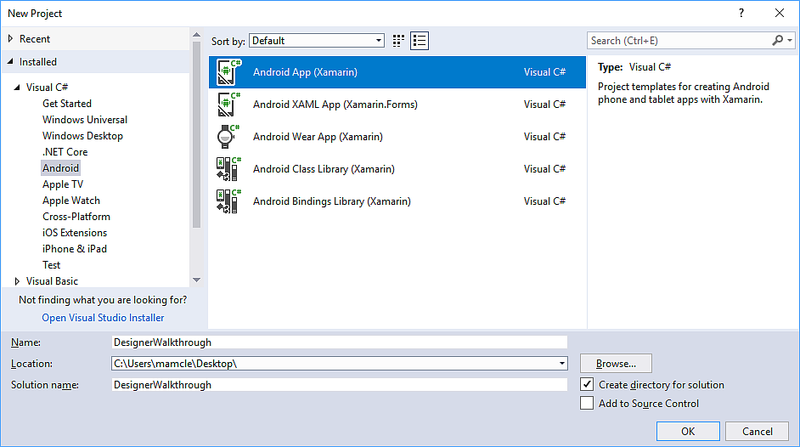
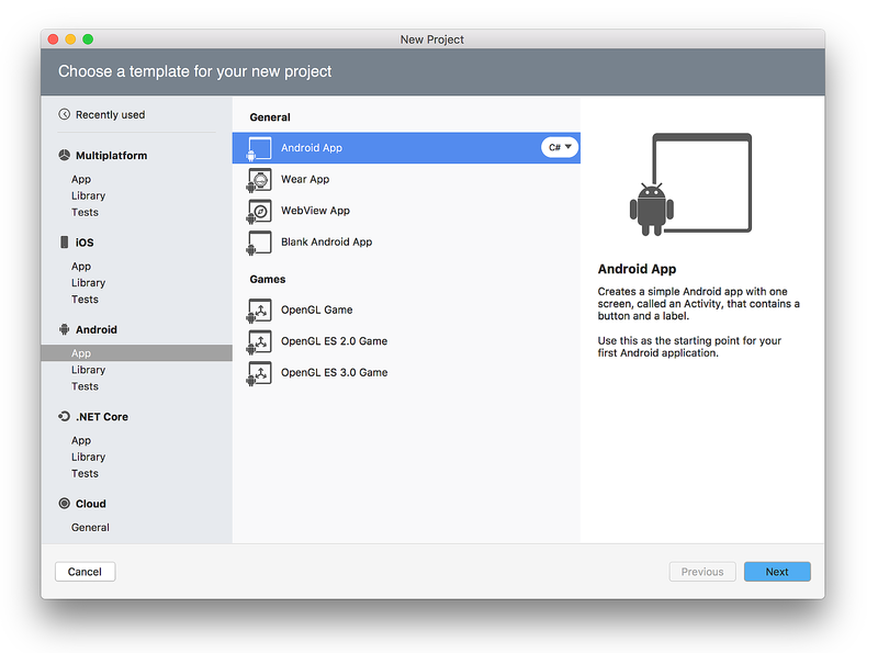
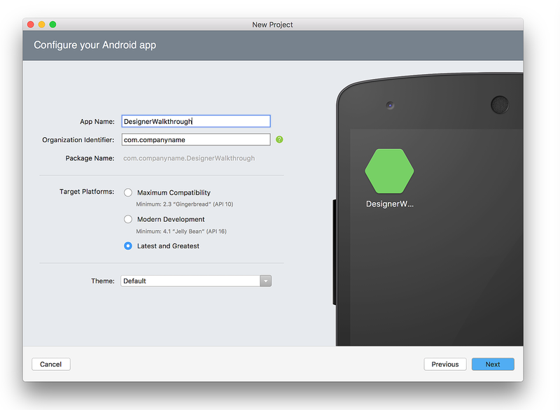
The first step is to create a new Xamarin.Android project. Launch Visual Studio, click New Project..., and choose the Visual C# > Android > Android App (Xamarin) template. Name the new app DesignerWalkthrough and click OK.
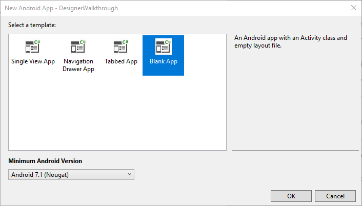
In the New Android App dialog, choose Blank App and click OK:
Adding a layout
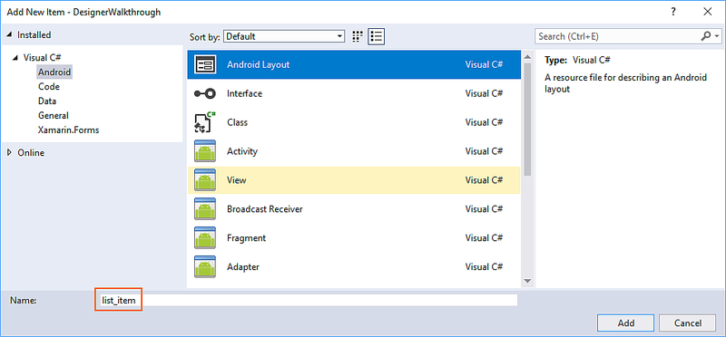
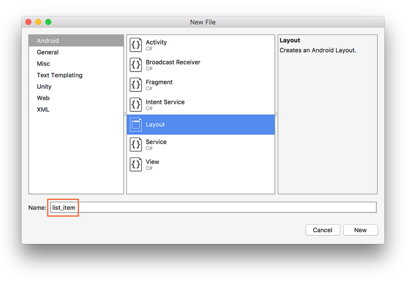
The next step is to create a LinearLayout that will hold the user interface elements. Right-click Resources/layout in the Solution Explorer and select Add > New Item.... In the Add New Item dialog, select Android Layout. Name the file list_item and click Add:
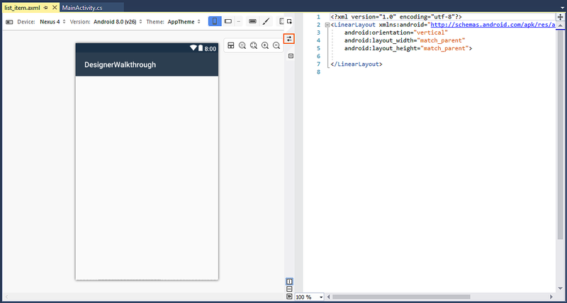
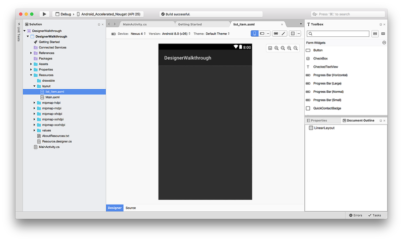
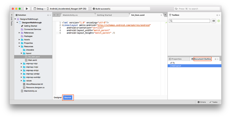
The new list_item layout is displayed in the Designer. Notice that two panes are displayed – the Design Surface for the list_item is visible in the left pane while its XML source is shown on the right pane. You can swap the positions of the Design Surface and Source panes by clicking the Swap Panes icon located between the two panes:
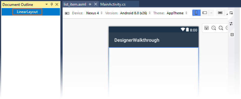
From the View menu, click Other Windows > Document Outline to open the Document Outline. The Document Outline shows that the layout currently contains a single LinearLayout widget:
The next step is to create the user interface for the color browser
app within this LinearLayout.
Creating the List Item user interface
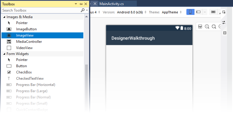
If the Toolbox pane is not showing, click the Toolbox tab on
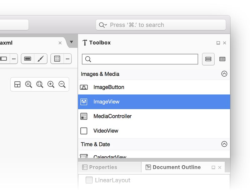
the left. In the Toolbox, scroll down to the Images & Media
section and scroll down further until you locate an ImageView:
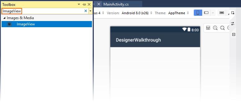
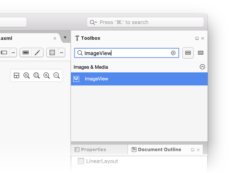
Alternately, you can enter ImageView into the search bar to locate
the ImageView:
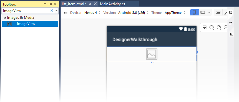
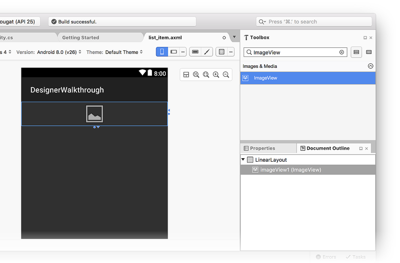
Drag this ImageView onto the Design Surface (this ImageView will be
used to display a color swatch in the color browser app):
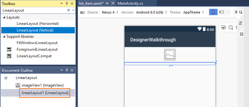
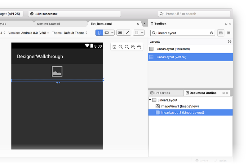
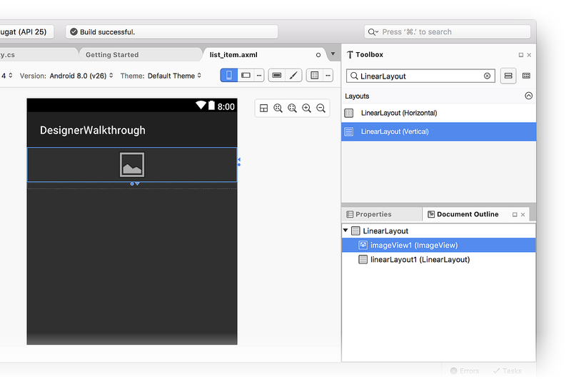
Next, drag a LinearLayout (Vertical) widget from the Toolbox into
the Designer. Notice that a blue outline indicates the boundaries of
the added LinearLayout. The Document Outline shows that it is a
child of LinearLayout, located under imageView1 (ImageView):
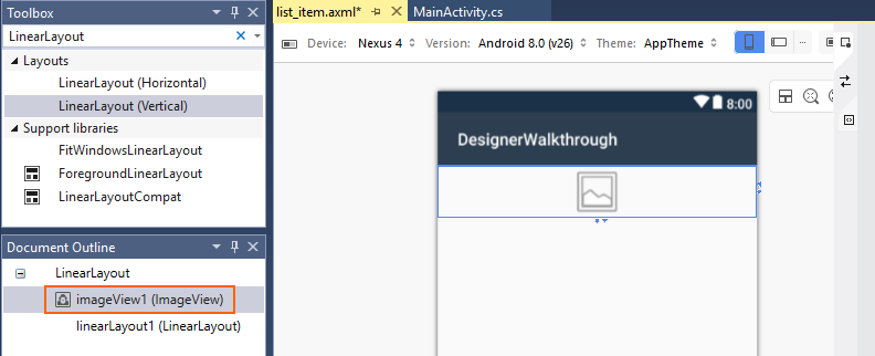
When you select the ImageView in the Designer, the blue outline moves
to surround the ImageView. In addition, the selection moves to
imageView1 (ImageView) in the Document Outline:
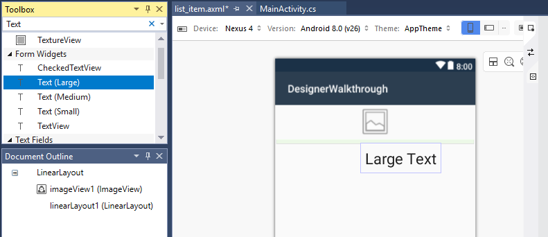
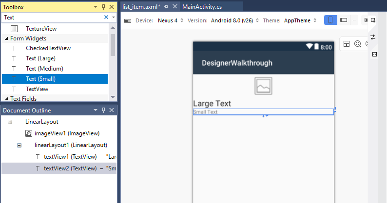
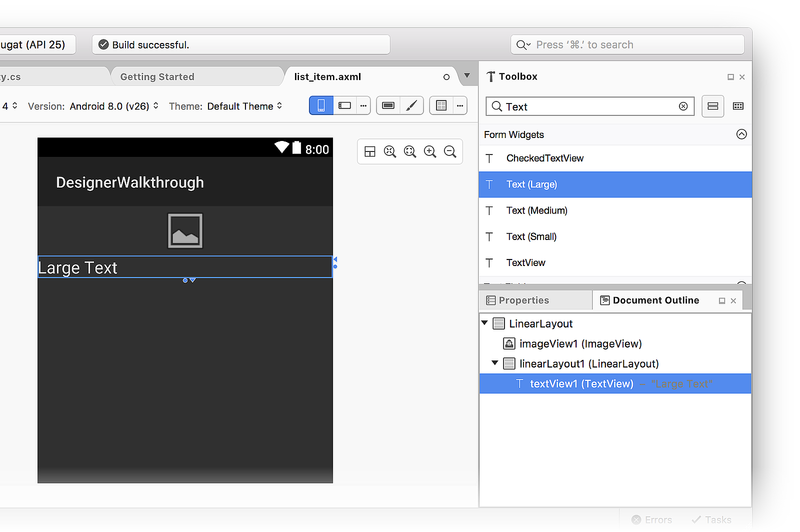
Next, drag a Text (Large) widget from the Toolbox into the
newly-added LinearLayout. Notice that the Designer uses green
highlights to indicate where the new widget will be inserted:
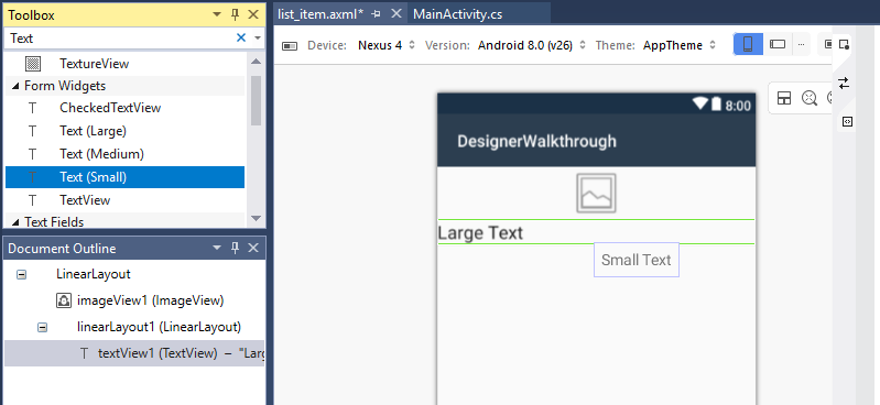
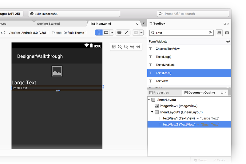
Next, add a Text (Small) widget below the Text (Large) widget:
At this point, the Designer surface should resemble the following screenshot:
If the two textView widgets are not inside linearLayout1, you can
drag them to linearLayout1 in the Document Outline and position
them so they appear as shown in the previous screenshot (indented under
linearLayout1).
Arranging the user interface
The next step is to modify the UI to display the ImageView on the
left, with the two TextView widgets stacked to the right of the
ImageView.
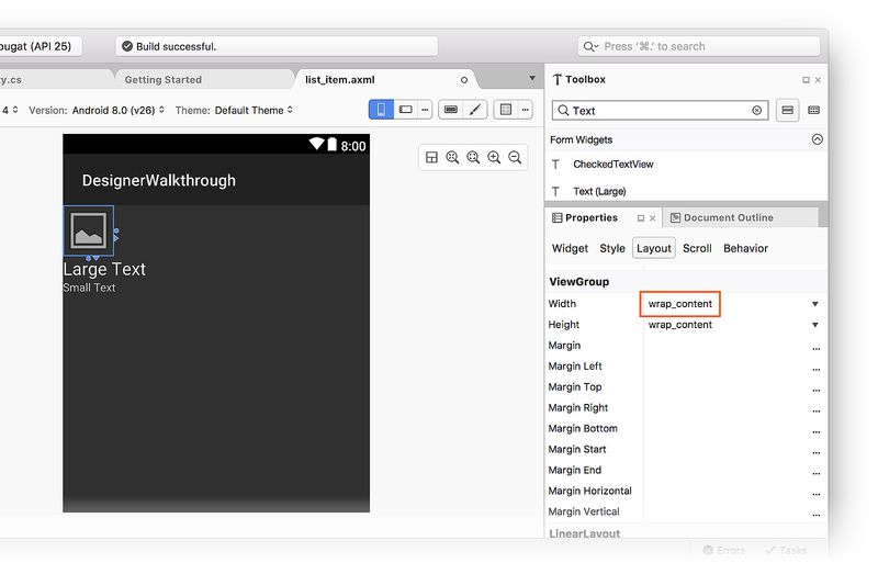
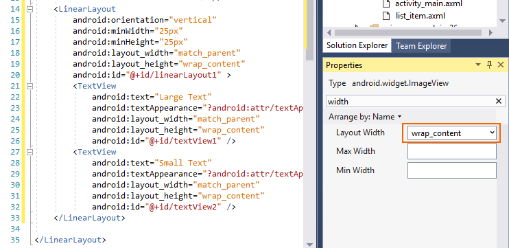
Select the
ImageView.In the Properties window, enter width in the search box and locate Layout Width.
Change the Layout Width setting to
wrap_content:
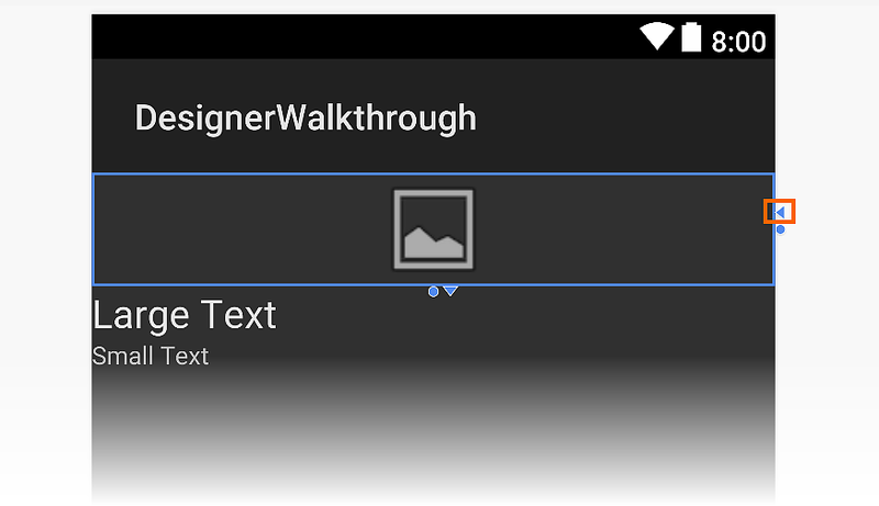
Another way to change the Width setting is to click the triangle
on the right-hand side of the widget to toggle its width setting to
wrap_content:
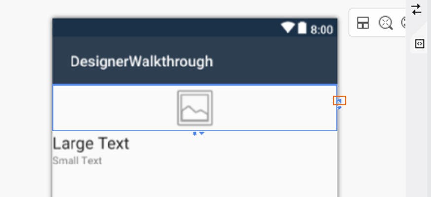
Clicking the triangle again returns the Width setting to
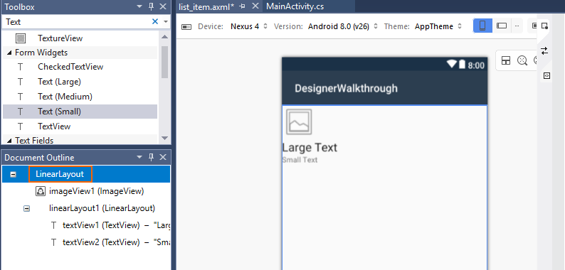
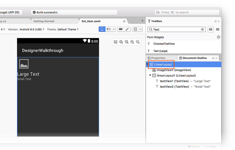
match_parent. Next, go to the Document Outline pane and select
the root LinearLayout:
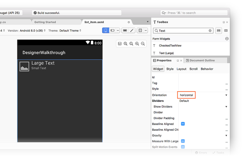
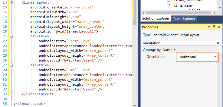
With the root LinearLayout selected, return to the Properties
pane, enter orientation into the search box and locate the
Orientation setting. Change Orientation to horizontal:
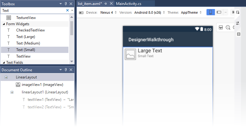
At this point, the Designer surface should resemble the following screenshot.
Notice that the TextView widgets have been moved to the right of the ImageView:
Modifying the spacing
The next step is to modify padding and margin settings in the UI to
provide more space between the widgets. Select the ImageView on the
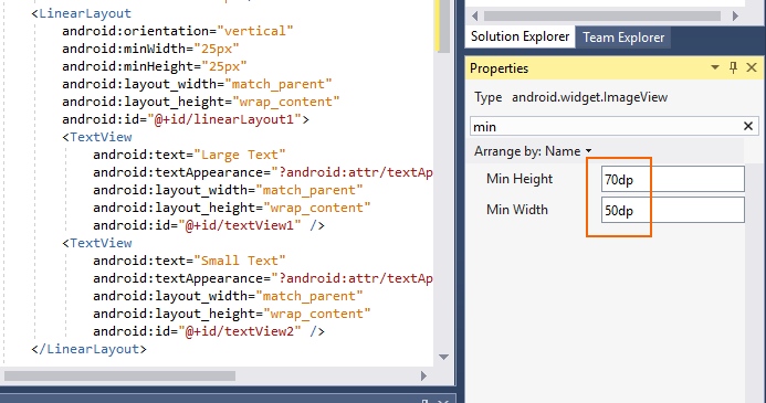
Design surface. In the Properties pane, enter min in the search
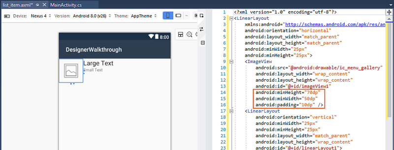
box. Enter 70dp for Min Height and 50dp for Min Width:
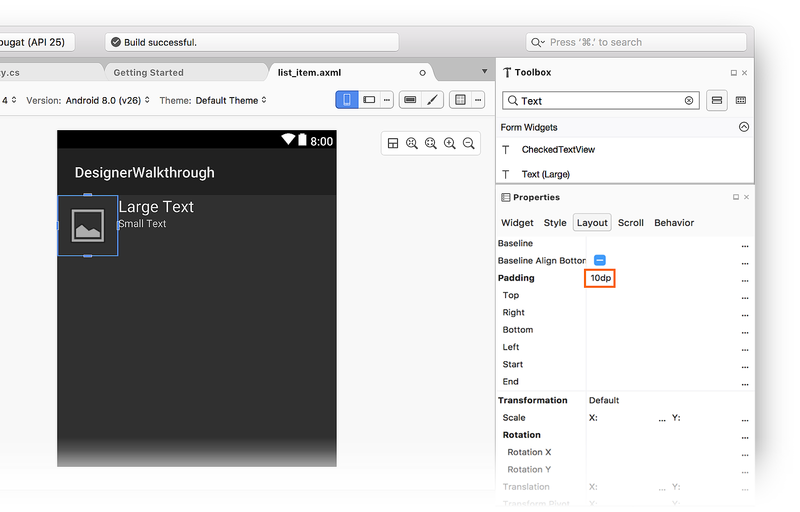
In the Properties pane, enter padding in the search box and enter
10dp for Padding. These minHeight, minWidth and padding
settings add padding around all sides of the ImageView and elongate
it vertically. Notice that the layout XML changes as you enter these
values:
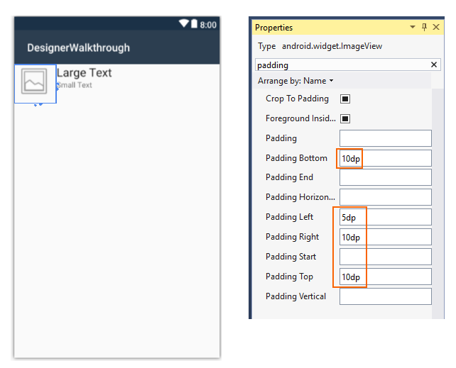
The bottom, left, right, and top padding settings can be set
independently by entering values into the Padding Bottom, Padding
Left, Padding Right, and Padding Top fields, respectively.
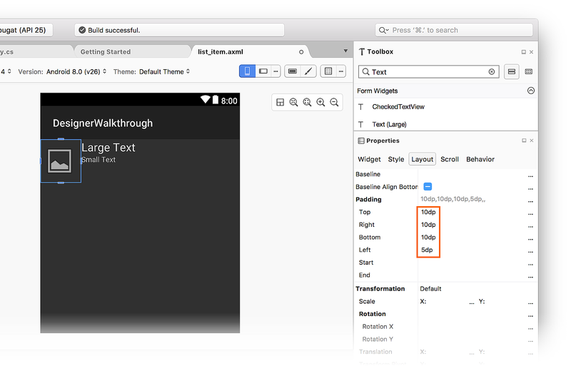
For example, set the Padding Left field to 5dp and the Padding
Bottom, Padding Right, and Padding Top fields to 10dp:
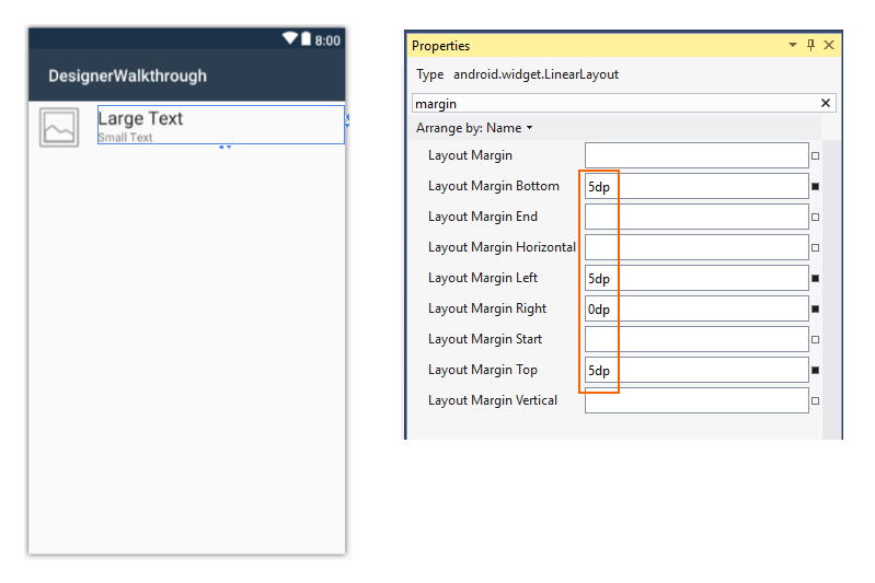
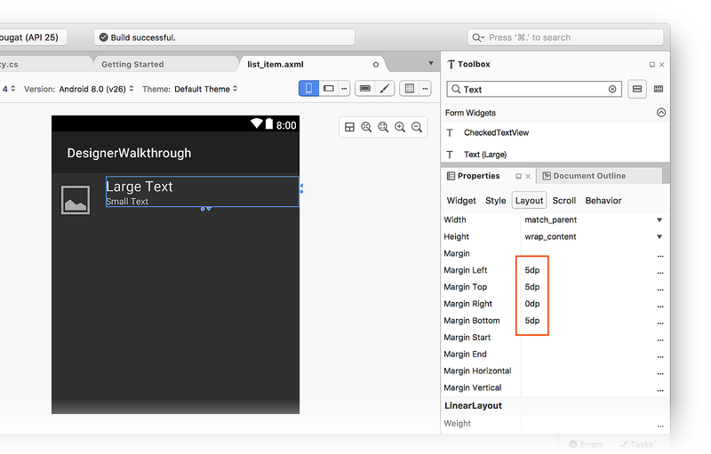
Next, adjust the position of the LinearLayout widget that contains the
two TextView widgets. In the Document Outline, select
linearLayout1. In the Properties window, enter margin in the
search box. Set Layout Margin Bottom, Layout Margin Left, and
Layout Margin Top to 5dp. Set Layout Margin Right to 0dp:
Removing the default image
Because the ImageView is being used to display colors (rather than
images), the next step is to remove the default image source added by
the template.
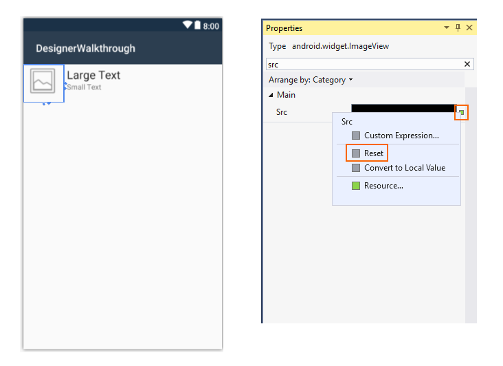
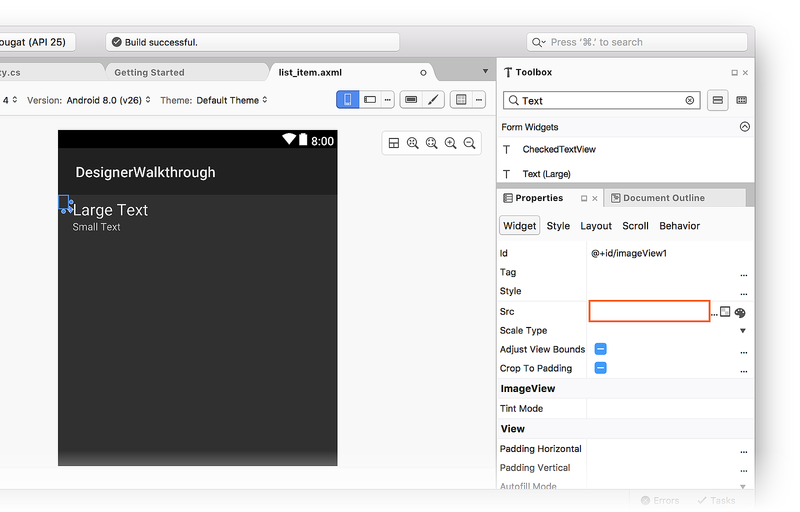
Select the
ImageViewon the Designer Surface.In Properties, enter src in the search box.
Click the small square to the right of the Src property setting and select Reset:
This removes android:src="@android:drawable/ic_menu_gallery" from the
source XML for that ImageView.
Adding a ListView container
Now that the list_item layout is defined, the next step is to add a
ListView to the Main layout. This ListView will contain a list of
list_item.
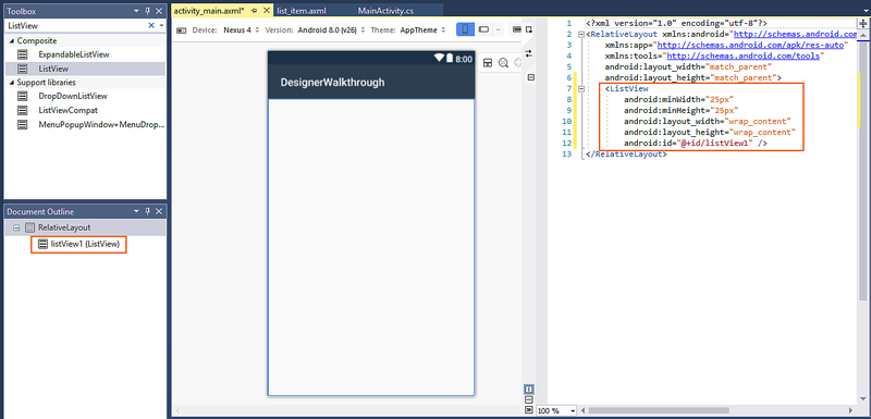
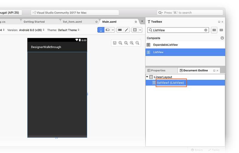
In the Solution Explorer, open
Resources/layout/activity_main.axml. In the ToolBox, locate the
ListView widget and drag it onto the Design Surface. The ListView
in the Designer will be blank except for blue lines that outline its
border when it is selected. You can view the Document Outline to
verify that the ListView was added correctly:
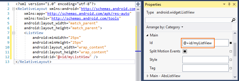
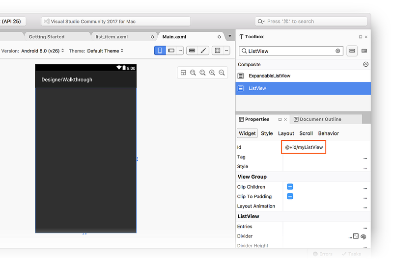
By default, the ListView is given an Id value of @+id/listView1.
While listView1 is still selected in the Document Outline, open
the Properties pane, click Arrange by, and select Category.
Open Main, locate the Id property, and change its value to
@+id/myListView:
At this point, the user interface is ready to use.
Running the application
Open MainActivity.cs and replace its code with the following:
using Android.App;
using Android.Widget;
using Android.Views;
using Android.OS;
using Android.Support.V7.App;
using System.Collections.Generic;

namespace DesignerWalkthrough
{
    [Activity(Label = "@string/app_name", Theme = "@style/AppTheme", MainLauncher = true)]
    public class MainActivity : AppCompatActivity
    {
        List<ColorItem> colorItems = new List<ColorItem>();
        ListView listView;

        protected override void OnCreate(Bundle savedInstanceState)
        {
            base.OnCreate(savedInstanceState);

            // Set our view from the "main" layout resource
            SetContentView(Resource.Layout.activity_main);
            listView = FindViewById<ListView>(Resource.Id.myListView);

            colorItems.Add(new ColorItem()
            {
                Color = Android.Graphics.Color.DarkRed,
                ColorName = "Dark Red",
                Code = "8B0000"
            });
            colorItems.Add(new ColorItem()
            {
                Color = Android.Graphics.Color.SlateBlue,
                ColorName = "Slate Blue",
                Code = "6A5ACD"
            });
            colorItems.Add(new ColorItem()
            {
                Color = Android.Graphics.Color.ForestGreen,
                ColorName = "Forest Green",
                Code = "228B22"
            });

            listView.Adapter = new ColorAdapter(this, colorItems);
        }
    }

    public class ColorAdapter : BaseAdapter<ColorItem>
    {
        List<ColorItem> items;
        Activity context;
        public ColorAdapter(Activity context, List<ColorItem> items)
            : base()
        {
            this.context = context;
            this.items = items;
        }
        public override long GetItemId(int position)
        {
            return position;
        }
        public override ColorItem this[int position]
        {
            get { return items[position]; }
        }
        public override int Count
        {
            get { return items.Count; }
        }
        public override View GetView(int position, View convertView, ViewGroup parent)
        {
            var item = items[position];

            View view = convertView;
            if (view == null) // no view to re-use, create new
                view = context.LayoutInflater.Inflate(Resource.Layout.list_item, null);
            view.FindViewById<TextView>(Resource.Id.textView1).Text = item.ColorName;
            view.FindViewById<TextView>(Resource.Id.textView2).Text = item.Code;
            view.FindViewById<ImageView>(Resource.Id.imageView1).SetBackgroundColor(item.Color);

            return view;
        }
    }

    public class ColorItem
    {
        public string ColorName { get; set; }
        public string Code { get; set; }
        public Android.Graphics.Color Color { get; set; }
    }
}
This code uses a custom ListView adapter to load color information
and to display this data in the UI that was just created. To keep this
example short, the color information is hard-coded in a list, but the
adapter could be modified to extract color information from a data
source or to calculate it on the fly. For more information about
ListView adapters, see
ListView.
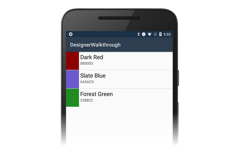
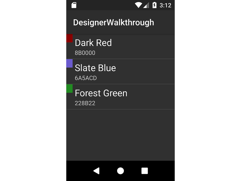
Build and run the application. The following screenshot is an example of how the app appears when running on a device:
Summary
This article walked through the process of using the Xamarin.Android Designer in Visual Studio to create a user interface for a basic app. It demonstrated how to create the interface for a single item in a list, and it illustrated how to add widgets and lay them out visually. It also explained how to assign resources and then set various properties on those widgets.
