Designing Adaptive Cards for your Microsoft Teams app
An Adaptive Card contains a freeform body of card elements and optional set of actions. Adaptive Cards are actionable snippets of content that you can add to a conversation through a bot or message extension. Using text, graphics, and buttons, these cards provide rich communication to your audience.
The Adaptive Card framework is used across many Microsoft products, including Teams. You can send cards inside messages to users via bots or message extensions. Users can also take actions on cards when present.
Microsoft Teams UI Kit
You can find more comprehensive design guidelines for Adaptive Cards in Teams, including elements that you can grab and modify as needed, in the Microsoft Teams UI Kit. The UI kit also covers essential topics such as theming, accessibility, and responsive sizing.
Adaptive Cards designer
You also can start designing your Adaptive Cards directly in the browser.
Adaptive Card starter collection
The Adaptive Card starter collection is a curated set of Adaptive Card templates for Teams. These templates serve as a practical starting point to inspire you to design your own Adaptive Card. The templates help you understand Microsoft’s design principles, offer insights into the correct structure, and help explore interaction patterns in Adaptive Cards. You can use the templates as they are, or customize them for your app's requirements.
Types of Adaptive Cards
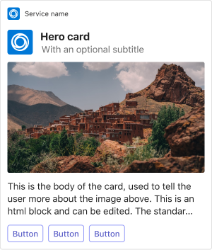
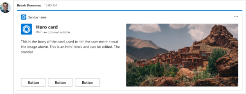
Hero
Our largest card. Use for sharing articles or scenarios where an image tells most of the story.
Mobile
Desktop
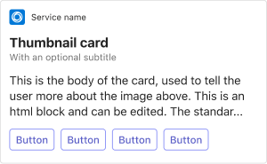
Thumbnail
Use for sending a simple actionable message.
Mobile
Desktop
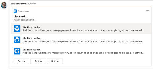
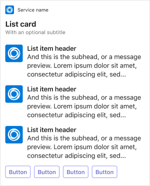
List
Use in scenarios where you want the user to pick an item from a list, but the items don’t need a lot of explanations.
Mobile
Desktop
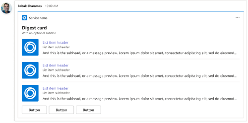
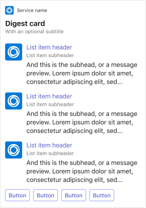
Digest
Use for news digests and round-up posts. Note: We recommend the thumbnail card for a single update or news item.
Mobile
Desktop
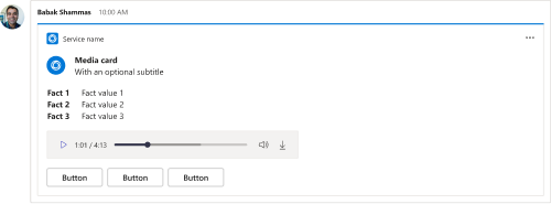
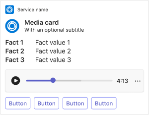
Media
Use when you want to combine text and media, like audio or video.
Mobile
Desktop
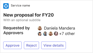
People
Use when you want to efficiently communicate the individuals involved in a task.
Mobile
Desktop
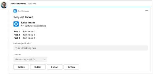
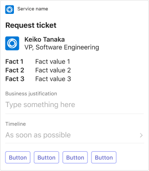
Request ticket
Use to get quick inputs from a user to automatically create a task or ticket.
Mobile
Desktop
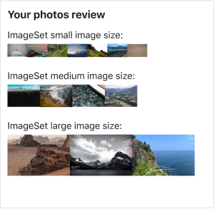
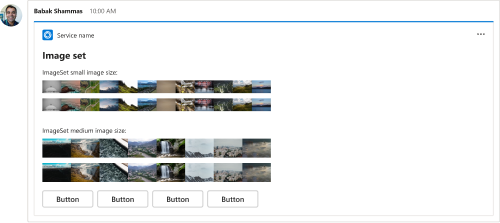
ImageSet
Use to send multiple image thumbnails.
Mobile
Desktop
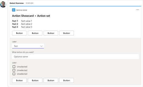
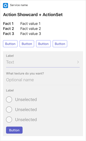
ActionSet
Use when you want to the user to select a button, then gather addition user input from the same card.
Mobile
Desktop
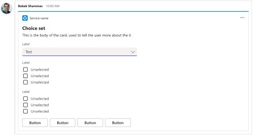
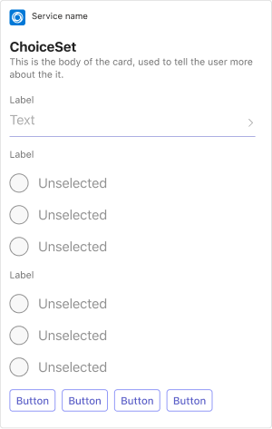
ChoiceSet
Use to gather multiple inputs from the user.
Mobile
Desktop
Anatomy
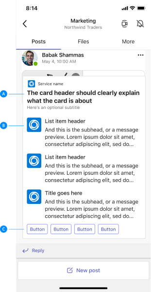
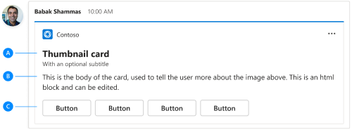
Adaptive Cards have a lot of flexibilities. But at minimum, we strongly suggest including the following components in every card:
| Counter | Description |
|---|---|
| A | Header: Make your headers clear and concise. |
| B | Body copy: Convey details that are either too long or not important enough to include in the header. |
| C | Primary actions: As a best practice, include 1-3 primary actions. You can have up to six. |
Mobile
Desktop
Best practices
Cards designed for a narrow screen scale well on wider screens (the opposite isn't true). You should also assume users won't only view your cards on desktop.
Column layouts
Use ColumnSet to format your card content into a table or grid. There are several options for formatting column width. These guidelines help you understand when to use each one.
"width": "auto": Sizes each column in theColumnSetto fit whatever app content you include in that column.- Do: Use when you have content of varying width and don't need to prioritize a specific column.
- Do: For each
TextBlock, set"wrap": truesince text doesn't wrap by default. - Don't: Set
"width": "auto"for every column container. For example, if you have an input and button side by side, the button might get cut off on some screens. Instead, setautofor the column with buttons and other content that must always be completely visible.
"width": "stretch": Sizes columns based on the availableColumnSetwidth. When multiple columns use the"stretch"value, they equally share the available width.- Do: Use with one column if all your other columns have a static width. For example, you have thumbnail images in one column that are all 50 pixels wide.
"width": "<number>": Sizes columns using a proportion of the availableColumnSetwidth. For example, if you set three columns with"width": "1","width": "4", and"width": "5", the columns take up 10, 40, and 50 percent of the available width."width": "<number>px": Sizes columns to a specific pixel width. This approach is useful when creating tables.- Do: Use when the width of what you're displaying doesn't need to change (for example, numbers and percentages).
- Don't: Accidentally exceed the width of what the card can display. Remember, available screen width depends on the device. Teams mobile also doesn't support horizontal scrolling like Teams desktop.
Example: Knowing when to stretch columns
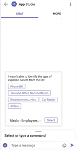
Do: In this screen, there are two columns at the bottom of the card. The input component width is set to stretch, while the Select button width is set to auto. This ensures the button remains completely in view.
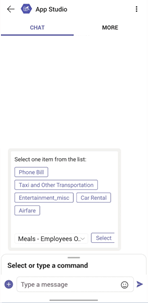
Don't: In this screen, both columns have width set to auto. This causes the Select button on the right to be cut off slightly compared to the input.
Example: Using fewer columns
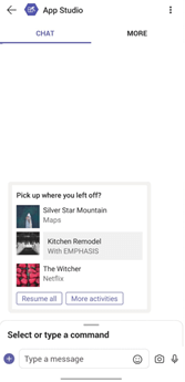
Do: Layouts tend to display better on mobile with fewer columns.
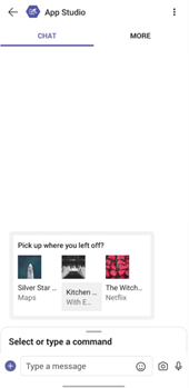
Don't: Using too many columns can clutter your card content on mobile.
Example: Fixed width has its place
When the the size of something you're displaying doesn't need to change, set you columns to a specific pixel width. This example shows the left column sized at 50 pixels, while the descriptions next to the thumbnails stretch the length of the card.

Text
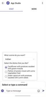
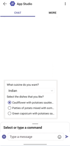
Whether you're using TextBlock, ColumnSet, or Input.ChoiceSet, set the wrap property to true so your card text doesn't truncate on mobile.
Example: Making sure text don't truncate
Do: In this screen, the card has a wrap property set to true. This allows the text to fit to any screen size.
Don't: In this screen, the card doesn't use the wrap property, so the text cuts off on a mobile screen.
Containers
A Container allows you to group a set of related elements together.
- Do: Use the
styleproperty to emphasize a container. - Do: Use the
selectActionproperty to associate an action with the other elements in the container. - Do: Use the
Action.ToggleVisibilityproperty to make a group of elements collapsible. - Don't: Use containers for any reason other than previously mentioned.
Images
Follow these guidelines when including images in your cards.
- Do: Design images for high DPI screens to avoid pixelation. It's better to display a 100 x 100 pixel image at 50 x 50 pixels than the other way around.
- Do: If you need to control the exact size of your images, use the
widthandheightproperties. - Don't: Include padding with your images. This typically introduces undesirable spacing and layout issues.
- Regarding background color:
- Do: Use transparent backgrounds so that your images adapt to any Teams theme.
- Don't: Include a fixed background color unless a specific color must be visible to your users.
- Don't: Add a background color to a
TextBlockthat hurts readability. For example, if your background is dark, use a lighter text color and vice versa.
Actions
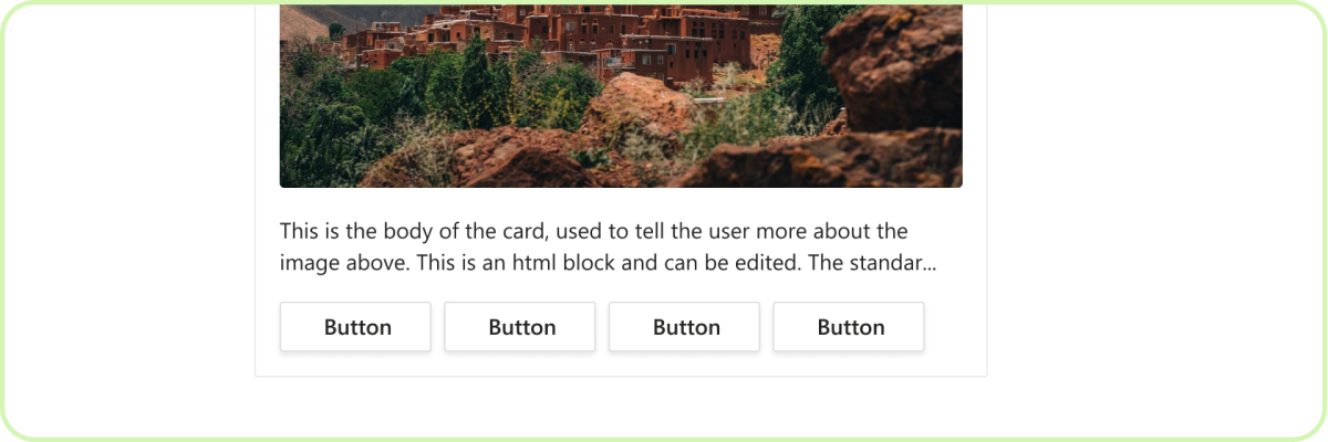
Do: Use up to six primary actions
While Adaptive Cards can support six primary actions, most cards don’t need that. Actions should be clear, concise, and straight forward. Less is more.
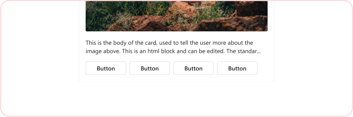
Don't: Use more than six primary actions
Adaptive Cards should present quick, actionable content. Too many actions can overwhelm a user.
Frequency

Do: Be concise
It's easy to send multiple cards into a conversation, but once cards scroll out of view, they become less useful. Try to limit yourself to the essentials. This is especially true in a channel where users have less tolerance for what they perceive as "noise".
See also
Platform Docs


