Tutorial: EDA techniques using Databricks notebooks
This tutorial guides you through the basics of conducting exploratory data analysis (EDA) using Python in a Azure Databricks notebook, from loading data to generating insights through data visualizations.
The notebook used in this tutorial examines global energy and emissions data and demonstrates how to load, clean, and explore data.
You can follow along using the example notebook or create your own notebook from scratch.
What is EDA?
Exploratory data analysis (EDA) is a critical initial step in the data science process that involves analyzing and visualizing data to:
- Uncover its main characteristics.
- Identify patterns and trends.
- Detect anomalies.
- Understand relationships between variables.
EDA provides insights into the dataset, facilitating informed decisions about further statistical analyses or modeling.
With Azure Databricks notebooks, data scientists can perform EDA using familiar tools. For example, this tutorial uses some common Python libraries to handle and plot data, including:
- Numpy: a fundamental library for numerical computing, providing support for arrays, matrices, and a wide range of mathematical functions to operate on these data structures.
- pandas: a powerful data manipulation and analysis library, built on top of NumPy, that offers data structures like DataFrames to handle structured data efficiently.
- Plotly: an interactive graphing library that enables the creation of high-quality, interactive visualizations for data analysis and presentation.
- Matplotlib: a comprehensive library for creating static, animated, and interactive visualizations in Python.
Azure Databricks also provides built-in features to help you explore your data within the notebook output, such as filtering and searching data within tables, and zooming in on visualizations. You can also use Databricks Assistant to help you write code for EDA.
Before you begin
To complete this tutorial, you need the following:
- You must have permission to use an existing compute resource or create a new compute resource. See Compute.
- [Optional] This tutorial describes how to use the assistant to help you generate code. To use the assistant, the assistant needs to be enabled in your account and workspace. See Use the assistant for more information.
Download the dataset and import CSV file
This tutorial demonstrates EDA techniques by examining global energy and emissions data. To follow along, download the Energy Consumption Dataset by Our World in Data from Kaggle. This tutorial uses the owid-energy-data.csv file.
To import the dataset to your Azure Databricks workspace:
In the sidebar of the workspace, click Workspace to navigate to the workspace browser.
In the top right, click the kebab menu, then click Import.
This opens the Import modal. Note the Target folder listed here. This is set to your current folder in the workspace browser and becomes the imported file’s destination.
Select Import from: File.
Drag and drop the CSV file,
owid-energy-data.csv, into the window. Alternatively, you can browse and select the file.Click Import. The file should appear in the target folder in your workspace.
You need the file path to import the file into your notebook later. Find the file in your workspace browser. To copy the file path to your clipboard, right-click on the file name, then select Copy URL/path > Full path.
Create a new notebook
To create a new notebook in your user home folder, click ![]() New in the sidebar and select Notebook from the menu.
New in the sidebar and select Notebook from the menu.
At the top, next to the notebook’s name, select Python as the default language for the notebook.
To learn more about creating and managing notebooks, see Manage notebooks.
Add each of the code samples in this article to a new cell in your notebook. Or, use the example notebook provided to follow along with the tutorial.
Load CSV file
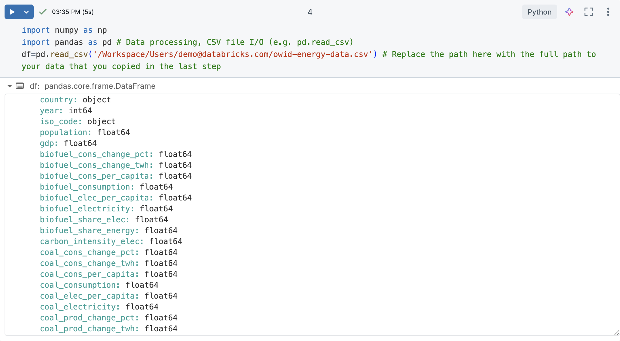
In a new notebook cell, load the CSV file. To do this, import numpy and pandas. These are useful Python libraries for data science and analysis.
Create a pandas DataFrame from the dataset for easier processing and visualization. Replace the file path below with the one you copied earlier.
import numpy as np
import pandas as pd # Data processing, CSV file I/O (e.g. pd.read_csv)
df=pd.read_csv('/Workspace/Users/demo@databricks.com/owid-energy-data.csv') # Replace the file path here with the workspace path you copied earlier
Run the cell. The output should return the pandas DataFrame, including a list of each column and its type.
Understand the data
Understanding the basics of the dataset is crucial for any data science project. It involves familiarizing oneself with the structure, types, and quality of the data at hand.
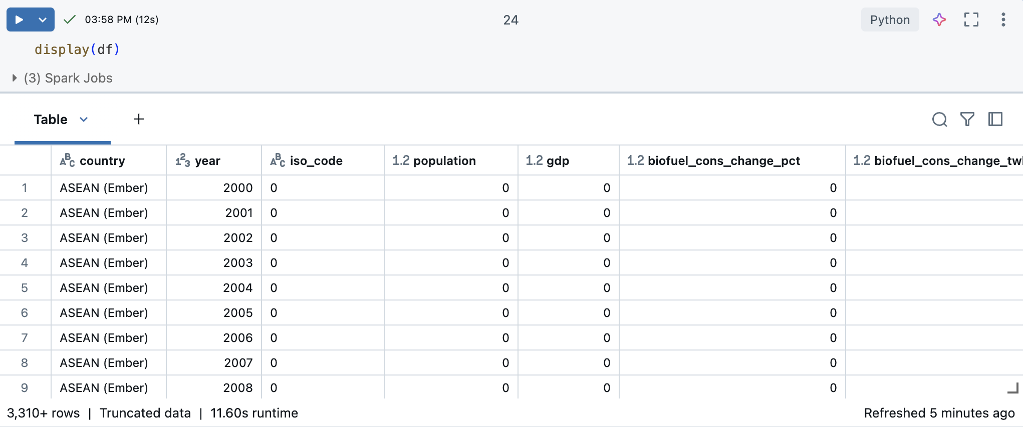
In a Azure Databricks notebook, you can use the display(df) command to display the dataset.
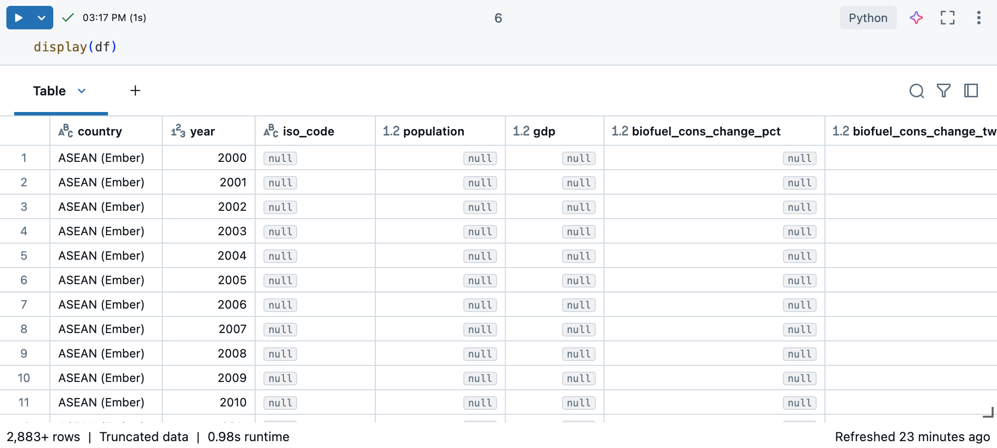
Because the dataset has more than 10,000 rows, this command returns a truncated dataset. On the left of each column, you can see the column’s data type. To learn more, see Format columns.
Use pandas for data insights
To understand your dataset effectively, use the following pandas commands:
The
df.shapecommand returns the dimensions of the DataFrame, giving you a quick overview of the number of rows and columns.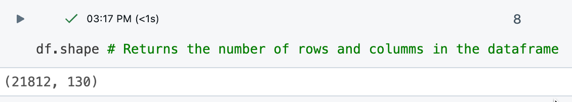
The
df.dtypescommand provides the data types of each column, helping you understand the kind of data you are dealing with. You can also see the data type for each column in the results table.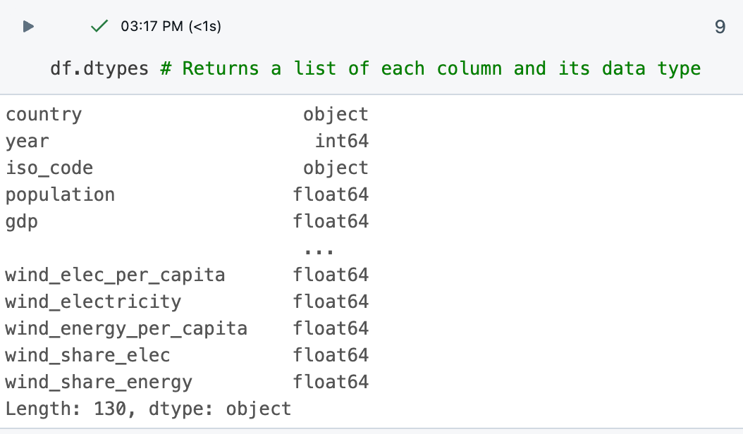
The
df.describe()command generates descriptive statistics for numerical columns, such as mean, standard deviation, and percentiles, which can help you identify patterns, detect anomalies, and understand the distribution of your data.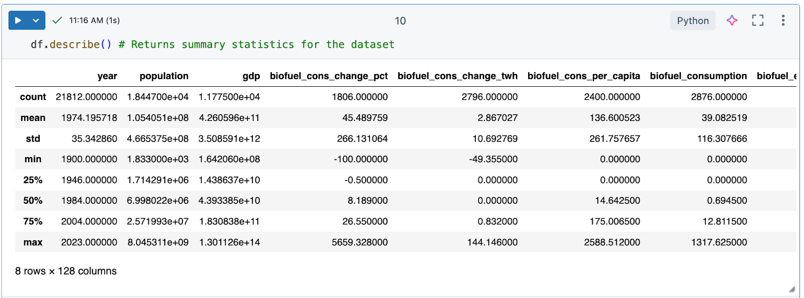
Generate a data profile
Azure Databricks notebooks include built-in data profiling capabilities. When viewing a DataFrame with the Azure Databricks display function, you can generate a data profile from the table output.
# Display the DataFrame, then click "+ > Data Profile" to generate a data profile
display(df)
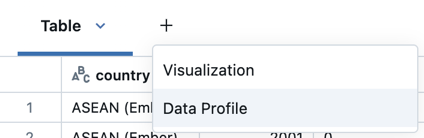
Click + > Data Profile next to the Table in the output. This runs a new command that generates a profile of the data in the DataFrame.
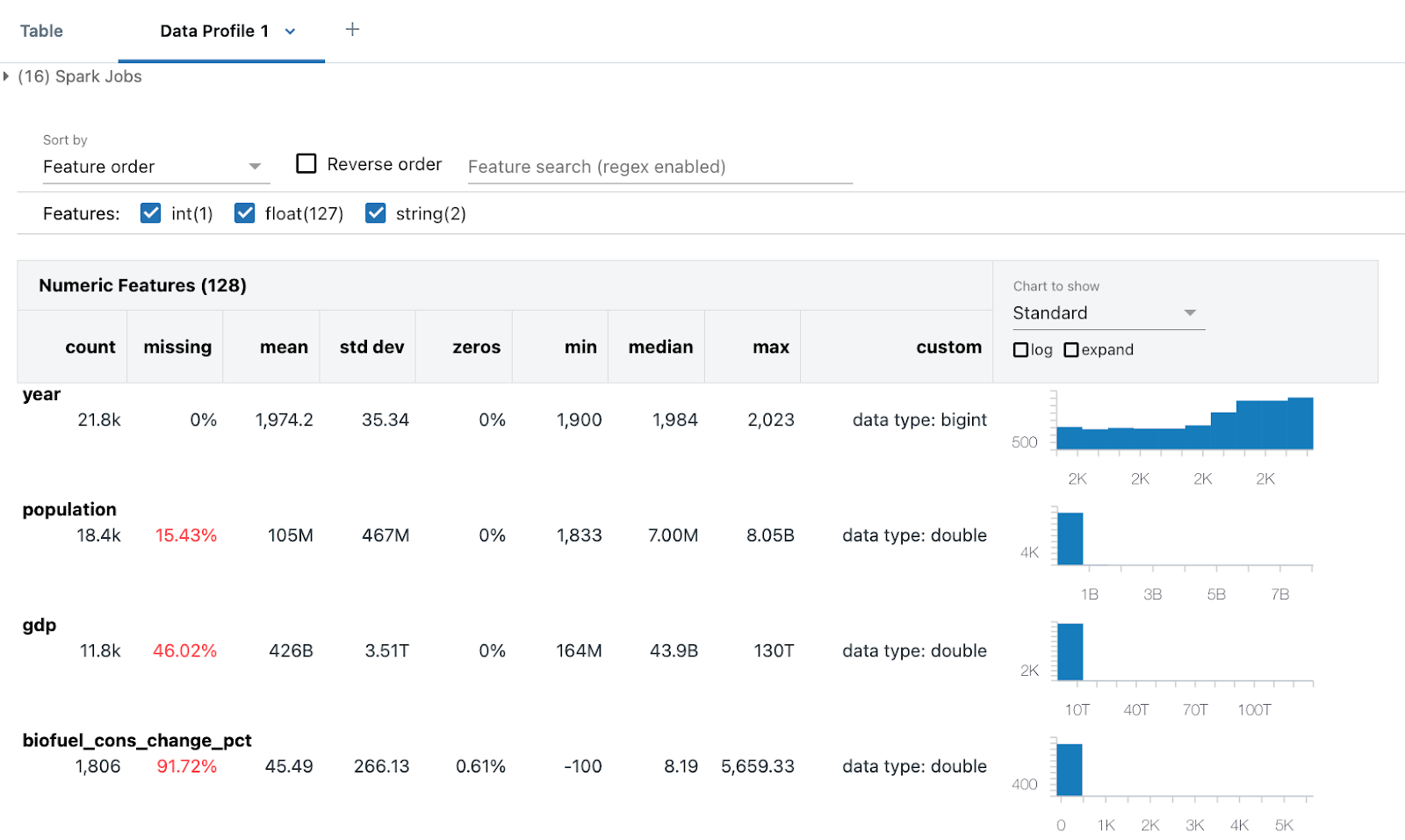
The data profile includes summary statistics for numeric, string, and date columns as well as histograms of the value distributions for each column.
Clean the data
Cleaning data is a vital step in EDA to ensure the dataset is accurate, consistent, and ready for meaningful analysis. This process involves several key tasks to ensure the data is ready for analysis, including:
- Identifying and removing any duplicate data.
- Handling missing values, which might involve replacing them with a specific value or removing the affected rows.
- Standardizing data types (for example, converting strings to
datetime) through conversions and transformations to ensure consistency. You might also want to convert data to a format that’s easier for you to work with.
This cleaning phase is essential as it improves the quality and reliability of the data, enabling more accurate and insightful analysis.
Tip: Use Databricks Assistant to help with data cleaning tasks
You can use Databricks Assistant to help you generate code. Create a new code cell and click the generate link or use the assistant icon in the top right to open the assistant. Enter a query for the assistant. The assistant may either generate Python or SQL code or generate a text description. For different results, click Regenerate.
For example, try the following prompts to use the assistant to help you clean the data:
- Check if
dfcontains any duplicate columns or rows. Print the duplicates. Then, delete the duplicates. - What format are date columns in? Change it to
'YYYY-MM-DD'. - I’m not going to use the
XXXcolumn. Delete it.
See Get coding help from Databricks Assistant.
Remove duplicate data
Check if the data has any duplicate rows or columns. If so, remove them.
Tip
Use the assistant to generate code for you.
Try entering the prompt: “Check if df contains any duplicate columns or rows. Print the duplicates. Then, delete the duplicates.” The assistant might generate code like the sample below.
# Check for duplicate rows
duplicate_rows = df.duplicated().sum()

# Check for duplicate columns
duplicate_columns = df.columns[df.columns.duplicated()].tolist()

# Print the duplicates
print("Duplicate rows count:", duplicate_rows)
print("Duplicate columns:", duplicate_columns)

# Drop duplicate rows
df = df.drop_duplicates()

# Drop duplicate columns
df = df.loc[:, ~df.columns.duplicated()]
In this case, the dataset does not have any duplicate data.
Handle null or missing values
A common way to treat NaN or Null values is to replace them with 0 for easier mathematical processing.
df = df.fillna(0) # Replace all NaN (Not a Number) values with 0
This ensures that any missing data in the DataFrame is replaced with 0, which can be useful for subsequent data analysis or processing steps where missing values might cause issues.
Reformat dates
Dates are often formatted in various ways in different datasets. They might be in date format, strings, or integers.
For this analysis, treat the year column as an integer. The following code is one way to do this:
# Ensure the 'year' column is converted to the correct data type (integer for year)
df['year'] = pd.to_datetime(df['year'], format='%Y', errors='coerce').dt.year

# Confirm the changes
df.year.dtype
This ensures that the year column contains only integer year values, with any invalid entries converted to NaT (Not a Time).
Explore the data using the Databricks notebook output table
Azure Databricks provides built-in features to help you explore your data using the output table.
In a new cell, use display(df) to display the dataset as a table.
Using the output table, you can explore your data in several ways:
- Search the data for a specific string or value
- Filter for specific conditions
- Create visualizations using the dataset
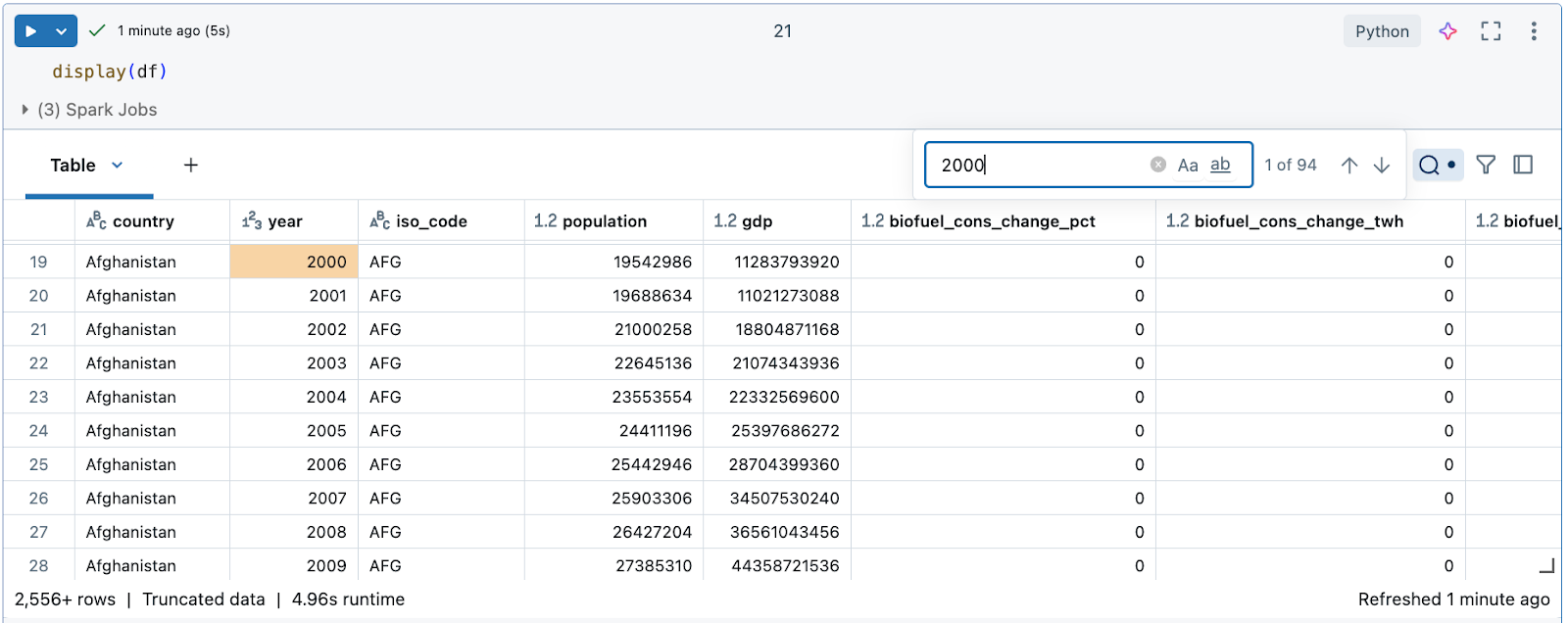
Search the data for a specific string or value
Click the search icon on the top right of the table and enter your search.
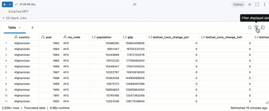
Filter for specific conditions
You can use built-in table filters to filter your columns for specific conditions. There are several ways to create a filter. See Filter results.
Tip
Use Databricks Assistant to create filters. Click the filter icon in the top right corner of the table. Enter your filter condition. Databricks Assistant automatically generates a filter for you.
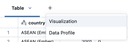
Create visualizations using the dataset
At the top of the output table, click + > Visualization to open the visualization editor.
Select the visualization type and columns you’d like to visualize. The editor displays a preview of the chart based on your configuration. For example, the image below shows how to add multiple line charts to view the consumption of various renewable energy sources over time.
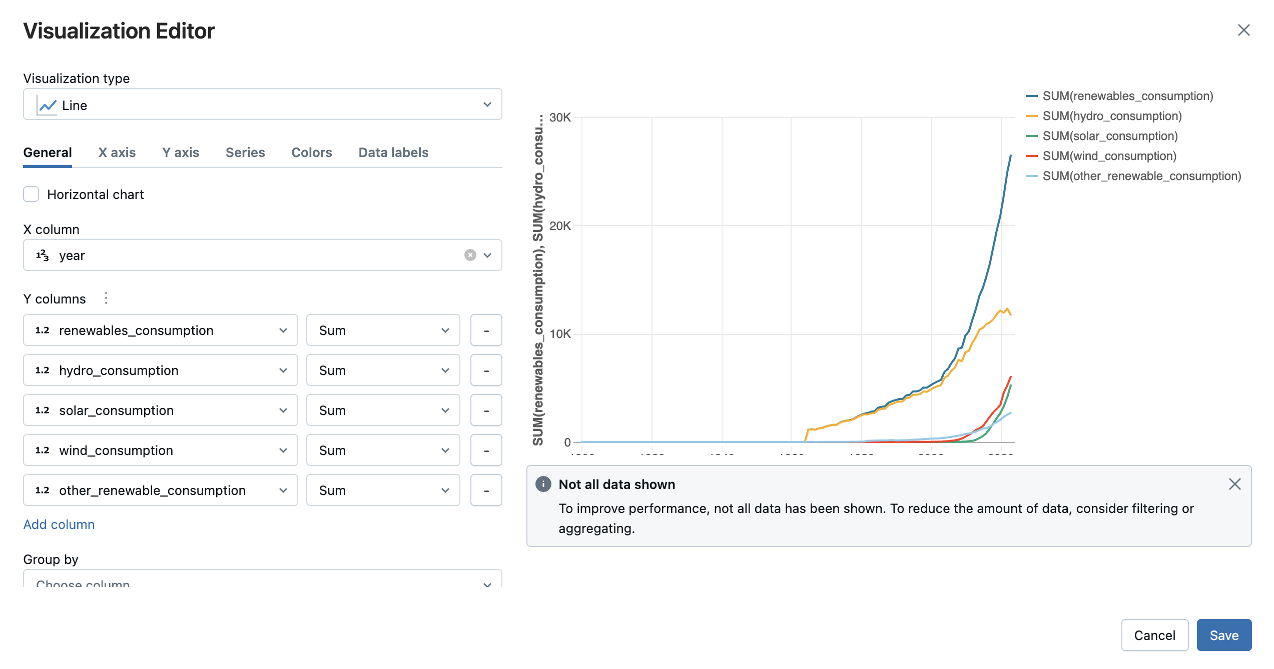
Click Save to add the visualization as a tab in the cell output.
See Create a new visualization.
Explore and visualize the data using Python libraries
Exploring data using visualizations is a fundamental aspect of EDA. Visualizations help to uncover patterns, trends, and relationships within the data that might not be immediately apparent through numerical analysis alone. Use libraries such as Plotly or Matplotlib for common visualization techniques including scatter plots, bar charts, line graphs, and histograms. These visual tools allow data scientists to identify anomalies, understand data distributions, and observe correlations between variables. For instance, scatter plots can highlight outliers, while time series plots can reveal trends and seasonality.
- Create an array for unique countries
- Chart emission trends for top 10 emitters (200-2022)
- Filter and chart emissions by region
- Calculate and graph renewable energy share growth
- Scatter plot: Show impact of renewable energy for top emitters
- Model projected global energy consumption
Create an array for unique countries
Examine the countries included in the dataset by creating an array for unique countries. Creating an array shows you the entities listed as country.
# Get the unique countries
unique_countries = df['country'].unique()
unique_countries
Output:
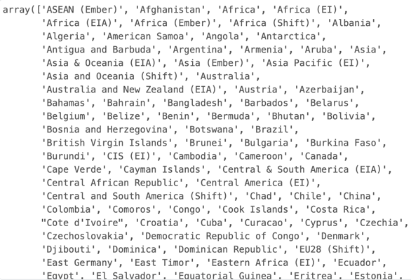
Insight:
The country column includes various entities, including World, High-income countries, Asia, and United States, that aren’t always directly comparable. It could be more useful to filter the data by region.
Chart emission trends for top 10 emitters (200-2022)
Let’s say you want to focus your investigation on the 10 countries with the highest greenhouse gas emissions in the 2000s. You can filter the data for the years you want to look at and the top 10 countries with the most emissions, then use plotly to create a line chart showing their emissions over time.
import plotly.express as px

# Filter data to include only years from 2000 to 2022
filtered_data = df[(df['year'] >= 2000) & (df['year'] <= 2022)]

# Get the top 10 countries with the highest emissions in the filtered data
top_countries = filtered_data.groupby('country')['greenhouse_gas_emissions'].sum().nlargest(10).index

# Filter the data for those top countries
top_countries_data = filtered_data[filtered_data['country'].isin(top_countries)]

# Plot emissions trends over time for these countries
fig = px.line(top_countries_data, x='year', y='greenhouse_gas_emissions', color='country',
             title="Greenhouse Gas Emissions Trends for Top 10 Countries (2000 - 2022)")
fig.show()
Output:
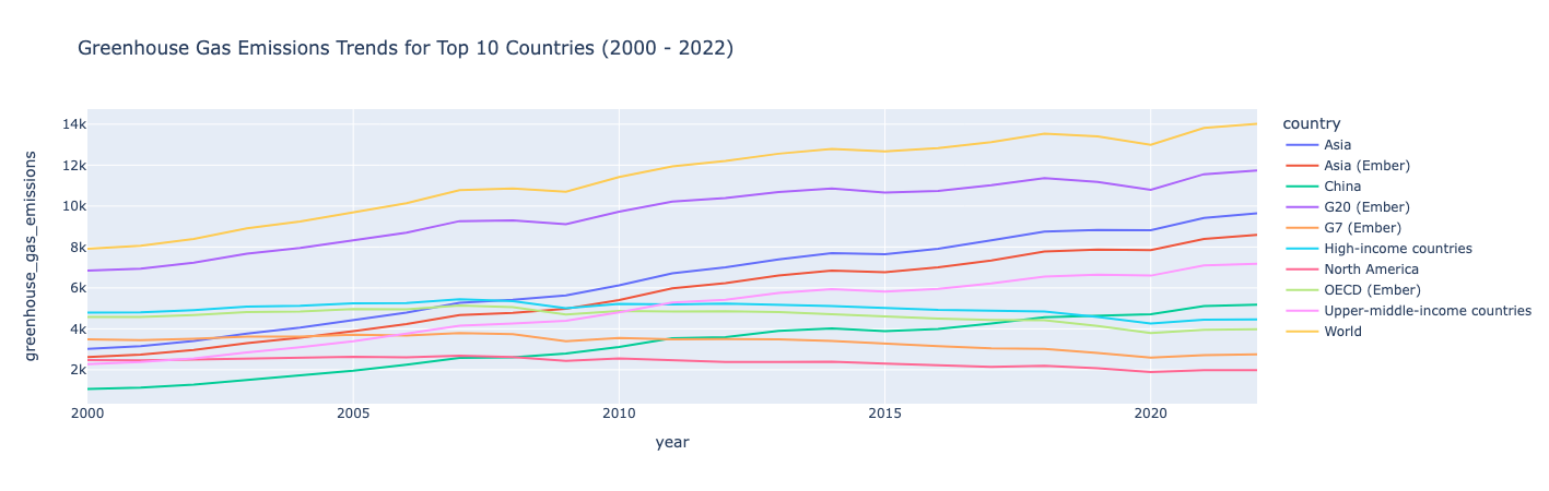
Insight:
Greenhouse gas emissions trended upwards from 2000-2022, with the exception of a few countries where emissions were relatively stable with a slight decline over that time frame.
Filter and chart emissions by region
Filter out the data by region and calculate the total emissions for each region. Then plot the data as a bar chart:
# Filter out regional entities
regions = ['Africa', 'Asia', 'Europe', 'North America', 'South America', 'Oceania']

# Calculate total emissions for each region
regional_emissions = df[df['country'].isin(regions)].groupby('country')['greenhouse_gas_emissions'].sum()

# Plot the comparison
fig = px.bar(regional_emissions, title="Greenhouse Gas Emissions by Region")
fig.show()
Output:
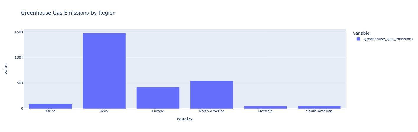
Insight:
Asia has the highest greenhouse gas emissions. Oceania, South America, and Africa produce the lowest greenhouse gas emissions.
Calculate and graph renewable energy share growth
Create a new feature/column that calculates the renewable energy share as a ratio of the renewable energy consumption over the primary energy consumption. Then, rank the countries based on their average renewable energy share. For the top 10 countries, plot their renewable energy share over time:
# Calculate the renewable energy share and save it as a new column called "renewable_share"
df['renewable_share'] = df['renewables_consumption'] / df['primary_energy_consumption']

# Rank countries by their average renewable energy share
renewable_ranking = df.groupby('country')['renewable_share'].mean().sort_values(ascending=False)

# Filter for countries leading in renewable energy share
leading_renewable_countries = renewable_ranking.head(10).index
leading_renewable_data = df[df['country'].isin(leading_renewable_countries)]
# filtered_data = df[(df['year'] >= 2000) & (df['year'] <= 2022)]
leading_renewable_data_filter=leading_renewable_data[(leading_renewable_data['year'] >= 2000) & (leading_renewable_data['year'] <= 2022)]
# Plot renewable share over time for top renewable countries
fig = px.line(leading_renewable_data_filter, x='year', y='renewable_share', color='country',
             title="Renewable Energy Share Growth Over Time for Leading Countries")
fig.show()
Output:
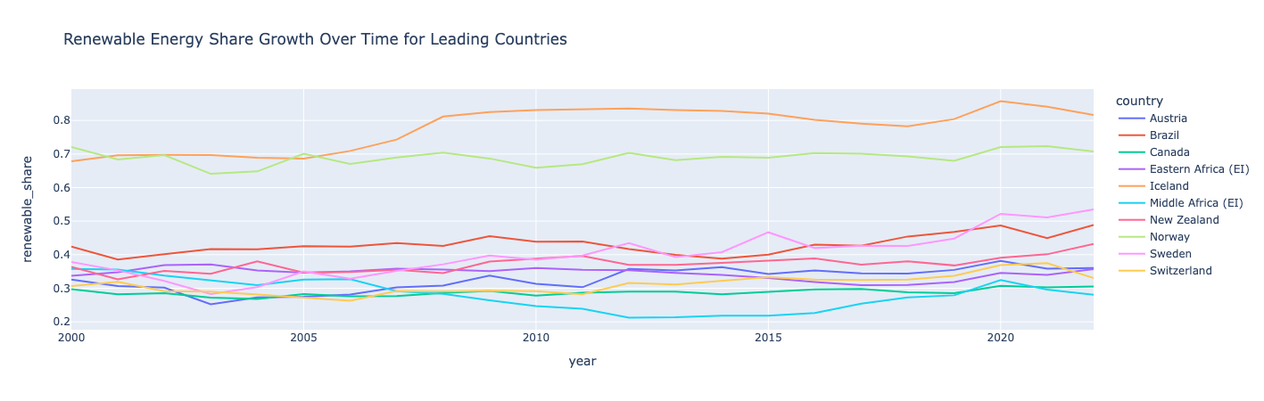
Insight:
Norway and Iceland are leading the world in renewable energy, with more than half of their consumption coming from renewable energy.
Iceland and Sweden saw the largest growth in their renewable energy share. All countries saw occasional dips and rises, demonstrating how renewable energy share growth isn’t necessarily linear. Interestingly, Middle Africa saw a dip in the early 2010s but bounced back in 2020.
Scatter plot: Show impact of renewable energy for top emitters
Filter the data for the top 10 emitters, then use a scatter plot to look at renewable energy share vs. greenhouse gas emissions over time.
# Select top emitters and calculate renewable share vs. emissions
top_emitters = df.groupby('country')['greenhouse_gas_emissions'].sum().nlargest(10).index
top_emitters_data = df[df['country'].isin(top_emitters)]

# Plot renewable share vs. greenhouse gas emissions over time
fig = px.scatter(top_emitters_data, x='renewable_share', y='greenhouse_gas_emissions',
                color='country', title="Impact of Renewable Energy on Emissions for Top Emitters")
fig.show()
Output:
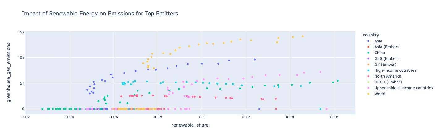
Insight:
As a country uses more renewable energy, it also has more greenhouse gas emissions, meaning that its total energy consumption rises faster than its renewable consumption. North America is an exception in that its greenhouse gas emissions stayed relatively constant throughout the years as its renewable share continued to increase.
Model projected global energy consumption
Aggregate the global primary energy consumption by year, then build an autoregressive integrated moving average (ARIMA) model to project total global energy consumption for the next few years. Plot the historical and forecasted energy consumption using Matplotlib.
import pandas as pd
from statsmodels.tsa.arima.model import ARIMA
import matplotlib.pyplot as plt

# Aggregate global primary energy consumption by year
global_energy = df[df['country'] == 'World'].groupby('year')['primary_energy_consumption'].sum()

# Build an ARIMA model for projection
model = ARIMA(global_energy, order=(1, 1, 1))
model_fit = model.fit()
forecast = model_fit.forecast(steps=10)  # Projecting for 10 years

# Plot historical and forecasted energy consumption
plt.plot(global_energy, label='Historical')
plt.plot(range(global_energy.index[-1] + 1, global_energy.index[-1] + 11), forecast, label='Forecast')
plt.xlabel("Year")
plt.ylabel("Primary Energy Consumption")
plt.title("Projected Global Energy Consumption")
plt.legend()
plt.show()
Output:
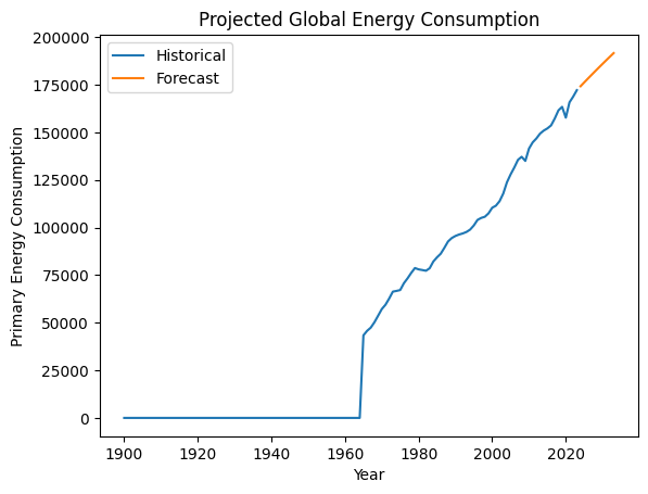
Insight:
This model projects that global energy consumption will continue to rise.
Example notebook
Use the following notebook to perform the steps in this article. For instructions on importing a notebook to a Azure Databricks workspace, see Import a notebook.
Tutorial: EDA with global energy data
Next steps
Now that you’ve performed some initial exploratory data analysis on your dataset, try these next steps:
- See the Appendix in the example notebook for additional EDA visualization examples.
- If you ran into any errors while going through this tutorial, try using the built-in debugger to step through your code. See Debug notebooks.
- Share your notebook with your team so that they can understand your analysis. Depending on what permissions you give them, they can help develop code to further the analysis or add comments and suggestions for further investigation.
- Once you’ve finalized your analysis, create a notebook dashboard or an AI/BI dashboard with the key visualizations to share with stakeholders.