Analyze and visualize monitoring data
This article describes built-in features for visualizing and analyzing collected data in Azure Monitor. Visualizations like charts and graphs can help you analyze your monitoring data to drill down on issues and identify patterns. You can create custom visualizations to meet the requirements of different users in your organization.
Built-in analysis features
This table describes Azure Monitor features that provide analysis of collected data without any configuration.
| Component | Description | Required training and/or configuration |
|---|---|---|
| Overview page | Most Azure services have an Overview page in the Azure portal that includes a Monitor section with charts that show recent critical metrics. This information is intended for owners of individual services to quickly assess the performance of the resource. | This page is based on platform metrics that are collected automatically. No configuration is required. |
| Metrics Explorer | You can use Metrics Explorer to interactively work with metric data and create metric alerts. You need minimal training to use Metrics Explorer, but you must be familiar with the metrics you want to analyze. | • Once data collection is configured, no other configuration is required. • Platform metrics for Azure resources are automatically available. • Guest metrics for virtual machines are available after an Azure Monitor agent is deployed to the virtual machine. • Application metrics are available after Application Insights is configured. |
| Log Analytics | With Log Analytics, you can create log queries to interactively work with log data and create log search alerts. | Some training is required for you to become familiar with the query language, although you can use prebuilt queries for common requirements. You can also add query packs with queries that are unique to your organization. Then if you're familiar with the query language, you can build queries for others in your organization. |
Built-in visualization tools
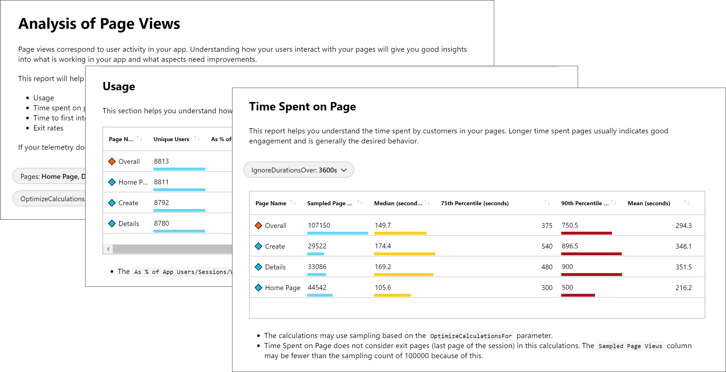
Azure workbooks
Azure workbooks provide a flexible canvas for data analysis and the creation of rich visual reports. You can use workbooks to tap into the most complete set of data sources from across Azure and combine them into unified interactive experiences. They're especially useful to prepare end-to-end monitoring views across multiple Azure resources. Insights use prebuilt workbooks to present you with critical health and performance information for a particular service. You can access a gallery of workbooks on the Workbooks tab in Azure Monitor, create custom workbooks, or leverage Azure GitHub community templates to meet the requirements of your different users.
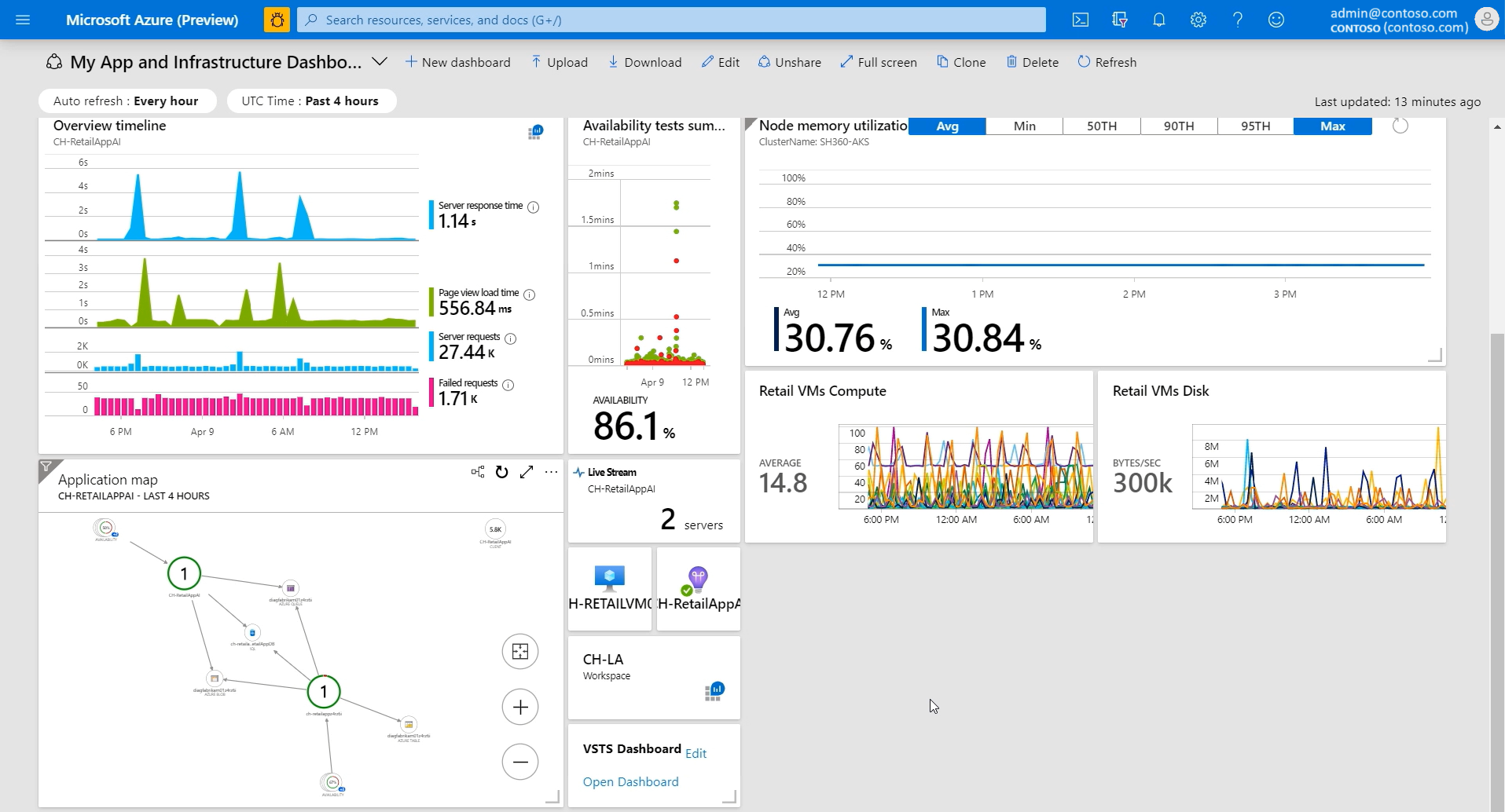
Azure dashboards
Azure dashboards are useful in providing a "single pane of glass" of your Azure infrastructure and services. While a workbook provides richer functionality, a dashboard can combine Azure Monitor data with data from other Azure services.
Here's a video about how to create dashboards:
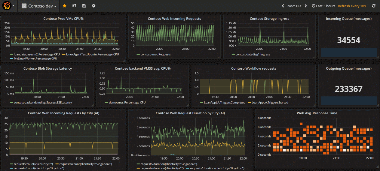
Grafana
Grafana is an open platform that excels in operational dashboards. It's useful for:
- Detecting, isolating, and triaging operational incidents.
- Combining visualizations of Azure and non-Azure data sources. These sources include on-premises, third-party tools, and data stores in other clouds.
Grafana has popular plug-ins and dashboard templates for application performance monitoring (APM) tools such as Dynatrace, New Relic, and AppDynamics. You can use these resources to visualize Azure platform data alongside other metrics from higher in the stack collected by other tools. It also has AWS CloudWatch and GCP BigQuery plug-ins for multicloud monitoring in a single pane of glass.
Grafana allows you to leverage the extensive flexibility included for combining data queries, query results, and performing open-ended client-side data processing, as well as using open-source community dashboards.
All versions of Grafana include the Azure Monitor datasource plug-in to visualize your Azure Monitor metrics and logs.
Azure Managed Grafana also optimizes this experience for Azure-native data stores such as Azure Monitor and Azure Data Explorer. In this way, you can easily connect to any resource in your subscription and view all resulting telemetry in a familiar Grafana dashboard. It also supports pinning charts from Azure Monitor metrics and logs to Grafana dashboards. Grafana includes out-of-the-box dashboards for Azure resources. Create your first Azure Managed Grafana workspace to get started.
The out-of-the-box Grafana Azure alerts dashboard allows you to view and consume Azure monitor alerts for Azure Monitor, your Azure datasources, and Azure Monitor managed service for Prometheus.
- For more information on define Azure Monitor alerts, see Create a new alert rule.
- For Azure Monitor managed service for Prometheus, define your alerts using Prometheus alert rules that are created as part of a Prometheus rule group, applied on the Azure Monitor workspace.
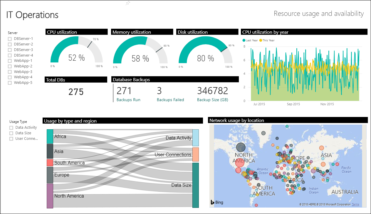
Power BI
Power BI is useful for creating business-centric dashboards and reports, along with reports that analyze long-term KPI (Key Performance Indicator) trends. You can import the results of a log query into a Power BI dataset, which allows you to take advantage of features such as combining data from different sources and sharing reports on the web and mobile devices.
Choose the right visualization tool
We recommend using Azure Managed Grafana for data visualizations and dashboards in cloud-native scenarios, such as Kubernetes and Azure Kubernetes Service (AKS), as well as multicloud, open source software, and third-party integrations. For other Azure scenarios, including Azure hybrid environments with Azure Arc, we recommend Azure workbooks.
When to use Azure Managed Grafana
- Cloud native environments monitored with Prometheus and CNCF tools
- Multi-cloud and multi-platform environments
- Multi-tenancy and portability support
- Interoperability with open-source and third-party tools
- Sharing dashboards outside of the Azure portal
When to use Azure workbooks
- Azure managed hybrid and edge environments
- Integrations with Azure actions and automation
- Creating custom reports based on Azure Monitor insights
Benefits and use cases
| Visualization tool | Benefits | Recommended uses |
|---|---|---|
| Azure workbooks | ||
| Native Azure dashboarding platform | Use as a tool for engineering and technical teams to visualize and investigate scenarios. | |
| Autorefresh | Use as a reporting tool for App developers, Cloud engineers, and other technical personnel | |
| Out-of-the-box and public GitHub templates and reports | ||
| Parameters allow dynamic real time updates | ||
| Can provide high-level summaries that allow you to select any item for more in-depth data using the selected value in the query | ||
| Can query more sources than other visualizations | ||
| Fully customizable | ||
| Designed for collaborating and troubleshooting | ||
| Azure dashboards | ||
| Native Azure dashboarding platform | For Azure/Arc exclusive environments | |
| No added cost | ||
| Supports at scale deployments | ||
| Can combine a metrics graph and the results of a log query with operational data for related services | ||
| Share a dashboard with service owners through integration with Azure role-based access control | ||
| Azure Managed Grafana | ||
| Multi-platform, multicloud single pane of glass visualizations | For users without Azure access | |
| Seamless integration with Azure | Use for external visualization experiences, especially for RAG type dashboards in SOC and NOC environments | |
| Can combine time-series and event data in a single visualization panel | Cloud Native CNCF monitoring | |
| Can create dynamic dashboards based on user selection of dynamic variables | Multicloud environments | |
| Prometheus support | Overall Statuses, Up/Down, and high level trend reports for management or executive level users | |
| Integrates with third party monitoring tools | Use to show status of environments, apps, security, and network for continuous display in Network Operations Center (NOC) dashboards | |
| Out-of-the-box plugins from most monitoring tools and platforms | ||
| Dashboard templates with focus on operations | ||
| Can create a dashboard from a community-created and community-supported template | ||
| Can create a vendor-agnostic business continuity and disaster scenario that runs on any cloud provider or on-premises | ||
| Power BI | ||
| Rich visualizations | Use for external visualizations aimed at management and executive levels | |
| Supports BI analytics with extensive slicing and dicing | Use to help design business centric KPI dashboards for long term trends | |
| Integrate data from multiple data sources | ||
| Results cached in a cube for better performance | ||
| Extensive interactivity, including zoom-in and cross-filtering | ||
| Share easily throughout your organization |
Other options
Some Azure Monitor partners provide visualization functionality. An Azure Monitor partner might provide out-of-the-box visualizations to save you time, although these solutions might have an extra cost.
You can also build your own custom websites and applications using metric and log data in Azure Monitor using the REST API. The REST API gives you flexibility in UI, visualization, interactivity, and features.


