MSDN has a new look!
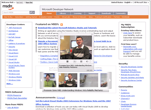
Earlier this week MSDN launched the redesigned pages under code name Tobago. Internally I had the pleasure of viewing the pages for few months and it’s amazing to see the new user experience. Please see a screen shot of the new site below:
The new design provides a rich "User and Search” Experience. The new design provides the following:
· Consistent top-level navigation for DevCenters and TechCenters. DevCenters and TechCenters are functionally identical; only the content is different.
- Create Globalized new User Experience (UX) with the following features:
Navigational Controls
• Section tabs
• Eyebrow - prepend existing eyebrow with Home links and flat list of centers
• In this section
Content Controls
• Left navigation
• Multi tab control
• Search etc…
Library Integration
• Improved Search with Auto Complete feature.
Nice work MSDN team.
Anand..
Comments
Anonymous
May 25, 2007
Sandcastle MSDN has a new look! MSDN의 개편 프로젝트 Tobago가 공개되었습니다. 그동안 정들었던(?) MSDN의 파란색이 없어지고 이제는 주황색과 회색Anonymous
May 31, 2007
Except it doesn't work in IE7 if you move the size up by one. Try it and move the splitter bar...ooops.Anonymous
June 14, 2007
PKR, This is a known issue with the MSDN library deep tree control. I spoke to MSDN team about this and they have promised a fix. BTW it’s not correct to say that it doesn’t work, it works fine, just doesn’t look that greatAnonymous
June 14, 2007
It's great to know that there is a fix due. However, I would argue that it doesn't work because the text disapears and I can't read it. Same thing happens in Firefox without the need to change the text size too!
