Add scale breaks to a paginated report chart (Report Builder)
Applies to:
Microsoft Report Builder (SSRS)
Power BI Report Builder
Report Designer in SQL Server Data Tools
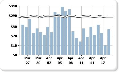
A scale break is a stripe drawn across the plotting area of a chart to denote a pause continuity between the high and low values on a value axis. This axis is usually the vertical, or y-axis. Use a scale break to display two distinct ranges in the same chart area in a paginated report.

Note
You can't specify where to place a scale break on your chart. The chart uses its own calculations based on the values in your dataset to determine whether there is sufficient separation between data ranges to draw a scale break on the value axis, or y-axis, at run time.
An example of a chart with scale breaks is available as a sample report. For more information about downloading this sample report and others, see Report Builder and Report Designer sample reports.
Note
You can create and modify paginated report definition (.rdl) files in Microsoft Report Builder, Power BI Report Builder, and in Report Designer in SQL Server Data Tools.
Enable scale breaks on the chart
Right-click the vertical axis, and then select Axis Properties. The VerticalAxis Properties dialog opens.
Select the Enable scale breaks box.
Change the style of the scale break
Open the Properties pane.
On the design surface, right-click on the y-axis of the chart. The properties for the y-axis object, named Chart Axis by default, are displayed in the Properties pane.
In the Scale section, expand the ScaleBreakStyle property.
Change the values for ScaleBreakStyle properties, such as BreakLineType and Spacing. For more information about scale break properties, see Display a series with multiple data ranges on a chart (Report Builder).