Xamarin.Forms RadioButton
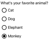
The Xamarin.Forms RadioButton is a type of button that allows users to select one option from a set. Each option is represented by one radio button, and you can only select one radio button in a group. By default, each RadioButton displays text:

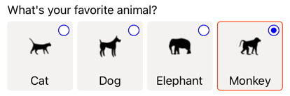
However, on some platforms a RadioButton can display a View, and on all platforms the appearance of each RadioButton can be redefined with a ControlTemplate:

The RadioButton control defines the following properties:
Content, of typeobject, which defines thestringorViewto be displayed by theRadioButton.IsChecked, of typebool, which defines whether theRadioButtonis checked. This property uses aTwoWaybinding, and has a default value offalse.GroupName, of typestring, which defines the name that specifies whichRadioButtoncontrols are mutually exclusive. This property has a default value ofnull.Value, of typeobject, which defines an optional unique value associated with theRadioButton.BorderColor, of typeColor, which defines the border stroke color.BorderWidth, of typedouble, which defines the width of theRadioButtonborder.CharacterSpacing, of typedouble, which defines the spacing between characters of any displayed text.CornerRadius, of typeint, which defines the corner radius of theRadioButton.FontAttributes, of typeFontAttributes, which determines text style.FontFamily, of typestring, which defines the font family.FontSize, of typedouble, which defines the font size.TextColor, of typeColor, which defines the color of any displayed text.TextTransform, of typeTextTransform, which defines the casing of any displayed text.
These properties are backed by BindableProperty objects, which means that they can be targets of data bindings, and styled.
The RadioButton control also defines a CheckedChanged event that's fired when the IsChecked property changes, either through user or programmatic manipulation. The CheckedChangedEventArgs object that accompanies the CheckedChanged event has a single property named Value, of type bool. When the event is fired, the value of the CheckedChangedEventArgs.Value property is set to the new value of the IsChecked property.
RadioButton grouping can be managed by the RadioButtonGroup class, which defines the following attached properties:
GroupName, of typestring, which defines the group name forRadioButtonobjects in aLayout<View>.SelectedValue, of typeobject, which represents the value of the checkedRadioButtonobject within aLayout<View>group. This attached property uses aTwoWaybinding by default.
For more information about the GroupName attached property, see Group RadioButtons. For more information about the SelectedValue attached property, see Respond to RadioButton state changes.
Create RadioButtons
The appearance of a RadioButton is defined by the type of data assigned to the RadioButton.Content property:
- When the
RadioButton.Contentproperty is assigned astring, it will be displayed on each platform, horizontally aligned next to the radio button circle. - When the
RadioButton.Contentis assigned aView, it will be displayed on supported platforms (iOS, UWP), while unsupported platforms will fallback to a string representation of theViewobject (Android). In both cases, the content is displayed horizontally aligned next to the radio button circle. - When a
ControlTemplateis applied to aRadioButton, aViewcan be assigned to theRadioButton.Contentproperty on all platforms. For more information, see Redefine RadioButton appearance.
Display string-based content
A RadioButton displays text when the Content property is assigned a string:
<StackLayout>
    <Label Text="What's your favorite animal?" />
    <RadioButton Content="Cat" />
    <RadioButton Content="Dog" />
    <RadioButton Content="Elephant" />
    <RadioButton Content="Monkey"
                 IsChecked="true" />
</StackLayout>
In this example, RadioButton objects are implicitly grouped inside the same parent container. This XAML results in the appearance shown in the following screenshots:

Display arbitrary content
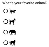
On iOS and UWP, a RadioButton can display arbitrary content when the Content property is assigned a View:
<StackLayout>
    <Label Text="What's your favorite animal?" />
    <RadioButton>
        <RadioButton.Content>
            <Image Source="cat.png" />
        </RadioButton.Content>
    </RadioButton>
    <RadioButton>
        <RadioButton.Content>
            <Image Source="dog.png" />
        </RadioButton.Content>
    </RadioButton>
    <RadioButton>
        <RadioButton.Content>
            <Image Source="elephant.png" />
        </RadioButton.Content>
    </RadioButton>
    <RadioButton>
        <RadioButton.Content>
            <Image Source="monkey.png" />
        </RadioButton.Content>
    </RadioButton>
</StackLayout>
In this example, RadioButton objects are implicitly grouped inside the same parent container. This XAML results in the appearance shown in the following screenshots:

On Android, RadioButton objects will display a string-based representation of the View object that's been set as content:

Note
When a ControlTemplate is applied to a RadioButton, a View can be assigned to the RadioButton.Content property on all platforms. For more information, see Redefine RadioButton appearance.
Associate values with RadioButtons
Each RadioButton object has a Value property, of type object, which defines an optional unique value to associate with the radio button. This enables the value of a RadioButton to be different to its content, and is particularly useful when RadioButton objects are displaying View objects.
The following XAML shows setting the Content and Value properties on each RadioButton object:
<StackLayout>
    <Label Text="What's your favorite animal?" />
    <RadioButton Value="Cat">
        <RadioButton.Content>
            <Image Source="cat.png" />
        </RadioButton.Content>
    </RadioButton>
    <RadioButton Value="Dog">
        <RadioButton.Content>
            <Image Source="dog.png" />
        </RadioButton.Content>
    </RadioButton>
    <RadioButton Value="Elephant">
        <RadioButton.Content>
            <Image Source="elephant.png" />
        </RadioButton.Content>
    </RadioButton>
    <RadioButton Value="Monkey">
        <RadioButton.Content>
            <Image Source="monkey.png" />
        </RadioButton.Content>
    </RadioButton>
</StackLayout>
In this example, each RadioButton has an Image as its content, while also defining a string-based value. This enables the value of the checked radio button to be easily identified.
Group RadioButtons
Radio buttons work in groups, and there are three approaches to grouping radio buttons:
- Place them inside the same parent container. This is known as implicit grouping.
- Set the
GroupNameproperty on each radio button in the group to the same value. This is known as explicit grouping. - Set the
RadioButtonGroup.GroupNameattached property on a parent container, which in turn sets theGroupNameproperty of anyRadioButtonobjects in the container. This is also known as explicit grouping.
Important
RadioButton objects don't have to belong to the same parent to be grouped. They are mutually exclusive provided that they share a group name.
Explicit grouping with the GroupName property
The following XAML example shows explicitly grouping RadioButton objects by setting their GroupName properties:
<Label Text="What's your favorite color?" />
<RadioButton Content="Red"
             GroupName="colors" />
<RadioButton Content="Green"
             GroupName="colors" />
<RadioButton Content="Blue"
             GroupName="colors" />
<RadioButton Content="Other"
             GroupName="colors" />
In this example, each RadioButton is mutually exclusive because it shares the same GroupName value.
Explicit grouping with the RadioButtonGroup.GroupName attached property
The RadioButtonGroup class defines a GroupName attached property, of type string, which can be set on a Layout<View> object. This enables any layout to be turned into a radio button group:
<StackLayout RadioButtonGroup.GroupName="colors">
    <Label Text="What's your favorite color?" />
    <RadioButton Content="Red" />
    <RadioButton Content="Green" />
    <RadioButton Content="Blue" />
    <RadioButton Content="Other" />
</StackLayout>
In this example, each RadioButton in the StackLayout will have its GroupName property set to colors, and will be mutually exclusive.
Note
When a Layout<View> object that sets the RadioButtonGroup.GroupName attached property contains a RadioButton that sets its GroupName property, the value of the RadioButton.GroupName property will take precedence.
Respond to RadioButton state changes
A radio button has two states: checked or unchecked. When a radio button is checked, its IsChecked property is true. When a radio button is unchecked, its IsChecked property is false. A radio button can be cleared by tapping another radio button in the same group, but it cannot be cleared by tapping it again. However, you can clear a radio button programmatically by setting its IsChecked property to false.
Respond to an event firing
When the IsChecked property changes, either through user or programmatic manipulation, the CheckedChanged event fires. An event handler for this event can be registered to respond to the change:
<RadioButton Content="Red"
             GroupName="colors"
             CheckedChanged="OnColorsRadioButtonCheckedChanged" />
The code-behind contains the handler for the CheckedChanged event:
void OnColorsRadioButtonCheckedChanged(object sender, CheckedChangedEventArgs e)
{
    // Perform required operation
}
The sender argument is the RadioButton responsible for this event. You can use this to access the RadioButton object, or to distinguish between multiple RadioButton objects sharing the same CheckedChanged event handler.
Respond to a property change
The RadioButtonGroup class defines a SelectedValue attached property, of type object, which can be set on a Layout<View> object. This attached property represents the value of the checked RadioButton within a group defined on a layout.
When the IsChecked property changes, either through user or programmatic manipulation, the RadioButtonGroup.SelectedValue attached property also changes. Therefore, the RadioButtonGroup.SelectedValue attached property can be data bound to a property that stores the user's selection:
<StackLayout RadioButtonGroup.GroupName="{Binding GroupName}"
             RadioButtonGroup.SelectedValue="{Binding Selection}">
    <Label Text="What's your favorite animal?" />
    <RadioButton Content="Cat"
                 Value="Cat" />
    <RadioButton Content="Dog"
                 Value="Dog" />
    <RadioButton Content="Elephant"
                 Value="Elephant" />
    <RadioButton Content="Monkey"
                 Value="Monkey"/>
    <Label x:Name="animalLabel">
        <Label.FormattedText>
            <FormattedString>
                <Span Text="You have chosen:" />
                <Span Text="{Binding Selection}" />
            </FormattedString>
        </Label.FormattedText>
    </Label>
</StackLayout>
In this example, the value of the RadioButtonGroup.GroupName attached property is set by the GroupName property on the binding context. Similarly, the value of the RadioButtonGroup.SelectedValue attached property is set by the Selection property on the binding context. In addition, the Selection property is updated to the Value property of the checked RadioButton.
RadioButton visual states
RadioButton objects have Checked and Unchecked visual states that can be used to initiate a visual change when a RadioButton is checked or unchecked.
The following XAML example shows how to define a visual state for the Checked and Unchecked states:
<ContentPage ...>
    <ContentPage.Resources>
        <Style TargetType="RadioButton">
            <Setter Property="VisualStateManager.VisualStateGroups">
                <VisualStateGroupList>
                    <VisualStateGroup x:Name="CheckedStates">
                        <VisualState x:Name="Checked">
                            <VisualState.Setters>
                                <Setter Property="TextColor"
                                        Value="Green" />
                                <Setter Property="Opacity"
                                        Value="1" />
                            </VisualState.Setters>
                        </VisualState>
                        <VisualState x:Name="Unchecked">
                            <VisualState.Setters>
                                <Setter Property="TextColor"
                                        Value="Red" />
                                <Setter Property="Opacity"
                                        Value="0.5" />
                            </VisualState.Setters>
                        </VisualState>
                    </VisualStateGroup>
                </VisualStateGroupList>
            </Setter>
        </Style>
    </ContentPage.Resources>
    <StackLayout>
        <Label Text="What's your favorite mode of transport?" />
        <RadioButton Content="Car" />
        <RadioButton Content="Bike" />
        <RadioButton Content="Train" />
        <RadioButton Content="Walking" />
    </StackLayout>
</ContentPage>
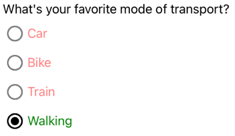
In this example, the implicit Style targets RadioButton objects. The Checked VisualState specifies that when a RadioButton is checked, its TextColor property will be set to green with an Opacity value of 1. The Unchecked VisualState specifies that when a RadioButton is in a unchecked state, its TextColor property will be set to red with an Opacity value of 0.5. Therefore, the overall effect is that when a RadioButton is unchecked it's red and partially transparent, and is green without transparency when it's checked:

For more information about visual states, see Xamarin.Forms Visual State Manager.
Redefine RadioButton appearance
By default, RadioButton objects use platform renderers to utilize native controls on supported platforms. However, RadioButton visual structure can be redefined with a ControlTemplate, so that RadioButton objects have an identical appearance on all platforms. This is possible because the RadioButton class inherits from the TemplatedView class.
The following XAML shows a ControlTemplate that can be used to redefine the visual structure of RadioButton objects:
<ContentPage ...>
    <ContentPage.Resources>
        <ControlTemplate x:Key="RadioButtonTemplate">
            <Frame BorderColor="#F3F2F1"
                   BackgroundColor="#F3F2F1"
                   HasShadow="False"
                   HeightRequest="100"
                   WidthRequest="100"
                   HorizontalOptions="Start"
                   VerticalOptions="Start"
                   Padding="0">
                <VisualStateManager.VisualStateGroups>
                    <VisualStateGroupList>
                        <VisualStateGroup x:Name="CheckedStates">
                            <VisualState x:Name="Checked">
                                <VisualState.Setters>
                                    <Setter Property="BorderColor"
                                            Value="#FF3300" />
                                    <Setter TargetName="check"
                                            Property="Opacity"
                                            Value="1" />
                                </VisualState.Setters>
                            </VisualState>
                            <VisualState x:Name="Unchecked">
                                <VisualState.Setters>
                                    <Setter Property="BackgroundColor"
                                            Value="#F3F2F1" />
                                    <Setter Property="BorderColor"
                                            Value="#F3F2F1" />
                                    <Setter TargetName="check"
                                            Property="Opacity"
                                            Value="0" />
                                </VisualState.Setters>
                            </VisualState>
                        </VisualStateGroup>
                    </VisualStateGroupList>
                </VisualStateManager.VisualStateGroups>
                <Grid Margin="4"
                      WidthRequest="100">
                    <Grid WidthRequest="18"
                          HeightRequest="18"
                          HorizontalOptions="End"
                          VerticalOptions="Start">
                        <Ellipse Stroke="Blue"
                                 Fill="White"
                                 WidthRequest="16"
                                 HeightRequest="16"
                                 HorizontalOptions="Center"
                                 VerticalOptions="Center" />
                        <Ellipse x:Name="check"
                                 Fill="Blue"
                                 WidthRequest="8"
                                 HeightRequest="8"
                                 HorizontalOptions="Center"
                                 VerticalOptions="Center" />
                    </Grid>
                    <ContentPresenter />
                </Grid>
            </Frame>
        </ControlTemplate>

        <Style TargetType="RadioButton">
            <Setter Property="ControlTemplate"
                    Value="{StaticResource RadioButtonTemplate}" />
        </Style>
    </ContentPage.Resources>
    <!-- Page content -->
</ContentPage>
In this example, the root element of the ControlTemplate is a Frame object that defines Checked and Unchecked visual states. The Frame object uses a combination of Grid, Ellipse, and ContentPresenter objects to define the visual structure of a RadioButton. The example also includes an implicit style that will assign the RadioButtonTemplate to the ControlTemplate property of any RadioButton objects on the page.
Note
The ContentPresenter object marks the location in the visual structure where RadioButton content will be displayed.
The following XAML shows RadioButton objects that consume the ControlTemplate via the implicit style:
<StackLayout>
    <Label Text="What's your favorite animal?" />
    <StackLayout RadioButtonGroup.GroupName="animals"
                 Orientation="Horizontal">
        <RadioButton Value="Cat">
            <RadioButton.Content>
                <StackLayout>
                    <Image Source="cat.png"
                           HorizontalOptions="Center"
                           VerticalOptions="CenterAndExpand" />
                    <Label Text="Cat"
                           HorizontalOptions="Center"
                           VerticalOptions="End" />
                </StackLayout>
            </RadioButton.Content>
        </RadioButton>
        <RadioButton Value="Dog">
            <RadioButton.Content>
                <StackLayout>
                    <Image Source="dog.png"
                           HorizontalOptions="Center"
                           VerticalOptions="CenterAndExpand" />
                    <Label Text="Dog"
                           HorizontalOptions="Center"
                           VerticalOptions="End" />
                </StackLayout>
            </RadioButton.Content>
        </RadioButton>
        <RadioButton Value="Elephant">
            <RadioButton.Content>
                <StackLayout>
                    <Image Source="elephant.png"
                           HorizontalOptions="Center"
                           VerticalOptions="CenterAndExpand" />
                    <Label Text="Elephant"
                           HorizontalOptions="Center"
                           VerticalOptions="End" />
                </StackLayout>
            </RadioButton.Content>
        </RadioButton>
        <RadioButton Value="Monkey">
            <RadioButton.Content>
                <StackLayout>
                    <Image Source="monkey.png"
                           HorizontalOptions="Center"
                           VerticalOptions="CenterAndExpand" />
                    <Label Text="Monkey"
                           HorizontalOptions="Center"
                           VerticalOptions="End" />
                </StackLayout>
            </RadioButton.Content>
        </RadioButton>
    </StackLayout>
</StackLayout>
In this example, the visual structure defined for each RadioButton is replaced with the visual structure defined in the ControlTemplate, and so at runtime the objects in the ControlTemplate become part of the visual tree for each RadioButton. In addition, the content for each RadioButton is substituted into the ContentPresenter defined in the control template. This results in the following RadioButton appearance:

For more information about control templates, see Xamarin.Forms control templates.
Disable a RadioButton
Sometimes an application enters a state where a RadioButton being checked is not a valid operation. In such cases, the RadioButton can be disabled by setting its IsEnabled property to false.