Xamarin.Forms Shell pages
A ShellContent object represents the ContentPage object for each FlyoutItem or Tab. When more than one ShellContent object is present in a Tab object, the ContentPage objects will be navigable by top tabs. Within a page, additional ContentPage objects that are known as detail pages, can be navigated to.
In addition, the Shell class defines attached properties that can be used to configure the appearance of pages in Xamarin.Forms Shell applications. This includes setting page colors, setting the page presentation mode, disabling the navigation bar, disabling the tab bar, and displaying views in the navigation bar.
Display pages
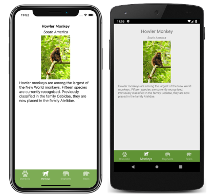
In Xamarin.Forms Shell applications, pages are typically created on demand in response to navigation. This is accomplished by using the DataTemplate markup extension to set the ContentTemplate property of each ShellContent object to a ContentPage object:
<Shell xmlns="http://xamarin.com/schemas/2014/forms"
       xmlns:x="http://schemas.microsoft.com/winfx/2009/xaml"
       xmlns:views="clr-namespace:Xaminals.Views"
       x:Class="Xaminals.AppShell">
    <TabBar>
       <ShellContent Title="Cats"
                     Icon="cat.png"
                     ContentTemplate="{DataTemplate views:CatsPage}" />
       <ShellContent Title="Dogs"
                     Icon="dog.png"
                     ContentTemplate="{DataTemplate views:DogsPage}" />
       <ShellContent Title="Monkeys"
                     Icon="monkey.png"
                     ContentTemplate="{DataTemplate views:MonkeysPage}" />
    </TabBar>
</Shell>
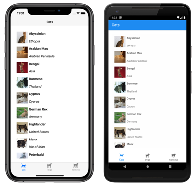
In this example, Shell's implicit conversion operators are used to remove the Tab objects from the visual hierarchy. However, each ShellContent object is rendered in a tab:
Note
The BindingContext of each ShellContent object is inherited from the parent Tab object.
Within each ContentPage object, additional ContentPage objects can be navigated to. For more information about navigation, see Xamarin.Forms Shell navigation.
Load pages at application startup
In a Shell application, each ContentPage object is typically created on demand, in response to navigation. However, it's also possible to create ContentPage objects at application startup.
Warning
ContentPage objects that are created at application startup can lead to a poor startup experience.
ContentPage objects can be created at application startup by setting the ShellContent.Content properties to ContentPage objects:
<Shell xmlns="http://xamarin.com/schemas/2014/forms"
       xmlns:x="http://schemas.microsoft.com/winfx/2009/xaml"
       xmlns:views="clr-namespace:Xaminals.Views"
       x:Class="Xaminals.AppShell">
    <TabBar>
     <ShellContent Title="Cats"
                   Icon="cat.png">
         <views:CatsPage />
     </ShellContent>
     <ShellContent Title="Dogs"
                   Icon="dog.png">
         <views:DogsPage />
     </ShellContent>
     <ShellContent Title="Monkeys"
                   Icon="monkey.png">
         <views:MonkeysPage />
     </ShellContent>
    </TabBar>
</Shell>
In this example, CatsPage, DogsPage, and MonkeysPage are all created at application startup, rather than on demand in response to navigation.
Note
The Content property is the content property of the ShellContent class, and therefore does not need to be explicitly set.
Set page colors
The Shell class defines the following attached properties that can be used to set page colors in a Shell application:
BackgroundColor, of typeColor, that defines the background color in the Shell chrome. The color will not fill in behind the Shell content.DisabledColor, of typeColor, that defines the color to shade text and icons that are disabled.ForegroundColor, of typeColor, that defines the color to shade text and icons.TitleColor, of typeColor, that defines the color used for the title of the current page.UnselectedColor, of typeColor, that defines the color used for unselected text and icons in the Shell chrome.
All of these properties are backed by BindableProperty objects, which mean that the properties can be targets of data bindings, and styled using XAML styles. In addition, the properties can be set using Cascading Style Sheets (CSS). For more information, see Xamarin.Forms Shell specific properties.
Note
There are also properties that enable tab colors to be defined. For more information, see Tab appearance.
The following XAML shows setting the color properties in a subclassed Shell class:
<Shell xmlns="http://xamarin.com/schemas/2014/forms"
       xmlns:x="http://schemas.microsoft.com/winfx/2009/xaml"
       x:Class="Xaminals.AppShell"
       BackgroundColor="#455A64"
       ForegroundColor="White"
       TitleColor="White"
       DisabledColor="#B4FFFFFF"
       UnselectedColor="#95FFFFFF">

</Shell>
In this example, the color values will be applied to all pages in the Shell application, unless overridden at the page level.
Because the color properties are attached properties, they can also be set on individual pages, to set the colors on that page:
<ContentPage ...
             Shell.BackgroundColor="Gray"
             Shell.ForegroundColor="White"
             Shell.TitleColor="Blue"
             Shell.DisabledColor="#95FFFFFF"
             Shell.UnselectedColor="#B4FFFFFF">

</ContentPage>
Alternatively, the color properties can be set with a XAML style:
<Style x:Key="DomesticShell"
       TargetType="Element" >
    <Setter Property="Shell.BackgroundColor"
            Value="#039BE6" />
    <Setter Property="Shell.ForegroundColor"
            Value="White" />
    <Setter Property="Shell.TitleColor"
            Value="White" />
    <Setter Property="Shell.DisabledColor"
            Value="#B4FFFFFF" />
    <Setter Property="Shell.UnselectedColor"
            Value="#95FFFFFF" />
</Style>
For more information about XAML styles, see Styling Xamarin.Forms Apps using XAML Styles.
Set page presentation mode
By default, a small navigation animation occurs when a page is navigated to with the GoToAsync method. However, this behavior can be changed by setting the Shell.PresentationMode attached property on a ContentPage to one of the PresentationMode enumeration members:
NotAnimatedindicates that the page will be displayed without a navigation animation.Animatedindicates that the page will be displayed with a navigation animation. This is the default value of theShell.PresentationModeattached property.Modalindicates that the page will be displayed as a modal page.ModalAnimatedindicates that the page will be displayed as a modal page, with a navigation animation.ModalNotAnimatedindicates that the page will be displayed as a modal page, without a navigation animation.
Important
The PresentationMode type is a flags enumeration. This means that a combination of enumeration members can be applied in code. However, for ease of use in XAML, the ModalAnimated member is a combination of the Animated and Modal members, and the ModalNotAnimated member is a combination of the NotAnimated and Modal members. For more information about flag enumerations, see Enumeration types as bit flags.
The following XAML example sets the Shell.PresentationMode attached property on a ContentPage:
<ContentPage ...
             Shell.PresentationMode="Modal">
    ...
</ContentPage>
In this example, the ContentPage is set to be displayed as a modal page, when the page is navigated to with the GoToAsync method.
Enable navigation bar shadow
The Shell.NavBarHasShadow attached property, of type bool, controls whether the navigation bar has a shadow. By default the value of the property is false on iOS, and true on Android.
While this property can be set on a subclassed Shell object, it can also be set on any pages that want to enable the navigation bar shadow. For example, the following XAML shows enabling the navigation bar shadow from a ContentPage:
<ContentPage ...
             Shell.NavBarHasShadow="true">
    ...
</ContentPage>
This results in the navigation bar shadow being enabled.
Disable the navigation bar
The Shell.NavBarIsVisible attached property, of type bool, controls if the navigation bar is visible when a page is presented. By default the value of the property is true.
While this property can be set on a subclassed Shell object, it's typically set on any pages that want to make the navigation bar invisible. For example, the following XAML shows disabling the navigation bar from a ContentPage:
<ContentPage ...
             Shell.NavBarIsVisible="false">
    ...
</ContentPage>
This results in the navigation bar becoming invisible when the page is presented:

Display views in the navigation bar
The Shell.TitleView attached property, of type View, enables any View to be displayed in the navigation bar.
While this property can be set on a subclassed Shell object, it can also be set on any pages that want to display a view in the navigation bar. For example, the following XAML shows displaying an Image in the navigation bar of a ContentPage:
<ContentPage ...>
    <Shell.TitleView>
        <Image Source="xamarin_logo.png"
               HorizontalOptions="Center"
               VerticalOptions="Center" />
    </Shell.TitleView>
    ...
</ContentPage>
This results in an image being displayed in the navigation bar on the page:

Important
If the navigation bar has been made invisible, with the NavBarIsVisible attached property, the title view will not be displayed.
Many views won't appear in the navigation bar unless the size of the view is specified with the WidthRequest and HeightRequest properties, or the location of the view is specified with the HorizontalOptions and VerticalOptions properties.
Because the Layout class derives from the View class, the TitleView attached property can be set to display a layout class that contains multiple views. Similarly, because the ContentView class ultimately derives from the View class, the TitleView attached property can be set to display a ContentView that contains a single view.
Page visibility
Shell respects page visibility, set with the IsVisible property. Therefore, when a page's IsVisible property is set to false it won't be visible in the Shell application and it won't be possible to navigate to it.
