Xamarin.Forms TabbedPage
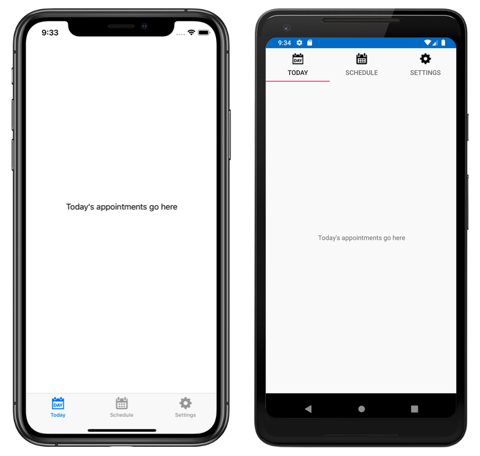
The Xamarin.Forms TabbedPage consists of a list of tabs and a larger detail area, with each tab loading content into the detail area. The following screenshots show a TabbedPage on iOS and Android:
On iOS, the list of tabs appears at the bottom of the screen, and the detail area is above. Each tab consists of a title and an icon, which should be a PNG file with an alpha channel. In portrait orientation, tab bar icons appear above tab titles. In landscape orientation, icons and titles appear side by side. In addition, a regular or compact tab bar may be displayed, depending on the device and orientation. If there are more than five tabs, a More tab will appear, which can be used to access the additional tabs.
On Android, the list of tabs appears at the top of the screen, and the detail area is below. Each tab consists of a title and an icon, which should be a PNG file with an alpha channel. However, the tabs can be moved to the bottom of the screen with a platform-specific. If there are more than five tabs, and the tab list is at the bottom of the screen, a More tab will appear that can be used to access the additional tabs. For information about icon requirements, see Tabs on material.io and Support different pixel densities on developer.android.com. For information about moving the tabs to the bottom of the screen, see Setting TabbedPage Toolbar Placement and Color.
On the Universal Windows Platform (UWP), the list of tabs appears at the top of the screen, and the details area is below. Each tab consists of a title. However, icons can be added to each tab with a platform-specific. For more information, see TabbedPage Icons on Windows.
Tip
Scalable Vector Graphic (SVG) files can be displayed as tab icons on a TabbedPage:
- The iOS
TabbedRendererclass has an overridableGetIconmethod that can be used to load tab icons from a specified source. In addition, selected and unselected versions of an icon can be provided if required. - The Android AppCompat
TabbedPageRendererclass has an overridableSetTabIconImageSourcemethod that can be used to load tab icons from a customDrawable. Alternatively, SVG files can be converted to vector drawable resources, which can automatically be displayed by Xamarin.Forms. For more information about converting SVG files to vector drawable resources, see Add multi-density vector graphics on developer.android.com.
Create a TabbedPage
Two approaches can be used to create a TabbedPage:
- Populate the
TabbedPagewith a collection of childPageobjects, such as a collection ofContentPageobjects. For more information, see Populate a TabbedPage with a Page Collection. - Assign a collection to the
ItemsSourceproperty and assign aDataTemplateto theItemTemplateproperty to return pages for objects in the collection. For more information, see Populate a TabbedPage with a template.
With both approaches, the TabbedPage will display each page as the user selects each tab.
Important
It's recommended that a TabbedPage should be populated with NavigationPage and ContentPage instances only. This will help to ensure a consistent user experience across all platforms.
In addition, TabbedPage defines the following properties:
BarBackgroundColor, of typeColor, the background color of the tab bar.BarTextColor, of typeColor, the color of text on the tab bar.SelectedTabColor, of typeColor, the color of the tab when it's selected.UnselectedTabColor, of typeColor, the color of the tab when it's unselected.
All of these properties are backed by BindableProperty objects, which means that they can be styled, and the properties can be the targets of data bindings.
Warning
In a TabbedPage, each Page object is created when the TabbedPage is constructed. This can lead to a poor user experience, particularly if the TabbedPage is the root page of the application. However, Xamarin.Forms Shell enables pages accessed through a tab bar to be created on demand, in response to navigation. For more information, see Xamarin.Forms Shell.
Populate a TabbedPage with a Page collection
A TabbedPage can be populated with a collection of child Page objects, such as a collection of ContentPage objects. This is achieved by adding the Page objects to the TabbedPage.Children collection. This is accomplished in XAML as follows:
<TabbedPage xmlns="http://xamarin.com/schemas/2014/forms"
            xmlns:x="http://schemas.microsoft.com/winfx/2009/xaml"
            xmlns:local="clr-namespace:TabbedPageWithNavigationPage;assembly=TabbedPageWithNavigationPage"
            x:Class="TabbedPageWithNavigationPage.MainPage">
    <local:TodayPage />
    <NavigationPage Title="Schedule" IconImageSource="schedule.png">
        <x:Arguments>
            <local:SchedulePage />
        </x:Arguments>
    </NavigationPage>
</TabbedPage>
Note
The Children property of the MultiPage<T> class, from which TabbedPage derives, is the ContentProperty of MultiPage<T>. Therefore, in XAML it's not necessary to explicitly assign the Page objects to the Children property.
The equivalent C# code is:
public class MainPageCS : TabbedPage
{
  public MainPageCS ()
  {
    NavigationPage navigationPage = new NavigationPage (new SchedulePageCS ());
    navigationPage.IconImageSource = "schedule.png";
    navigationPage.Title = "Schedule";

    Children.Add (new TodayPageCS ());
    Children.Add (navigationPage);
  }
}
In this example, the TabbedPage is populated with two Page objects. The first child is a
ContentPage object, and the second child is a NavigationPage containing a ContentPage object.
The following screenshots show a ContentPage object in a TabbedPage:
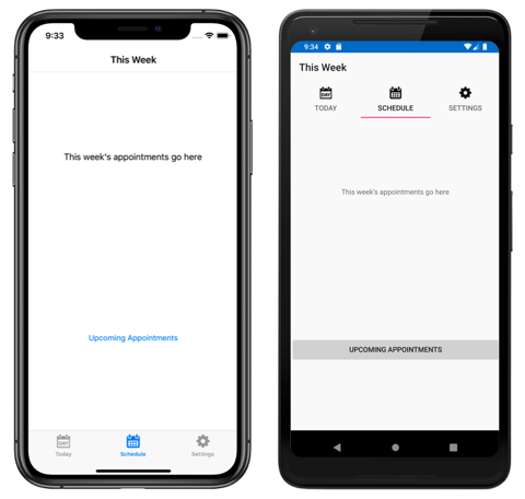
Selecting another tab displays the ContentPage object that represents the tab:
On the Schedule tab, the ContentPage object is wrapped in a NavigationPage object.
Warning
While a NavigationPage can be placed in a TabbedPage, it's not recommended to place a TabbedPage into a NavigationPage. This is because, on iOS, a UITabBarController always acts as a wrapper for the UINavigationController. For more information, see Combined View Controller Interfaces in the iOS Developer Library.
Navigate within a tab
Navigation can be performed within a tab, provided that the ContentPage object is wrapped in a NavigationPage object. This is accomplished by invoking the PushAsync method on the Navigation property of the ContentPage object:
await Navigation.PushAsync (new UpcomingAppointmentsPage ());
The page being navigated to is specified as the argument to the PushAsync method. In this example, the UpcomingAppointmentsPage page is pushed onto the navigation stack, where it becomes the active page:
For more information about performing navigation using the NavigationPage class, see Hierarchical Navigation.
Populate a TabbedPage with a template
A TabbedPage can be populated with pages by assigning a collection of data to the ItemsSource property, and by assigning a DataTemplate to the ItemTemplate property that templates the data as Page objects. This is accomplished in XAML as follows:
<TabbedPage xmlns="http://xamarin.com/schemas/2014/forms"
            xmlns:x="http://schemas.microsoft.com/winfx/2006/xaml"
            xmlns:local="clr-namespace:TabbedPageDemo;assembly=TabbedPageDemo"
            x:Class="TabbedPageDemo.TabbedPageDemoPage"
            ItemsSource="{x:Static local:MonkeyDataModel.All}">
  <TabbedPage.Resources>
    <ResourceDictionary>
      <local:NonNullToBooleanConverter x:Key="booleanConverter" />
    </ResourceDictionary>
  </TabbedPage.Resources>
  <TabbedPage.ItemTemplate>
    <DataTemplate>
      <ContentPage Title="{Binding Name}" IconImageSource="monkeyicon.png">
        <StackLayout Padding="5, 25">
          <Label Text="{Binding Name}" Font="Bold,Large" HorizontalOptions="Center" />
          <Image Source="{Binding PhotoUrl}" WidthRequest="200" HeightRequest="200" />
          <StackLayout Padding="50, 10">
            <StackLayout Orientation="Horizontal">
              <Label Text="Family:" HorizontalOptions="FillAndExpand" />
              <Label Text="{Binding Family}" Font="Bold,Medium" />
            </StackLayout>
            ...
          </StackLayout>
        </StackLayout>
      </ContentPage>
    </DataTemplate>
  </TabbedPage.ItemTemplate>
</TabbedPage>
The equivalent C# code is:
public class TabbedPageDemoPageCS : TabbedPage
{
  public TabbedPageDemoPageCS ()
  {
    var booleanConverter = new NonNullToBooleanConverter ();

    ItemTemplate = new DataTemplate (() =>
    {
      var nameLabel = new Label
      {
        FontSize = Device.GetNamedSize (NamedSize.Large, typeof(Label)),
        FontAttributes = FontAttributes.Bold,
        HorizontalOptions = LayoutOptions.Center
      };
      nameLabel.SetBinding (Label.TextProperty, "Name");

      var image = new Image { WidthRequest = 200, HeightRequest = 200 };
      image.SetBinding (Image.SourceProperty, "PhotoUrl");

      var familyLabel = new Label
      {
        FontSize = Device.GetNamedSize (NamedSize.Medium, typeof(Label)),
        FontAttributes = FontAttributes.Bold
      };
      familyLabel.SetBinding (Label.TextProperty, "Family");
      ...

      var contentPage = new ContentPage
      {
        IconImageSource = "monkeyicon.png",
        Content = new StackLayout {
          Padding = new Thickness (5, 25),
          Children =
          {
            nameLabel,
            image,
            new StackLayout
            {
              Padding = new Thickness (50, 10),
              Children =
              {
                new StackLayout
                {
                  Orientation = StackOrientation.Horizontal,
                  Children =
                  {
                    new Label { Text = "Family:", HorizontalOptions = LayoutOptions.FillAndExpand },
                    familyLabel
                  }
                },
                // ...
              }
            }
          }
        }
      };
      contentPage.SetBinding (TitleProperty, "Name");
      return contentPage;
    });
    ItemsSource = MonkeyDataModel.All;
  }
}
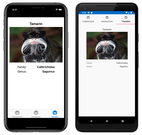
In this example, each tab consists of a ContentPage object that uses Image and Label objects to display data for the tab:
Selecting another tab displays the ContentPage object that represents the tab.


