Xamarin.Forms Carousel Page
The Xamarin.Forms CarouselPage is a page that users can swipe from side to side to navigate through pages of content, like a gallery. This article demonstrates how to use a CarouselPage to navigate through a collection of pages.
Important
The CarouselPage has been superseded by the CarouselView, which provides a scrollable layout where users can swipe to move through a collection of items. For more information about the CarouselView, see Xamarin.Forms CarouselView.
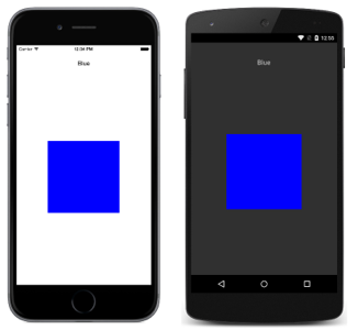
The following screenshots show a CarouselPage on each platform:

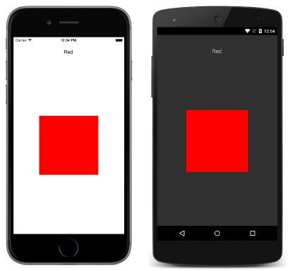
The layout of a CarouselPage is identical on each platform. Pages can be navigated through by swiping right to left to navigate forwards through the collection, and by swiping left to right to navigate backwards through the collection. The following screenshots show the first page in a CarouselPage instance:

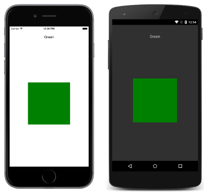
Swiping from right to left moves to the second page, as shown in the following screenshots:

Swiping from right to left again moves to the third page, while swiping from left to right returns to the previous page.
Note
The CarouselPage does not support UI virtualization. Therefore, performance may be affected if the CarouselPage contains too many child elements.
If a CarouselPage is embedded into the Detail page of a FlyoutPage, the FlyoutPage.IsGestureEnabled property should be set to false to prevent gesture conflicts between the CarouselPage and the FlyoutPage.
For more information about the CarouselPage, see Chapter 25 of Charles Petzold's Xamarin.Forms book.
Create a CarouselPage
Two approaches can be used to create a CarouselPage:
- Populate the
CarouselPagewith a collection of childContentPageinstances. - Assign a collection to the
ItemsSourceproperty and assign aDataTemplateto theItemTemplateproperty to returnContentPageinstances for objects in the collection.
With both approaches, the CarouselPage will then display each page in turn, with a swipe interaction moving to the next page to be displayed.
Note
A CarouselPage can only be populated with ContentPage instances, or ContentPage derivatives.
Populate a CarouselPage with a Page collection
The following XAML code example shows a CarouselPage that displays three ContentPage instances:
<CarouselPage xmlns="http://xamarin.com/schemas/2014/forms"
              xmlns:x="http://schemas.microsoft.com/winfx/2009/xaml"
              x:Class="CarouselPageNavigation.MainPage">
    <ContentPage>
        <ContentPage.Padding>
          <OnPlatform x:TypeArguments="Thickness">
              <On Platform="iOS, Android" Value="0,40,0,0" />
          </OnPlatform>
        </ContentPage.Padding>
        <StackLayout>
            <Label Text="Red" FontSize="Medium" HorizontalOptions="Center" />
            <BoxView Color="Red" WidthRequest="200" HeightRequest="200" HorizontalOptions="Center" VerticalOptions="CenterAndExpand" />
        </StackLayout>
    </ContentPage>
    <ContentPage>
        ...
    </ContentPage>
    <ContentPage>
        ...
    </ContentPage>
</CarouselPage>
The following code example shows the equivalent UI in C#:
public class MainPageCS : CarouselPage
{
    public MainPageCS ()
    {
        Thickness padding;
        switch (Device.RuntimePlatform)
        {
            case Device.iOS:
            case Device.Android:
                padding = new Thickness(0, 40, 0, 0);
                break;
            default:
                padding = new Thickness();
                break;
        }

        var redContentPage = new ContentPage {
            Padding = padding,
            Content = new StackLayout {
                Children = {
                    new Label {
                        Text = "Red",
                        FontSize = Device.GetNamedSize (NamedSize.Medium, typeof(Label)),
                        HorizontalOptions = LayoutOptions.Center
                    },
                    new BoxView {
                        Color = Color.Red,
                        WidthRequest = 200,
                        HeightRequest = 200,
                        HorizontalOptions = LayoutOptions.Center,
                        VerticalOptions = LayoutOptions.CenterAndExpand
                    }
                }
            }
        };
        var greenContentPage = new ContentPage {
            Padding = padding,
            Content = new StackLayout {
                ...
            }
        };
        var blueContentPage = new ContentPage {
            Padding = padding,
            Content = new StackLayout {
                ...
            }
        };

        Children.Add (redContentPage);
        Children.Add (greenContentPage);
        Children.Add (blueContentPage);
    }
}
Each ContentPage simply displays a Label for a particular color and a BoxView of that color.
Populate a CarouselPage with a template
The following XAML code example shows a CarouselPage constructed by assigning a DataTemplate to the ItemTemplate property to return pages for objects in the collection:
<CarouselPage xmlns="http://xamarin.com/schemas/2014/forms"
              xmlns:x="http://schemas.microsoft.com/winfx/2009/xaml"
              x:Class="CarouselPageNavigation.MainPage">
    <CarouselPage.ItemTemplate>
        <DataTemplate>
            <ContentPage>
                <ContentPage.Padding>
                  <OnPlatform x:TypeArguments="Thickness">
                    <On Platform="iOS, Android" Value="0,40,0,0" />
                  </OnPlatform>
                </ContentPage.Padding>
                <StackLayout>
                    <Label Text="{Binding Name}" FontSize="Medium" HorizontalOptions="Center" />
                    <BoxView Color="{Binding Color}" WidthRequest="200" HeightRequest="200" HorizontalOptions="Center" VerticalOptions="CenterAndExpand" />
                </StackLayout>
            </ContentPage>
        </DataTemplate>
    </CarouselPage.ItemTemplate>
</CarouselPage>
The CarouselPage is populated with data by setting the ItemsSource property in the constructor for the code-behind file:
public MainPage ()
{
    ...
    ItemsSource = ColorsDataModel.All;
}
The following code example shows the equivalent CarouselPage created in C#:
public class MainPageCS : CarouselPage
{
    public MainPageCS ()
    {
        Thickness padding;
        switch (Device.RuntimePlatform)
        {
            case Device.iOS:
            case Device.Android:
                padding = new Thickness(0, 40, 0, 0);
                break;
            default:
                padding = new Thickness();
                break;
        }

        ItemTemplate = new DataTemplate (() => {
            var nameLabel = new Label {
                FontSize = Device.GetNamedSize (NamedSize.Medium, typeof(Label)),
                HorizontalOptions = LayoutOptions.Center
            };
            nameLabel.SetBinding (Label.TextProperty, "Name");

            var colorBoxView = new BoxView {
                WidthRequest = 200,
                HeightRequest = 200,
                HorizontalOptions = LayoutOptions.Center,
                VerticalOptions = LayoutOptions.CenterAndExpand
            };
            colorBoxView.SetBinding (BoxView.ColorProperty, "Color");

            return new ContentPage {
                Padding = padding,
                Content = new StackLayout {
                    Children = {
                        nameLabel,
                        colorBoxView
                    }
                }
            };
        });

        ItemsSource = ColorsDataModel.All;
    }
}
Each ContentPage simply displays a Label for a particular color and a BoxView of that color.