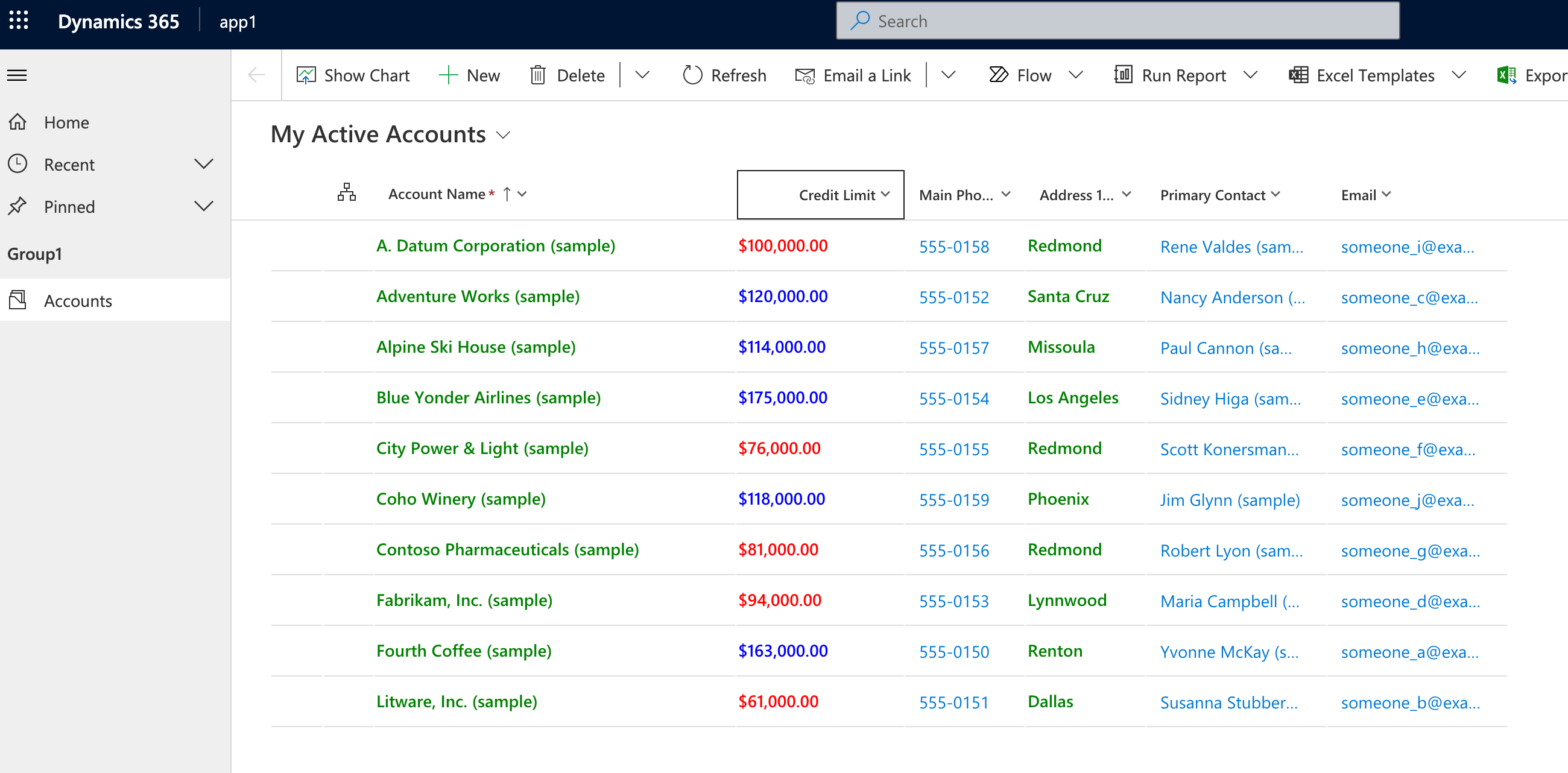
Customized editable grid
This sample demonstrates how to customize the Power Apps editable grid control as described in Customize the editable grid control.
This sample changes the main grid page for a table that is configured to use this control. All text columns will use green text. Any values for the creditlimit column will display as blue if the value is greater than 100,000 and red otherwise.

Available for
Model-driven apps
Code
You can find the code for sample here: PowerApps-Samples/component-framework/PowerAppsGridCustomizerControl/.
The key change is to PAGridCustomizer/customizers/CellRendererOverrides.tsx .
This sample uses the following override for the cell renderer to change the text color for text fields to green, and the color of the creditlimit column depends on the value.
import { Label } from '@fluentui/react';
import * as React from 'react';
import { CellRendererOverrides } from '../types';

export const cellRendererOverrides: CellRendererOverrides = {
    ["Text"]: (props, col) => {
        // Render all text cells in green font
        return <Label style={{ color: 'green' }}>{props.formattedValue}</Label>
    },
    ["Currency"]: (props, col) => {
        // Only override the cell renderer for the CreditLimit column
        if (col.colDefs[col.columnIndex].name === 'creditlimit') {
            // Render the cell value in blue when the value is more than $100,000 and red otherwise
            if ((props.value as number) > 100000) {
                return <Label style={{ color: 'blue' }}>{props.formattedValue}</Label>
            }
            else {
                return <Label style={{ color: 'red' }}>{props.formattedValue}</Label>
            }
        }
    }
}
Related topics
Customize the editable grid control (Preview)
Download sample components
How to use the sample components
Power Apps component framework API reference
Power Apps component framework manifest schema reference