Outlook add-in design guidelines
Add-ins are a great way for partners to extend the functionality of Outlook beyond our core feature set. Add-ins enable users to access external experiences, tasks, and content without needing to leave their inbox. Once installed, Outlook add-ins are available on every platform and device.
The following high-level guidelines will help you design and build a compelling add-in, which brings the best of your app right into Outlook on the web, on Windows, on Mac, on Android, and on iOS.
Principles
Focus on a few key tasks; do them well
The best designed add-ins are simple to use, focused, and provide real value to users. Because your add-in will run inside of Outlook, there is additional emphasis placed on this principle. Outlook is a productivity app—it's where people go to get things done.
Your add-in will be an extension of our experience and it's important to make sure the scenarios you enable feel like a natural fit inside Outlook. Think carefully about which of your common use cases will benefit the most from having hooks to them from within our email and calendaring experiences.
Note
Add-ins that interact with the user's calendar, meetings, or appointments are available only if the user opens the calendar in Outlook, not Teams.
An add-in shouldn't attempt to do everything your app does. The focus should be on the most frequently used, and appropriate, actions in the context of Outlook content. Think about your call to action and make it clear what the user should do when your task pane opens.
Make it feel as native as possible
Your add-in should be designed using patterns native to the platform that Outlook is running on. To achieve this, be sure to respect and implement the interaction and visual guidelines set forth by each platform. Outlook has its own guidelines and those are also important to consider. A well-designed add-in will be an appropriate blend of your experience, the platform, and Outlook.
This does mean that your add-in will have to visually be different when it runs in Outlook on iOS versus on Android.
Make it enjoyable to use and get the details right
People enjoy using products that are both functionally and visually appealing. You can help ensure the success of your add-in by crafting an experience where you've carefully considered every interaction and visual detail. The necessary steps to complete a task must be clear and relevant. Ideally, no action should be further than a click or two away.
Try not to take a user out of context to complete an action. A user should easily be able to get in and out of your add-in and back to whatever they were doing before. An add-in isn't meant to be a destination to spend a lot of time in—it's an enhancement to our core functionality. If done properly, your add-in will help us deliver on the goal of making people more productive.
Brand wisely
We value great branding, and we know it's important to provide users with your unique experience. But we feel the best way to ensure your add-in's success is to build an intuitive experience that subtly incorporates elements of your brand versus displaying persistent or obtrusive brand elements that only distract a user from moving through your system in an unencumbered manner.
A good way to incorporate your brand in a meaningful way is through the use of your brand colors, icons, and voice—assuming these don't conflict with the preferred platform patterns or accessibility requirements. Strive to keep the focus on content and task completion, not brand attention.
Note
Ads should not be shown within add-ins in Outlook on iOS or on Android.
Design patterns
Note
While the above principles apply to all endpoints/platforms, the following patterns and examples are specific to mobile add-ins in Outlook on iOS.
To help you create a well-designed add-in, we have templates that contain iOS mobile patterns that work within the Outlook mobile environment. Leveraging these specific patterns will help ensure your add-in feels native to both the iOS platform and Outlook mobile. These patterns are also detailed later in this article. While not exhaustive, this is the start of a library that we'll continue to build upon as we uncover additional paradigms partners wish to include in their add-ins.
Overview
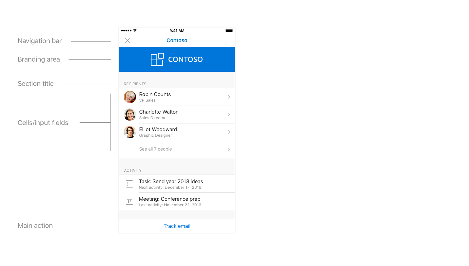
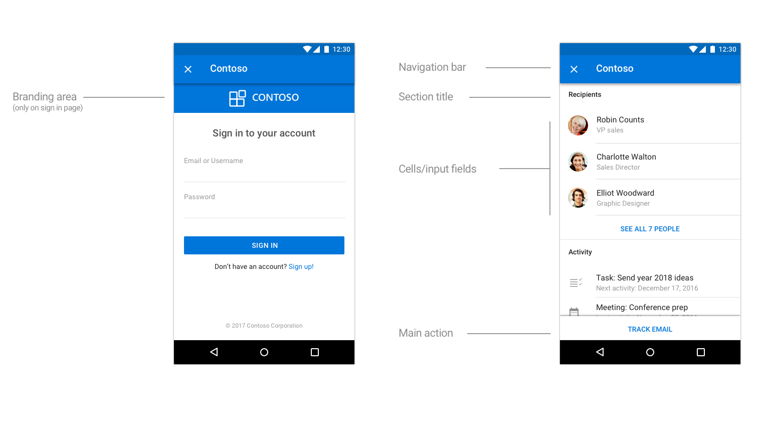
A typical add-in is made up of the following components.
Loading
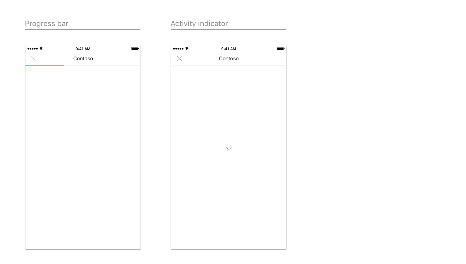
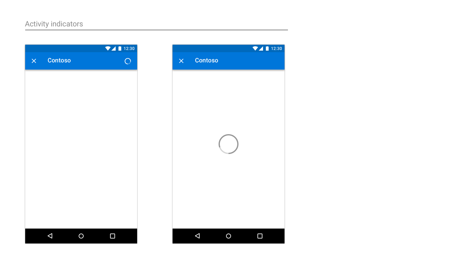
When a user taps on your add-in, the UX should display as quickly as possible. If there is any delay, use a progress bar or activity indicator. A progress bar should be used when the amount of time is determinable and an activity indicator should be used when the amount of time is indeterminable.
An example of loading pages on iOS
An example of loading pages on Android
Sign in/Sign up
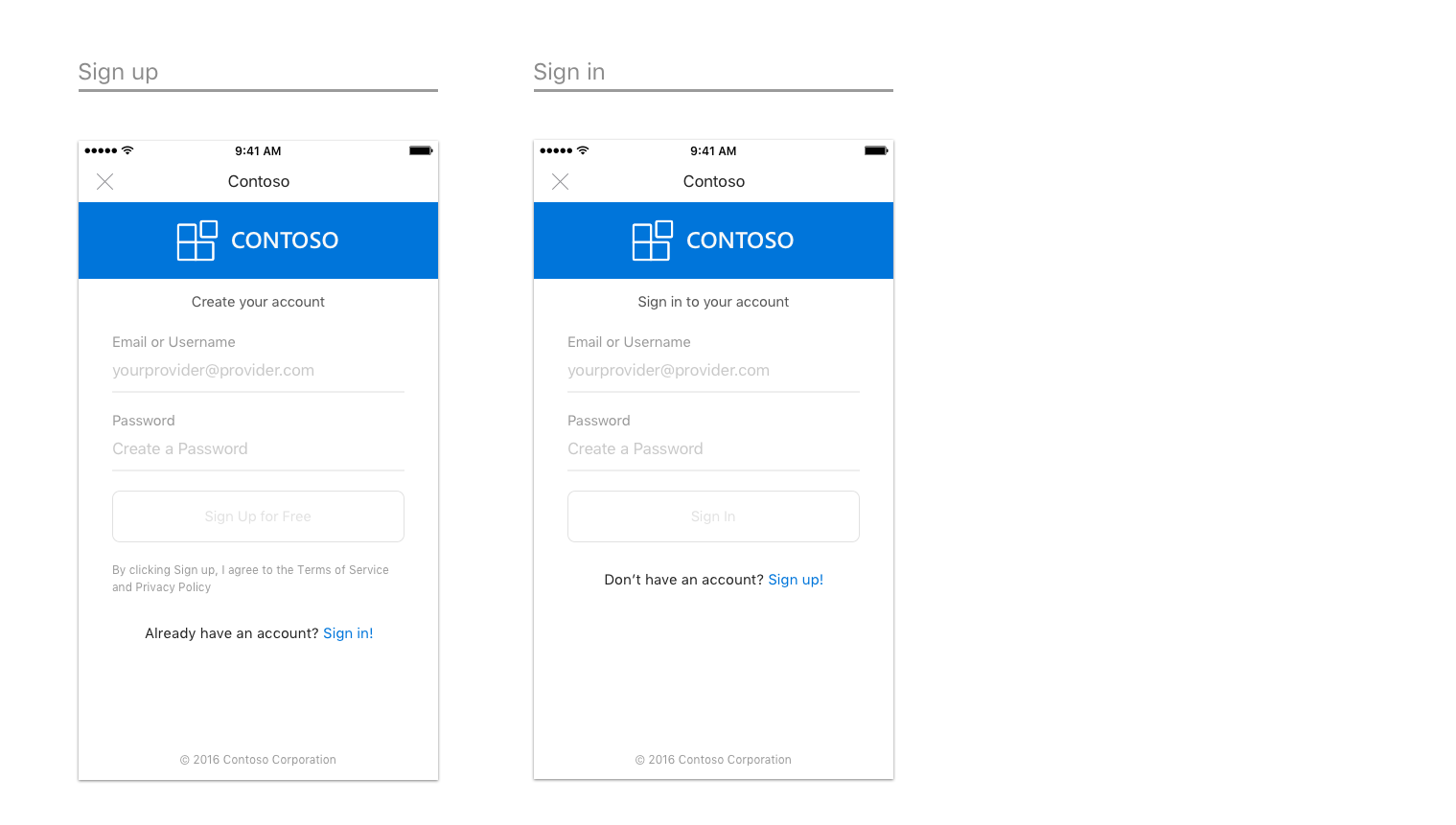
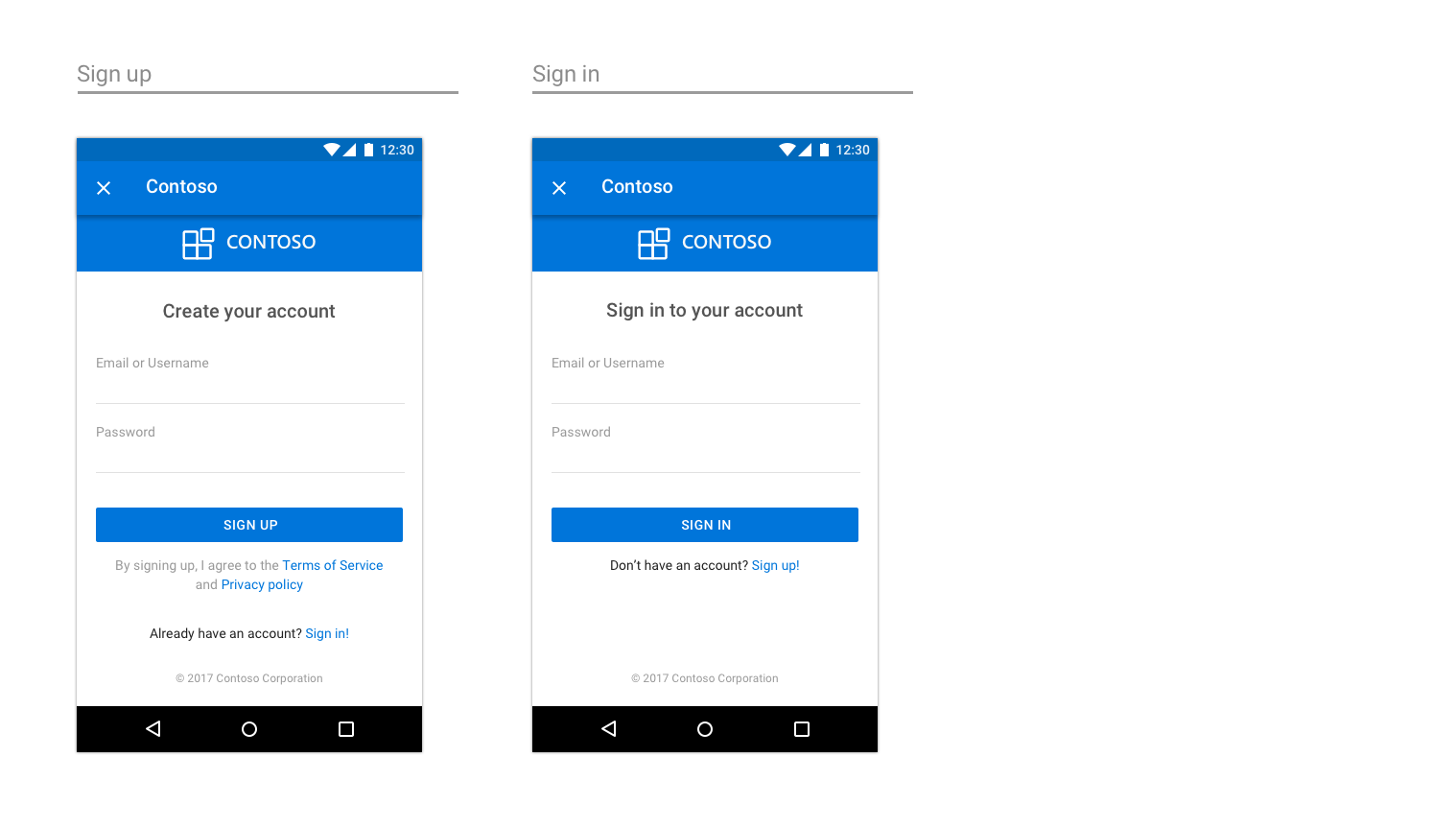
Make your sign in (and sign up) flow straightforward and simple to use.
An example page to sign in and sign up on iOS
An example sign in page on Android
Brand bar
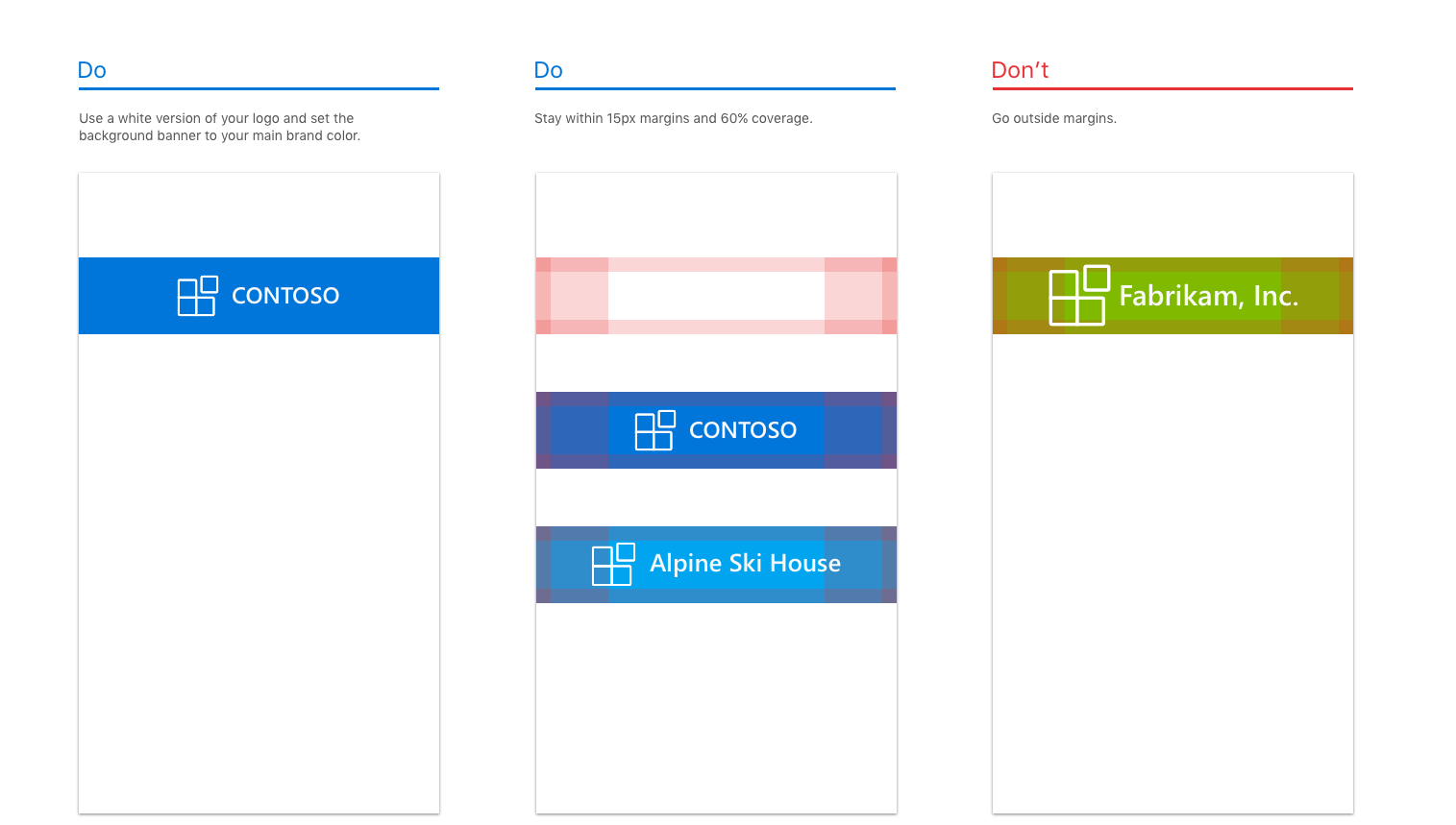
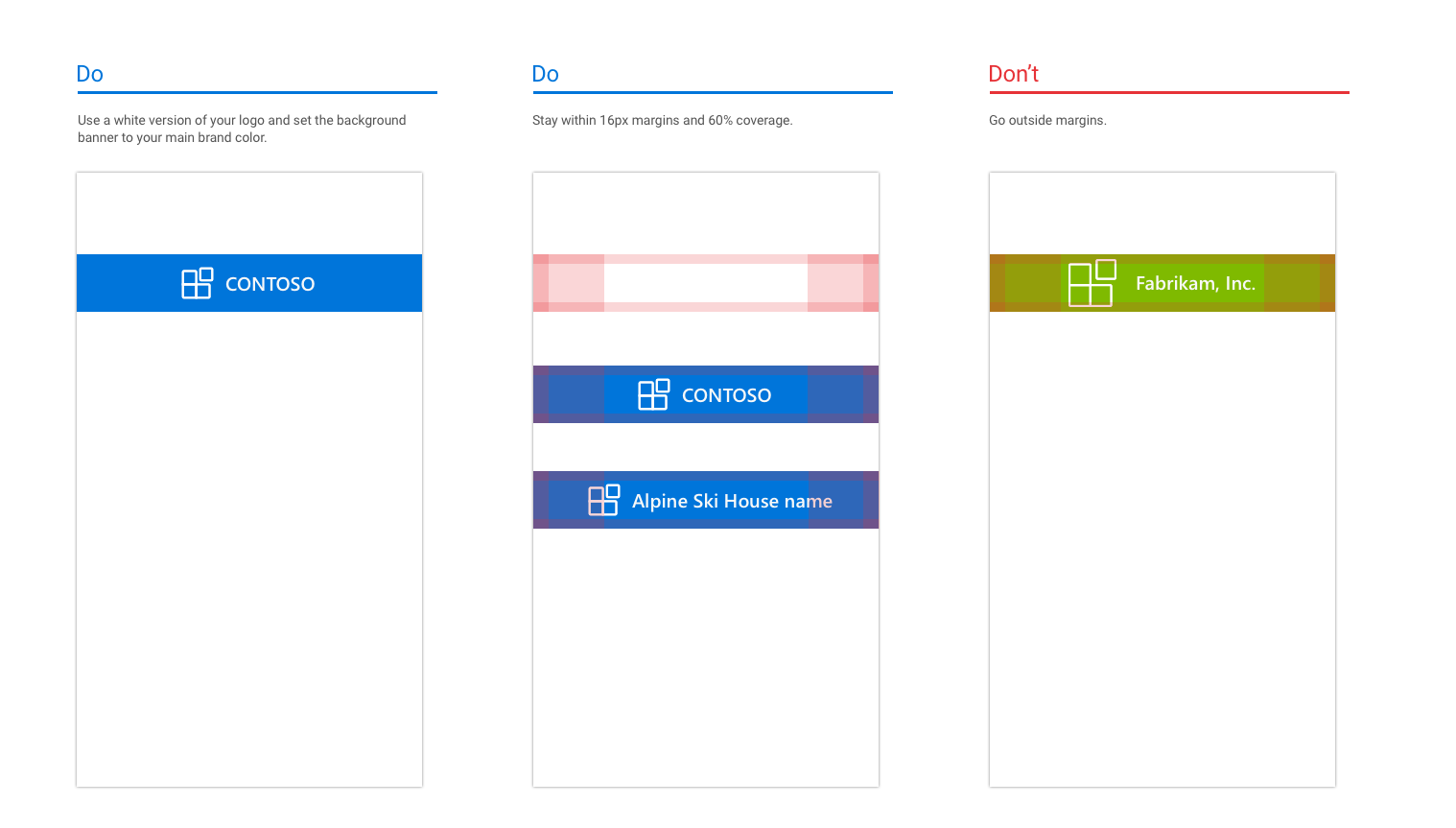
The first screen of your add-in should include your branding element. Designed for recognition, the brand bar also helps set context for the user. Because the navigation bar contains the name of your company/brand, it's unnecessary to repeat the brand bar on subsequent pages.
An example of branding on iOS
An example of branding on Android
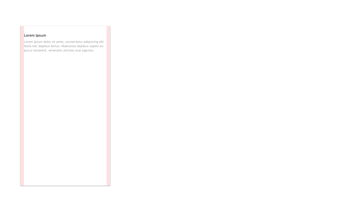
Margins
Mobile margins should be set to 15px (8% of screen) for each side, to align with Outlook on iOS and 16px for each side to align with Outlook on Android.
Typography
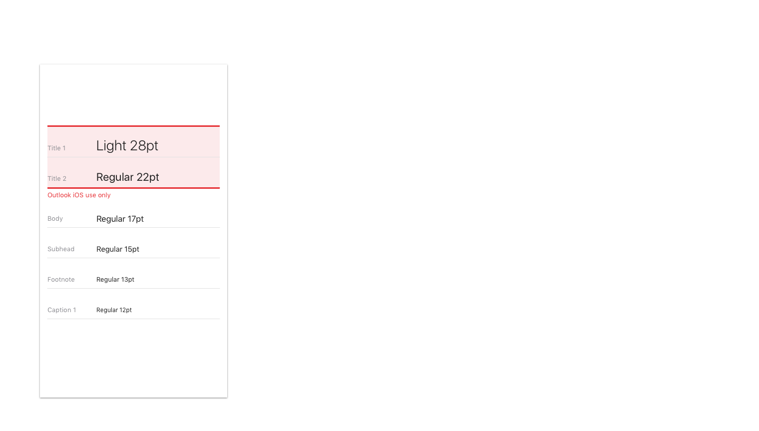
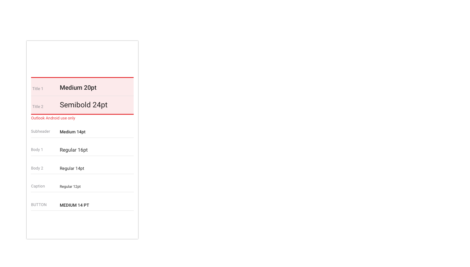
Typography usage is aligned to Outlook on iOS and is kept simple for scannability.
Typography on iOS
Typography on Android
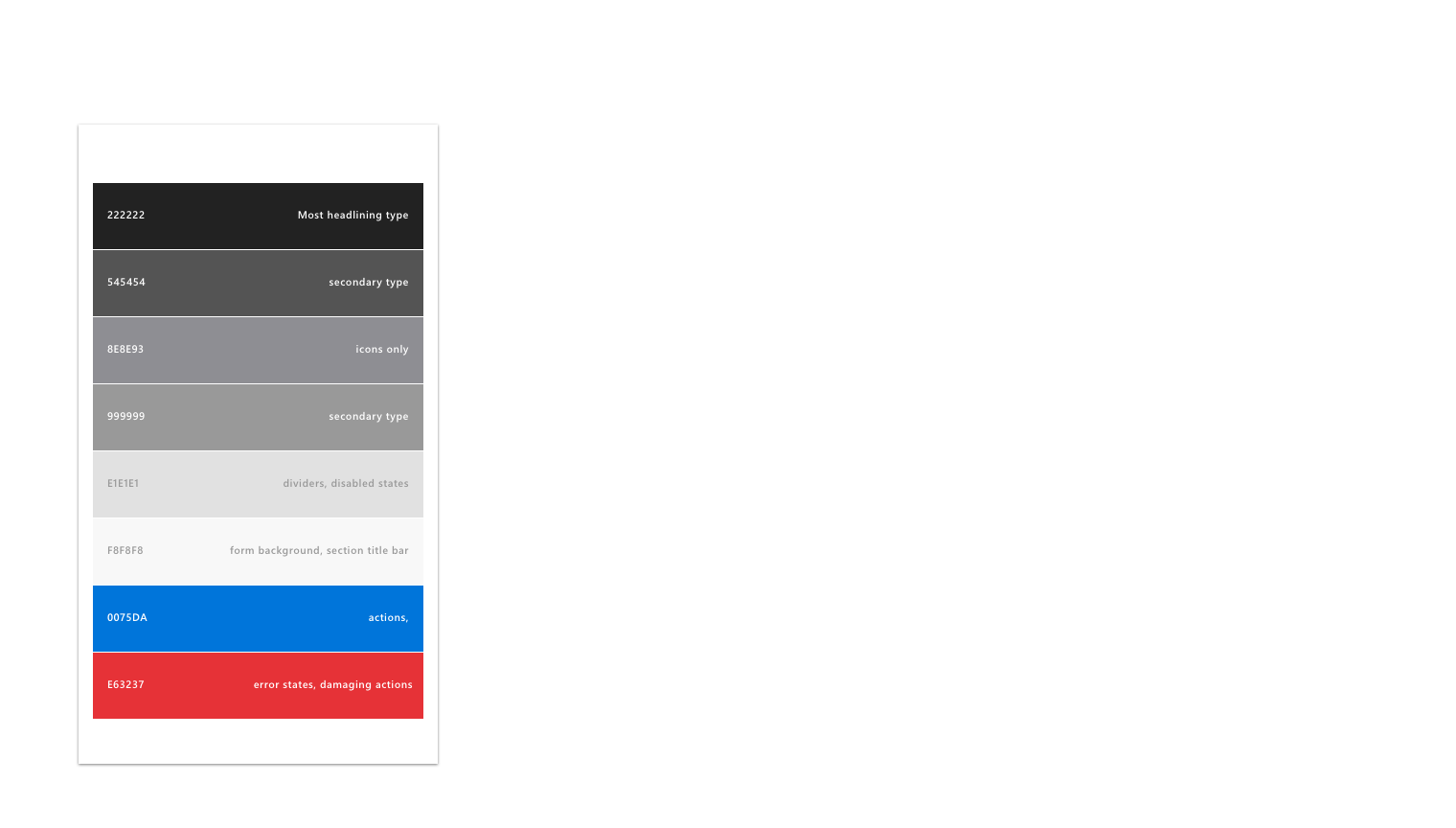
Color palette
Color usage is subtle in Outlook on iOS. To align, we ask that usage of color is localized to actions and error states, with only the brand bar using a unique color.
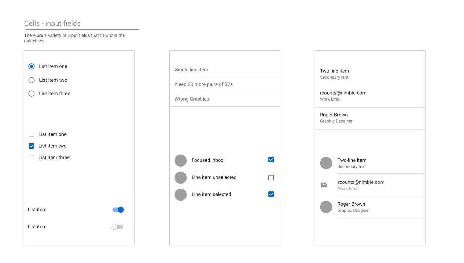
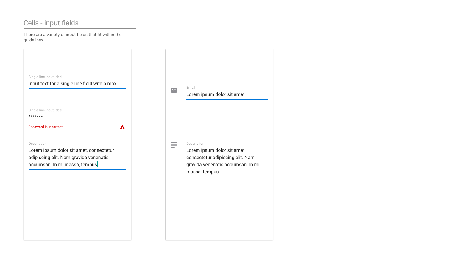
Cells
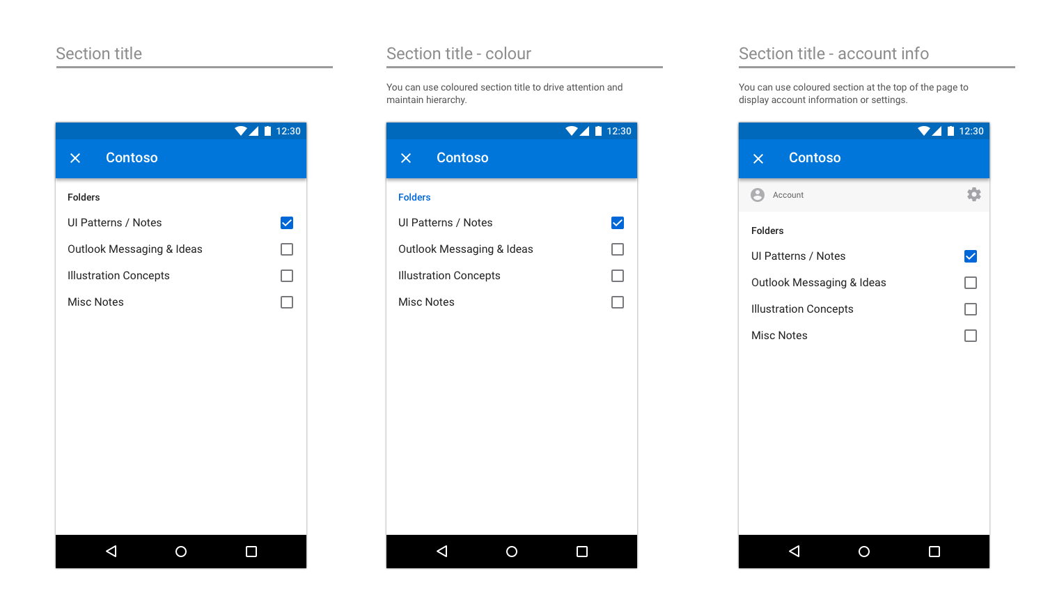
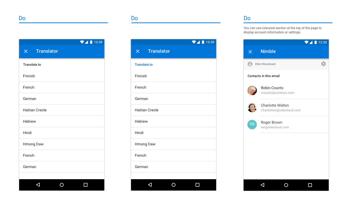
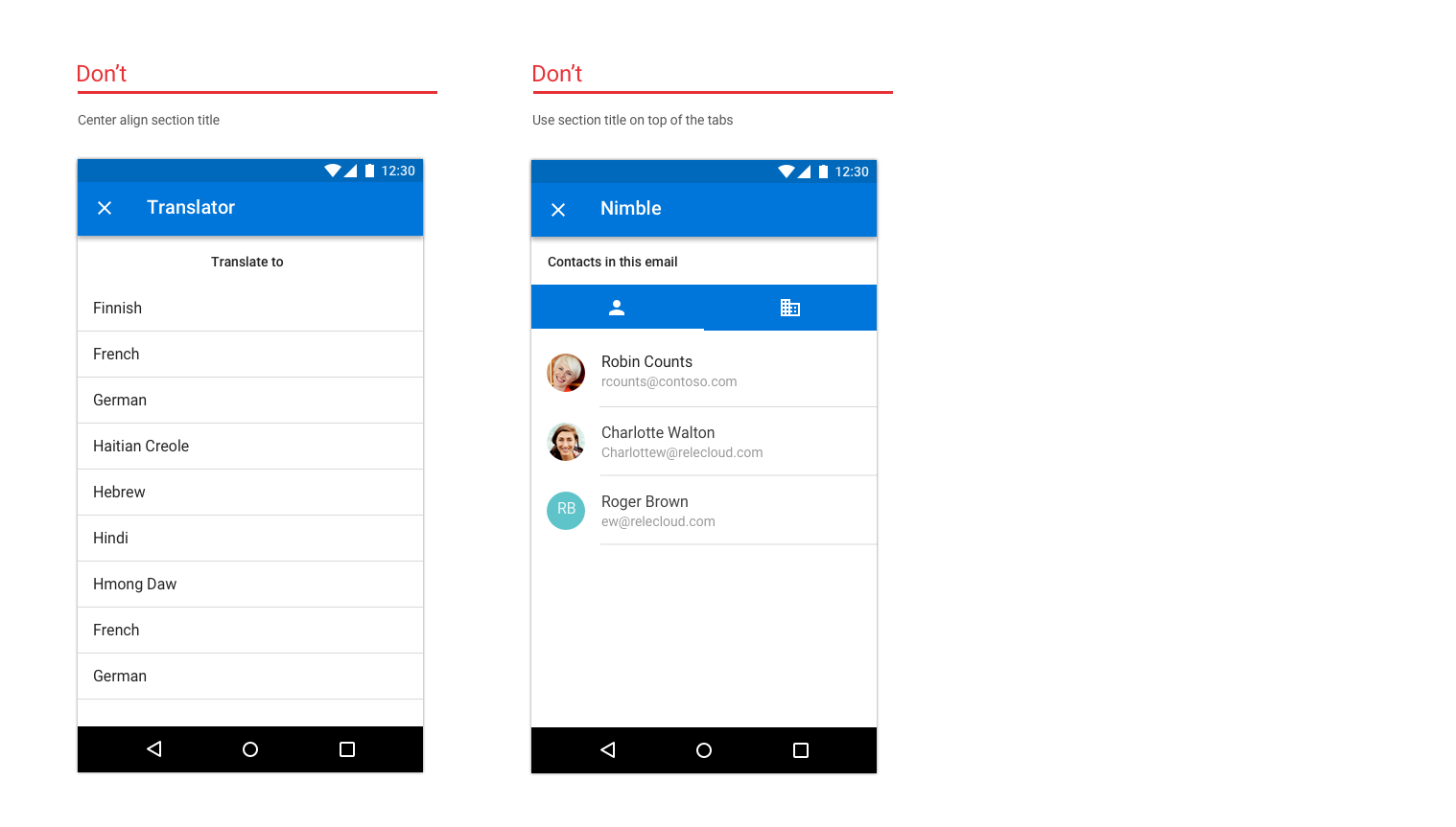
Since the navigation bar cannot be used to label a page, use section titles to label pages.
Examples of cells on iOS
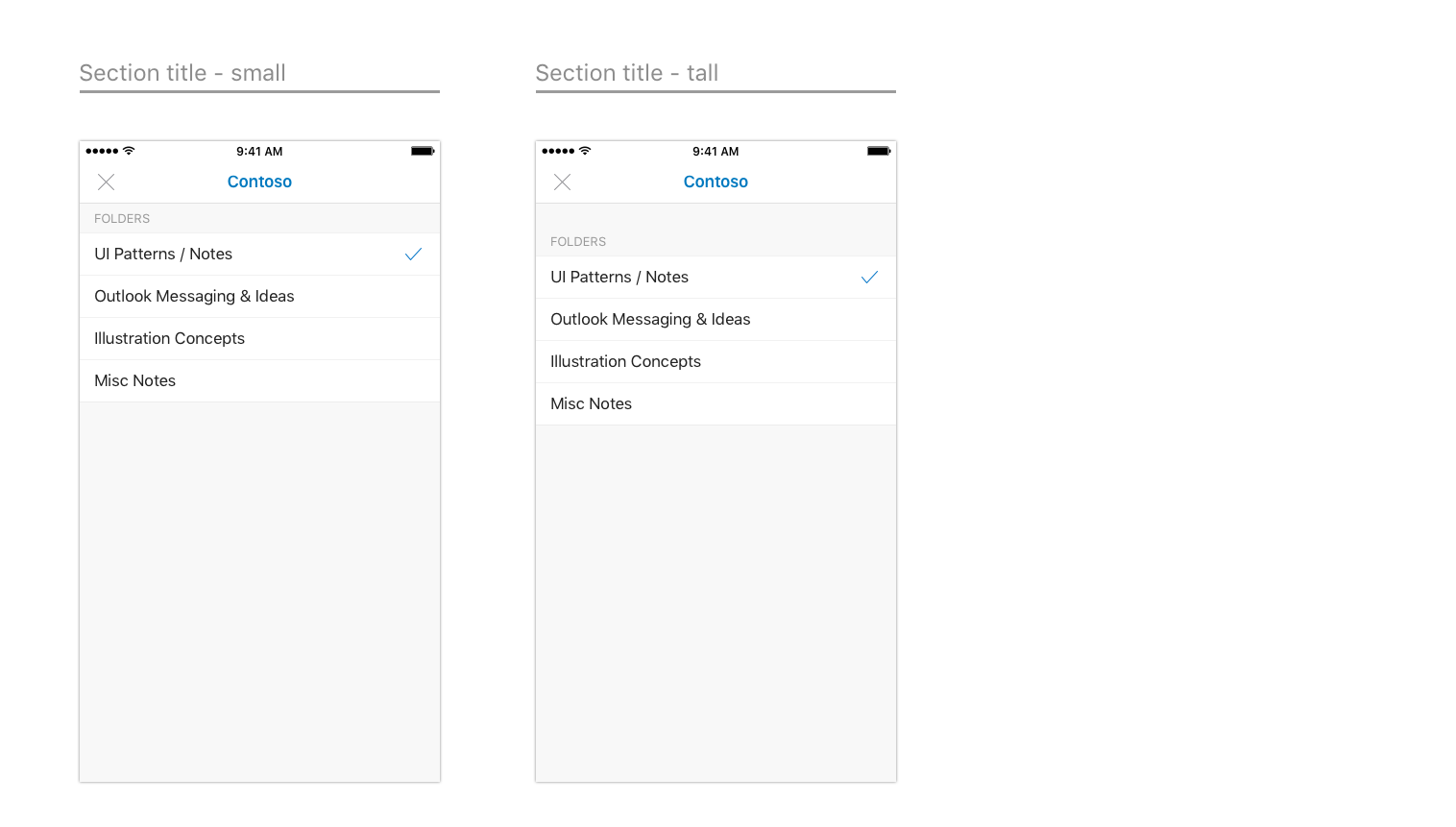
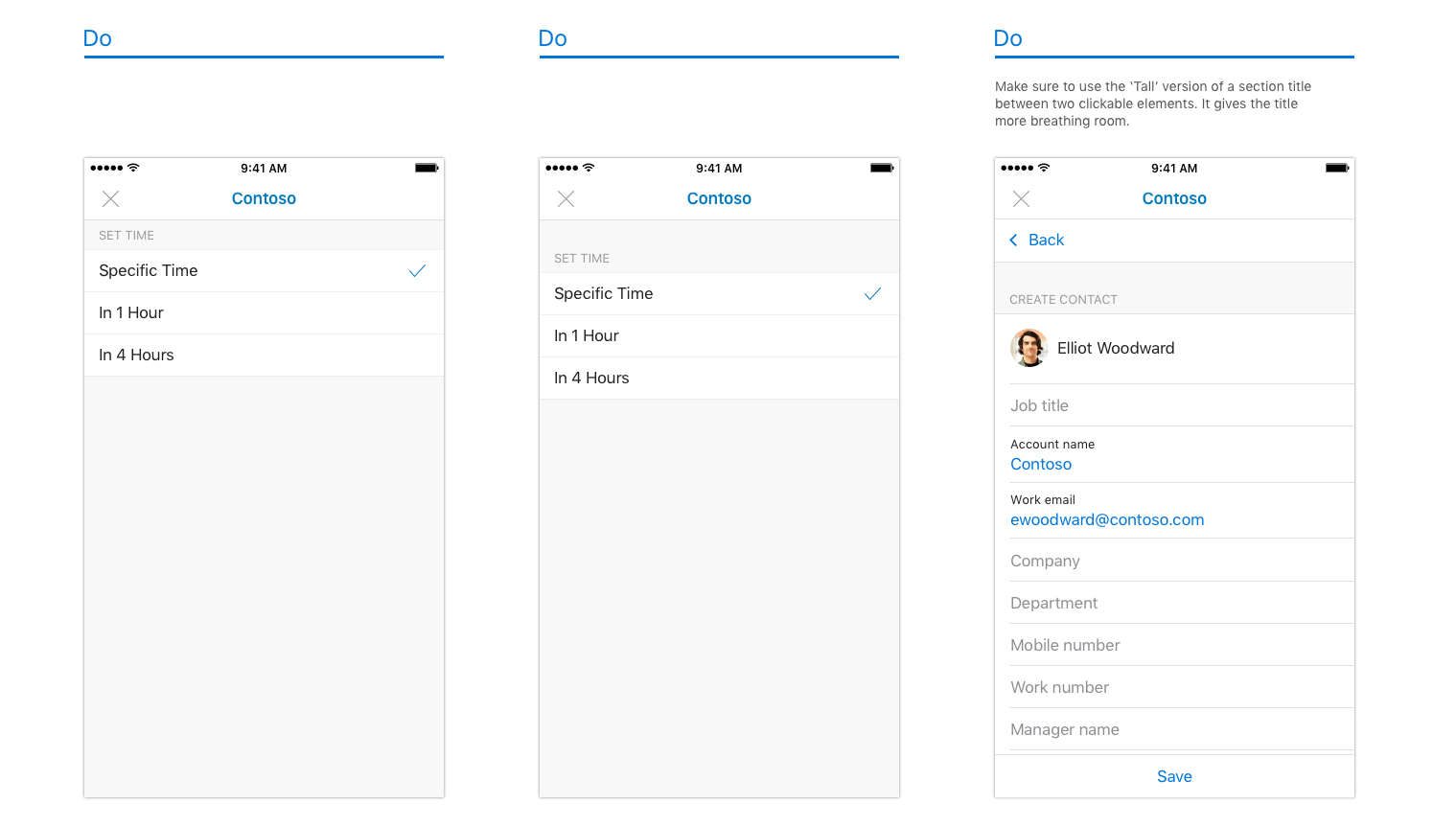
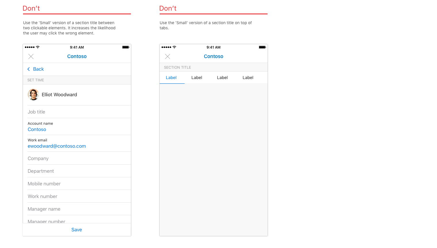
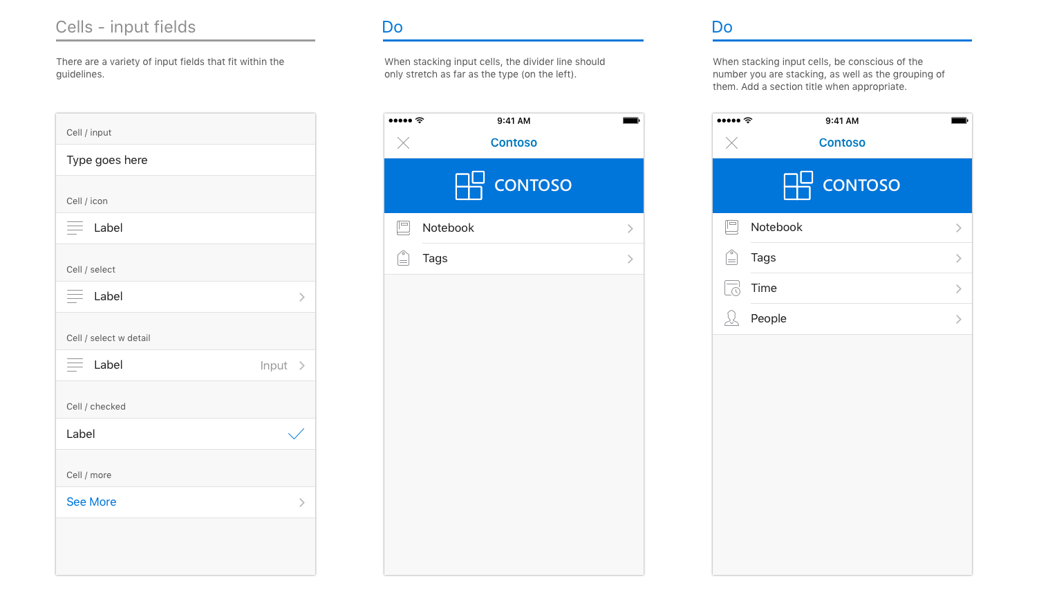
Examples of cells on Android
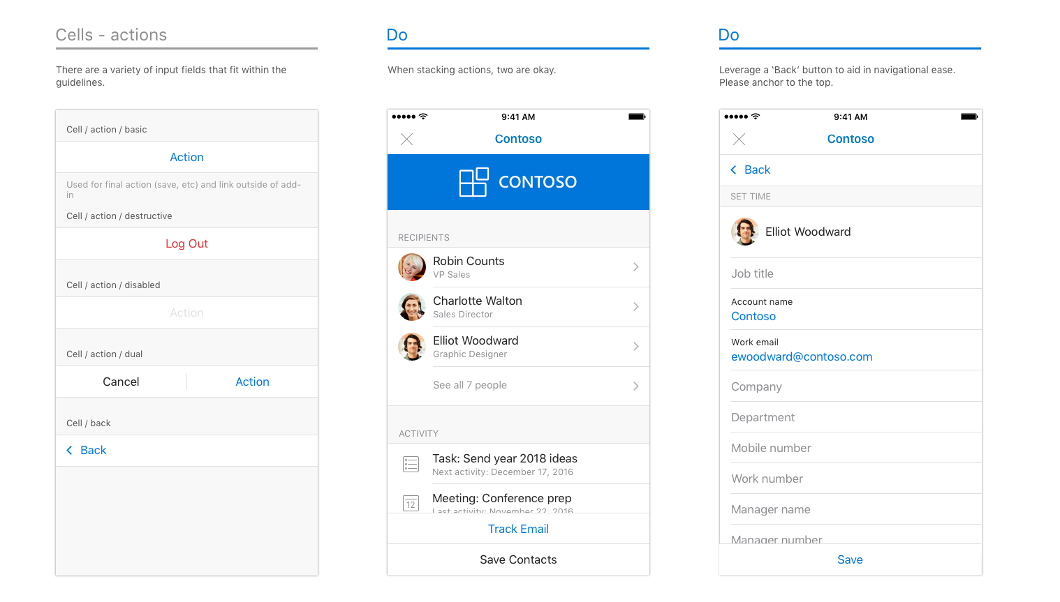
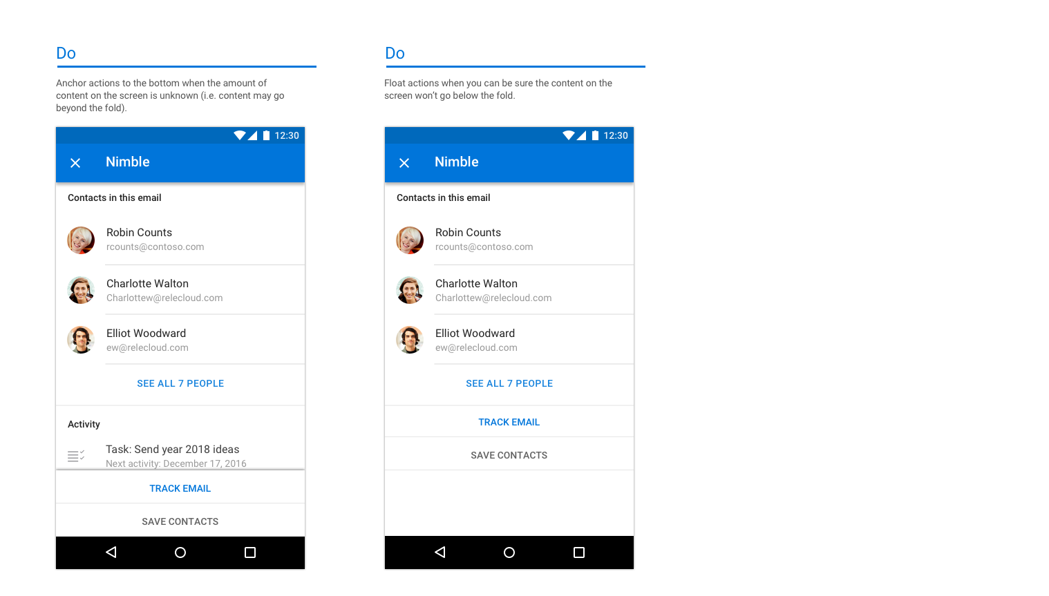
Actions
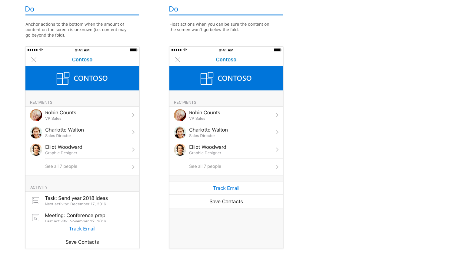
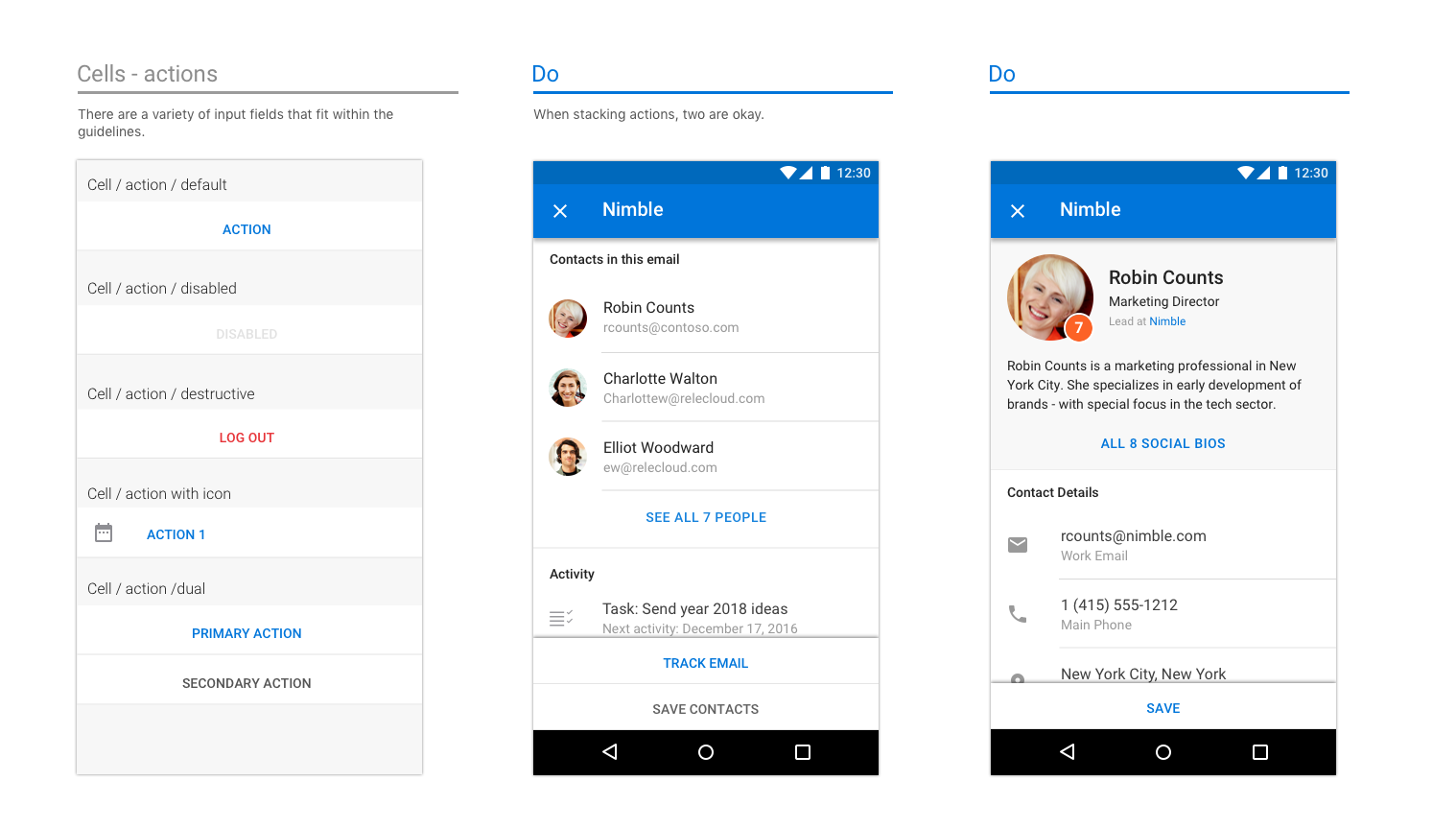
Even if your app handles a multitude of actions, think about the most important ones you want your add-in to perform, and concentrate on those.
Examples of actions on iOS
Examples of actions on Android
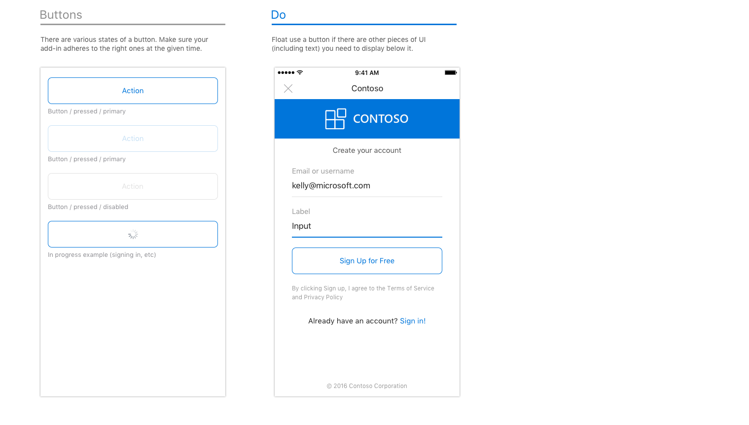
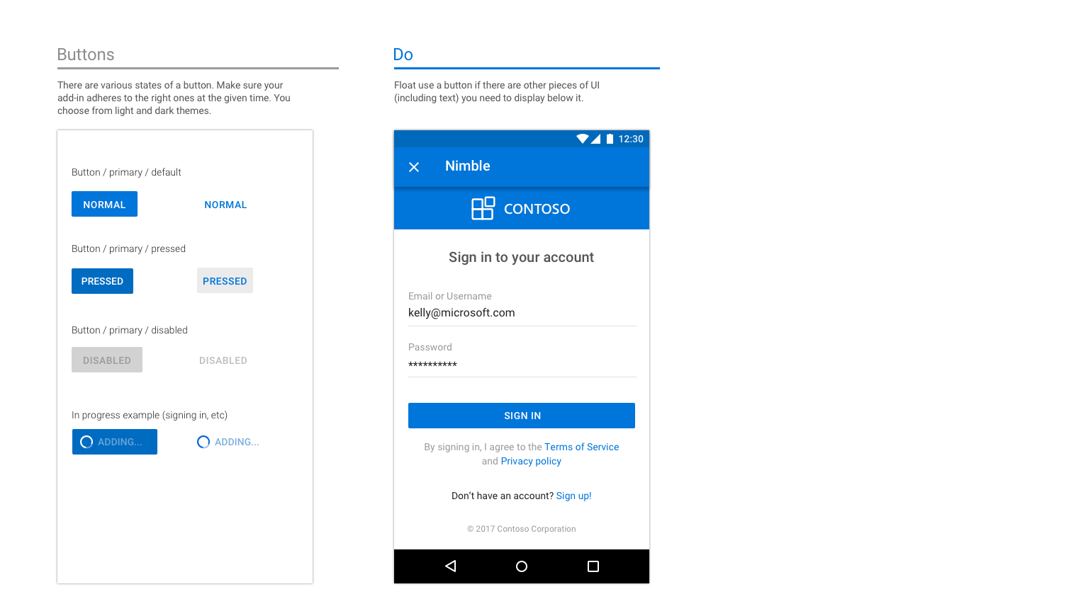
Buttons
Buttons are used when there are other UX elements below (vs. actions, where the action is the last element on the screen).
Examples of buttons on iOS
Examples of buttons on Android
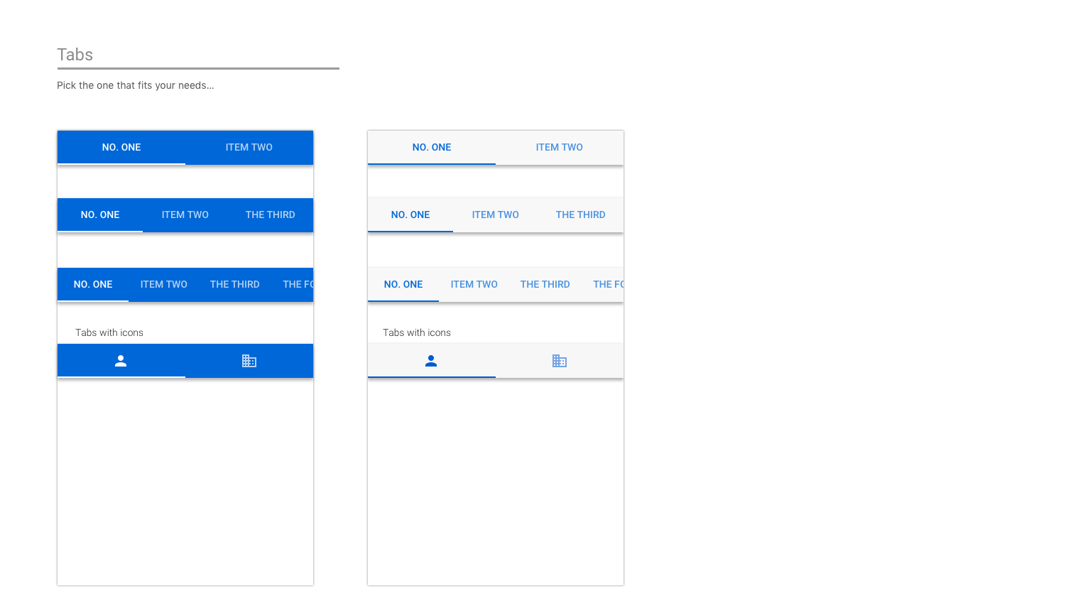
Tabs
Tabs can aid in content organization.
Examples of tabs on iOS
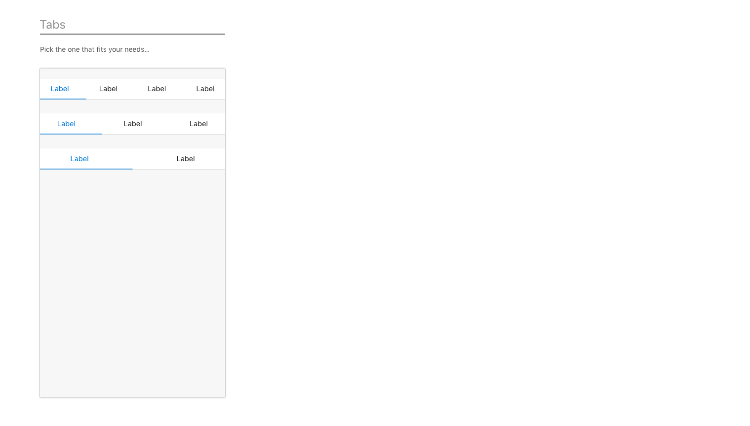
Examples of tabs on Android
Icons
Icons should follow the current Outlook on iOS design when possible. Use our standard size and color.
Examples of icons on iOS
![]()
Examples of icons on Android
![]()
End-to-end examples
When Outlook mobile add-ins were launched, we worked closely with our partners who were building add-ins. As a way to showcase the potential of their add-ins on Outlook mobile, our designer put together end-to-end flows for each add-in, leveraging our guidelines and patterns.
Important
These examples are meant to highlight the ideal way to approach both the interaction and visual design of an add-in and may not match the exact feature sets in the shipped versions of the add-ins.
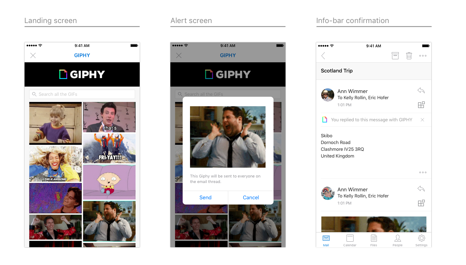
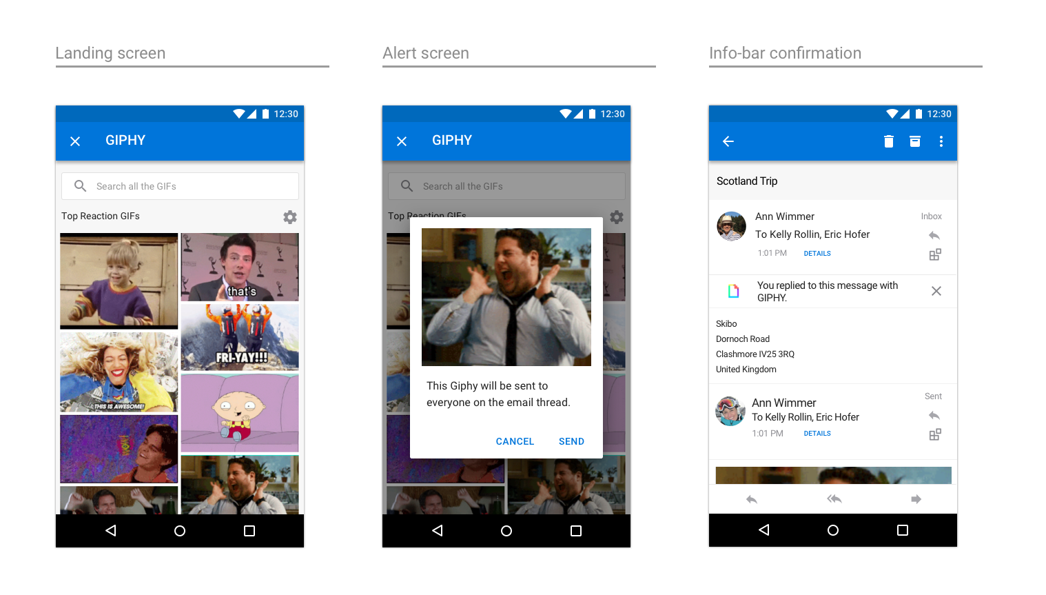
GIPHY
An example of GIPHY on iOS
An example of GIPHY on Android
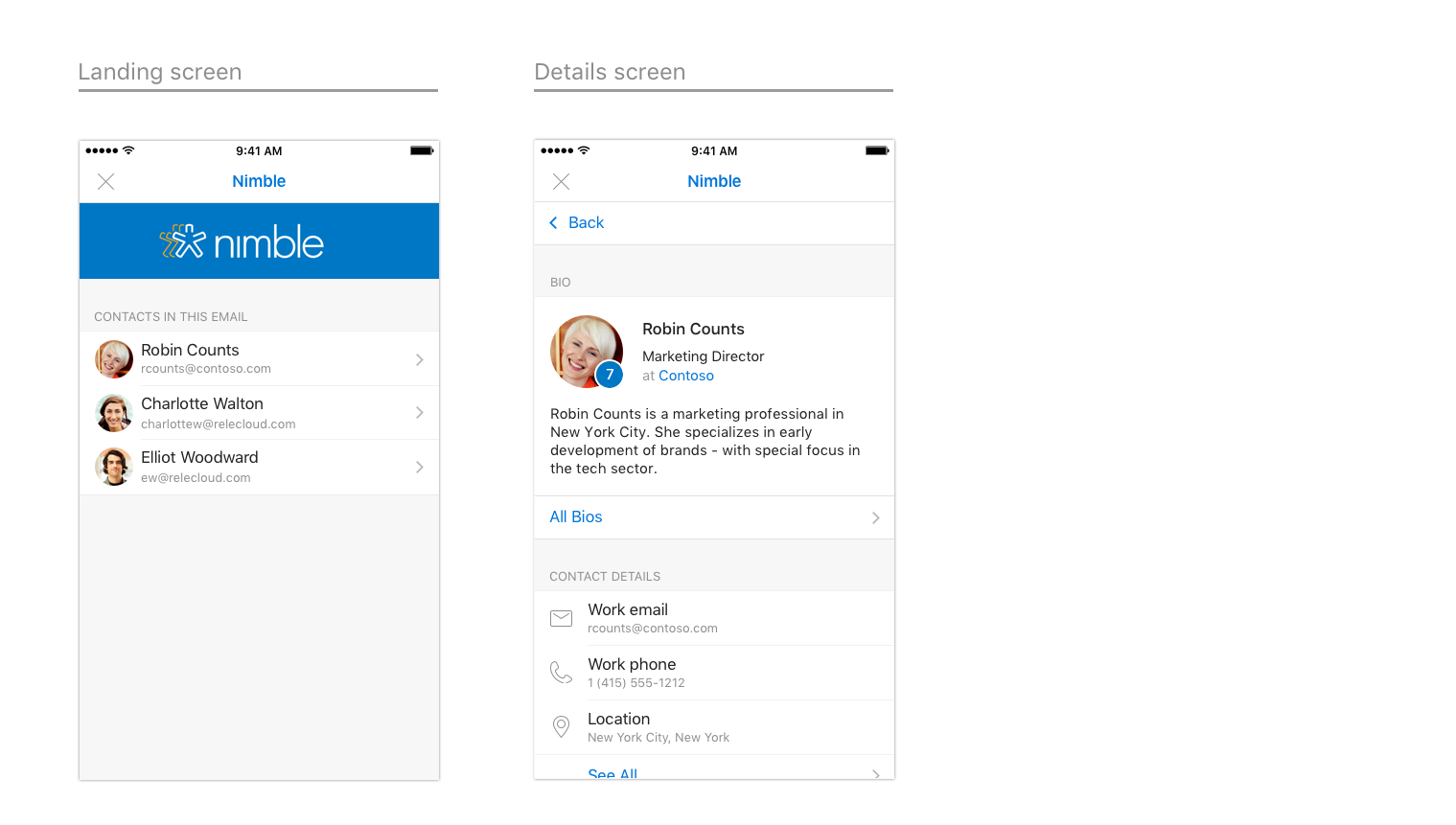
Nimble
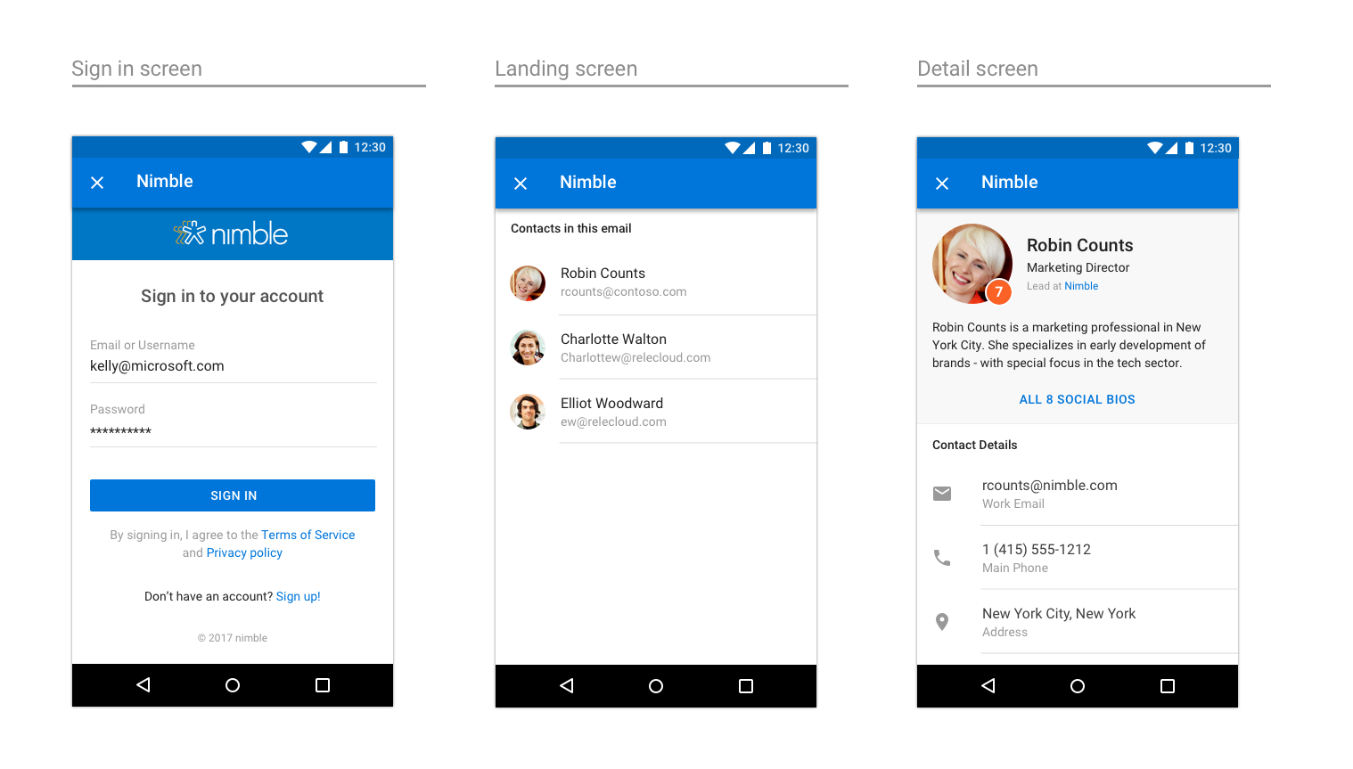
An example of Nimble on iOS
An example of Nimble on Android
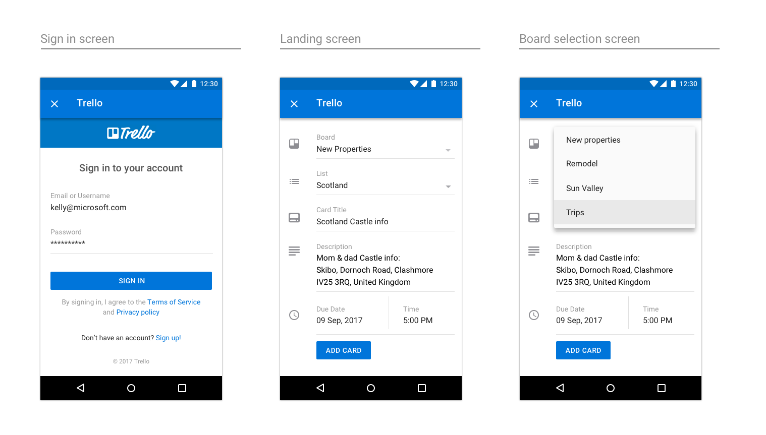
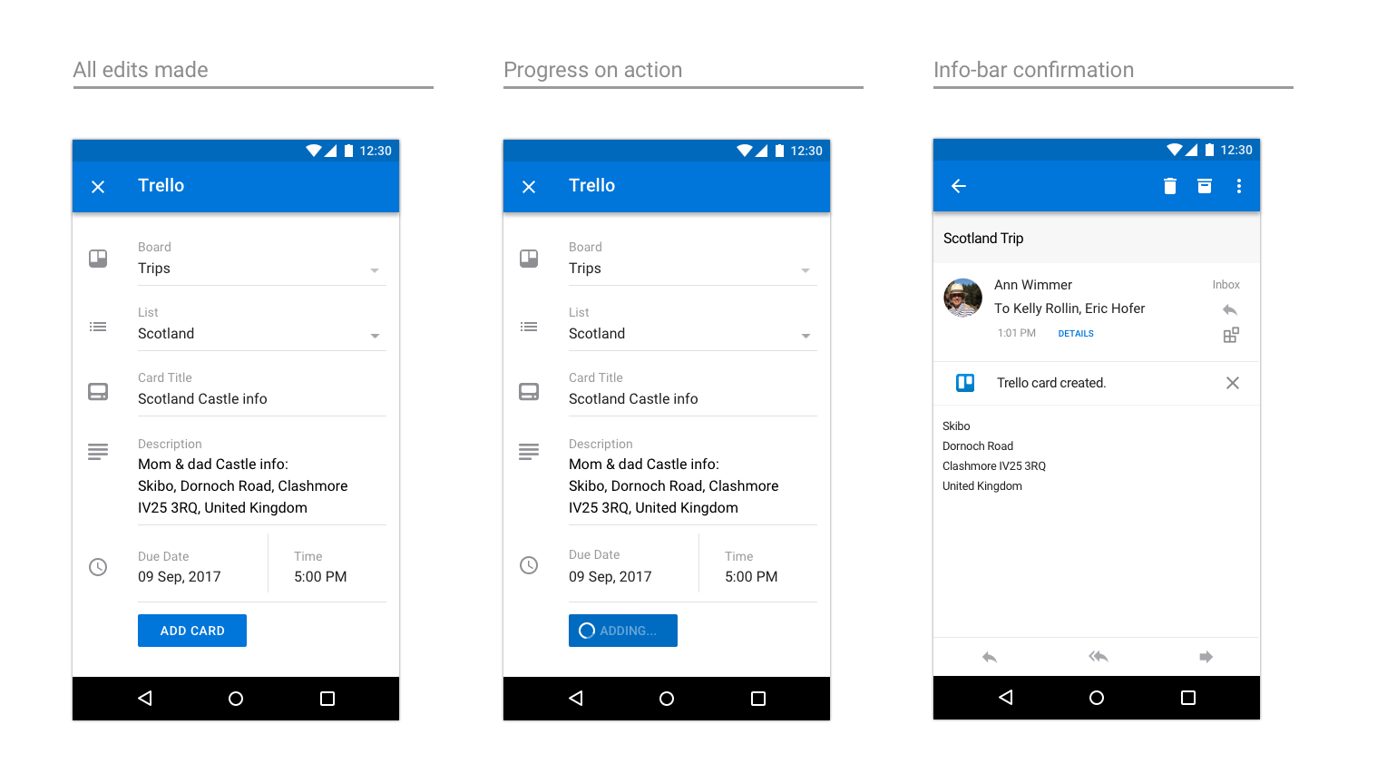
Trello
An example of Trello on iOS
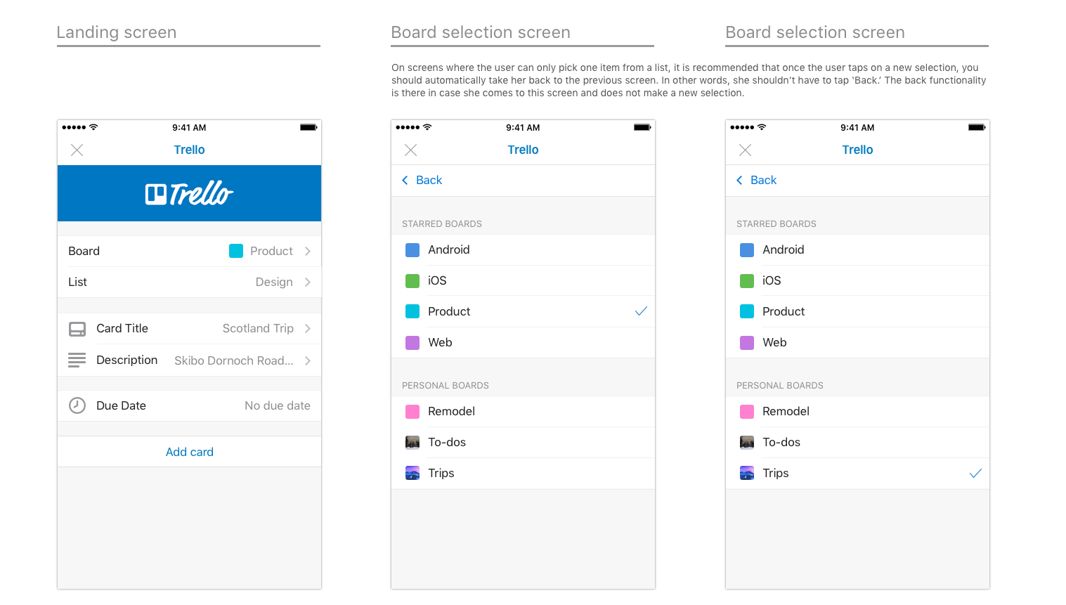
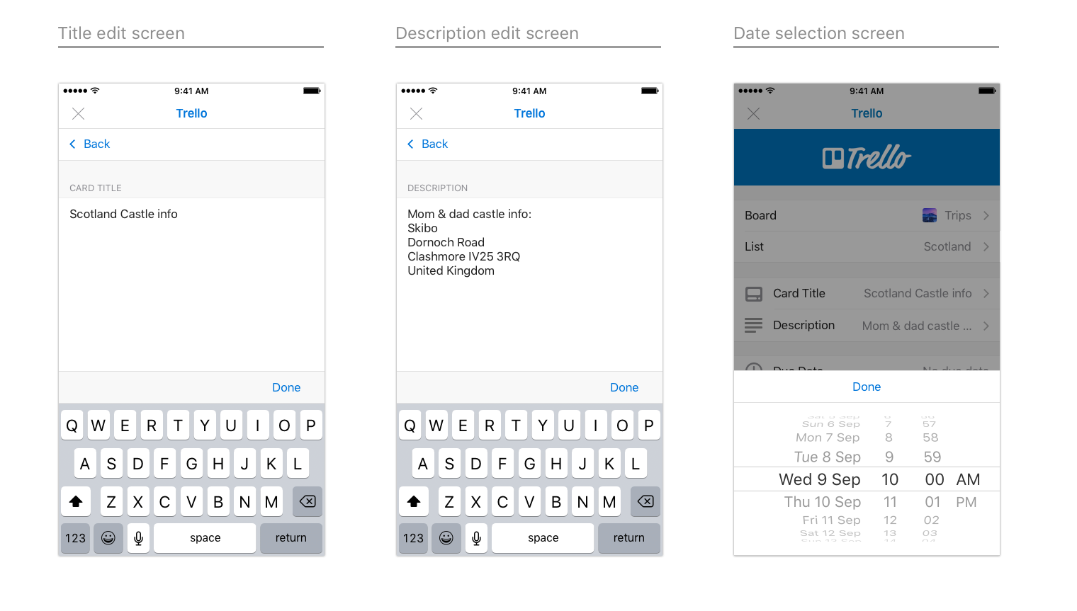
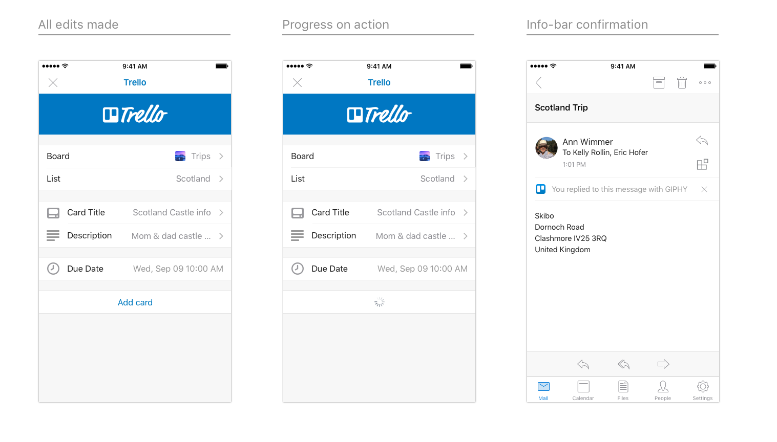
An example of Trello on Android
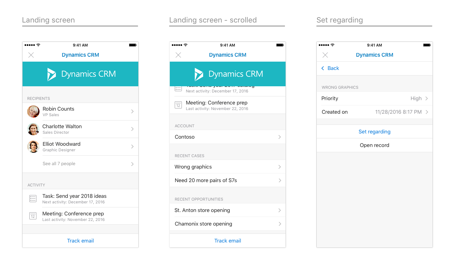
Dynamics CRM
An example of Dynamics CRM on iOS
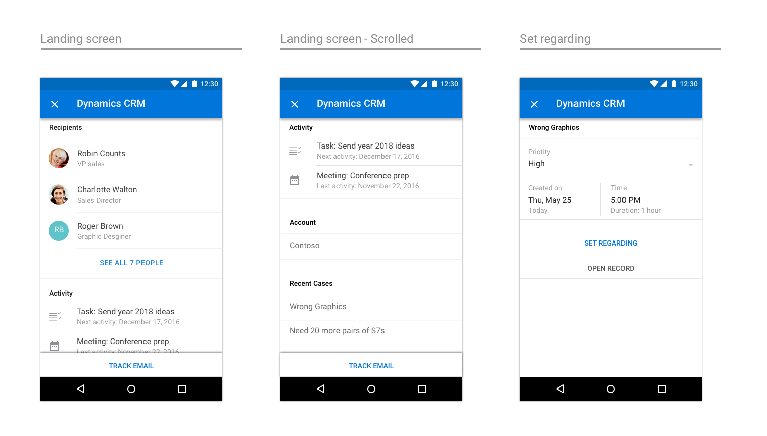
An example of Dynamics CRM on Android
Office Add-ins