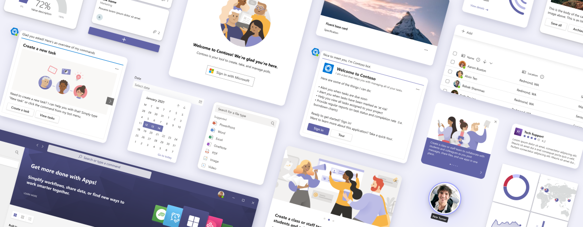
Designing your Microsoft Teams app

Whether you're a designer, product manager, developer, or maker using low-code tools, these guidelines can help you quickly make the right design decisions for your Microsoft Teams app.
Creating a cohesive experience
Designing a Teams app is like designing a conventional web app—but also a little different. An effective design highlights your app's unique attributes while fitting naturally with Teams features and contexts.
These guidelines and resources can help you strike that balance. You'll know what to do and what to avoid when designing your Teams app (such as multilevel navigation in a tab).
Teams app design principles
Teams apps help people achieve more together. Use these principles to guide your design.
Collaborative
Teams app promotes collaboration through coordinated and shared activity among users.
Trustworthy
The app is secure and compliant. Users can easily find information about privacy.
Globally inclusive
People of all backgrounds, skillsets, and disciplines can use the app. It’s culturally, racially, and socially aware.
Light
The app focuses on core scenarios that blend with Teams workflows.
Native or distinct
The app uses native Teams design components or your own. There’s no blend of color schemes, controls, and so on.
Useful
The app is based on a scenario people need to do in Teams.
Easy to use
The UI is easy to understand, pleasant in look and tone, and makes people more productive.
Responsive
The app is device- and screen-agnostic.
Accessible
The app meets Teams accessibility requirements in terms of color contrast, navigation alternatives, and more.
Well described
Text, icons, and images make it clear what the app is for and how to use it.
Teams design system
Learn the fundamentals of Teams app design, including layout, color schemes, and more.
App capabilities
Understand how people add, use, and manage Teams apps to make the most of each capability in your design.
UI templates
Create complex and high-fidelity designs with templates for common Teams use cases and workflows. The app playbooks and UI templates are also available to help you get started for the apps extended across Microsoft 365.
Basic UI components
Based on Fluent UI, these are the core elements you can use to create Teams experiences from scratch.
Tools and samples
The following tools can help designers and developers get started:
Microsoft Teams UI Kit
Design a Teams app with UI components, templates, and examples that you can drag, drop, and modify as needed. The UI kit also includes comprehensive information about how apps should look and behave in different Teams scenarios.
Fluent UI documentation
Obtain code samples and understand the implementation specifics for the fundamental Fluent UI components utilized in constructing Teams experiences.
Sample app
You can upload a sample app to see how apps should look and behave in the Teams client.
Adaptive Cards designer
Design Adaptive Cards in our web-based tool.
See also
Platform Docs