Verify that the webpage layout is usable when narrow
An important part of accessibility is to make sure that your website works well on a narrow viewport. Many users need to zoom the page to be able to use it, and this means that there isn't much space left.
When there isn't enough space, your multi-column layout should turn into a single-column layout, with content placed in an understandable order. This means placing the most important content at the top of the page, and placing additional content further down the page.
Test narrow viewports by resizing the browser window
Open the accessibility-testing demo webpage in a new window or tab.
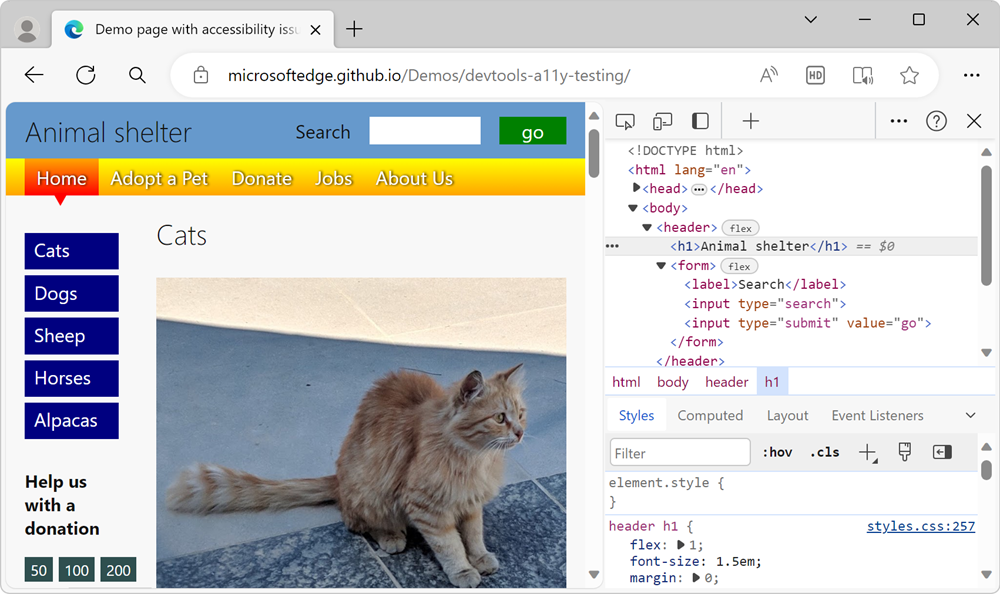
Right-click anywhere in the webpage and then select Inspect. Or, press F12. DevTools opens next to the webpage:

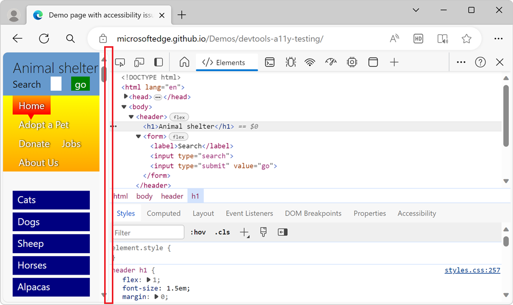
Make the browser window narrower by dragging the separator between the webpage and DevTools to the left.
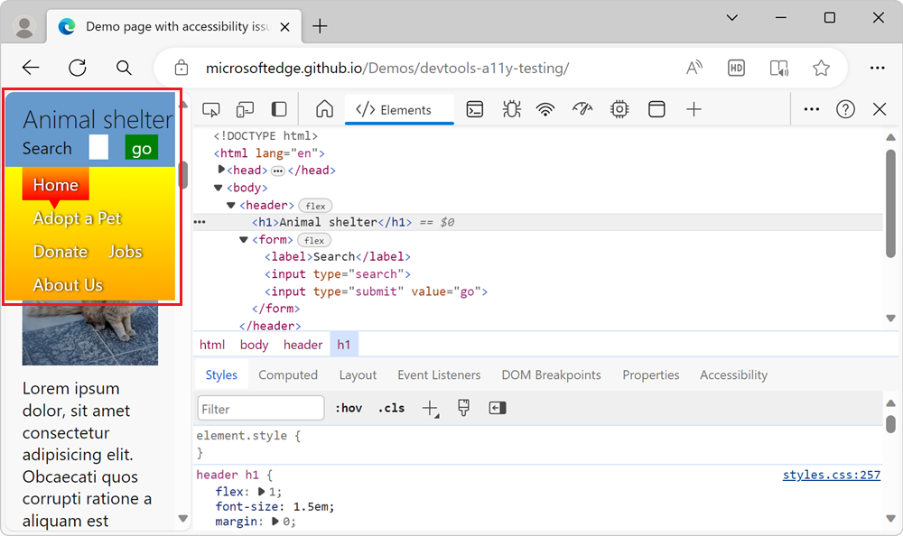
The rendered webpage rearranges its layout to fit the narrow viewport:

Use the arrow keys to scroll down the page and assess the accessibility of the content.
The two-column layout is now a single-column layout. But the top navigation bar occupies a lot of vertical space, which makes it harder to read the content. The search form is also hard to use, because it's too narrow:

Device Emulation tool to test narrow viewports
You can simulate a narrow viewport by resizing the browser window, but a better way to test the responsiveness of your design is to use the Device Emulation tool. Here are some features of the Device Emulation tool that help you find accessibility issues of any website:
Without resizing the browser window, resize the page and test whether your CSS media queries trigger a change in layout.
Check for dependencies that use a mouse. By default, Device Emulation assumes a touch device. This means that any functionality of your product that relies on hover interaction will not work.
Do visual testing by simulating different devices, zoom levels, and pixel ratios.
Test how your product behaves on unreliable connections or when the user is offline. Showing the most important interactions to a user on a slow connection is also an accessibility consideration.
To learn more about the Device Emulation tool, see Emulate mobile devices (Device Emulation).