Display a menu bar in a .NET MAUI desktop app
A .NET Multi-platform App UI (.NET MAUI) menu bar is a container that presents a set of menus in a horizontal row, at the top of an app on Mac Catalyst and Windows.
Each top-level menu in the menu bar, known as a menu bar item, is represented by a MenuBarItem object. MenuBarItem defines the following properties:
Text, of typestring, defines the menu text.IsEnabled, of typeboolean, specifies whether the menu is enabled. The default value of this property istrue.
These properties are backed by BindableProperty objects, which means that they can be targets of data bindings, and styled.
A MenuBarItem can consist of the following children:
- MenuFlyoutItem, which represents a menu item that can be clicked.
- MenuFlyoutSubItem, which represents a sub-menu item that can be clicked.
- MenuFlyoutSeparator, which is a horizontal line that separates items in the menu.
MenuFlyoutSubItem derives from MenuFlyoutItem, which in turn derives from MenuItem. MenuItem defines multiple properties that enable the appearance and behavior of a menu item to be specified. The appearance of a menu item, or sub-item, can be defined by setting the Text, and IconImageSource properties. The response to a menu item, or sub-item, click can be defined by setting the Clicked, Command, and CommandParameter properties. For more information about menu items, see Display menu items.
Create menu bar items
MenuBarItem objects can be added to the MenuBarItems collection, of type IList<MenuBarItem>, on a ContentPage. .NET MAUI desktop apps will display a menu bar, containing menu items, when they are added to any ContentPage that's hosted in a NavigationPage or a Shell app.
The following example shows a ContentPage that defines menu bar items:
<ContentPage ...>
    <ContentPage.MenuBarItems>
        <MenuBarItem Text="File">
            <MenuFlyoutItem Text="Exit"
                            Command="{Binding ExitCommand}" />
        </MenuBarItem>
        <MenuBarItem Text="Locations">
            <MenuFlyoutSubItem Text="Change Location">
                <MenuFlyoutItem Text="Redmond, USA"
                                Command="{Binding ChangeLocationCommand}"
                                CommandParameter="Redmond" />
                <MenuFlyoutItem Text="London, UK"
                                Command="{Binding ChangeLocationCommand}"
                                CommandParameter="London" />
                <MenuFlyoutItem Text="Berlin, DE"
                                Command="{Binding ChangeLocationCommand}"
                                CommandParameter="Berlin"/>
            </MenuFlyoutSubItem>
            <MenuFlyoutSeparator />
            <MenuFlyoutItem Text="Add Location"
                            Command="{Binding AddLocationCommand}" />
            <MenuFlyoutItem Text="Edit Location"
                            Command="{Binding EditLocationCommand}" />
            <MenuFlyoutItem Text="Remove Location"
                            Command="{Binding RemoveLocationCommand}" />
        </MenuBarItem>
        <MenuBarItem Text="View">
            <MenuFlyoutItem Text="Refresh"
                            Command="{Binding RefreshCommand}" />
            <MenuFlyoutItem Text="Change Theme"
                            Command="{Binding ChangeThemeCommand}" />
        </MenuBarItem>
    </ContentPage.MenuBarItems>
</ContentPage>
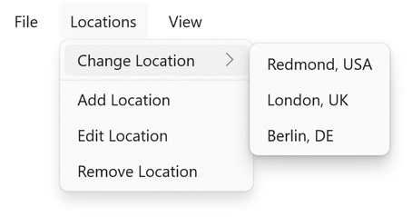
This example defines three top-level menus. Each top-level menu has menu items, and the second top-level menu has a sub-menu and a separator:

Note
On Mac Catalyst, menu items are added to the system menu bar.
In this example, each MenuFlyoutItem defines a menu item that executes an ICommand when selected.
Keyboard accelerators can be added to menu items in a menu bar, so that a menu item can be invoked through a keyboard shortcut. For more information, see Keyboard accelerators.
Display icons on menu items
MenuFlyoutItem and MenuFlyoutSubItem inherit the IconImageSource property from MenuItem, which enables a small icon to be displayed next to the text for a menu item. This icon can either be an image, or a font icon.
Warning
Mac Catalyst does not support displaying icons on menu items.
The following example shows a menu bar item, where the icons for menu items are defined using font icons:
<ContentPage.MenuBarItems>
<MenuBarItem Text="Media">
<MenuFlyoutItem Text="Play">
<MenuFlyoutItem.IconImageSource>
<FontImageSource Glyph="▶"
FontFamily="Arial" />
</MenuFlyoutItem.IconImageSource>
</MenuFlyoutItem>
<MenuFlyoutItem Text="Pause"
Clicked="OnPauseClicked">
<MenuFlyoutItem.IconImageSource>
<FontImageSource Glyph="⏸"
FontFamily="Arial" />
</MenuFlyoutItem.IconImageSource>
</MenuFlyoutItem>
<MenuFlyoutItem Text="Stop"
Clicked="OnStopClicked">
<MenuFlyoutItem.IconImageSource>
<FontImageSource Glyph="⏹"
FontFamily="Arial" />
</MenuFlyoutItem.IconImageSource>
</MenuFlyoutItem>
</MenuBarItem>
</ContentPage.MenuBarItems>
In this example, the menu bar item defines three menu items that display an icon and text on Windows.
For more information about displaying font icons, see Display font icons. For information about adding images to .NET MAUI projects, see Add images to a .NET MAUI app project.
