ContentView
The .NET Multi-platform App UI (.NET MAUI) ContentView is a control that enables the creation of custom, reusable controls.
The ContentView class defines a Content property, of type View, which represents the content of the ContentView. This property is backed by a BindableProperty object, which means that it can be the target of data bindings, and styled.
The ContentView class derives from the TemplatedView class, which defines the ControlTemplate bindable property, of type ControlTemplate, which defines the appearance of the control. For more information about the ControlTemplate property, see Customize appearance with a ControlTemplate.
Note
A ContentView can only contain a single child.
Create a custom control
The ContentView class offers little functionality by itself but can be used to create a custom control. The process for creating a custom control is to:
- Create a class that derives from the ContentView class.
- Define any control properties or events in the code-behind file for the custom control.
- Define the UI for the custom control.
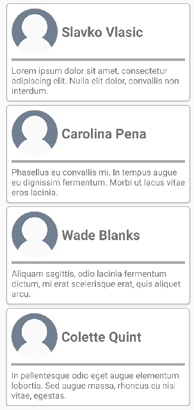
This article demonstrates how to create a CardView control, which is a UI element that displays an image, title, and description in a card-like layout.
Create a ContentView-derived class
A ContentView-derived class can be created using the ContentView item template in Visual Studio. This template creates a XAML file in which the UI for the custom control can be defined, and a code-behind file in which any control properties, events, and other logic can be defined.
Define control properties
Any control properties, events, and other logic should be defined in the code-behind file for the ContentView-derived class.
The CardView custom control defines the following properties:
CardTitle, of typestring, which represents the title shown on the card.CardDescription, of typestring, which represents the description shown on the card.IconImageSource, of type ImageSource, which represents the image shown on the card.IconBackgroundColor, of type Color, which represents the background color for the image shown on the card.BorderColor, of type Color, which represents the color of the card border, image border, and divider line.CardColor, of type Color, which represents the background color of the card.
Each property is backed by a BindableProperty instance.
The following example shows the CardTitle bindable property in the code-behind file for the CardView class:
public partial class CardView : ContentView
{
    public static readonly BindableProperty CardTitleProperty = BindableProperty.Create(nameof(CardTitle), typeof(string), typeof(CardView), string.Empty);

    public string CardTitle
    {
        get => (string)GetValue(CardView.CardTitleProperty);
        set => SetValue(CardView.CardTitleProperty, value);
    }
    // ...

    public CardView()
    {
        InitializeComponent();
    }
}
For more information about BindableProperty objects, see Bindable properties.
Define the UI
The custom control UI can be defined in the XAML file for the ContentView-derived class, which uses a ContentView as the root element of the control:
<ContentView ...
             x:Name="this"
             x:Class="CardViewDemo.Controls.CardView">
    <Border BindingContext="{x:Reference this}"
            BackgroundColor="{Binding CardColor}"
            Stroke="{Binding BorderColor}"
            ...>
        <Grid>
            ...
            <Border Stroke="{Binding BorderColor, FallbackValue='Black'}"
                    BackgroundColor="{Binding IconBackgroundColor, FallbackValue='Grey'}"
                   ...>
                <Image Source="{Binding IconImageSource}"
                       .. />
            </Border>
            <Label Text="{Binding CardTitle, FallbackValue='Card Title'}"
                   ... />
            <BoxView BackgroundColor="{Binding BorderColor, FallbackValue='Black'}"
                     ... />
            <Label Text="{Binding CardDescription, FallbackValue='Card description text.'}"
                   ... />
        </Grid>
    </Border>
</ContentView>
The ContentView element sets the x:Name property to this, which can be used to access the object bound to the CardView instance. Elements in the layout set bindings on their properties to values defined on the bound object. For more information about data binding, see Data binding.
Note
The FallbackValue property in the Binding expression provides a default value in case the binding is null.
Instantiate a custom control
A reference to the custom control namespace must be added to the page that instantiates the custom control. Once the reference has been added the CardView can be instantiated, and its properties defined:
<ContentPage xmlns="http://schemas.microsoft.com/dotnet/2021/maui"
             xmlns:x="http://schemas.microsoft.com/winfx/2009/xaml"
             xmlns:controls="clr-namespace:CardViewDemo.Controls"
             x:Class="CardViewDemo.CardViewXamlPage">
   <ScrollView>
       <StackLayout>
           <controls:CardView BorderColor="DarkGray"
                              CardTitle="Slavko Vlasic"
                              CardDescription="Lorem ipsum dolor sit amet, consectetur adipiscing elit. Nulla elit dolor, convallis non interdum."
                              IconBackgroundColor="SlateGray"
                              IconImageSource="user.png" />
            <!-- More CardView objects -->
       </StackLayout>
   </ScrollView>
</ContentPage>
The following screenshot shows multiple CardView objects:

Customize appearance with a ControlTemplate
A custom control that derives from the ContentView class can define its UI using XAML or code, or may not define its UI at all. A ControlTemplate can be used to override the control's appearance, regardless of how that appearance is defined.
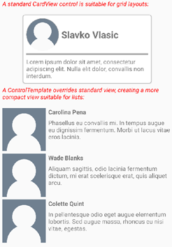
For example, a CardView layout might occupy too much space for some use cases. A ControlTemplate can be used to override the CardView layout to provide a more compact view, suitable for a condensed list:
<ContentPage.Resources>
    <ResourceDictionary>
        <ControlTemplate x:Key="CardViewCompressed">
            <Grid>
                <Grid.RowDefinitions>
                    <RowDefinition Height="100" />
                </Grid.RowDefinitions>
                <Grid.ColumnDefinitions>
                    <ColumnDefinition Width="100" />
                    <ColumnDefinition Width="100*" />
                </Grid.ColumnDefinitions>
                <Image Source="{TemplateBinding IconImageSource}"
                       BackgroundColor="{TemplateBinding IconBackgroundColor}"
                       WidthRequest="100"
                       HeightRequest="100"
                       Aspect="AspectFill"
                       HorizontalOptions="Center"
                       VerticalOptions="Center" />
                <StackLayout Grid.Column="1">
                    <Label Text="{TemplateBinding CardTitle}"
                           FontAttributes="Bold" />
                    <Label Text="{TemplateBinding CardDescription}" />
                </StackLayout>
            </Grid>
        </ControlTemplate>
    </ResourceDictionary>
</ContentPage.Resources>
Data binding in a ControlTemplate uses the TemplateBinding markup extension to specify bindings. The ControlTemplate property can then be set to the defined ControlTemplate object, by using its x:Key value. The following example shows the ControlTemplate property set on a CardView instance:
<controls:CardView ControlTemplate="{StaticResource CardViewCompressed}" />
The following screenshot shows a standard CardView instance, and multiple CardView instances whose control templates have been overridden:

For more information about control templates, see Control templates.
