Data Visualization Features in Excel 2010
The Excel team has made several improvements in the data visualization area for Excel 2010 and been posting lots of details on the Excel Team Blog. First off, the Excel team added a visualization that you can use to enhance your spreadsheets, sparklines:
“For Excel 2010 we’ve implemented sparklines, “intense, simple, word-sized graphics”, as their inventor Edward Tufte describes them in his book Beautiful Evidence. Sparklines help bring meaning and context to numbers being reported and, unlike a chart, are meant to be embedded into what they are describing…”

Data bars and icon sets have been enhance to address important customer feedback. One of the biggest requests for data bars was negative data bars, which is now in Excel 2010:
“In Excel 2010, we have introduced negative value data bars which can help analyze trends when negative values are involved. By default, we smartly position the axis in the cell so that a small negative value will not occupy half the cell lengths when bigger positives values are also in the range. If you prefer, we let you position the axis in the center of the cell.”

Also, there are improvements to charting, especially around the performance and rendering of charts:
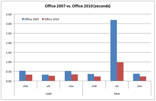
“In today’s article I will outline some of the significant new chart improvements that impact performance. In Office 2007 the graphics engine used by Office Charts was replaced with one that could support more complex rendering. A downside of this change was slower performance in certain scenarios relative to Office 2003. For example, supporting anti-aliasing in Office 2007 allows the chart to render smooth lines; however, the computation for smoothing takes multiple rendering passes which take additional time. One of the top priorities for Office 2010 was increasing chart performance.”

Here’s the full list of Excel blogs posts around sparklines, conditional formatting, and charting:
Adding Some Spark to Your Spreadsheets
Sparklines – Lining Up the Points
A Sparkline Trick - Using the Horizontal Axis as a Reference Line
Icon Set Improvements in Excel 2010
Data Bar Improvements in Excel 2010
More Conditional Formatting Features in Excel 2010
Chart Object Model in Word & PowerPoint
Improvements to Chart Performance
More Charting Enhancements in Excel 2010
Enjoy!
Comments
Anonymous
January 22, 2010
喜欢Anonymous
April 14, 2010
What a shame that the "slower performance in certain scenarios relative to Office 2003" hasn't been addressed as a bug-fix to those loyal Office 2007 buyers. Instead Microsoft will be charging us for the privelege of updating to Office 2010 in order to restore Excel's speed. Also, the "negative value data bars which can help analyze trends when negative values are involved" should surely have been forseen when launched in Office 2007?