Early days with the HTC Touch Pro 2
Last week Orange delivered a consignment of HTC-Touch Pro 2 phones and one of them had my name on it. Every phone I’ve ever had has been driven by buttons and I wrote before Christmas that I was in two minds about “going touch”. But my old E650 was falling apart and I decided the HTC was the best of my choices, so here are some first impressions
This is the 6th device made by HTC I’ve owned (the original Compaq IPAQ 3650, the first 02 XDA – which I never used, the first Orange SPV phone, the SPV-C500 and the E650). It’s the first to have HTC’s name on it. In terms of build quality and design it is the best of them, and so it should be with a price tag which would let me buy a laptop or two net-books. Adjectives which come to mind are “clean” , “minimalist”, “solid”, “business like”.
The device is built around an 800x480 (“Wide screen VGA”) display: my old desktop monitor is about 85 Pixels per inch, my lap is twice that, and the HTC is 3 times that – I suspect that is a large part of the cost of these devices. The screen is actually slightly smaller than that original IPAQ (47x79mm - 3713mm² against 58x77 4466mm²) but packs in 5 times as many pixels. Not to mention phone and GPS functions a Micro-SD memory socket, a much more powerful processor, two cameras and a bucketful more memory. Each new device seems to have better brightness and saturation than its predecessor and this one is no exception - I thought this was one of the new OLED screens but the specs say it is just LCD. That screen enables some new scenarios, especially as graphics abilities of the device seem pretty good, and there is no getting away from the fact that applications I had on my E650 are just better on a big screen (that’s not a surprise – I can’t think of anything which gets better on a small screen.)
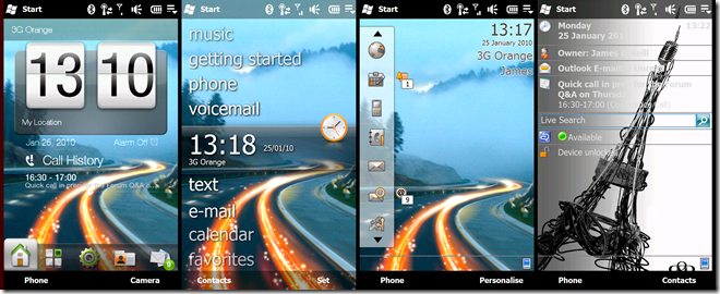
One oddity of this phone is the extent to which choosing a home screen changes the whole user experience of the phone.
From left to right we have HTC’s “Sense” UI which has short-cuts to other HTC apps along the bottom. Then there is the “Microsoft default” which puts people in mind of Zune’s UI. Neither of these is greatly customizable so far as I can tell so I can’t get rid of the getting started or voice mail options (I only use my Exchange voice mail, and have turned off the one that Orange provide). Then there is the Orange home screen - the latest incarnation of something that first saw the light of day on the C500 phone and I’ve never warmed to. And finally there is the traditional Pocket-PC page – this certainly used to be highly customizable using XML files I haven’t found out if that still applies, but it looks dated beside the first two. However it lets me see time and upcoming appointments at the same time, and it doesn’t provide a button for call history which looks a missed call notification.
The HTC sense “skin” gives access to the main functions via the bar along the bottom
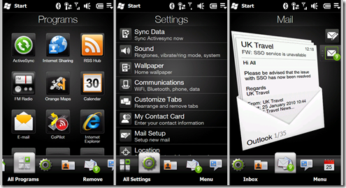
They’re all pretty nice, but don’t do everything, so I end up clinking All programs , all settings or Inbox to open up the built in windows application.
I’m slowly warming to touch as a UI (though I keep growling “Why do I have to slide that, why can’t I tap it”), and with the slide out keyboard I think I’ve got something where I can do mail, note taking, tweeting and so on quite easily. Since E650 was not a 3G device the thing I notice most is the speed of the new device – not only do it’s CPU and graphics make it feel nippy, it hops from my home network on WiFi to 3G, and then to the office Network on WiFi pretty much seamlessly (something I gave up on with the E650 which never seemed happy about changing networks) – the only speed test I’ve done it to date showed a download speed of about 750Kbits/sec and upload of about 128Kbits/sec - plenty good enough for all but the largest downloads. One neat trick about the phone is when connected by USB it asks if you want to go into internet sharing mode, memory stick mode, or normal active sync. I wish it would offer a “Web cam mode” too as the camera looks pretty good. There’s a rear facing autofocus camera of 2.4MP and a front facing one for video calls (though communicator mobile can’t use them). There’s no flash but the camera has fast lens and high ISO rating so it can get pictures in poor light.
Music and video seem pretty good – there is a TV connection cable for the USB socket and like previous HTC devices an adapter is used plug in conventional headphones. And of course the GPS is built in, and seems to work at least as well as the Bluetooth GPS puck I used before – the only Bluetooth configuration needed was to get my earpiece going and that was pretty straight forward.
All in it’s a easy device to like, and I’ll explain a bit more in the next post or 2 … or 3
Comments
Anonymous
January 25, 2010
I'm in exactly the same position as you, trying to work out which of those home screens I like.. I went for the Zune-y one... and found this application that answers your shortcomings: http://marketplace.windowsphone.com/details.aspx?appSKU=ff4930d7-7090-49c9-8513-4e1776907fb9&retURL=/categories.aspx%3FcategoryId%3D50140 That'll allow you to customise that list and remove the apps you don't want.Anonymous
January 26, 2010
I have had the HTC HD2 (aka Leo) for about 3 months now, brilliant phone. Before this I have had 7 Windows Mobile phones (now Windows Phones) and have never been dissapointed. I too was hesitant to move from type to touch but could not go back now. I'm sure you will slowly move into the touch idea with such a device as a Touch Pro 2 (which I have had a similar device in the past). The HTC Sense UI also makes a huge improvement on the default Windows Phone menu system IMO. Now I have got used to such a menu and now all my settings are configured how I like them I rarely take a stroll into the WM interface. Enjoy your new toy!

