Introducing Ambiguity
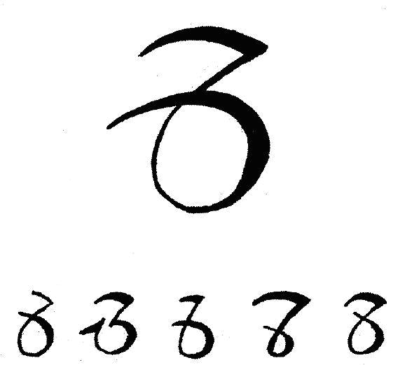
Here is another idea for a sentence end punctuation. I call it the ambiguity mark. It is perhaps not as necessary as the irony mark; but unlike the irony mark, it has an elegant design.

I found this symbol in G.G. Neill Wright’s 1952 book The Writing of Arabic Numerals. It was written by a Papal Chancery hand of the 15th century and may plausibly be interpreted as 0, 3, 6, 7, or 8.
When would one use the ambiguity mark? It’s not intended for unintentionally ambiguous writing, as it would be better for the author to rewrite the sentence. The most compelling use would be for puns. Here is a classic font pun:
A font walks into a bar; and the bartender says: “We don’t serve your type here ”
”
Kevin Larson
Edit: Update Image Reference
Comments
Anonymous
April 05, 2006
it's really funny, i also know the wonderful fonts
http://www.yaodownload.com/video-design/fonts/
you can visit and check out!Anonymous
April 06, 2006
Is it the american way of telling the world you are so dumb that you wouldnt laugh a joke if it hadn't a 'please, laugh' mark at the end? I dislike your modern, coll characters and I swear i will never use any other punctuation except for .?!Anonymous
April 06, 2006
Keff, could you punctuate your sentences with the ethnic slur mark please, i'm not sure i caught what you're trying to say.Anonymous
April 06, 2006
Ironically, I can only see the ambiguity mark causing confusion.
Please, stick to giving us decent fonts and not unnecessary new symbols.Anonymous
April 06, 2006
@George Liquor: +1 :-)
@Rich: +1 also.
I think smileys are enough for us to show our emotions within text when necessary.Anonymous
April 07, 2006
I think more useful would be a "perfectly serious" mark that conveys that something is a verifiable fact and the writer is not joking or ironic about it.
E.g. "Microsoft is known for ripping off famous type designers' fonts and putting new names on them%"
...where % is the proposed mark.Anonymous
April 11, 2006
Start doing some real typography or drop the blog.Anonymous
April 11, 2006
font and font tools at http://www.yaodownload.com/desktop-enhancements/Anonymous
June 18, 2006
wow now msdn blogs are getting spammed!^
I agree with Rich in that this symbol can cause confusion.Anonymous
October 18, 2006
This symbol can cause confusion? Well, yes, I guess I agree, too. After all, it is an AMBIGUITY MARK. I tihnk it should be included immediately, the precise usage can be worked out at some unspecified point in the future. I think I will use it where I want to cause chaos, uncertainty, or irtritate anyone who thinks that punctuation should remain in stasis while language evolves. Of course, if you want a boring application, it could be a nice placeholder for a pending citation in collaborative media.Anonymous
October 10, 2008
PingBack from http://bikefridaywalter.wordpress.com/2008/10/10/disambiguation/Anonymous
January 01, 2009
PingBack from http://blog.strawjackal.org/2008/12/%d7%a4%d7%99%d7%a1%d7%95%d7%a7-%d7%9c%d7%9e%d7%aa%d7%a7%d7%93%d7%9e%d7%99%d7%9d/Anonymous
December 01, 2009
I agree that an 'in all seriousness' mark would be much better. Especially considering it could be used ironically, which would admittedly decrease clarity, but would also add to the richness of expression.