Creating XAML Drawing Images with Graphic Designer
The Converting WMF images to XAML using Graphic Designer posting showed how you could easily convert WMF format files to XAML. In this case, the drawing information in the generated XAML files was contained within a Canvas object. However, Graphic Designer can also create XAML files that are drawing objects, such as a DrawingImage. The drawing object is contained within a ResourceDictionary element, which means it can be used as a resource within the WPF application.
In this posting, we'll look at several ways of using Graphic Designer generated XAML drawings. At the bottom of this posting, you can find an attached Zip file (clipXart03.zip) that contains the following three XAML files:
- SkippyImage_1.xaml
- SkippyImage_2.xaml
- SkippyImage_3.xaml
Exporting to XAML using a DrawingImage
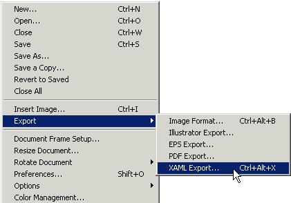
To export your drawing to XAML in Graphic Designer, select Export from the File menu list. Then select XAML Export…

The following dialog displays XAML format options for the image conversion:
Change the Document Format from the default Canvas value to Resource Dictionary. Then, select the Path Output Type as Drawing Image. The final selection, Group By, has three options:
- Document All drawing elements are grouped together as
one DrawingImage object.
- Layers For each layer defined in a Graphic Designer drawing,
a separate DrawingImage object is created. For example,
if your drawing has two layers,
then two DrawingImage objects are created.
- Objects A DrawingImage is created for each discrete drawing
element. For a complex drawing, this option could easily end up
generating hundreds of XAML objects.
In most cases, the Document Format value should be Document, since this option generates the fewest XAML objects.
| A Closer Look at the Generated XAML File |
The drawing object in the generated XAML file is contained within a ResourceDictionary object, which means the drawing object can be used as a shared resource multiple times throughout the application. I changed x:Key from the default value of Metafile to Skippy, and will use this value later as a reference to the drawing:
<ResourceDictionary>
<DrawingImage x:Key='Skippy'>
<DrawingImage.Drawing>
<DrawingGroup>
<DrawingGroup.Children>
<GeometryDrawing ... />
. . .
</DrawingGroup.Children>
</DrawingGroup>
</DrawingImage.Drawing>
</DrawingImage>
</ResourceDictionary>
Referencing the DrawingImage
ln the SkippyImage_1.xaml file, the DrawingImage is added as a resource to the Canvas object.
<Canvas.Resources>
<ResourceDictionary>
<DrawingImage x:Key='Skippy'>
<!-- Drawing objects -->
</DrawingImage>
</ResourceDictionary>
</Canvas.Resources>
Once the drawing object is stored as a resource, it can be used by other UI elements, such as the Image objects in the following lines:
<
Image Height="80" Source="{StaticResource Skippy}" />
<Image Height="120" Source="{StaticResource Skippy}"
Canvas.Left="80"/>
<Image Height="160" Source="{StaticResource Skippy}"
Canvas.Left="200"/>
When you set the Height property, the referenced drawing object is automatically scaled in height. The width is also scaled in order to preserve the aspect ratio of the original drawing object. The Source property uses a StaticResource value to reference the x:Key value of the DrawingImage.
The Canvas.Left property allows you to reposition the drawings -- otherwise, the drawings would overlay each other. Notice how multiple Image object can reference the same DrawingImage resource. Using objects as shared resources is a primary reuse mechanism in WPF.
Referencing the DrawingImage as a Button Image
ln the SkippyImage_2.xaml file, the DrawingImage is added as a resource to the StackPanel object. This time the drawing object is used as an image for two Button controls:
<
Button Height="50" Width="50" Padding="2">
<Image Source="{StaticResource Skippy}" />
</Button>
<Button Height="75" Width="75" Padding="10">
<Image Source="{StaticResource Skippy}" />
</Button>
Notice how the Padding property controls the amount of spacing between the drawing and the border of the Button:
Animating the DrawingImage
ln the SkippyImage_3.xaml file, the DrawingImage is added as a resource to the StackPanel object. The drawing is referenced by an Image object, which is then animated. The previous posting, Animating XAML Clip Art, explains how the animation is created.
Graphic Designer Info
The Expression Designers blog provides a lot more info on how to use the Graphic Designer product.
Thanks to my teammate, Mike, for helping me figure out a lot of the issues here!
Enjoy,
Lorin
About Us
We are the Windows Presentation Foundation SDK writers and editors.
Comments
- Anonymous
June 12, 2006
Shows how to compose an animated XAML scene using multiple drawings defined as ResourceDictionary objects. Uses a Viewbox object to scale drawing content correctly. - Anonymous
June 15, 2006
At this point, with the amount of great content online (and free), it is possible to train yourself on...


