Using Power BI to visualise your data

Power BI is a suite of powerful business analytics tools that can connect to hundreds of data sources, create personalised dashboards so particular data points are brought to the forefront, and produce beautiful reports based on the findings. By creating visualisations, we can better understand large pools of data.
Visualisations, as their name suggests, are graphics such as charts and graphs that display insights that have been derived from a group of data. A report generated in Power BI might show a single visual, or it might have pages full of different visuals. These visuals can also be brought to the forefront by pinning them to a Power BI dashboard. This is particularly useful if the data in the visual is worth constantly monitoring, such as situations where the data has a direct impact on the business.
Datasets can be taken from a number of different sources, including Microsoft Excel, Power BI Desktop, databases, SaaS applications and apps. For example, when you connect to an Excel workbook that contains Power View sheets, Power BI can create a report based on those sheets. The same applies when you connect to an SaaS application; Power BI imports a pre-built report.
Data visualisations allow you to interact with your data to find business insights. Power BI lets you use visualisations from the community gallery as well as custom visualisations that you've created yourself, allowing you to find something suitable and tailored to the data you wish to analyse.
Creating visualisations
You can get started with Power BI visualisations by using an example data set. Microsoft and ObviEnce have created eight of these, themed on different use cases, so that you can hit the ground running. Download these samples if you don't have your own data set to test out visualisation with. Once you're ready, follow these steps to create your first visualisation in Power BI:
1. Open a report and add a new page. Make sure the fields pane and the visualisation pane are visible.
If they're not, you can expand them by clicking the arrows on the right side of the screen.
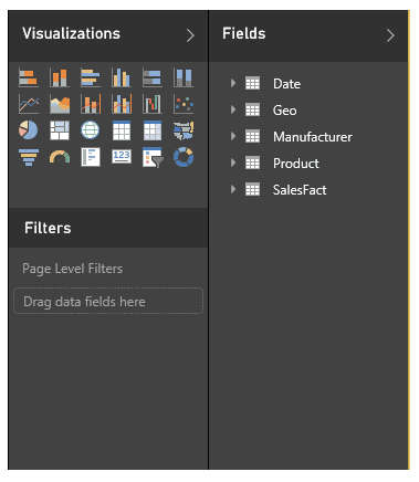
2. Select one of visuals in the visualisation pane.
Don't worry too much about which one you select to begin with, as this can be changed at a later point. For this demo, start with a pie chart. This visualisation will now appear on the page, though it will not currently contain any data. You can resize this visualisation if you'd prefer it to be larger or smaller.
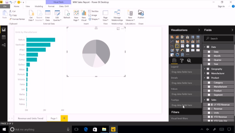
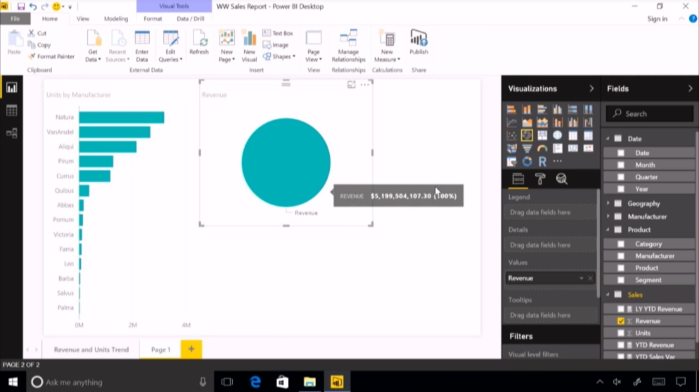
3. Drag a field from the fields pane into the values section of the visualisation pane.
What field you decide to use here will depend on the type of visualisation you're trying to build. As an example, if you want to see which groups in a company are earning the most revenue, you may wish to drag your revenue field into the value section of the visualisation pane. For the sake of this demo, try using a numerical field. The value selection can be found beneath the pictures of the visuals. Once you've dragged a field over, you should notice the pie chart has become populated with one data set - the entire 'pie' has been filled by the field you dragged over.
4. Drag a field from the fields pane into the legend section of the visualisation pane.
In our example, we want to see a breakdown of revenue across groups of a company. At this point, as we already have the revenue information in the 'value' section of the visual, we need a way of seeing who owns what revenue. To do this, we would drag the data that corresponds to these groups in a company from the field pane and into the legend section of the visualisation pane. If you chose a numerical value in step 4, take a look at what data sets are available to you in the fields pane and select one that would break it down as the legend. If you do this correctly, you'll see the pie chart split into segments. In our example, this would be by the revenue generated by each group. You've now created your first visualisation!
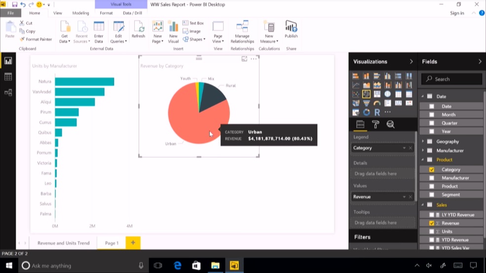
This is just a basic implementation of Power BI visualisations, but be sure to experiment with the sample datasets to see what kind of visualisations you can generate. You'll start to see what kind of data points you'll want to find in your own data.
If you find yourself stuck, check out the video below which runs through the creation of several Power BI visualisations.
You're not only limited to the visualisations that come built into Power BI. These are just a few of the ways you can expand your library of visualisations, so you can find the right visual for the job when applying them to your own data.
Community-sourced visualisations
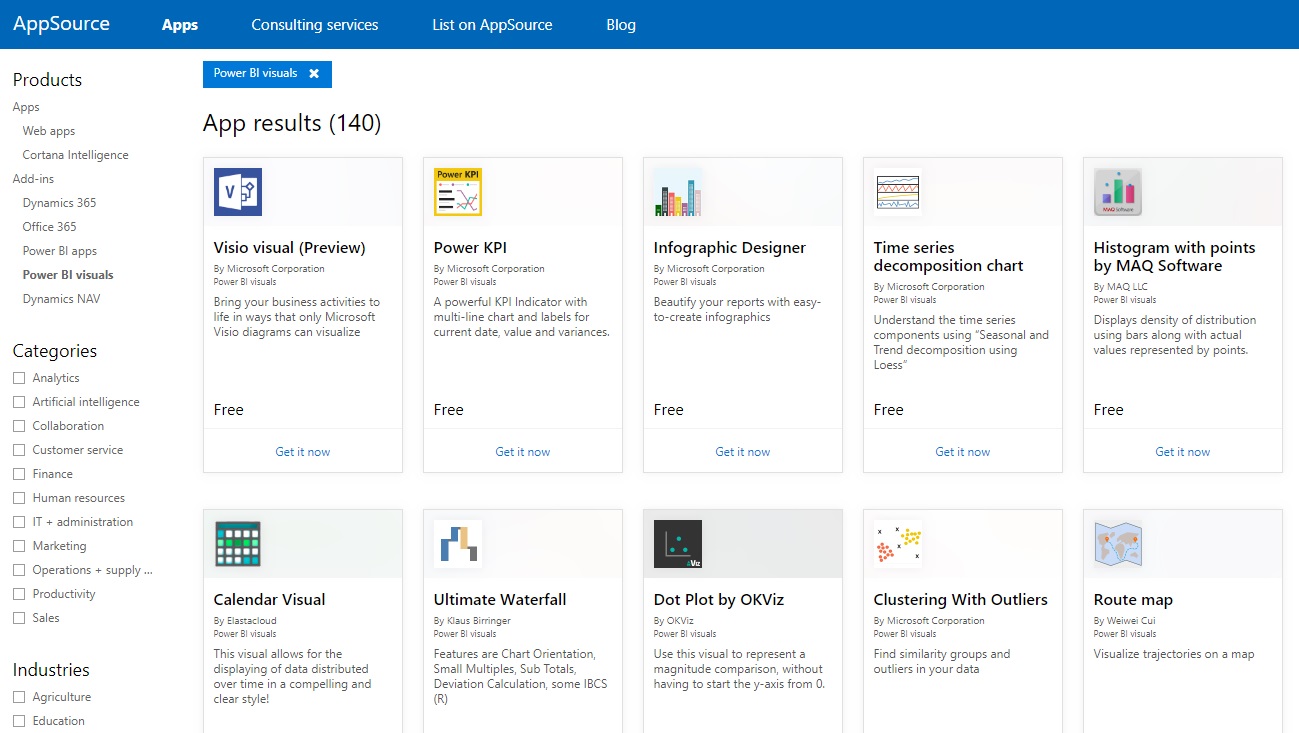
Members of the community, as well as Microsoft, have published their custom visuals to the AppSource marketplace, where they can be downloaded and added to your Power BI reports. All of these custom visuals have been tested and approved by Microsoft for functionality and quality.
To use these in your own reports, filter by Power BI visuals on the AppSource marketplace, then select and download the report you would like to use.
R visualisations
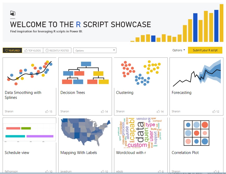
The R Script Showcase for Power BI allows you to create new or use existing advanced analytics in R visualisations. Using the R Showcase, you’ll be able to apply complex algorithms, visualisations, scripts, and more with just a few clicks. You don’t even need to know anything about R - just import an R custom visual to your report, drag the data, and the visual will be applied without writing one line of R code.
To use these in your own reports, visit the R Script Showcase, then select and download the report you would like to use.
Custom visualisations
Custom visualisation in Power BI allows you to create fully custom visuals to add to your own reports, or submit them to the Power BI community for others to use. You can create a custom visual using the Power BI developer tools, which let you design and test custom visuals by writing TypeScript code and creating CSS.
Once you’ve tested your custom visual, you can export it to your Power BI dashboard or submit it to the Power BI visuals gallery on AppSource.
---
Want to learn more about Power BI? Download the free Advanced Analytics with Power BI whitepaper and learn about predictive analytics, real-time dashboards, visualisations and more.