Dashboard Creator – Part I
First, my thoughts on dashboards. In the many projects I’ve managed I’ve used lots of different dashboards to help communicate to the team what is important. Dashboards are a communication and accountability tool. The problem is, the things that are important to be communicated change vastly over the project’s lifecycle:
· At the beginning of the project, its requirements approved
· In the middle, its tasks completed, and also change requests.
· At the end of the project, its bugs.
Also, maybe you have a 1 week push to address a certain type of bug, or at the end of every month, you want to close down on change requests.
Most dashboards I’ve worked with are very static, and very hard to change. They never met my needs, which means I’m resorting to a barrage of emails and/or walking around.
OK, enough of that blather … except that yes, I believe that TFS should provide such a tool out of the box.
Attached to this post (way at the bottom) is a dashboard creator that I wrote to help me manage projects. It is written based on Excel using Macros. Its goal is to be fluid enough and easy enough to configure that you could change it daily if you wanted, with minimal effort.
The dashboard creator has a Summary tab, which will end up being the dashboard. Here is a blank Summary Page:

Let’s say we want to do a dashboard on bugs pivoted on Bug Priority and Team Member. You would enter information like this:

The text in the first column (Bugs, P1-P4) is just header text.
The text in the grey column has the following meaning:
· “Assigned To” – This is the field that the headers will be pivoted on and is specified on the same row as the headers. The headers in this example are “TeamMember1-13”. If a Bug has Assigned To = TeamMember1, then it is counted under TeamMember1’s column, and so on. All my examples will pivot on Assigned To, but you can pivot on other fields
· “SheetName=SampleBugs,Priority=1” – This is the selection “clause”. It works like this:
o SheetName – This is the Excel sheet where you’ll get the information from. In this case, we have an sheet named “SampleBugs”.
o Priority – This is a filter for that row. Priority=1 says, only count rows where Priority=1. You can add additional filters as well. For example, say you wanted a “HOT BUGS” line, you could have a filter like: “Priority=1,Severity=1”. You can even make the text red, to make it stand out.
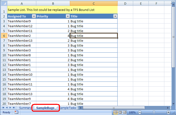
The Dashboard Creator works on the premise that all the data you want to report on is in sheets in the Excel workbook. For example, “SampleBugs” is a sheet in this workbook that contains a list of bugs:

The spreadsheet macros don’t care how the data gets into these sheets … just that it’s there.
So how does the data get in the “SampleBugs” spreadsheet? That’s where TFS-Bound Lists come in. The attached Excel file has non-bound lists, but the idea is to include TFS-bound lists with the information you need.
When you create a new sheet, with a TFS bound list, just make sure that all the fields you need are listed. In my examples, that would mean you need at least “Assigned To” and “Priority”. If you were filtering other fields, then you would need to include those in the TFS-bound list as well.
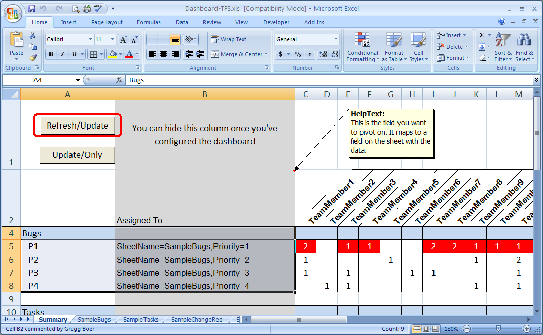
Once you’ve set up the lists and the Summary page, then to refresh your dashboard, you use Refresh/Update button:

The Refresh/Update button does the following:
· Tell all TFS-Bound Lists in the Excel workbook to refresh themselves from TFS.
· Update the Dashboard with the latest information.
The “Update/Only” button just refreshes the Dashboard with the information in the lists, without refresh.
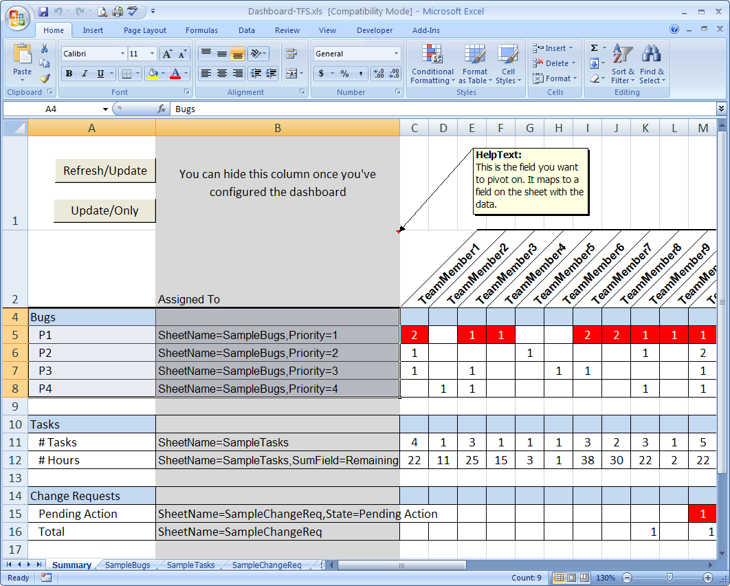
The beauty of this dashboard creator, is that you can mix and match different types of data. This example has Bugs, Tasks, and Change Requests.

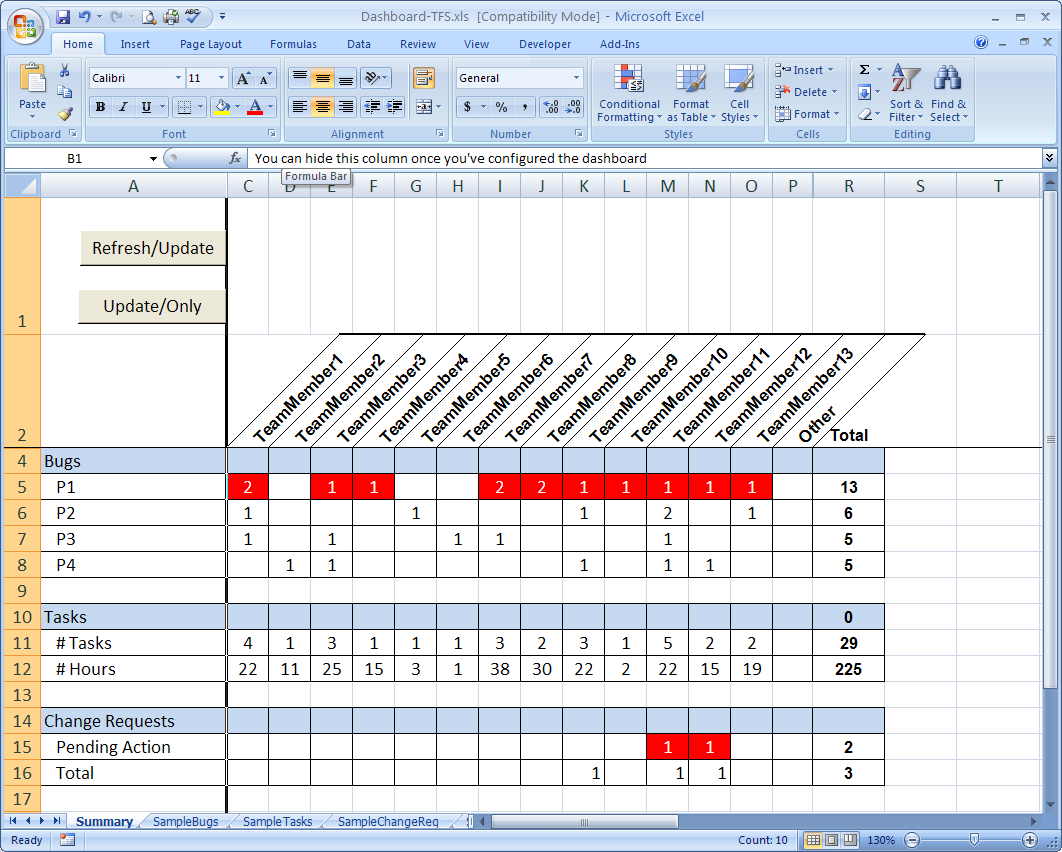
And finally, when you have made it look the way you want, you can hide column “B” to make it look nice:

You’ll also notice in the example, that I’ve made certain rows Red, because I want to highlight them as important. This is just simple Excel formatting.
There are other features and other ways I've used this dashboard creator, but I've already made this blog post too long. I'll post about them later.
One more thing, the attached file is an Excel 2003 file, however it is compatible with Excel 2007. Additionally, you can save it as a macro-enabled Excel 2007 file (*.xlsm), if you want to.
Let us know what you think! Hope this was all helpful.
Comments
Anonymous
September 11, 2007
Dashboard Creator – Part II In a post last week, I introduced a Excel-based Dashboard Creator I wrote.Anonymous
September 26, 2007
In previous posts , I introduced on the Dashboard Creator tool that I made in Excel. The most recentAnonymous
November 01, 2007
In previous posts , I introduced on the Dashboard Creator tool that I made in Excel. In short, the DashboardAnonymous
November 01, 2007
In these four posts ( I , II , III , IV ), I introduced a Dashboard creator that I wrote using Excel+Macros.Anonymous
November 01, 2007
In these four posts ( I , II , III , IV ), I introduced a Dashboard creator that I wrote using ExcelAnonymous
March 03, 2009
I’m going to add this blog to my links on the left—I go out here often, and I frequently mail these articles