The Evolution of the UI Design of Test and Lab Manager
In the last post, I discussed how our team approaches designing user interfaces in an Agile manner. In this post, I will discuss how the design of Test and Lab Manager, aka codename Camano, has evolved as assumptions were tested and feedback was received.
Starting out
After doing extensive research on the testing market, we were fairly certain that in the next release, we wanted to create a product targeting Generalist Testers (70% of the testing market) who are uncomfortable with the amount of options available to them in Visual Studio. We were however fairly uncertain on the exactly which features to include in the product all the scenarios which we would have time to handle.
Being an Agile team who was open to change along the way, we decided to start designing and developing the product with the understanding that change would come along the way.
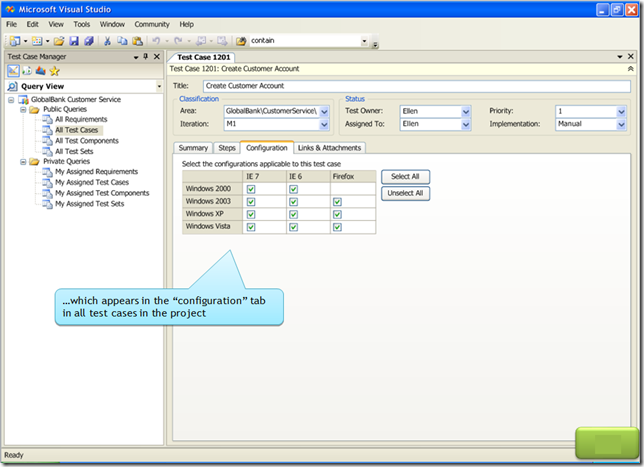
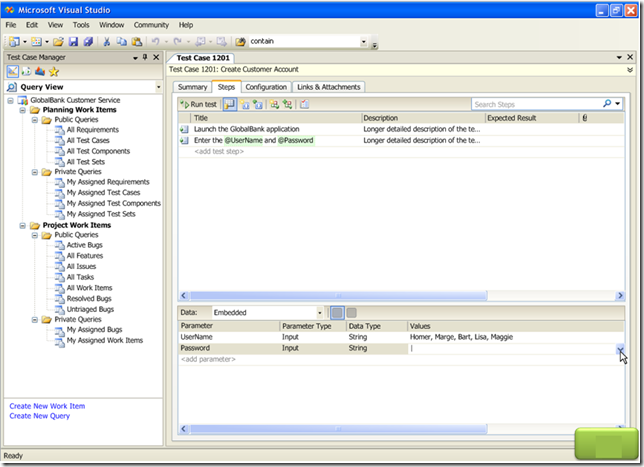
Iteration 1: Test Case Management inside Visual Studio
To get going on the project, while our other release (Visual Studio 2008) was winding down, we decided to create the basics of testing tools inside Visual Studio. Our thinking was that we wanted to get some tools around Test Case Management in the box so we could leverage the infrastructure which we had created in future sprints.
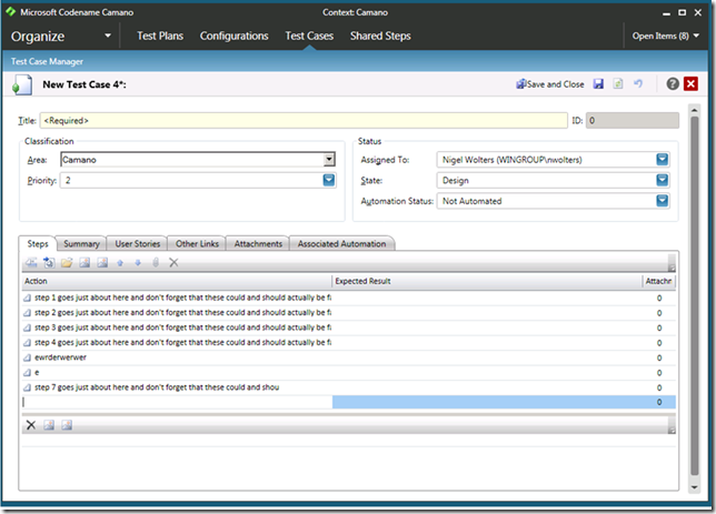
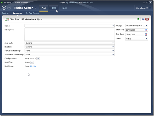
Below are a couple of shots of how we envisioned doing Test Case Management inside Visual Studio. The first shows managing configurations, the second shows authoring a test case (which is a work item). The mockups below were created by Moneta Ho.
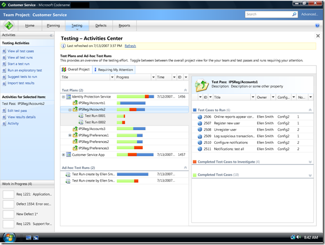
Iteration 2: Creating codename Camano
As more research studies became available and we learned more about our target market's likes and dislikes, the team decided to create a standalone environment for generalist testers and to scrap the abilities to do TCM in Visual Studio. Our studies had told us that our target audience was not extremely technical and was a little overwhelmed by Visual Studio. We hoped that in doing so, testers would feel much more comfortable using our tools for their testing. The sprint of work that we did inside Visual Studio was not throw away work since the majority of it was merged into Camano later on.
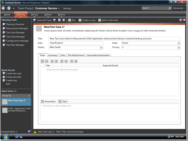
UI Breakdown: Although, we were unsure which actual features would end up in the product, we envisioned that the majority of the tasks would fall in to 5 broad categories: Dashboard Information, Planning, Testing, Triaging Bugs and Reporting. To accommodate these groups, we chunked the UI into 5 groups: Home, Planning, Testing, Defects and Reports, with the perl on the left reserved for items which didn't seem to fit into any group.
Workflows: We wanted to make the product as simple to use as possible so we thought to guide the user through the workflow of various tasks. To this end, we modeled much of the UI after traditional tasked based UIs such as Microsoft Money, with the left portion the UI dedicated to guiding the user through various workflows via hyperlinks. Tasks which were specific to the activity displayed in the activity window would be displayed as "common activities," while tasks specific to whatever is selected in the page would appear under "selected activities."
Multi-tasking: As we felt that it would be quite common to work on multiple things in parallel, we introduced a work in progress area to the left hand pane. The area worked by like a stack in that when a user navigated away from an activity, the activity from which the user went was placed at the top of the stack.
Below are a few mock ups, created by Moneta Ho, of the initial design of Camano. The first shows the broad breakdown of the UI, the second shows the UI with a few artifacts.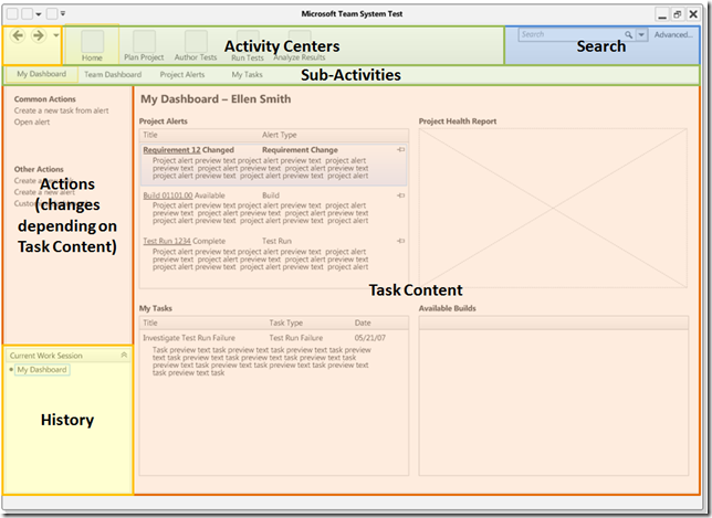
Iteration 3: Simple Tweaks
Problems
We conducted a round of usability studies with local testers. We took away the following details from the study:
- Many people did not understand where they were in the UI at any given point
- Many didn't understand why the contents of the left hand pane was changing all the time or find it useful
- Nobody used the work in progress area to switch between items, rather they preferred to just navigate to it directly
After observing users crying out in frustration in the usability study, we decided to make some tweaks to the Camano shell.
Solution
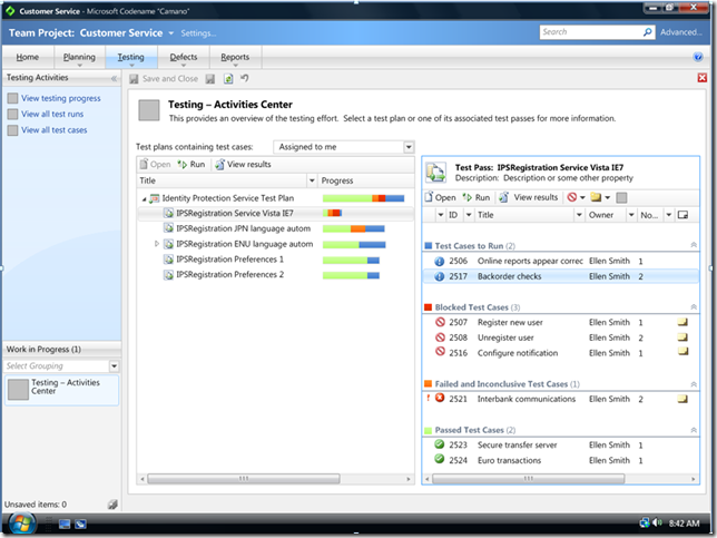
Since most users did not correlate between selecting an item in the grid and then selecting an action to be performed on it far away, we moved all actions that could be performed on items in a grid to a toolbar directly above the item. Further, we created a toolbar to contain items for the page displayed in the Activities pane. Together, this allowed us to get rid of the selected item activities and paved the way to getting rid of the left hand pane entirely later on.
As we iterated, we found that we really did not need the Perl in the top left hand corner in the UI. We therefore removed it from the product as well.
Below is a screenshot of the tweaks that were made, one with a blue theme, one with a dark theme. Both themes were in implemented in the the product at various times.
Iteration 4: Major Overhaul
Problems
As more of Camano began to take shape and more users internally began to use it, we increasingly received feedback from almost all of our channels including TAP, MVPs, the SIG and internal users that the product was not easy to use. In our effort to make something that would allow people to plan all the steps of their testing, we made something which exposed too many artifacts in the UI at one time, did not guide a user through any particular workflow and to some extent got in the way of a user doing their testing. Although we initially designed band aid solutions such as activities dedicated to streamlining the out of the box experience via a wizard, filtering a tester’s view by various factors, and workflow diagrams built into the page, we felt we needed to do something more dramatic.
Further, it was felt that our current UI:
- Had too much space (around 40%) dedicated to navigation. Much of the navigation was redundant with 2 or 3 areas dedicated to doing the same thing.
- Our history metaphor was not working. Our work in progress area quickly filled with items which the user was not interested in navigating back to.
- Did not make it easy to perform simple tasks. 2 or 3 steps were needed to just perform simple things without the tool guiding the user through the process.
In a typical tester’s day, we began to understand that:
- Most testers would work within the context of a Single Test Plan. Examining items that span multiple plans would be a 20% scenario.
- The majority of their time would be spent in 3 types of activities: Authoring Tests, Running Tests, and Examining Bugs
Solution
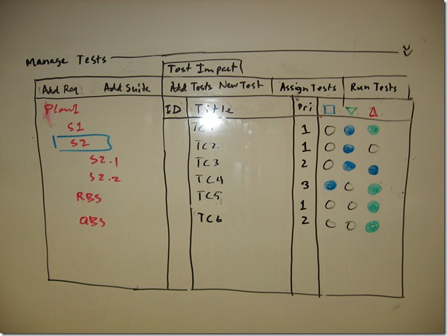
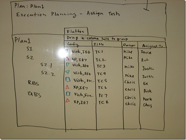
Object Model: After much discussion, between both server and client teams, it was realized that the object model on which Camano was based could be dramatically simplified if we always forced the user to plan their test cases for execution at the plan level rather than as stand-alone suites which could be used from plan to plan.
Some of the initial sketches of this idea by Ed Glas and the server team were as follows:
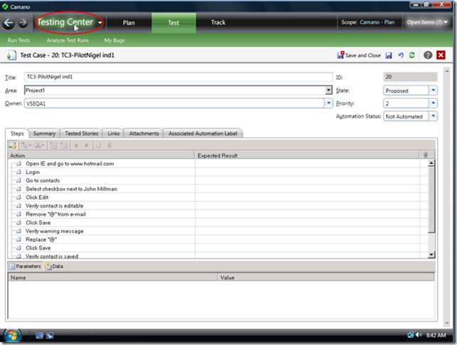
User Interface: To assist with the issues mentioned above, we decided to make several changes to the UI. Specifically, we decided to optimize the UI on common workflows, make it easier to access the most common activities, eliminate the left hand pane, change the history metaphor, add back and forward buttons to the UI and to force the user to work within a single plan.
By doing so, I think that we were able to naturally filter the perspective of the tester to the items they are interested in (their currently connected plan), and streamline workflows. With these changes made, workflows become much more natural since objects are always created in the context of a plan.
Below is a mock up of design, by Nigel Wolters, that shows the changes, followed by a screenshot of what was actually implemented. Note that the amount of space dedicated to navigation was minimized and that when the user is in the “Tester’s Center,” the user’s perspective is filtered to the Test Plan to which they are currently connected. Further, access to the most common areas (to author or run tests or look at bugs), are just one or two clicks away at any given point.
Iteration 5: Simple Tweaks
After making the major overhaul to the object model and accompanying changes in the UI, we started to get raving reviews. Folks were particularly happy to have the full horizontal screen for their activity content and that they were able to get testing quickly out of the box. All of our feedback channels started telling us that the product felt much more polished and easy to use.
As folks in Visual Studio started to look at it, it was pointed out that the colors were not in sync with the new blue Visual Studio theme in VS2010. We decided to do a simple update to make Camano blue in addition to making it a little sexier. I’m quite happy with how it ended up.
Below is a mockup created by David Culberton in conjunction with Nigel Wolters. It is very close to how the Beta 1 product looks and feels.
Conclusion
As you can see, in the run up to the Beta 1 release of codename Camano, the product has been completely redesigned several times. My hat goes off to the Agile process and management which has allowed us to respond to various levels of feedback to make design changes when appropriate.
I should note how much of a team effort designing Camano has been. Each design decision has been thoroughly scrutinized to make sure that the right trade-offs are considered and the right optimizations are made. Nigel Wolters, David Culbertson, Moneta Ho, Mark Mydland, David R. Williamson, Ed Glas, Michael Rigler, Dominic Hopton, Euan Garden and myself (Naysawn Naderi) have have all been thoroughly involved in making Camano as easy on the eye as we think it is easy to use.
Along these lines, we are also incredibly indebted to our MVPs, SIG representatives and many other unsung feedback heros who have been invaluable in praising us when appropriate and holding us out on the ringer when we deserve to as well. My thanks goes out to you for helping to shape the design of codename Camano.
Comments
- Anonymous
May 28, 2009
PingBack from http://microsoft-sharepoint.simplynetdev.com/the-evolution-of-the-ui-design-of-test-and-lab-manager/
