Improved model-driven app header, sitemap, and app switching
Important
This content is archived and is not being updated. For the latest documentation, see Microsoft Power Platform product documentation. For the latest release plans, see Dynamics 365 and Microsoft Power Platform release plans.
| Enabled for | Public preview | Early access | General availability |
|---|---|---|---|
| Users, automatically | - |  Aug 9, 2020
 |
 Oct 4, 2020
 |
Business value
Improved reliability and usability of model-driven app header, sitemap, and app switching.
Feature details
Model-driven apps have several enhancements for usability and reliability. The header has an updated Office app launcher to match other Office products. The app name in the header now opens the inline model-driven app switcher, which is a faster experience. When the website is opened without an app parameter, the message bar enables switching to a specific app. The classic sitemap control has been replaced with the modern sitemap control for better usability. The embedded mode is updated to an experience aligned with the web browser providing a neutral styling to blend into the host.
The header breadcrumb has been removed to align with Office header styling and to make space for the upcoming app search box in the header. To support this navigation change and help users with navigation discovery, page back buttons have been added to the main page types of Form, View, and Dashboard.


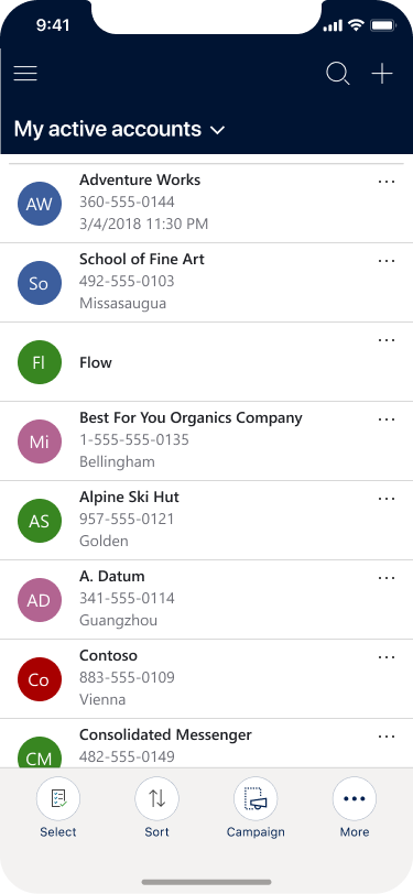
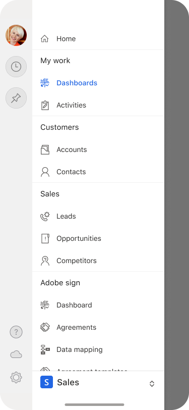
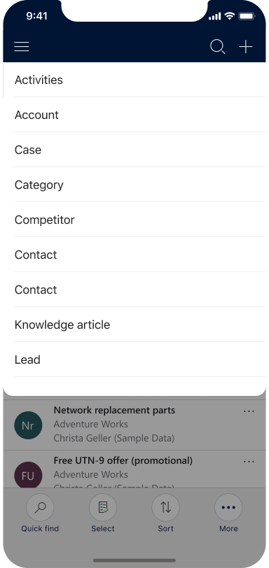
Model-driven apps now support an upgraded sitemap as the launch pad of experiences on Dynamics 365 mobile app for phones and tablets. This sitemap is now consistent with the web experience. Recently accessed and pinned records are easier to find for users to be more productive on the go.
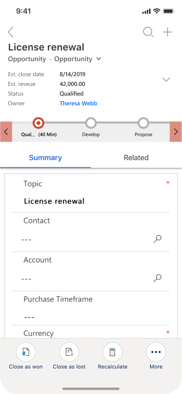
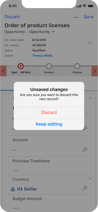
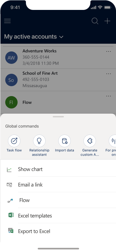
In addition, within the windows app and on phone devices, commonly used commands are removed from the bottom bar to the top corners of the screen for easy access, reducing the levels of navigation. The commands and gestures are tailored to match iOS and Android patterns. Page-level commanding always has the More command that displays a fly out of all of the available commands on the page. Global commands are displayed at the top in a list spanning horizontally. Form tabs are scrollable, and grids and sub-grids are compact. So users can better orient themselves within the Dynamics 365 mobile app, the save experience has been improved with clear save and discard actions provided to the user, and less commonly used areas, like settings and profile information, are tucked away for users to access as needed.
