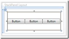
WPF & Silverlight Layout Controls
This article has a corresponding video that can be viewed here.
The WPF and Silverlight platforms have a wide selection of powerful layout controls.
This topic will provide you with an understanding of these layout controls and how to take advantage of the WPF and Silverlight Designer features when working with these controls.
In this topic when the term pixel is used, it refers to a device-independent-pixel. In WPF a pixel is 1/96 of an inch. This MSDN topic covers device-independent-pixels. https://msdn.microsoft.com/en-us/library/bb847924.aspx
Table of Contents
- Layout Control Types
- Panel Selection
- Panels
- Decorators
- Content Controls
- Items Controls
- Layout Properties
- Comments
Layout Control Types
WPF layout controls can be logically grouped by base types that determine their behavior.
- Panels
- Provide arrangement of their child objects.
- Derive directly or indirectly from Panel.
- Have a Children property that is a collection of their child objects.
- Example controls are the Grid, StackPanel, Canvas, DockPanel WrapPanel and UniformGrid.
- Decorators
- Apply effects to their single child object.
- Derive from Decorator.
- Have a Child property that contains their single child object.
- Example controls are the Border and ViewBox.
- Content Controls
- Contain a single object of any type.
- Derive directly or indirectly from ContentControl.
- Have a Content property that contains their single object.
- Example controls are the Window, UserControl, GroupBox, TabItem, Expander, HeaderedContentControl and ContentControl.
- Items Controls
- Used to present a collection of objects.
- Derive directly or indirectly from ItemsControl.
- Have two ways of being populated
- Objects can be added to the Items property in code behind or in XAML.
- A list of objects can be bound to the ItemsSource property.
- When objects are added using either of the two above methods, UI objects will be automatically generated. The generated UI objects can be customized through the use of DataTemplates.
- Example controls are the ListBox, ListView, DataGrid, TabControl, ComboBox, Menu and ItemsControl.
- Note the DataGrid and Menu will be covered in a future article.
Panel Selection
| Panel | Description | Good For |
| Grid | Provides flexible grid area that consists of rows and columns. | Overall application layout, data entry forms |
| Canvas | Supports absolute positioning of child elements | Good for drawings, not great for dialogs as there is no support for reliability, and limited support for Auto sizing |
| StackPanel | Supports flow like positioning of child elements in a horizontal or vertical direction | Good for lists of items. For situations where you want more fine-tuned control of sizing relationships, use a grid instead. Instead of using a StackPanel as ItemsControl ItemsPanel, use the VirtualizingStackPanel instead as it will yield much better performance for large lists of items. |
| WrapPanel | Similar to StackPanel, but wraps the content when it reaches a boundary | Good for lists of items, though it does not support virtualization |
| UniformGrid | Divides the space equally into rows and columns, placing each child in a separate cell | Good for tiling in a ItemsControl, though it does not support virtualization |
| Dock Panel | Aligns content to edges of its container. Content can also be set to fill the remaining space | For better designer support use a Grid |
Grid
The Grid control provides a flexible grid area that consists of rows and columns. Flexible row and column sizing options enable the grid to predictably size and resize itself at design time or runtime as its parent control is resized.
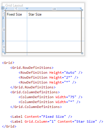
Figure 1 Grid Layout
Grid Row and Columns
Rows are added to the grid by adding a RowDefinition to the RowDefinitions collection. The grid in Figure 1 above has three rows defined.
Columns are added to the grid by adding a ColumnDefinition to the ColumnDefinitions collection. The grid in Figure 1 has two columns defined.
Row and Column Definition Sizes
The Grid row Height and Grid column Width properties are of type GridLength. The GridLength allows for flexible property value assignment.
Star sizing
- Is expressed as a weighted proportion of available space.
- In Figure 1 the last two rows use Star sizing. The middle row (2*) will be giving twice the layout space as the last row (*). By looking at the left grid rail, you can see that the middle row has been allocated 80 pixels and the bottom row has been given 40 pixels.
- Row or columns that are Star sized will resize at runtime if their parent Grid is resized.
- Star sizing is the default mode for row and column definitions if no height or width is provided.
Fixed
- Numeric value of type Double that defines size in pixels.
- Value can be qualified to allow sizing to be determined in points, inches or centimeters. Example: 14pt, 2in or 5cm. The default is pixel sizing. 75px is equivalent to 75.
- In Figure 1 the first column uses Fixed sizing.
Auto
- Sizing is determined by the size of its contents. In Figure 1, the first row is Auto sized and its height is determined by the height of its contents; in this case the two Label controls.
- Auto sized rows or columns that have no content consume no space on the design surface.
- However, the row or column handle is still visible and can be used to resize the row or column as in Figure 2 below. The red arrow points to the Auto sized column handle.
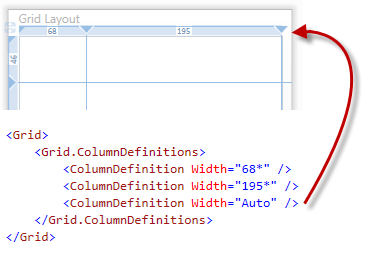
Figure 2 Auto Sized Column Handle
Design Time Size Information
The numeric values displayed in the Grid control's rail is the actual design time size in pixels of the row or column. This is true for both Fixed size and Star sized rows or columns.
| Note |
If the Auto Sized Grid is hosted in a Window, the indicated values for height and width may be different at runtime based on the Window chrome. |
Positioning Controls in a Grid
The Grid control lays out controls based on several attached properties.
| Information |
See MSDN documentation on Attached Properties here: https://msdn.microsoft.com/en-us/library/ms749011.aspx |
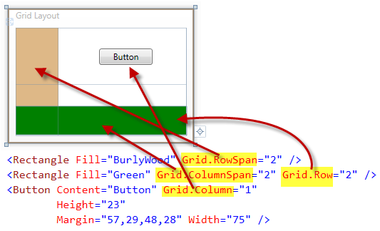
Figure 3 Grid Attached Properties
In Figure 3 above the Grid has three rows and two columns defined. The child controls as laid out according to the attached properties.
- Grid.Row – assigns the row the control will be rendered in (default is row 0)
- Grid.Column – assigns the column the control will be rendered in (default is column 0)
- Grid.RowSpan - indicates the total number of rows that the control spans within the Grid (default is row 0)
- Grid.ColumnSpan - indicates the total number of columns that the control spans within the Grid (default is row 0)
Grid Design Time Features
The WPF Designer operates on rows and columns in a similar manner. Examples and text will not be repeated for row and columns. Where designer behavior differs between rows and columns that information will be provided.
Adding Rows or Columns using the WPF Designer
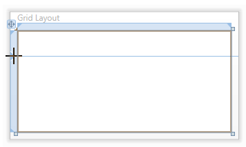
Figure 4 Add Grid Row
- With the Grid control selected in the designer, you can add rows by hovering the mouse over the left grid rail and clicking the rail in the desired location as in Figure 4 above.
- Clicking on the left rail splits the row into two rows.
- If the row is Star sized, the row will be split leaving two Star sized rows.
- If the row is Fixed sized, the row will be split leaving two Fixed sized rows.
- If the row is Auto sized, the row will be split leaving two Fixed sized rows.
- Columns are added using the top grid rail using same technique as the rows.
Resizing Rows and Columns with the WPF Designer
The WPF Designer provides two techniques for resizing a row or column.
- When resizing by dragging the row or column handle, the designer will maintain the size of the child controls
- When resizing by dragging the row or column line, the designer will maintain the margins of the child controls
Resizing a Row Containing an Auto Sized Control without Changing the Control Size
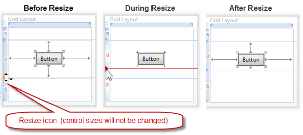
Figure 5 Maintain Control Size Resize
Dragging the row handle (triangle) enables row resizing without changing the Button size.
Resizing a Row Containing an Auto Sized Control without Changing the Control Margins
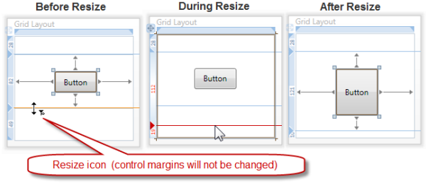
Figure 6 Maintain Control Margin Resize
Dragging the row grid line maintains the Button's margins which results in the Button resizing.
Resizing and Dropping Grid Line on Fixed Sized Control While Maintaining Control Size
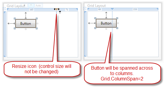
Figure 7 Dropping Grid Line on Fixed Sized Control
Figure 7 above displays the results of resizing a column and dropping the grid line on top of a Fixed sized control (control aligned Top & Left). Dragging the column handle resulted in the Button control maintaining its size. This was accomplished by spanning the Button across two columns.
Resizing and Dropping Grid Line on Fixed Sized Control While Maintaining Control Margins
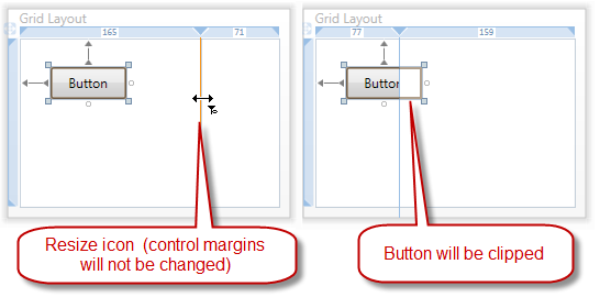
Figure 8 Dropping Grid Line on Fixed Sized Control
Figure 8 above displays the results of resizing a column and dropping the grid line on top of a Fixed sized control (control aligned Top & Left). Dragging the column line resulted in the Button control being clipped since size was not being maintained. To maintain sizes, use the column handle instead of the column row when resizing as in Figure 7 above.
Deleting Rows and Columns with the WPF Designer
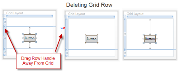
Figure 9 Deleting Grid Row
To delete a row or column drag the row or column header away from the grid and release the left mouse button. Notice the delete row drag icon in Figure 9 above in the center grid.
The right grid in Figure 9 shows the results of deleting the second row. The grid now has two rows and the Button control that was in Grid.Row 1 is now in Grid.Row 0.
In a row or column delete operation, the WPF Designer will renumber all affected control's Grid.Row or Grid.Column attached properties. Margins will be adjusted to maintain control positioning unless the control alignment is centered, in that case the control will remain centered.
Adding Rows and Columns using the Properties Window
Rows and columns can be added and removed from a Grid by editing the RowDefinitions or ColumnDefinitions collections using the Properties Window.
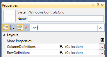
Figure 10 Properties Window
With the Grid control selected, using the Properties Window search box, enter "def" and the RowDefinitions and ColumnDefinitions collections will be visible.
Clicking on the ellipsis button will open a collection editor for adding, removing or reordering row or column definitions. Figure 11 below shows the ColumnDefinitions collection editor.
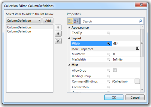
Figure 11 ColumnDefinitions Collection Editor
The ColumnDefinitions collection editor allows editing each of the ColumnDefinition properties. In addition to the Width property which is currently set to 68*, the MinWidth and MaxWidth properties are sometimes used by developers to provide a size range for the column by restricting the column's minimum and/or maximum width.
A ColumnDefinition can be added or removed from the ColumnDefinitions collection using the Add or Delete button.
| Important |
When using the Collection Editor and a ColumnDefinition is deleted, the Grid.Column attached property value is not adjusted like it is when using the WPF Designer. |
ColumnDefinitions can be reordered using the up or down arrows.
| Important |
When using the Collection Editor and ColumnDefinitions are reordered, only the ColumnDefinitions are reordered. The Grid.Column attached property value is not changed for any control. |
RowDefinitions have a collection editor similar to the ColumnDefinition editor.
Drag Drop and Drag Move Visual Clues
The WPF Designer provides visual clues when creating child controls by dragging and dropping from the ToolBox. These same visual clues are displayed when performing a drag move operation on the design surface.
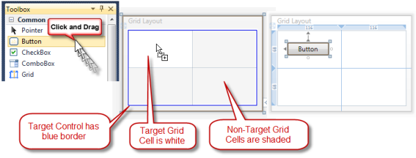
Figure 12 Drag Drop from the ToolBox
All WPF controls that allow the dropping of child controls will display a blue border around themselves when a control is being dragged over them. This blue border indicates that this control will be the parent of the control being dragged if it's dropped. Additionally the target control is colored white and other areas on the design surface outside the control are shaded.
The Grid has an enhanced drag over behavior. The cell that the mouse is over will be white and the rest of the design surface will be shaded as in Figure 12 above.
If the control being dragged would span multiple rows or columns, the additional rows or columns will also be white and not shaded.
Grid.IsSharedSizeScope
The Grid control has a unique feature that allows either rows or columns to be automatically sized to the largest row or column in their SharedSizeGroup. The SharedSizeGroup scope is determined by the attached property Grid.IsSharedSizeScope.
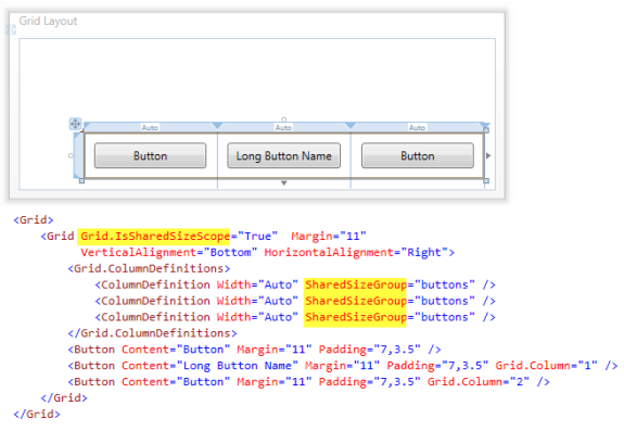
Figure 13 Grid.IsSharedSizeScope
In Figure 13 above the three ColumnDefinitions are participants of the SharedSizeGroup "buttons." The scope of their size sharing is the immediate parent Grid control. The parent Grid control has the attached property Grid.IsSharedSizeScope set to True. This establishes this Grid control as a shared size scope.
Each of the columns will automatically size to the largest column width in the SharedSizeGroup. In Figure 13 the Button "Long Button Name" is the widest Button control. Since the other two Button controls are using auto sizing, they will grow as their column resizes to match the widest column in the SharedSizeGroup.
Multiple Grid Controls Sharing the Same Shared Size Scope
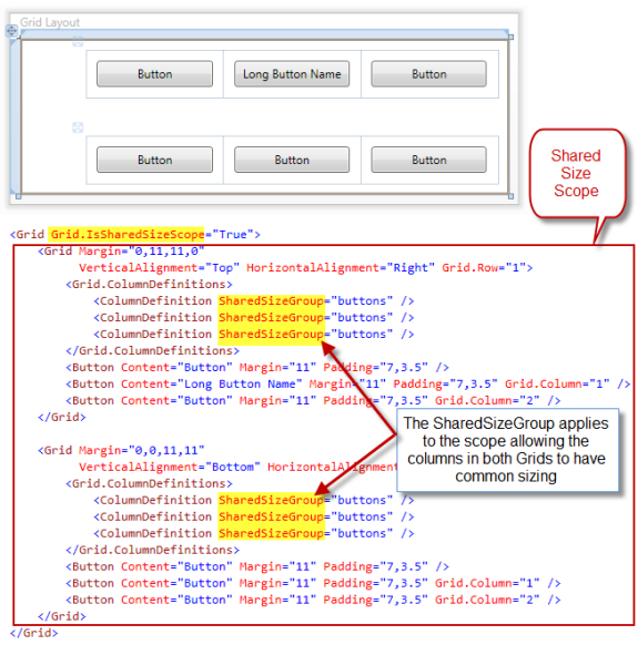
Figure 14 Multiple Grids Sharing the Same Shared Size Scope
Figure 14 above shows multiple Grid Controls sharing the same shared size scope. This is accomplished by nesting Grid Controls.
The outer Grid has the Grid.IsSharedSizeScope attached property set to True.
The nested child Grid rows or columns can now participate in the same SharedSizeGroup.
In Figure 14 the two Grid control's columns will all be the size of the widest column in the SharedSizeGroup "buttons."
Runtime Resizing of Grid Rows and Columns
The GridSplitter control provides runtime resizing of the Grid control's rows or columns.
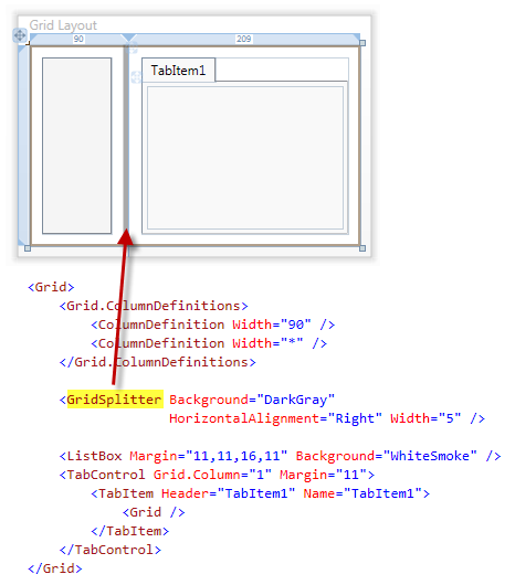
Figure 15 GridSplitter
In Figure 15 the GridSplitter is located in Grid.Column zero and aligned to the right of the column. The GridSplitter control can also be placed in its own row or column.
After adding the GridSplitter control to the Grid, use the Properties Window or the XAML editor to set the required properties on it.
At runtime the user will be able to resize the columns by dragging the GridSplitter left or right.
StackPanel
The StackPanel arranges child elements into a single line that can be oriented horizontally or vertically.
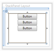
Figure 16 StackPanel with Vertical Orientation
Figure 16 above shows the default orientation of the StackPanel, vertical.
Figure 17 StackPanel with Horizontal Orientation
Figure 17 above shows the StackPanel with its Orientation property set to Horizontal.
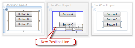
Figure 18 StackPanel Child Control Reordering
The StackPanel control has a design time experience that displays a position line when dragging controls into the StackPanel or when dragging controls to reorder them.
In Figure 18 above Button B is being dragged below Button C. The three above image display before, during and after the drag operation.
Notice the blue border and white drop surface applied to the drop target StackPanel and the shading outside the StackPanel control.
Canvas
The Canvas defines an area which you can explicitly position child elements by using coordinates that are relative to the Canvas area.
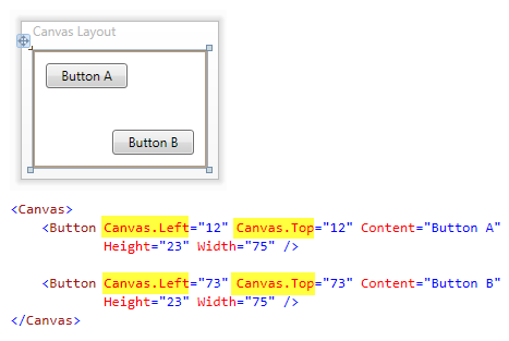
Figure 19 Canvas
When controls are placed on a Canvas, the Margin, Vertical and Horizontal alignment properties do not play a part in the control's layout. Instead the Canvas uses the attached properties Canvas.Left and Canvas.Top determine child control positioning. In Figure 19 the Canvas.Left and Canvas.Top attached properties are highlighted.
DockPanel
The DockPanel defines an area where you can arrange child elements either horizontally or vertically, relative to each other.
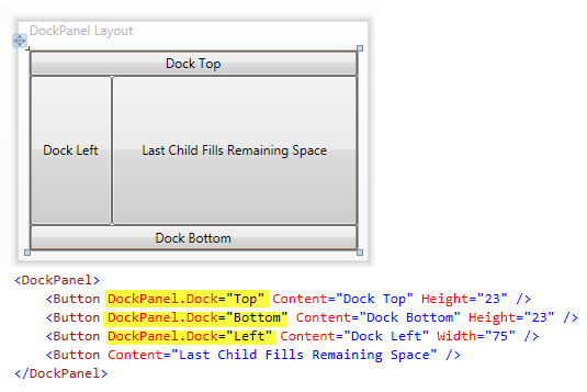
Figure 20 DockPanel
Except for adding controls to the DockPanel, the WPF Designer does not provide additional design time help. After adding controls to the DockPanel, use the Properties Window or the XAML editor to set the properties on the child controls.
The location of the DockPanel child controls is determined by the attached property DockPanel.Dock. Controls can by docked, left, top, right or bottom.
By default the DockPanel will allocate all remaining space to the last child added to it. In Figure 20 above you can see how the last Button control has consumed the remaining space of the DockPanel.
The secret to using the DockPanel is to add the outer controls to the DockPanel first. Note the order the controls are added in the XAML. The last control you add should be the control that will consume the remaining space.
WrapPanel
The WrapPanel positions child elements in sequential position from left to right, breaking content to the next line at the edge of the containing box. Subsequent ordering happens sequentially from top to bottom or from right to left, depending on the value of the Orientation property.
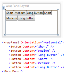
Figure 21 WrapPanel
Except for adding controls to the WrapPanel, the WPF Designer does not provide additional design time help.
When the WrapPanel is resized at runtime, it will automatically lay its child controls out again.
Child controls can be laid out horizontally or vertically by setting the Orientation property.
A real world example of using the WrapPanel would be the Windows Control Panel. With each icon and text being wrapped in its own panel, those panels would be added to the WrapPanel to provide flexible layout repositioning at runtime as the Control Panel is resized.
UniformGrid
The UniformGrid provides a way to arrange content in a grid where all the cells in the grid have the same size.
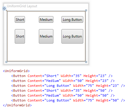
Figure 22 UniformGrid
Except for adding controls to the UniformGrid, the WPF Designer does not provide additional design time help.
Each of the controls in Figure 22 above has the same space allocated to them.
The UniformGrid provides properties for setting the desired number of row and columns if the default layout does not suit your application's needs.
Panel.ZIndex Attached Property
Before looking at some additional layout panels, let's cover a layout attached property that is exposed by the Panel class that all panels derive from.
The Canvas is a panel so this attached property applies to the Canvas as well as other panels.
Stacking Order for Panel Child Controls
The Panel.ZIndex attached property is used by all panel controls to determine the stacking order of controls laid on top of one another.
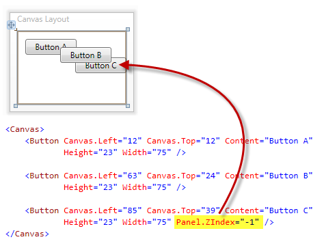
Figure 23 Control Stacking Order
| Note |
The Panel.ZIndex property can be set on child controls of all panels. This example is showing the Panel.ZIndex attached property being used with the Canvas. |
Normally the control stacking order is determined by the order that the controls are added to the layout.
In Figure 23 above buttons A, B and C were added in the order they appear in the XAML.
However Button B is rendered on top of Button C. This is because the Panel.ZIndex attached property for Button C has been set to a lower value than the Panel.ZIndex attached property for Button B.
The default value of the Panel.ZIndex attached property is zero. You can assign positive or negative values to this attached property to get the stacking order your application requires.
Border
The Border control draws a border, background, or both around another element.
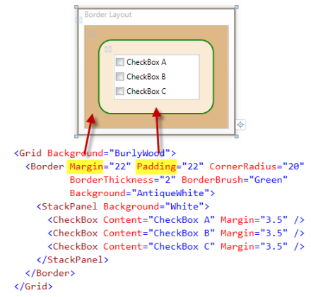
Figure 24 Border
Except for adding a single child control to the Border, the WPF Designer does not provide additional design time help.
In Figure 24 above, the StackPanel is the single child control of the Border.
Commonly set Border Properties
- Margin provides spacing around the Border.
- Padding provides spacing between the Border's border and the child control.
- BorderThickness is of type Thickness and gives the border edges their thickness.
- BorderBrush gives the border its color.
- CornerRadius gives the Border the rounded corners.
- Background can also be set to provide a background color for the Border and its child control.
Window
The Window control provides the ability to create, configure, show, and manage the lifetime of windows and dialog boxes.
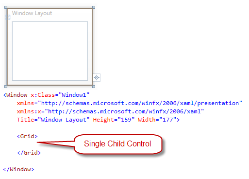
Figure 25 Window
Except for adding a single child control to the Window and the size mode button, the WPF Designer does not provide additional design time help.
WPF applications each have one or more windows. Since a Window control can only contain a single control, the content of a Window control is normally a layout panel to enable the layout of many additional controls.
The size mode button was covered in the Setting Up Visual Studio for WPF and Silverlight Development article.
UserControl
The UserControl provides a simple way to create a control or extract out a set of controls for reuse.
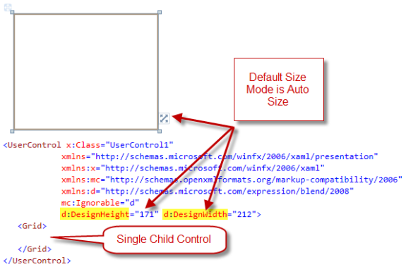
Figure 26 UserControl
Except for adding a single child control to the UserControl and the size mode button, the WPF Designer does not provide additional design time help.
Since a UserControl can only contain a single control, the content of a UserControl is normally a layout panel to enable the layout of many additional controls.
The UserControl size mode defaults to Auto size.
The size mode button was covered in the Setting Up Visual Studio for WPF and Silverlight Development article.
GroupBox
The GroupBox is a control that creates a container that has a border and header for its single content object.
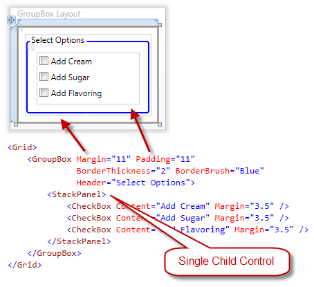
Figure 27 GroupBox
Except for adding a single child control to the GroupBox, the WPF Designer does not provide additional design time help.
In Figure 27 above, the StackPanel is the single child control of the GroupBox.
When dragging a GroupBox from the ToolBox, the default child control for the GroupBox is a Grid. In Figure 27, the Grid has been replaced with a StackPanel.
Commonly set Border Properties
- Margin provides spacing around the GroupBox.
- Padding provides spacing between the GroupBox's border and the child control.
- BorderThickness is of type Thickness and gives the border edges their thickness.
- BorderBrush gives the border its color.
- Header typically provides text at the top left of the GroupBox. However, the Header property is not limited to just text as it's of type Object. The Header can contain any single WPF control.
- An example of a non-standard Header could be a StackPanel that contains an Image control and a TextBlock control.
- Background can also be set to provide a background color for the GroupBox and its child control.
Expander
The Expander control displays a header that has a collapsible window that displays content.
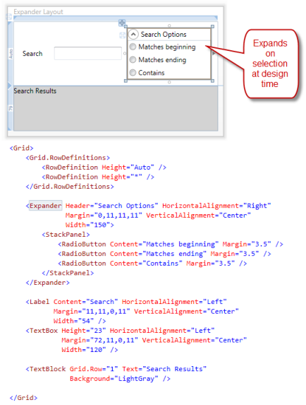
Figure 28 Expander Control Expanded
At design time, when the Expander control is selected it will expand. This provides access to its single child control. The child control is typically a panel. The default panel is the Grid control. In Figure 28 above the Grid was replaced with a StackPanel.
The Header property typically provides text at the top of the Expander. However, the Header property is not limited to just text as it's of type Object. The Header can contain any single WPF control. An example of a non-standard Header could be a StackPanel that contains an Image control and a TextBlock control.
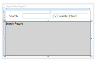
Figure 29 Expander Control Collapsed
Selecting another control outside the Expander will cause the Expander to collapse as pictured in Figure 29 above.
TabItem
The TabItem control represents a selectable item inside a TabControl.
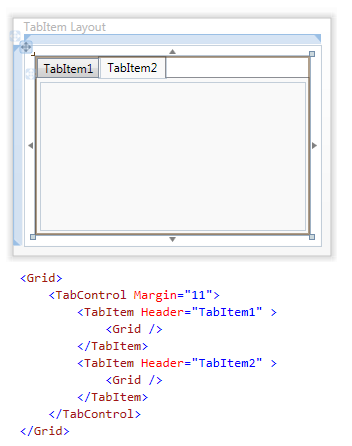
Figure 30 TabItem
The TabControl contains one or more TabItem controls that the user can select at runtime. The TabItem control typically contains a single panel child control that is used to layout additional controls.
The default panel for the TabItem when added from the TabControl Context Menu is the Grid control as pictured in the XAML in Figure 30 above.
WPF: At design time in you can select the TabItem you need to layout by clicking on its Header.
The Header property typically provides text for the TabItem Header. However, the Header property is not limited to just text as it's of type Object. The Header can contain any single WPF control. An example of a non-standard Header could be a StackPanel that contains an Image control and a TextBlock control.
TabControl
The TabControl is a control that contains multiple items that share the same space on the screen and is pictured in Figure 30 above.
The TabControl TabStripPlacement property determines the location of the TabItem Headers. The default value is Top. Other possible locations are Left, Right and Bottom.
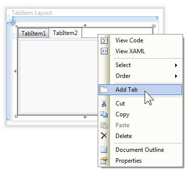
Figure 31 Adding TabItem using TabControl Context Menu
At design time additional TabItem controls can be added to the TabControl by selecting the TabControl, right clicking to bring up the Context Menu and selecting Add Tab as pictured in Figure 31 above. In Figure 31 the mouse was right clicked when the mouse cursor was in the white space to the right of TabItem2's Header.
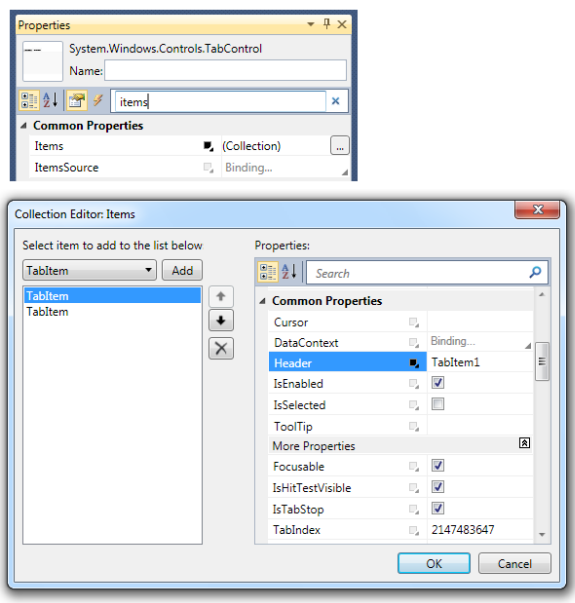
Figure 32 Adding TabItem using Properties Window
At design time additional TabItem controls can also be added, removed and reordered by using the TabControl Items property Collection Editor as in Figure 32 above.
Layout Properties
The following section briefly covers common properties that affect layout.
Margin
The Margin property is of type Thickness and provides spacing from the control's outer edge to other controls around it.
VerticalAlignment
- Top – control is aligned to the top of the parent's layout slot.
- Center – control is aligned to the center of the parent's layout slot.
- Bottom – control is aligned to the bottom of the parent's layout slot.
- Stretch – control stretches to fill the parent's layout slot.
HorizontalAlignment
- Left – control aligned to the left of the layout slot for the parent element.
- Center – control aligned to the center of the layout slot for the parent element.
- Right – control aligned to the right of the layout slot for the parent element.
- Stretch – control stretched to fill the entire layout slot of the parent element.
Visibility
- Visible – display the control.
- Hidden – do not display the control, but reserve space it in layout.
- Collapsed – do not display the control, and do not reserve space for it in layout.
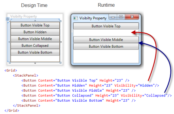
Figure 33 Visibility
In Figure 33 above the left Widow shows the design time rendering of controls on the design surface. Regardless of the Visibility property, all controls are rendered on the design surface.
In Figure 33 above the right Window shows the runtime rendering of controls with the different Visibility property values set.
ClipToBounds
The ClipToBounds property indicates whether to clip the content of this control (or content coming from the child elements of this control) to fit into the size of the containing element.
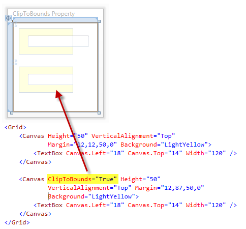
Figure 34 ClipToBounds
In Figure 34 above the top TextBox extends past the boundary of its parent Canvas control.
In Figure 34 above the bottom Canvas has its ClipToBounds property set to True. This results in the bottom TextBox being clipped at the boundary of its parent Canvas control.
Comments
Microsoft values your opinion about our products and documentation. In addition to your general feedback it is very helpful to understand:
- How the above feature enables your workflow
- What is missing from the above feature that would be helpful to you
Thank you for your feedback and have a great day,
Karl Shifflett
Visual Studio Cider Team
Comments
Anonymous
January 23, 2010
Karl, Excellent reference. I learned a load by reading this and will be coming back often when a question comes up. bill bAnonymous
January 24, 2010
Ahh but you forgot one very useful and often neglected layout control - InkCanvas. Aside from collecting ink (yeah, remember us Tablet PC supporters?) it also works great as a poor man's designer surface because you can set its editing mode to Select and resize/move/delete controls at runtime with zero code.Anonymous
March 11, 2010
Josh, Nice run-time idea for sure. Thank you for the great tip. Have a super day, KarlAnonymous
July 01, 2010
Lovely piece of code! Really nice article...got very very good understanding about WPF Thanks a lot.Anonymous
July 02, 2010
Tarun, Thank you for your kind words on the article. WPF is a wonderful framework for developing Windows applications. Have a super day, KarlAnonymous
September 28, 2010
Hi Karl. Is there any way to control the "position" of the Gridsplitter from code behind, og preferrably XAML for MVVM Property Binding? LarsMAnonymous
July 04, 2012
Very nice explanations! Well done. yvesAnonymous
August 16, 2012
hoping that the video have chinese translation. those video are very good.

