How you | ALM Rangers can improve the elevator pitch
My head literally started to spin during a recent PM event “How to Create Your Elevator Pitch”.
 I wondered how we used to pitch our ideas, how we evolved, how we intuitively adopted a lot of the improvements that were highlighted in the course and more importantly how we can improve going forward.
Historical and visual evidence
The training was focused on the “elevator pitch”. Please bear with me as I share a few visuals I pondered over during and after the training, because the “elevator pitch” is evident in many different deliverables.
| Back in the days … | Recently … | My thoughts … |
 |
 |
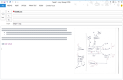
In the past our emails (left mock-up) used to be very detailed, precise, formal and most importantly long. Thanks to a number of phenomenal peer mentors the emails have evolved to a format which is concise, starts with the context, followed by bulleted and actionable items, including visuals. Which would you intuitively file for later action and which would you action (read) first? |
 |
 |
The typical ALM Rangers guidance project include a wealth of practical guidance and artefacts such as guides, hands-on labs, quick reference posters, cheat sheets and calculation workbooks … all in all it can result in a daunting pile of “stuff”. The latest experiment was the Better Unit Testing with Microsoft Fakes guide, which was developed as a single-artefact eBook containing guidance, walk-through (light-weight HOLs) and cheat sheets. Which would you intuitively pickup first? Trivia: The project on the left is enjoying a 14/day and the one on the right a 197/day download average. |
 |
 |
The typical ALM Rangers project kick-off was a ceremony that required 1-1.5h and involved the sharing of detailed and often verbose 15-20 slides. The recent kick-off events have been time-boxed to 30min, using 7 standard slides, with a bulleted, visual and less formal approach. Which session would you intuitively prefer to attend? |
Key improvements I took from the course and my mentors
Communication in general
- Emails should be kept crisp
When I have to scroll to read an email, my attention starts to fade and emails are usually deferred for (much) later processing. - Emails should focus on (one) topic
When email content forks, it can become very hard to consume and identify the core “ask”. - Visualizations are invaluable and a picture may say a thousand words
Many humans (myself included) are visually minded and automatically convert textual (bla, bla, bla, …) content into visual diagrams, mind-maps, etc.
Invest time in visuals and crisp text … your reader will love you! - Every sentence you write should be meaningful
Validate that each sentence (word) has value and do not feel bad to delete content. Less is better!
Elevator pitch
- Why? Create a (visual) vision statement that clearly answers the “why”.
- Start strong.
- You can start with a question: Do you…? Are you…? With an optional “then you are not alone” empathy statement.
- You can also start with a fact (visual) that triggers a favourable response.
- Focus! Instead of boring the user with generic and lots of facts, focus on one (the best) feature.
- End strong
- You can end with a statement that provokes further action: We have / will … interested? Find us …
To determine what could trigger a response with your audience, read about them on LinkedIn, Facebook or their blog. In Willy-Peter Schaub you should, for example, find many things that could trigger a favourable and negative response with me.
To conclude, how would I pitch the Better Unit Testing with Microsoft Fake project if I had to do it all over again?
Are you finding it daunting to get started with Microsoft Fakes? We want to combine the experience of the product group, ALM MVPs and Rangers to develop practical guidance covering:
We are going to publish an eBook enabling developers to adopt Microsoft Fakes. Interested in joining the team? |
|
PS: This revised vision has 69 words, the previous involved no less than 112.
Comments
Anonymous
April 11, 2013
Shorter and more concise with visuals is how we write our user stories...i like it!Anonymous
April 13, 2013
Good lessons here and well presented.

