OMS Log Analytics: Create Tiles, Drill-ins and Dashboards with the View Designer
The View Designer feature was recently released to public preview in OMS Log Analytics. This feature enables dashboards, tiles and visualizations to be created based on data collected and stored in your OMS Log Analytics workspace.
For more information, please visit Evan’s announcement on the OMS View Designer.
This post demonstrates how data collected from the text log file described in the previous post on Collect, Visualize and Analyse Log File Data, can be presented on a dashboard with multiple views and summarized as a tile on the home screen of the OMS Log Analytics portal.

Figure 1: A Tile on the home screen of the OMS Log Analytics Portal
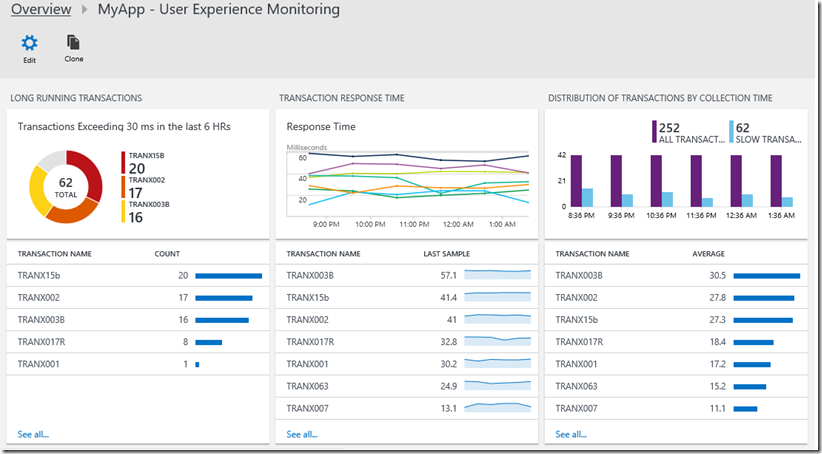
Figure 2: A Dashboard can be configured to present more information after clicking and drilling-in from the summary Tile. This Dashboard consist of 3 separate Views – View A, View B and View C.
The Summary Tile shown in Figure 1 is configured using the Donut template, it’s used to provide a summary of the Total Number of Transactions and Top 3 Most Frequent Transactions recorded from the text file data collection.
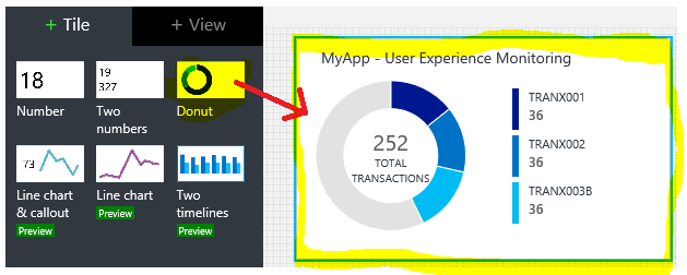
The query used for the Summary Tile is: Type=SampleApplication5_CL | measure count() by AppName5_CF
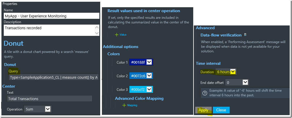
The configuration of the Summary Tile on the Properties blade is laid out horizontally as follows:
Note that the duration is set to 6 hours.
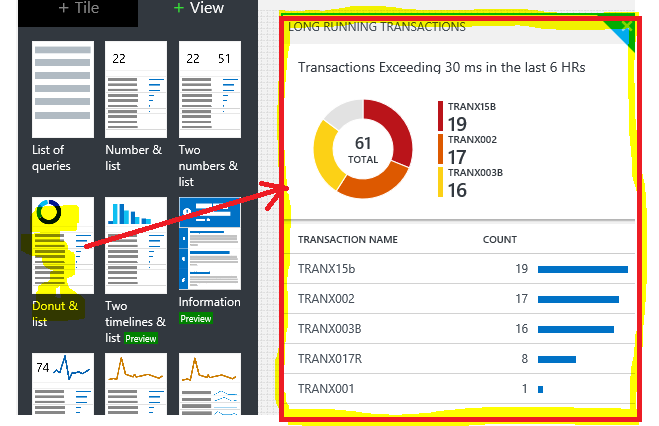
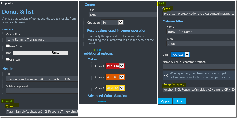
The first View within the Dashboard shown in Figure 2, View A,is configured using the Donut & list View template.
The donut section provides a summary of the Total Number of Transactions and Top 3 Most Frequent Transactions that exceeded 30 ms response time, they are classified as long running transactions, recorded from the text file data collection.
The list section below it lists each of these long running transactions in descending order based on their frequency in the last 6 hours.
The queries used in View A are:
Donut: Type= SampleApplication5_CL ResponseTimeMetric5Numeric_CF > 30 | measure count() by AppName5_CF List: Type= SampleApplication5_CL ResponseTimeMetric5Numeric_CF > 30 | measure count() by AppName5_CF
Navigation Query: Type=SampleApplication5_CL ResponseTimeMetric5Numeric_CF > 30
Note that the Navigation Query field can be used to allow further drill-in to the Log Search screen to further search and analyse the raw data.
The configuration of View A on the Properties blade is laid out horizontally as follows:
The second View within the Dashboard shown in Figure 2, View B,is configured using the Line chart & sparklines View template.
The line chart section displays the maximum response time recorded (in ms) for each transaction over time on a line chart on an hourly interval:
The sparklines section below it summarizes each of the transactions recorded with their last sampled response time and sparkline (a small line chart) in the last 6 hours.
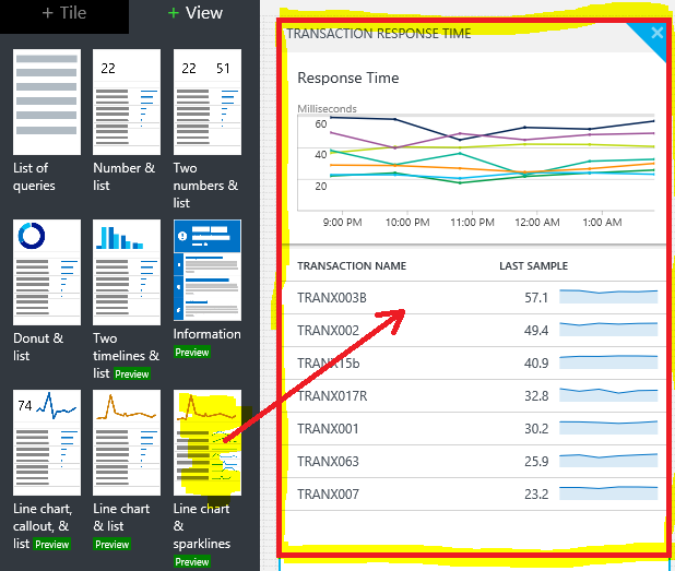
The queries used in View B are:
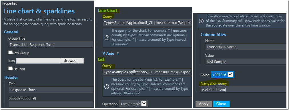
Line Chart: Type=SampleApplication5_CL | measure max(ResponseTimeMetric5Numeric_CF) by AppName5_CF List: Type= SampleApplication5_CL | measure max(ResponseTimeMetric5Numeric_CF) by AppName5_CF
Note that the Navigation Query field can be used to allow further drill-in to the Log Search screen to further search and analyse the raw data.
The configuration of View B on the Properties blade is laid out horizontally as follows:
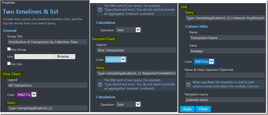
The third View within the Dashboard shown in Figure 2, View C,is configured using the Two timelines & list View template.
The two timelines section compares the Total Number of Transactions and all the transactions that exceeded 30 ms response time side-by-side on a bar chart, on an hourly interval, recorded in the last 6 hours.
The list section below it lists each the transaction with their average response time in the last 6 hours in descending order.
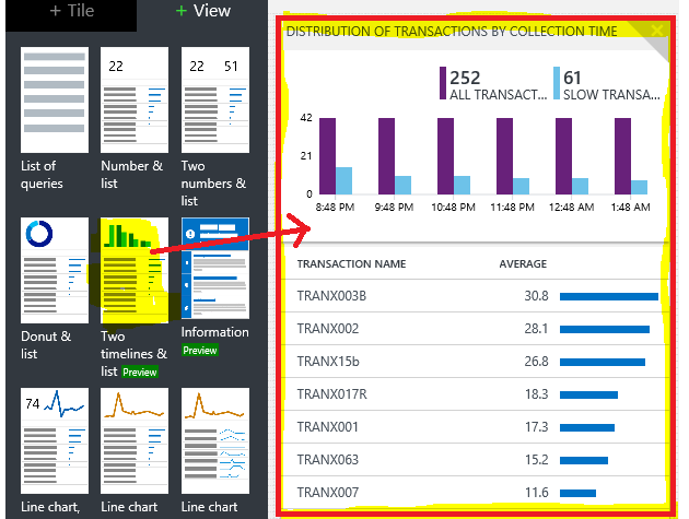
The queries used in View C are:
First Chart: Type=SampleApplication5_CL Second Chart: Type=SampleApplication5_CL ResponseTimeMetric5Numeric_CF > 30 List: Type=SampleApplication5_CL | measure Avg(ResponseTimeMetric5Numeric_CF) by AppName5_CF
Note that the Navigation Query field can be used to allow further drill-in to the Log Search screen to further search and analyse the raw data.
The configuration of View C on the Properties blade is laid out horizontally as follows:
Apart the the internet browser, the Summary Tile, Views and Dashboards can be access and viewed in mobile devices installed with the OMS Mobile App:
https://blogs.msdn.microsoft.com/wei_out_there_with_system_center/2016/07/04/oms-mobile-app-your-bespoke-tiles-and-dashboards-at-your-finger-tips/
A shout out and kudos to my colleague Vipul Malhotra for sharing his knowledge and his time in helping me get this custom monitoring solution and visualization for my test scenario working.
More information on the OMS View Designer:
OMS View Designer: Visualize your data your way by Evan Hissey
https://blogs.technet.microsoft.com/msoms/2016/06/30/oms-view-designer-visualize-your-data-your-way/
Using the new View Designer in Microsoft OMS by Cameron Fuller (Catapult Systems)
https://blogs.catapultsystems.com/cfuller/archive/2016/06/29/using-the-new-view-designer-in-microsoft-oms/
Thank you for your support !