Additional WPF Text Clarity Improvements
During each milestone of WPF4, we have been working to improve our text rendering. WPF4 Beta2 included new text rendering and formatting modes. The RC contained additional bug fixes to our rendering. We hoped that this work would solve WPF’s text rendering issues. Overall, feedback on our improved text rendering was positive; however it was clear a few issues remained.
During our last milestone, we have identified an issue with our display mode (pixel aligned) rendering. When using light colored text on a dark background, text rendering differed noticeably from GDI. With this fixed, WPF is not technically pixel perfect with GDI text rendering, but the difference is indiscernible to the naked eye.
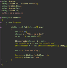
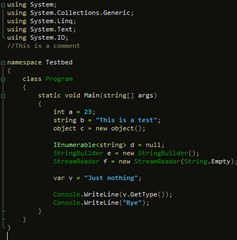
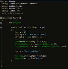
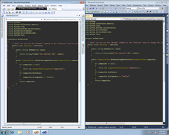
Below are some comparison screenshots of VS2008 (GDI) and VS10 (WPF) with this fix. All cropped images use Consolas 9. The color schemes used are: default(default VS color scheme), customColors1(submitted via a connect bug as a blurry color scheme. I believe it is the same as Oren Ellenbogen’s DarkScheme), and customColors2(DesertNights color scheme). Check them out and let us know what you think!
Open corresponding images in two different windows of an image editor. Make sure the windows completely align and overlap. Alt-tab between the two windows. You should NOT be able to tell the difference between the two images. To verify that these are actually different images, zoom in and use the color picker to sample the color on the same pixel from both images. Notice that the RGB values change ever so slightly as you sample the color from the different images.
- Chipalo
VS2008, default colors
VS2010 with fix, default colors
VS2008, customColors1
VS2010 with fix, customColors1
VS2008, customColors2
VS2010 with fix, customColors2
Side by side comparison of VS2008 and VS2010 with fix
Enlarged comparison of a line of text from VS2008 and VS2010 with fix
Side by side comparison of VS2008 and VS2010 with fix
Enlarged comparison of a line of text from VS2008 and VS2010 with fix
Comments
Anonymous
March 05, 2010
You're right, I can't tell the difference! Umm ... congratulations? :)Anonymous
March 05, 2010
Awesome, congrats guys! I know you just made a lot of developers really happy.Anonymous
March 05, 2010
Sounds really good! Another analysis trick is to copy-paste these into 2 layers in Paint.NET ( http://www.getpaint.net/ ), and then set the top layer's blend mode to "Xor". You can use Ctrl+Alt+V (Edit->Paste into New Image) for the first image, and then Ctrl+Shift+V (Edit->Paste into New Layer) to make this faster. -Rick BrewsterAnonymous
March 05, 2010
LGTM.Anonymous
March 05, 2010
I can see the difference just between the Vs2008 and Vs2010 original color scheme. The Vs2010 is much better.Anonymous
March 05, 2010
Great! Thanks for this improvement. I really appreciate it.Anonymous
March 05, 2010
Could you please comment on this: http://social.msdn.microsoft.com/Forums/en-ZA/wpfprerelease/thread/84874beb-60af-4474-a42e-fb727a0e950b ================================ Would it possible to create exact texts that we see in GDI? I have already played with TextFormattingMode and TextRenderingMode but they are not effective enough (except TextRenderingMode.Aliased). If you look at the below picture (link), you will see the "Windows 7 Paint" on the left and a WPF application on the right and they are different and "Windows 7 Paint" is much more better. http://cid-e096e7c6c38aedc5.skydrive.live.com/self.aspx/Public/TextRenderingComparison.bmp Regards, BijanAnonymous
March 05, 2010
This is great news! Thank you for listening, and thank you for your work on fixing this. I was getting worried when I saw the white-on-black text issue was still present in VS2010 RC. Seeing these screenshots is a big relief!Anonymous
March 05, 2010
The comment has been removedAnonymous
March 05, 2010
I can't tell the difference too. Awesome! Thanks!Anonymous
March 06, 2010
well done. now I can sleep easy at night again.Anonymous
March 06, 2010
This sounds good - could you just confirm that this is a general WPF4 fix, not a VS-specific thing? I am working on a white-on-black WPF app at the moment which doesn't have very good rendering despite fiddling with the various WPF text options - is this going to improve at RTM?Anonymous
March 06, 2010
So finally in the 4th release of WPF (3.0, 3.5, 3.5 SP1 and now 4.0), text rendering is sharp and GDI-like with ClearType enabled. This makes Visual Studio, Expression Blend, Design and Encoder, and dozens of other .NET apps highly usable. Thank you. An important development for WPF IMO.Anonymous
March 06, 2010
The comment has been removedAnonymous
March 06, 2010
This is great work! Will this be ported to Silverlight, where the same issues apply??Anonymous
March 06, 2010
I use a bitmap font (ProggySquareTT size 12). Will this work equally well?Anonymous
March 06, 2010
Looks great - but what about Portrait mode ? Does WPF render differently than "normal" cleartype ? If not, how does WPF work for non-cleartype fonts ?Anonymous
March 07, 2010
The comment has been removedAnonymous
March 07, 2010
Thank you, thank you, thank you. This is the one thing that have held me back from using VS2010.Anonymous
March 08, 2010
I must be the only one. Looking at the side-by-side, 2010 looks much blurrier to me. 2008 looks much more 'crisp'.Anonymous
March 08, 2010
Will - This fix will be default behavior for all apps based on the final release of WPF4. Borek – It would be interesting to see if you could consistently pick one out in a blind test. We’ve run this on a few people here and they have not been able to do so. Leave your email and if we set up a broader test, I’d be happy to include you. Getting font rendering “right” is very dependent on personal preference the scenario in which font is being used. I know the link below has some info on this subject. I thought I had written about it more, but the location of those posts is slipping my mind at the moment. http://windowsclient.net/wpf/white-papers/wpftextclarity.aspx Arnoud – Text plans around the next versions of Silverlight (5+) have not been finalized Martin – This fix should apply to all fonts; however, WPF does not support bitmap/raster fonts so neither does VS10. Are you already using this font with VS10. With some work, a customer has figured out how to convert a bitmap/raster font to a font usable by WPF. http://www.electronicdissonance.com/2010/01/raster-fonts-in-visual-studio-2010.html Atle – You’ll have to give me more information as to what you mean by “Portrait mode.” VS running on a rotated monitor? Portarit mode printing? No, WPF uses the standard ClearType algorithm for rendering glyph bitmaps. This process takes many different inputs which can change the final result of the image produced. ClearType is an antialiasing method, used for fonts, which takes advantage of physical properties of a LCD screen. Some fonts, like Consolas, are hinted to improve the ClearType process; however this does not prevent a text stack from using other antialiasing algorithms on the glyph bitmaps (eg grayscale). If WPF is told to use ClearType (system settings or TextRenderingMode), WPF will use ClearType. Otherwise WPF will use grayscale antialiasing or aliased rendering. Sean – You may not be alone, Borek says that he can tell a difference as well. Hopefully it is not as noticeable for you in a running WPF application.Anonymous
March 08, 2010
Is there any info about how this fix relates to DirectWrite? Many of the complaints against WPF text seem to be the same as complaints against other DW clients (Valve's beta Steam UI a recent example).Anonymous
March 08, 2010
Great work guys ! Finally WPF gets decent text rendering. However, when looking at the two images side by side I can definitely see the difference. I wouldn't say GDI is more crisp though. WPF's text just seems to be slightly more bold compared to GDI's. I don't think the difference would bother me (haven't really been using VS2010 RC yet, just played with it) Anyways, great work ! SvenAnonymous
March 08, 2010
Can we assume that same text rendering will available in Silverlight 4 ?Anonymous
March 08, 2010
Will we get a hotfix for .net 4.0 RC, so that we can check it ourself that it is fixed?Anonymous
March 09, 2010
I can tell the "M" and "W" and "a" letters look easily brighter in 2010 flipping between them quickly. However if a test to look for this involved say a couple minute break between the flip to a random shot, I doubt I could tell which is which as it's still quite subtle. As to which looks better? While it's quite subtle, the brighter subpixels contribute to the more blurry appearance but really I think this is acceptable now. The REAL QUESTION, is what about backgrounds that are not very dark or bright? eg. Low contrast/pastel themes. While those may not be a huge issue for the editor, WPF application overall would still use text on more than just black or white bg.Anonymous
March 09, 2010
For the people saying that it still is blurry, make sure you are not looking at it zoomed out. There is no difference. I even put them in photoshop to compare with some of the blending options to highlight differences.Anonymous
March 09, 2010
Thanks for the response, my email is borekb@gmail.com. If you took a couple of screenshots in VS 2k8/2010 and sent them to me I'd be happy to try to guess which is which.Anonymous
March 10, 2010
The comment has been removedAnonymous
March 22, 2010
I just want it to display aliased text.Anonymous
March 24, 2010
Can this be applied to the blurry text in Windows 7 too? (jump lists, window captions, taskbar)Anonymous
March 25, 2010
Zoxc - no this only applies to WPF applications. The Widows7 shell should already be using GDI.Anonymous
November 10, 2010
One question: WPF does AFAIK use DirectWrite. Is this still true if you use TextFormattingMode="Display"? And if it still holds true, how can I achieve the same effect when I use DirectWrite - but not WPF - in my application?



%20x%20Dev10%20(Bottom)_thumb.png)
%20x%20Dev10%20(Bottom)_thumb.png)