SEAT and the Super Real
I was sent a link today to this site from the UK which is for the launch of the SEAT Exeo (it’s a car).
Yes it’s built in Silverlight but what I really want to concentrate on is the design.
Visual Design
Firstly, it’s beautiful to look at.
That’s good for Silverlight because if you ask me there have been too many examples of the technical capabilities of Silverlight, at the expense of good visual design. If we want to continue to drive designer adoption of Silverlight we need to reassure designers that good design is just as possible in Silverlight as in other technologies (even more so with Silverlight 3 with bitmap effects, perspective 3D, better type rendering etc).
When your content is discretionary like this is (few people will feel they have to use this site) you simply must present yourself well.
Information Design
More importantly I like this example for its information design (or information architecture), regardless of technology.
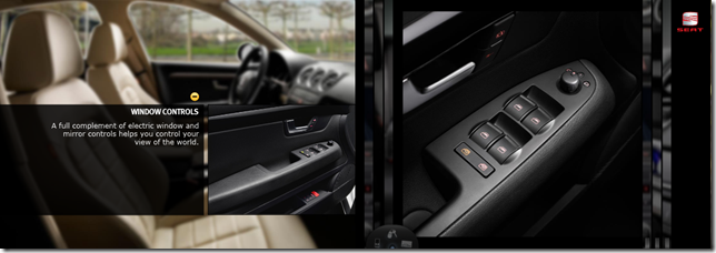
They start by using the magazine metaphor – something that we’ve seen used before of course, but which is very appropriate for a car launch. We’ve all flipped through those glossy printed car brochures before after all. Drawing on this experience sets up a ‘model’ for the user to follow. The challenge to the designers, then, is to not break that pact with their users but violating that model (too much).
By avoiding the traditional ‘menu’ of options for people to choose from, the designers make the entire site more approachable – I am invited to simply browse the brochure, rather than having to make a decision as soon as I arrive.
Instead of asking me to make a choice, the brochure format offers me a ‘path of least resistance’.
Interaction Design
The designers then go on to add interesting interactive pieces on each page of the brochure. I like these for two reasons:
- Firstly, they add delight – they are all well designed, small and augment the basic idea of a printed brochure in ways that delight, without breaking that overall model. This is what we refer to as ‘super-real’ – taking a metaphor from the real world, and making it more than it's real-life counterpart, but without losing connection to the basic real-world experience.
- Secondly, they make the task of choosing which features to explore less daunting, since there are only a few offered on each page. This reduces the user’s cognitive load (by which I mean the effort required to choose and keep track of those choices) and makes the experience that much more ‘comfortable’.
The faint blue light, the 3D affordance, and the likeness of a key-fob invite me to interact with this simple element.
What Could Have Been Improved?
Having said all of that, there were a few things that might have been done better? (Usual caveat that ‘it’s all very well for me to criticise, I wasn’t there’ etc applies.)
- The page turn mechanism, when done with the mouse, feels a little clunky at the end. When I ‘let go’ of the page it seems to resist falling into place. It ‘hovers’ for a moment and then takes an unnaturally long time to come to rest. This gives me the unnerving feeling that I haven’t done it right. It should fall more quickly, and possibly ‘snap’ into place as my mouse approaches the bottom-left corner?
- The zoom with the mouse wheel is not smooth and feels a little forced. The double-click zoom works well, on the other hand. (OK, maybe not the most important feature of the whole experience.)
- It’s disappointing that they had to provide such complex-looking instructions next to the first page. perhaps this is the result of usability testing? (Over-done on-screen instructions often are.) It’s a bit daunting as I read those instructions and try to map to the controls at the top. Could the controls have been better placed to avoid this? For example should the ‘previous’ and ‘next’ buttons have been placed to the left and right of the brochure? Would a little ‘teaser’ animation of the cursor grabbing the page corner and dragging it help?
Less is More
Overall this is a great example of how restraint (in navigation options, in amount of content and in visuals) can make for a very satisfying experience.
As I often say in presentations, functionality is the natural enemy of user experience. Have only as much as necessary to achieve your purpose.
Comments
Anonymous
April 05, 2009
Hi Shane. Thanks for sharing your analysis. This is indeed an interesting design which appeals for exploration. I couldn't agree more on your last point, and that reminds me of my favourite quote from Antoine de Saint-Exupery: "A designer knows he has achieved perfection not when there is nothing left to add, but when there is nothing left to take away."Anonymous
April 05, 2009
Hi Shane, We built the site here at Metia I'm glad you like it. AndrewAnonymous
April 05, 2009
Thanks for getting in touch Andrew, and congratulations! I'd love to give you a 'right of reply' to my observations. You could reply in a comment, or, better yet, get in touch (via the Email link) and maybe we could record a little podcast as a followup? Shane

