High and Low Fidelity Prototyping
Gosh I love the serendipity that is Radio National. Today on Artworks they interviewed a 'Concept Designer'. This guy (Iain) did conceptual mockups for movies like Ratatouille and the Star Wars prequels. The idea is to give the director a vision of how the movie will look before production starts. In this way this is the high-fidelity companion to (low-fidelity) storyboarding.
Coincidentally, at TechEd last week the guy from Animal Logic talked about similar topics: making low-fidelity storyboards or animatics, as well as high-fidelity mockups of individual frames.
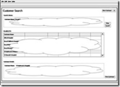
 Interestingly, that is often the way we need to work in interaction design too. In the early phases of design, when we are most worried about usability, the visual treatment of the product is less important. Since we know that showing users fully-treated mockups in early usability testing actually decreases the quality of the feedback we get, we are usually happy to stick with low-fidelity mockups like paper prototypes and wireframes.
The problem with these lo-fi mockups is that they really don't go down well with stakeholders, who are understandably less-than-impressed when we show them hand drawn mockups in briefings! So the usual compromise is to create a broad set of wireframes or paper prototypes to allow us to test with users, and to get the end-to-end flow right, along with fully-treated mockups of key screens/pages so the stakeholders can see what they are getting (often on a website 3 or 4 treated mockups are enough).
Working simultaneously in high and low fidelity gives you the best of both worlds:
- Low fidelity allows you to work rapidly and iterate quickly. You are able to envision more of the end-to-end experience more quickly. Also, test participants are not 'distracted' by the visuals.
- High fidelity allows you to envision the all-important eventual look, but takes more time. That's OK if your lo-fi prototypes have covered the breadth.
At MIX, Lee Brimelow said he likes to give his early prototypes a more polished visual look, even though he knows it will not be the final treatment, which will come from Frog's visual designers. This made me a little anxious:
- As I mentioned above, testing 'finished' looking interfaces diverts participants' attention to reviewing the visuals - colours and fonts.
- There is a risk that when something does not go well in usability testing we will be inclined to blaim the visuals, especially if we know the visuals tested will not be the final ones.
If you ask me, a mix of high and low fidelity prototypes (and early testing with low fidelity prototypes) is still the way to go.
Comments
- Anonymous
August 14, 2007
The comment has been removed - Anonymous
August 14, 2007
The comment has been removed - Anonymous
August 14, 2007
The comment has been removed - Anonymous
August 14, 2007
The comment has been removed